16 Web Design Mistakes You’re Probably Making Right Now
These 16 mistakes can undermine your website’s user experience and credibility. See what might be going wrong and learn easy ways to address each problem.

Patrick Antinozzi
Owner of RapidWebLaunch
As a web designer, whether professional or amateur, you should constantly be seeking to improve your website.
Whether it’s website performance, style, copywriting, conversion rate, or user experience, keeping a pulse on how your website is performing is essential.
And with web design standards and Google’s algorithms constantly evolving, this should be something you do at least once a month.
After years of running my own web design agency, I’ve seen a lot of people make some crucial web design mistakes. (and refuse to learn from them)
I want to keep you from making those same mistakes.
By removing these 16 things from your website, you can instantly fix these mistakes and improve it today.
1) Vague and confusing headlines
When people first land on your website, you have mere seconds to grab their attention.
How will you choose to use those precious few seconds?
For one, you better make it abundantly clear what you can offer your lovely new visitor. And the most efficient way to do that is with your top headline.
Vague headlines will only serve to confuse or frustrate your website visitors.
Here’s an example of a good headline and a bad headline:
In the first headline from TrustedHousesitters, the benefit offered to the visitor is immediately made clear.
In contrast, the second headline from MindMyHouse is just a generic “welcome to my website”. Like we’re all still building websites on Homestead in 2002…
Which one makes you want to learn more about the company?
WHAT YOU SHOULD DO INSTEAD: Write a clear and concise headline that immediately tells your visitor what benefits they will receive when they buy/sign up/subscribe to your product or service.
2) Unclear calls to action
Too many businesses are so focused on attracting people to their website that they don’t even know what they want their visitors to do once they arrive.
You’ll see all kinds of bloggers boasting about how much traffic they get to their website every month, but almost none talk about how many of those visitors actually became customers or subscribers.
Do you want 50,000 visitors every month? Or do you want 1,000 new customers every month?
Having a clear call to action to guide your visitors will turn your generic traffic-generating machine into a real profit-making business.
Here’s an example of a good call to action and a bad call to action:
BombBomb‘s call to action is clear, immediate and actionable. Visitors don’t even need to click or scroll anywhere to sign up. (credit-card-free too!)
Whereas iMark Interactive‘s call to action is confusing and divisive. What exactly am I “Getting Started” with? Is it different from “Contact Us”? Why do I have two options to choose from? What if I choose the wrong one?
See how easily things can go wrong for your visitor?
WHAT YOU SHOULD DO INSTEAD: Use a call to action that makes it obvious what the visitors are acting on. They shouldn’t have to click through multiple layers to act on it. Make it clear, simple and enticing.
3) Too many calls to action
Subscribe to our newsletter, follow us on social media, buy this, click here, read this, watch my YouTube video…
It’s all too much.
Each page of your website should be dedicated towards getting your visitors to take one single action.
While it’s perfectly acceptable to have links to your other pages, you should be guiding your visitor down a path to a call to action at the end.
A funnel can look something like this:
A visitor lands on your blog post about “How to know when your roof needs repairing”
They read your post, then click your call to action at the bottom that says “Get a quote on a roof repair”
Your call to action takes them to your Roof Repair Services landing page
They view the page, like what they see, then submit a request for a quote on your contact form located at the bottom of the page
You just successfully turned a visitor into a potential new customer!
That whole funnel only works if you stick to that one call to action: Get the user to request a quote on roof repair.
If you had placed a bunch of other stuff at the top of that funnel, like a bunch of subscribe buttons and social media links in the middle of your blog post, you increase the odds of your visitors losing focus and wandering off somewhere else.
Here’s an example of too many calls to action: (yes, this is a real website lolz)
Yikes.
This is an extreme example, of course. But you’d be amazed how many websites commit this gargantuan web design error.
WHAT YOU SHOULD DO INSTEAD: Keep every one of your website’s pages to only one call to action. In some rare occurrences, you can get away with 2-3, but they are usually minor CTA’s in comparison to the primary CTA.
4) Long paragraphs
This is an easy one.
No one wants to read a wall of text. Break your content up into short, skimmable paragraphs.
Here’s an example of good paragraph length vs bad paragraph length:
Which one would you take the time to read?
WHAT YOU SHOULD DO INSTEAD: Keep your paragraphs to no more than 2-3 sentences each. Make liberal use of one-sentence paragraphs.
5) Autoplaying videos
Videos that automatically play when you land on a website are obnoxious.
In fact, any aspect of a website that forces me to do anything, or limits my freedom to choose my experience, is obnoxious.
Not to mention that force-playing videos reduces the load time of your website. The video has to be loaded regardless of whether your visitors wants to watch it.
And there’s a special place in… my heart… for websites that force-play videos with THE SOUND ON.
Here’s a bad example of an auto-playing video:
If I wanted to watch it, I would have hit play, Anchor. (love your podcast platform though!)
WHAT YOU SHOULD DO INSTEAD: Give your visitors options. Let them decide if they want to watch your video or not. Make it compelling enough that they want to hit play.
6) Too many animations
Animations are cool.
And they can certainly add value to your website’s message. If you’re making a website about space, who doesn’t want to watch planets float by as you scroll?
But you can definitely overdo it.
There’s a fine line between improving the user experience of your website and just throwing in as many cheesy gimmicks as your server can fit.
Not to mention that it can seriously damage the performance of your website.
Here’s an example of good use of website animations:
Your website animations shouldn’t detract from your message, it should add to it.
WHAT YOU SHOULD DO INSTEAD: Keep the animations to a minimum. Only add them if it make sense to. More isn’t always better.
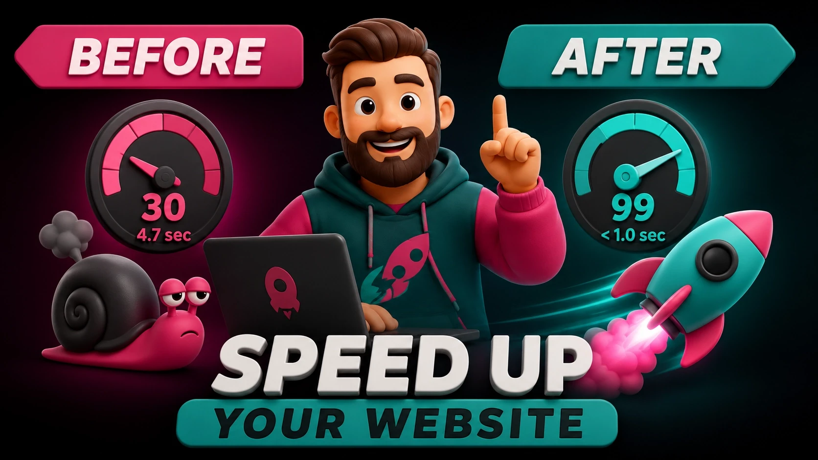
7) Oversized images
Powerful imagery is the lifeblood of your website. People don’t have time for your old-fashioned words.
And with images becoming the focus of great web design, the toll it can take on your website’s servers is massive.
Many DIY bloggers and designers are downloading high quality photos and then simply uploading them to their own websites. Without doing any optimization or compression first.
This is a costly mistake.
Many of these images are clocking in at 3MB+…
Take a look at the difference compressing and optimizing your images makes: (from our friends over at Kinsta)
Optimizing the images of this page catapulted the loading time from 1.5 seconds to just under half a second.
A massive improvement for such a simple task!
WHAT YOU SHOULD DO INSTEAD: Ensure that every single image you upload to your website has been resized and optimized appropriately.
8) Generic stock photos
Is there anything worse than discovering a beautiful website, only to scroll down and find that they are using cheesy stock photos of people who don’t even work for the company?
Or worse still, Vince Vaughn works for them?
Yep, that’s right. Vince Vaughn and a few other actors decided to skewer the stock photo industry by taking part in producing their own cheesy stock photos.
The point was to show how stock photos dehumanize their subjects. To the point where you wouldn’t even notice a famous celebrity in them.
“But Patrick, I don’t have $500/month to drop on Shutterstock. Where can I get free stock photos that don’t look like stock photos?” – You, probably
The truth is, you can find many resources for free stock photos that don’t look like they’ve been mass produced for every lawyer and accounting firm in the country.
How do you know what to look for?
Here’s an example of a bad stock photo and a good stock photo:
The difference is clear.
WHAT YOU SHOULD DO INSTEAD: Use beautiful, high quality stock photos that have been taken by a freelance photographer. Avoid the generic, mass-produced Vince Vaughns of the world.
9) Boring copy
This one drives me bonkers.
People put so much thought into the look and feel of their website, make something beautiful and functional, then completely crap the bed when it’s time to write the words.
Great copywriting is the heart and soul of not just your website, but your entire business.
It’s the thing that will either keep your visitors reading and scrolling, or running off to your competitors.
The web design industry is notoriously bad at copywriting. As such, they will be the focus of my scorn.
Here’s an example of bad website copywriting and good website copywriting:
Which page is more likely to hook you and keep you scrolling down for more?
(Full disclosure: the bottom page is mine.)
WHAT YOU SHOULD DO INSTEAD: Put some effort into your writing. Learn about your target audience and what type of content they like to read. Dig deep into psychology and what makes people tick. Read more books.
10) About page
The About page is dead.
The vast majority of websites don’t need one.
If you can’t tell your visitors what you’re all about from your home page, then they won’t bother clicking through to your About page.
Save the time, and money, and skip it.
Here’s an example of a bad About page that you should never see:
ProBlogger is a fantastic website, and produces one of my favorite web design podcasts, but this About page is boring. Which is probably why it’s hidden down in the footer…
WHAT YOU SHOULD DO INSTEAD: Skip the About page entirely. Get your message across on your home page. In rare occurrences where that isn’t possible, and you feel you need an About page, don’t just throw up a wall of text.
11) Testimonials page
The Testi’s page (lolz) is even deader than the About page.
Frankly, you should have social proof (i.e. reviews and testimonials) sprinkled throughout your entire site. There’s no reason to keep them all to one dedicated page.
And getting reviews for your Google My Business page is more important anyway.
Here’s a good example of where testimonials should go: (via our friends at BigScoots)
Right there in the middle of the home page. That’s where your testimonials should go.
And in any other subsequent pages where relevant.
WHAT YOU SHOULD DO INSTEAD: Skip the Testimonials page and sprinkle them throughout your website instead. Particularly right near your calls to action.
12) Prominent social media icons
Our friends over at Orbit Media put it better than I ever could:
“Social media icons are merely candy-colored exit signs.” – Andy Crestodina
Well. Said.
Every social media icon you place on your site is an opportunity for your visitors to get distracted and peace out.
The whole point of social media is to get people to come FROM social media TO your website. Not the other way around.
WHAT YOU SHOULD DO INSTEAD: Your website is the moneymaker here. Tell Zuck to take a hike. Keep your social icons placed discreetly in the bottom of your footer.
13) Bloated plugins
This one mainly applies to my fellow WordPress users out there.
WordPress’ plugins feature makes it easy to add advanced functionality to your website. Features that would normally require some complicated customization.
But many people go way overboard with adding plugins.
Each plugin you install draws more resources from your server. Resources that could potentially be better spent elsewhere.
Look at the difference WPCurve made in their website when removing unnecessary plugins:
From a loading time of 5.2 seconds to just under half a second.
That is massive.
WHAT YOU SHOULD DO INSTEAD: Keep your plugins to a minimum. Make sure whatever you install is absolutely necessary and can’t easily be done without a plugin. Also keep an eye on which plugins you install, ensuring they are all secure and reputable.
14) Obnoxious live chat
Live chat…
Quite possibly the worst new internet marketing trend in a decade.
It’s the new popup.
I just can’t believe how many website owners continue to defy all moral sensibility of the user experience. Obnoxious really is the only way to describe it.
I’m not opposed to all live chat, mind you. It needs to be done discreetly and with the user in mind.
Here’s an example of live chat done right, and also done horribly wrong:
One of these is a subtle contact option that is there if you need it.
The other is aggressive, annoying, and somehow even manages to be an advertisement for one of their own products.
Which website would you prefer to visit?
WHAT YOU SHOULD DO INSTEAD: By all means, have the live chat option. But make it just that; an OPTION. Don’t shove it down your visitor’s throats the moment they land on your page.
15) Email links
I had this debate with a client recently. I lost.
I guess sometimes “the customers is always right.” *shoulder shrug*
They insisted that they needed to have a direct-to-email link on their site. You know, when you click an email and it automatically pulls up your email client of choice so you can start typing.
Sounds super convenient, right?
And it was. Right up until “marketers” ruined it.
Now, if you do decide to put a mailto: link on your site, you’re just increasing the amount of spam you’re going to receive in your inbox.
WHAT YOU SHOULD DO INSTEAD: Have your visitors contact you in other formats. Contact form, live chat, phone number, WhatsApp, anything but direct-to-email.
16) Too much “stuff”
And last but not least, too much “stuff”.
I know that sounds super vague, but bare with me.
With modern web design, less is more. White space is your friend. Just because you have empty space, doesn’t mean you have to fill it with something.
Wise use of white space actually better presents your message, and beautifies your website even further.
Here’s an example of a website with too much stuff, and a website with just the right amount:
(Yah, that’s right. I used my own website as an example again. Make your own blog if you don’t like it.)
Which of these sites has the clearer message?
Clean, simple and minimal is in. Clutter and information overload are out.
WHAT YOU SHOULD DO INSTEAD: Tell as much as you can with as little as possible. Help your visitors to focus on the most important aspects of your message.
Oh, I’m sure there’s more stuff to get rid of…
As the internet evolves, web design standards adapt.
These days, this is happening at a rapid pace.
I’m gonna have to stay on top of this post so I can continue to add more over the years…
But if you remove these 16 things from your website today, you will notice a dramatic improvement in your website performance and conversion rate.
I personally guarantee it.
Read more


Get a website that pays for itself.
It's not just a website. It's a lead-generating, process-simplifying, time-saving, money-making, marketing machine.