37 Reasons Visitors Are Leaving Your Website Right Away (and How to Fix It)
Uncover the top reasons visitors abandon your site almost instantly and learn simple ways to fix loading times, design hiccups, and overall user experience.

Patrick Antinozzi
Owner of RapidWebLaunch
Let me guess.
You just took a quick look at your Google Analytics account, didn’t you?
Perhaps your eyes once again gravitated towards those 3 pesky metrics you’ve been obsessively tracking for months. Your website’s Pageviews, Bounce Rate and Average Time on Page, right?
And you didn’t like what you saw…
It’s OK, you can tell me. This is a safe space.
The good news is that people are landing on your website.
The bad news? These same people are leaving your website almost immediately.
Why? How can that be?
Did the hundreds of hours and thousands of dollars you poured into your website mean nothing? Was it all a waste? Should you just give up on web design and go back to school to learn how to repair AI-powered toasters?
Easy there, tiger. Let’s walk through this one together.
The truth is there could be literally dozens of reasons why visitors are leaving your website.
Let’s break them down one by one.
Your website bounce rate is bad because… your visitors get impatient
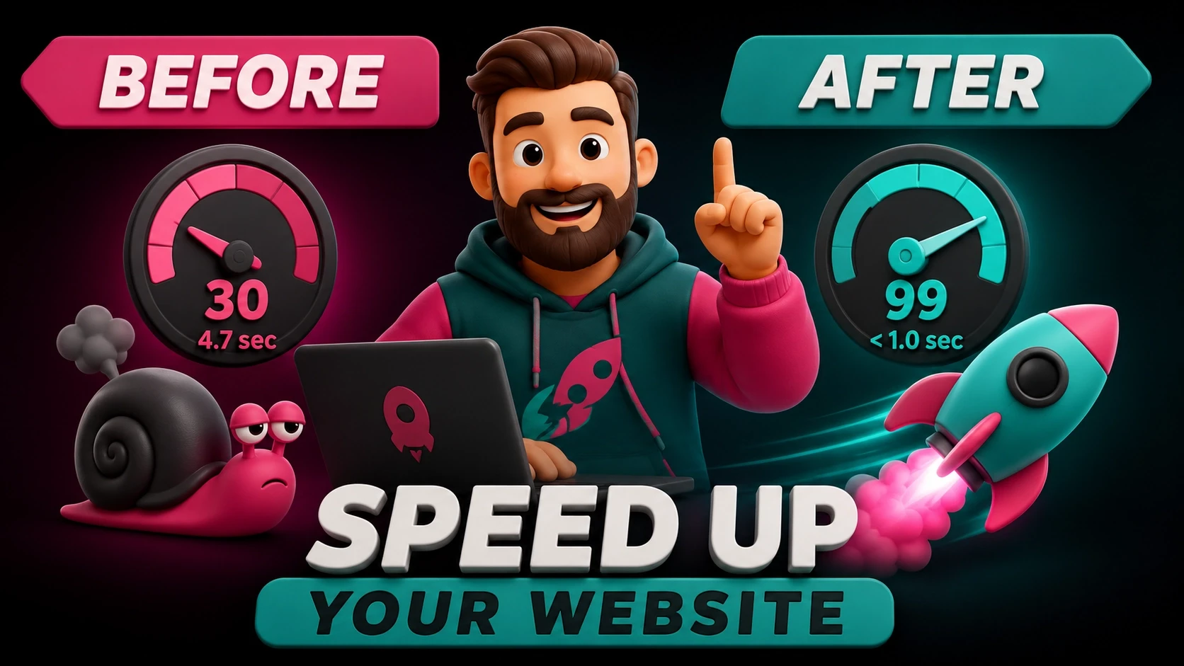
…Because your website loads too slowly
Google has made it abundantly clear that website loading speed is an important ranking factor. They recognize that you have mere seconds to catch your visitor’s attention, and they’re not gonna wait around.
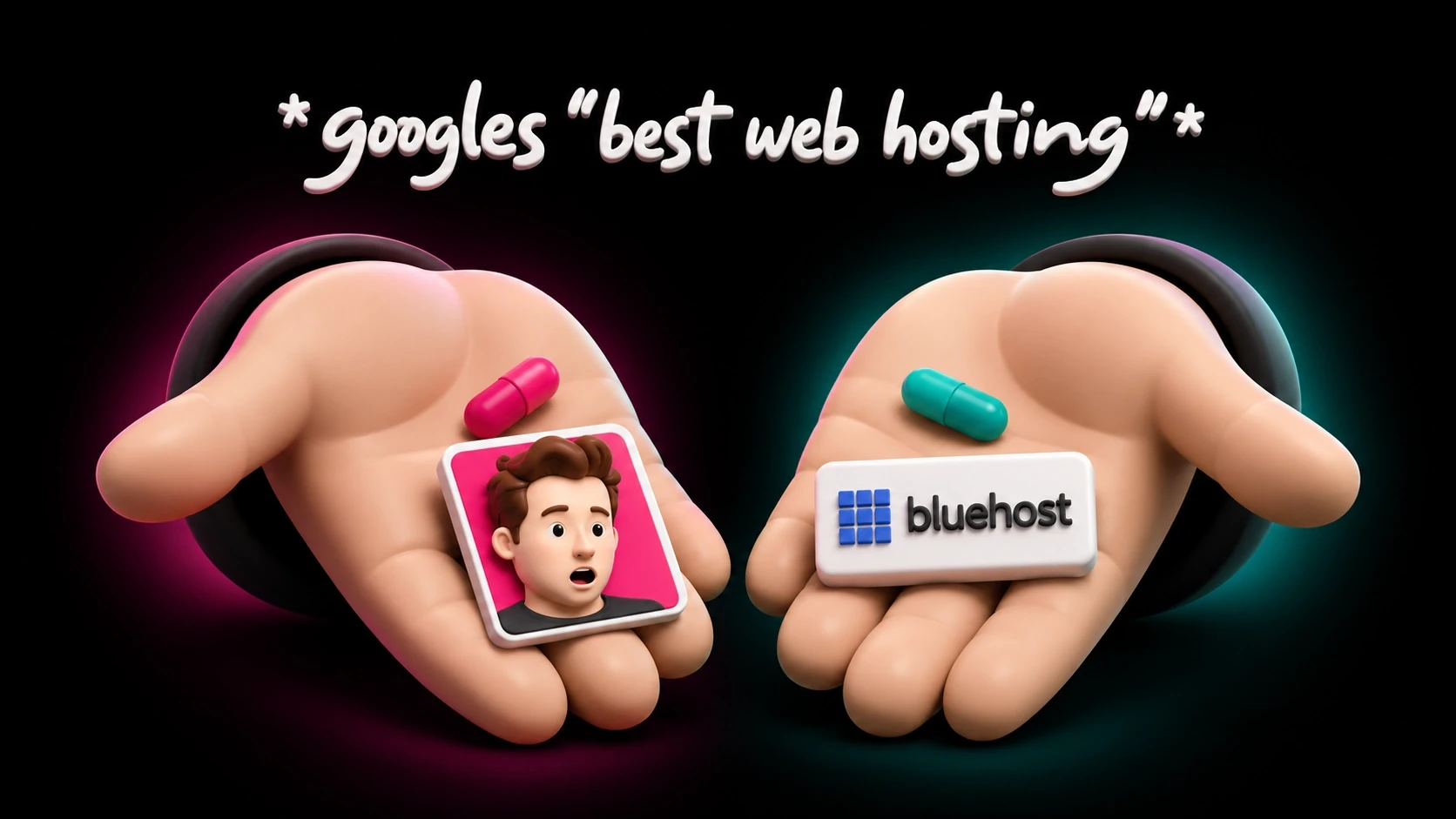
…Because your hosting sucks
Remember that sweet deal you got on your monthly website hosting? You’re only paying $2.99/month while your friends are coughing up $29/month.
“Pfft. Chumps.” – You, probably
Well…
I hate to break it to you, but sometimes you get what you pay for.
At $2.99/month, you’re scraping the bottom of the bucket in terms of web hosting. Your website shares a server with thousands of other websites, and will be forced to compete for those precious server resources.
If you get any decent amount of traffic, you’re going to notice a difference.
And so will your visitors.
Cut out a few Starbucks lattes every month and invest in high quality, super-optimized website hosting.
…Because your images are too large
This is one of the most common mistakes made by both web designers and bloggers alike.
Uploading high quality images without optimizing them first is like trying to drive a speed boat while the anchor drags along the bottom of the lake.
You’re gonna have a bad time.
Use a tool like Photoshop to reduce and compress every single image you upload to your website.
…Because your videos autoplay
Autoplaying videos sucks up valuable resources and damages your website’s user experience. (because they’re annoying as heck)
By all means, use videos. But make sure you give your visitors the option to watch it or not.
If you can’t create an enticing enough call to action to watch it, then you need to try harder.
…Because your website isn’t optimized for performance
A lot goes into making a website load blazingly fast.
Even if you manage to do everything else right, and you avoided the common snares mentioned above, your website can still be poorly optimized for performance.
Have you thought about things like:
caching (both server and browser)
content delivery networks
reducing plugins
and simplifying code?
Probably not.
Which is why you should hire someone to optimize your website for you. Or take the time to learn how to do it yourself. It will be well worth the investment.
Your website bounce rate is bad because… your visitors get bored
…Because your content is organized poorly
Even if you have a website that loads quickly, you still need it to be… well, interesting. There’s no time for a boring website.
…Because you have huge walls of text
I’m not sure if you’ve noticed or not, but people don’t read a whole lot of books these days. The era of reading page after page of nothing but text is long gone. As our attention spans continue to shrink with each binge-watch we subject ourselves to, it’s becoming harder and harder to hold a website visitor’s attention. Writing a novel’s worth of text in one overly-long paragraph is sure to scare away even the most loyal of readers. Make your content less intimidating by breaking your text into super-short paragraphs. I’m talking 1-2 sentences short.
Or have you not noticed that I wrote that entire section in one paragraph to illustrate my point?
Wasn’t that painful?
Keep it short and sweet. And break up your formatting with “quotes”, italics, bolds,
bullet-
point
lists
and, yes, even emojis. ????
…Because you don’t have enough images
Speaking of walls of text… a super easy way to break them up is by inserting more imagery into pages.
Telling your story visually is always more powerful than writing about it.
Take it easy with the text and use more images, illustrations, vector icons and graphics in your website design.
…Because you use generic stock photos
Does that group of grinning millennials pouring over documents in the conference room meeting actually work for your company?
No? Then why are they featured on your About page?
Using fake stock photos with fake people is, at best, disorienting and confusing for your visitor.
At worst, they’ll see right through it and take off to your more transparent competitor.
Don’t be so obsessed with appearing bigger than you are. Be transparent and honest about your story. Connect with your visitors on a more intimate level.
And if you must use stock photos, make sure they are unique and high quality. (and don’t feature any people in them)
…Because your copy is dull and lacks personality
If someone walked up to you, introduced themselves, then began to ramble on about their age, relationship history, family situation, work experience, medical records, favorite type of pie, etc… what would you think?
You’d be looking for the first opportunity to escape.
For some reason, many web designers apply this same methodology to their websites.
But here’s the thing…
It’s not about you. Or your business.
It’s about your visitor. More specifically, how you can help them. How can they benefit from your product or service? Why should _the_y listen to you? What can you do for them?
So tell them. And do it with some style and flair for goodness’ sake. Inject some personality into your storytelling.
…Because your offer isn’t compelling
Every search query is a question waiting to be answered. Your job as a web designer is to answer that question.
Are you doing it wrong?
…Because you sound like everyone else
Let’s play a game.
I’m in search of a cleaning company to do a post-renovation cleaning of my new town-home project. I have a modest budget in mind, but mostly I’m concerned with getting the job done right with quality workmanship.
I do a quick Google search and find 13 cleaning companies in my area who offer the same service at similar prices.
How do I choose one?
After digging a bit further into the websites of these companies, I find the CEO of one of them casually mentions how he’s a Montreal Canadiens fan in one of his blog posts.
I’m a Montreal Canadiens fan. I now have common ground with one of these cleaning companies, and this little nugget of info humanizes their brand in my mind.
Yes, it’s really that simple. And you may think it’s dumb.
Mutual interests and common ground is a major factor in how we connect with the people around us.
Why shouldn’t small businesses be the same?
Like it or not, you are a brand now. Not just your business.
…Because your product’s benefits aren’t clear
Are you selling products or benefits?
Apple, and more specifically Steve Jobs, was a master at this.
Which one would you buy?
1. “Storage for 1GB of MP3s”
2. “1,000 songs in your pocket.”
Tell your visitors how they stand to benefit from your website’s product or service.
Your website bounce rate is bad because… your visitors get distracted
…Because you make it easy for them to be distracted
Squirrel! – The dog from Up
…Because your social media links are too prominent
Our good friends over at Orbit Media put it best when they said:
Social media icons are merely candy-colored exit signs. – Andy Crestodina
I couldn’t agree more.
The entire point of social media is to attract attention and bring people to your website. Not the other way around.
Featuring your social media icons in prominent places all but guarantees that your visitors will get distracted and leave.
By all means, have your social media profiles displayed on your website, just make sure they are discreetly placed in the footer instead.
…Because your embedded YouTube videos link out to cat videos
This is a smaller web design mistake, but still worth mentioning.
If you have YouTube videos embedded on your website, make sure you have turned off the Suggested Videos feature.
Here’s how:
1. Click the “share” button under the video.
2. Now click “embed”
3. Click “show more”
4. Uncheck the box next to “show suggested videos when the video finishes”
5. Copy and paste the new embed code into your page
Boom. No more featured cat videos!
…Because they get overwhelmed by your website
Autoplaying videos! Flashy animations! Sliding images! Popping text! Cramming every feature under the sun into your website thinking that it somehow improves the experience!
Whoa, slow down there.
When it comes to good web design. Less is more.
Use those fancy features sparingly, and only when it adds to the user experience. White space is good. Let that text and imagery breathe a little.
Remember: don’t overwhelm your visitors. Keep it simple.
Your website bounce rate is bad because… your visitors get confused
…Because your website is designed poorly
I mean, you wouldn’t be reading a post about why visitors leave your website if your site was designed properly, would you?
…Because your navigation structure is unclear
A clear navigation structure is important for both your visitors, and for Google’s algorithm.
Having a clearly defined hierarchy will help guide your visitors to what they’re looking for.
If you have more than 5-6 sections in your navigation menu, you best be asking yourself why.
A navigation menu like this can quickly be improved by consolidating all of the “Collator” pages under a submenu, and removing the Videos page and instead placing those videos throughout the rest of the site.
Simple. Clear. Concise.
…Because you don’t have a clear call to action
What do you want your visitors to do when they land on your page?
Fill in a contact form? Subscribe to your newsletter? Follow you on social media? Buy a fluffy, homemade koala magnet?
It may seem obvious to you, but how does it look to your visitors?
Go through your entire website from the point of view of a new visitor who knows nothing about you. Then see how obvious it is.
You can even ask a friend to do it if you don’t trust your biased judgement.
…Because you have too many calls to action
While we’re at it, let’s talk about too many calls to action. Yes, it is possible to have too many.
Have you ever heard of the Paradox of Choice?
It’s a simple psychological theory that says too many options lead to paralysis and unhappiness.
From Aziz Ansari’s book, Modern Romance:
In one study, a researcher setup a table at a luxury food store and offered shoppers samples of jams. Sometimes the researcher offered 6 types of jam, but other times offered 24. With the table of 24 jams, people were more likely to stop by for a sample. But the table of only 6 jams was 10X more likely to have someone actually buy some jam.
This paradox of thinking more options means better options is something I’m confident we have all experienced at some point. And it applies to web design as well.
Pick one or two clear calls to action, and focus your visitor’s attention on those.
Any more than that, and you’ll paralyze your visitor into thinking he may make a wrong choice, so he’ll make no choice at all.
…Because the design is outdated
A website that worked into 2008 isn’t going to work so well in 2020. Get it updated to modern standards.
Or are you still rocking that OG iPhone 3G just fine? Hmm? ????
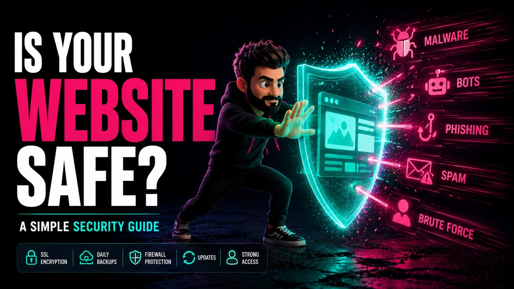
…Because your website is insecure
Online security is an increasingly worrisome issue. If you’re collecting your visitors’ personal data, this is even more important. So pay attention.
…Because your website doesn’t have an SSL certificate
In short, SSL certificates are small data files that allow secure connections between your server and your visitor’s browser.
Most web hosts now provide them for free, as they have become an industry standard across the web.
Websites without an SSL certificate will be flagged by Google as unsafe.
How do you know if your SSL is working or not? Look for the green pad lock beside the address bar.
…Because your website has been hacked
Yes, it’s possible for your website to be hacked. In a number of ways, actually.
But the most common form of website hacking is still the simplest.
Guessing the website owner’s weak password.
Use a password manager like LastPass to organize your passwords and autogenerate complicated passwords that will be nearly impossible for an algorithm to guess.
Your website bounce rate is bad because… your visitors get frustrated
…Because you destroyed your website’s user experience
Why… Why did you do it??
It’s OK. I’m sure it was unintentional. Let’s fix it.
…Because you’re still using ads to monetize your website
In my entire life, I’ve met exactly one person who enjoys advertisements.
We are no longer friends.
Ads are (nearly) universally loathed. They destroy your website’s UX and reward you with mere pennies to show for it.
Monetize your website through literally any other method.
…Because you refuse to get rid of obnoxious popups
I’ve written 100’s of blog posts on here. The dreaded popup probably gets mentioned in about 63% of them.
Visitors hate popups. Google hates popups. I hate popups.
And they suffer from extremely poor conversion rates anyway.
Removing all popups from your site is as much of a no-brainer as removing ads is.
…Because your onboarding process is excessive
Did you actually manage to get a visitor to sign up for your website’s service? Awesome!
Did you then scare them away because you demanded to know what their little sister’s favorite flavor of ice cream was? Not awesome.
If you ask for too much info up front, you dramatically reduce the chances of your visitor completing your onboarding process.
Keep it simple. Only ask for info that is absolutely necessary from the beginning. Typically, that means only their name and email.
You can get the rest of the info once you’ve earned their trust.
…Because your website isn’t responsive
Stop me if you’ve heard this before.
Your website looks amazing on the desktop, but when you take a look at it from your iPhone, it’s a garbled mess.
The majority of website visits already come from mobile, and that’s only increasing year after year.
If you’re not designing your website to look great on any device, and with a focus on mobile first, you’re gonna have a bad time…
…Because they didn’t find what they were looking for
Matching your content with the answers searchers seek is the foundation of modern SEO.
…Because you were more concerned about keywords than search intent
Look, I get it. SEO is critical to the success of your website. And keywords still play an important part in that.
But not nearly as important as they used to be.
Google is stinkin’ smart these days, man. They are far better at understanding the context and intent behind every search query.
They can focus on the why more than the what.
If you’re still trying to stuff as many target keywords into a page as possible, you’re playing SEO the old-fashioned way.
It’s now all about the search intent. Efficiently providing exactly what your visitor is looking for.
And that’s when you’ll start to notice those pesky 3 metrics start to improve: Pageviews, Bounce Rate, and Average Time on Page.
So, what do you do now?
There are honestly a lot of things that can go wrong with your website. And even more reasons why visitors leave right away.
I capped it at 37 because we can’t be here all day. ????
But, in reality, things are beginning to simplify.
The technical aspects of great web design and excellent SEO are becoming less and less important. The new focus is on user experience.
So, if you’re feeling overwhelmed at the prospect of trying to fix all of these mistakes and improving your bounce rate on your own, just focus on this one simple thing instead:
Will this improve or damage my visitor’s experience?
If the answer is improve, do it. If the answer is damage, don’t do it.
There, doesn’t that feel better? Much simpler.
Read more

Get a website that pays for itself.
It's not just a website. It's a lead-generating, process-simplifying, time-saving, money-making, marketing machine.