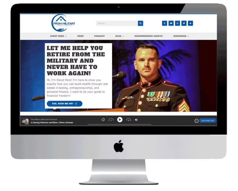
Whether you’re a beachside café in Miami or a hip boutique in Portland, our affordable mobile web design services can give your local business a sleek, user-friendly online presence.


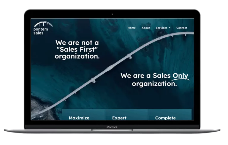
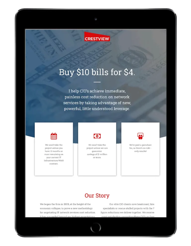
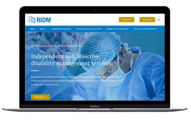
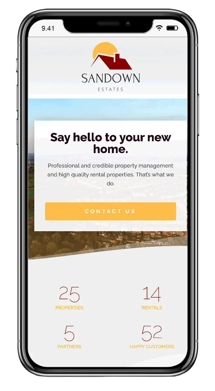
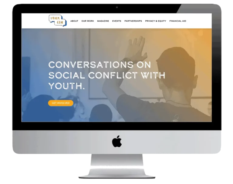
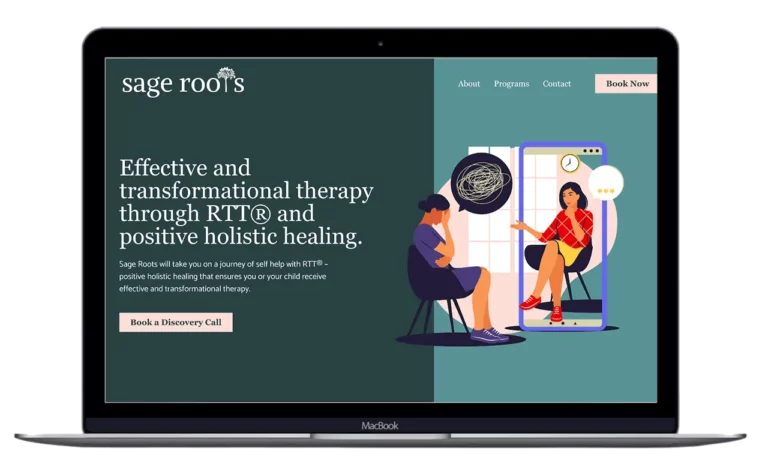
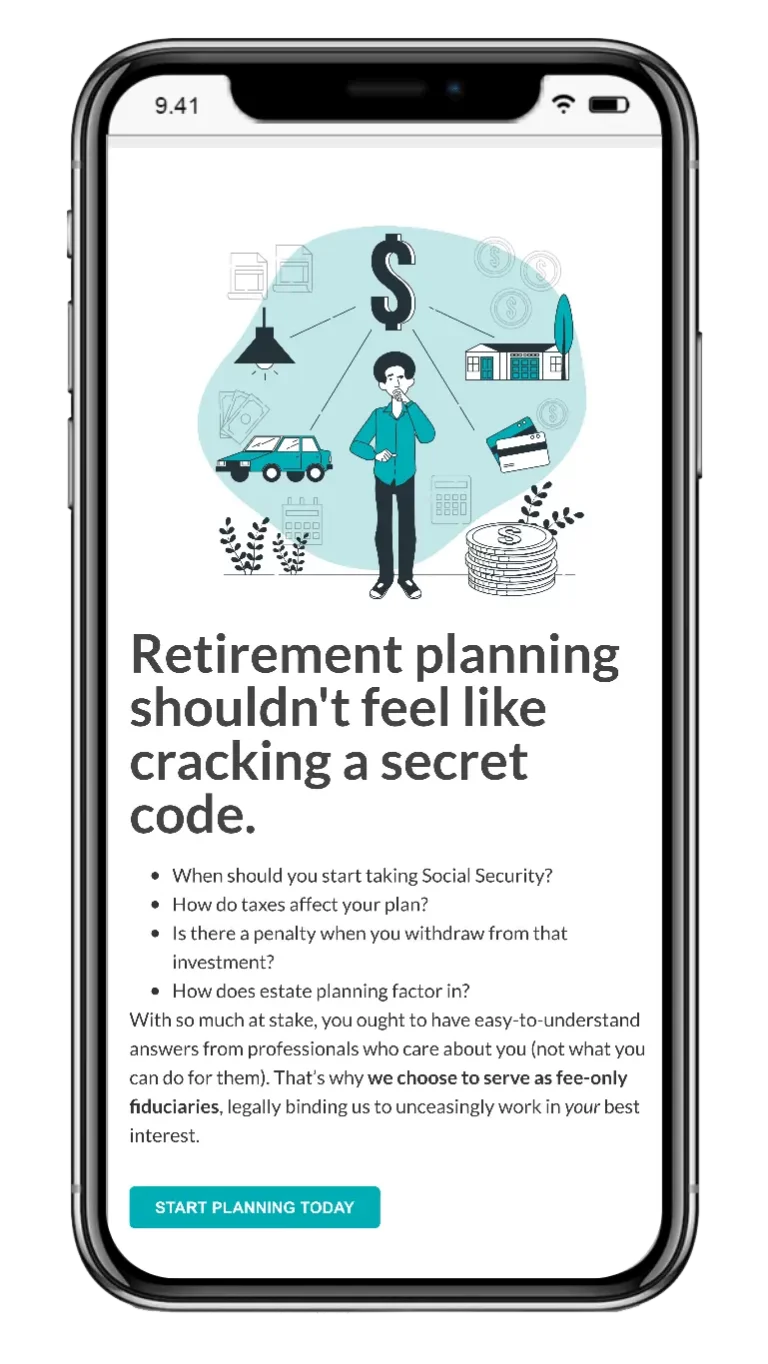
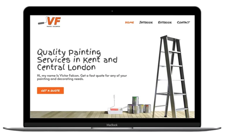
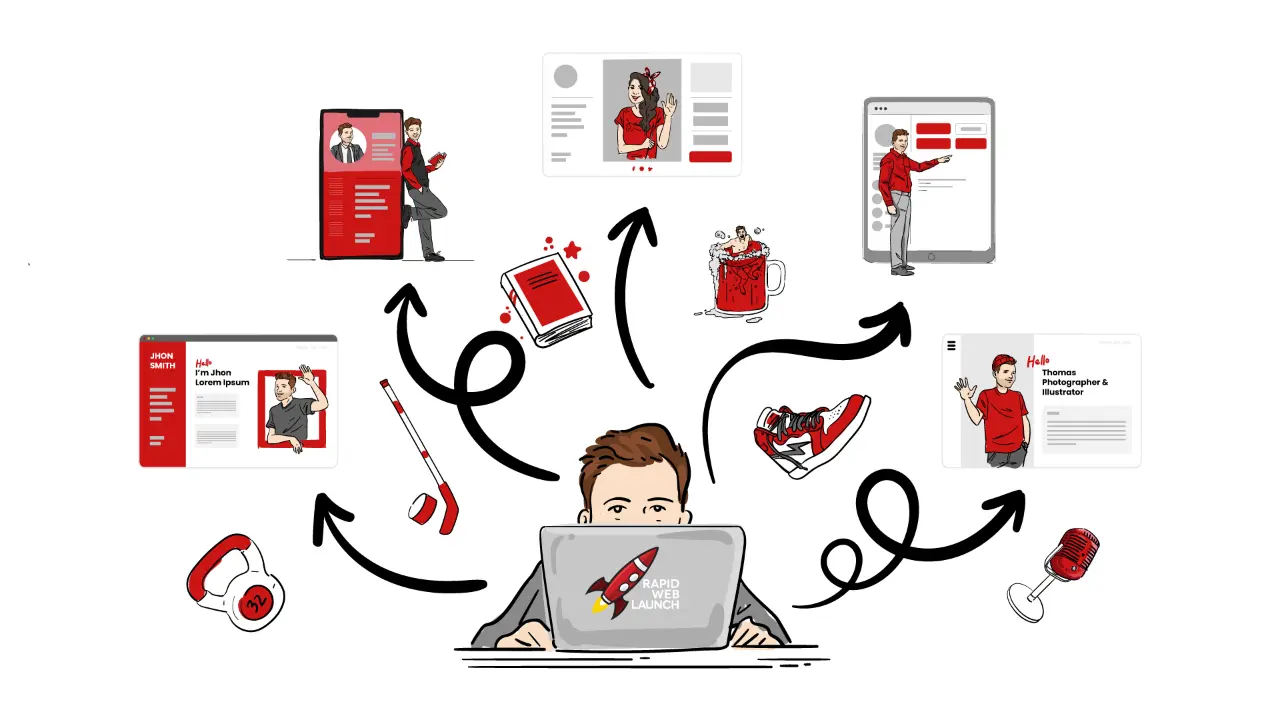
6 legit reasons to choose our Mobile web design services
No more waiting for the next blue moon to update your website. With RapidWebLaunch, you send a tweak, we make it chic—in under 72 hours, every time.
Don’t worry about getting lost in a sea of hold music and faceless call center reps; with us, you get the royal treatment – one-on-one support that makes you feel like the VIP you truly are. Your mobile web design woes are a thing of the past, because in our world, every client is top-tier.
Paying no mind to the one-size-fits-all approach, we’re crafting mobile web designs that could practically give search engines butterflies. Think of it as a matchmaking service, where we set up small and medium businesses with their dream SEO profile, leading to a beautiful and profitable relationship.
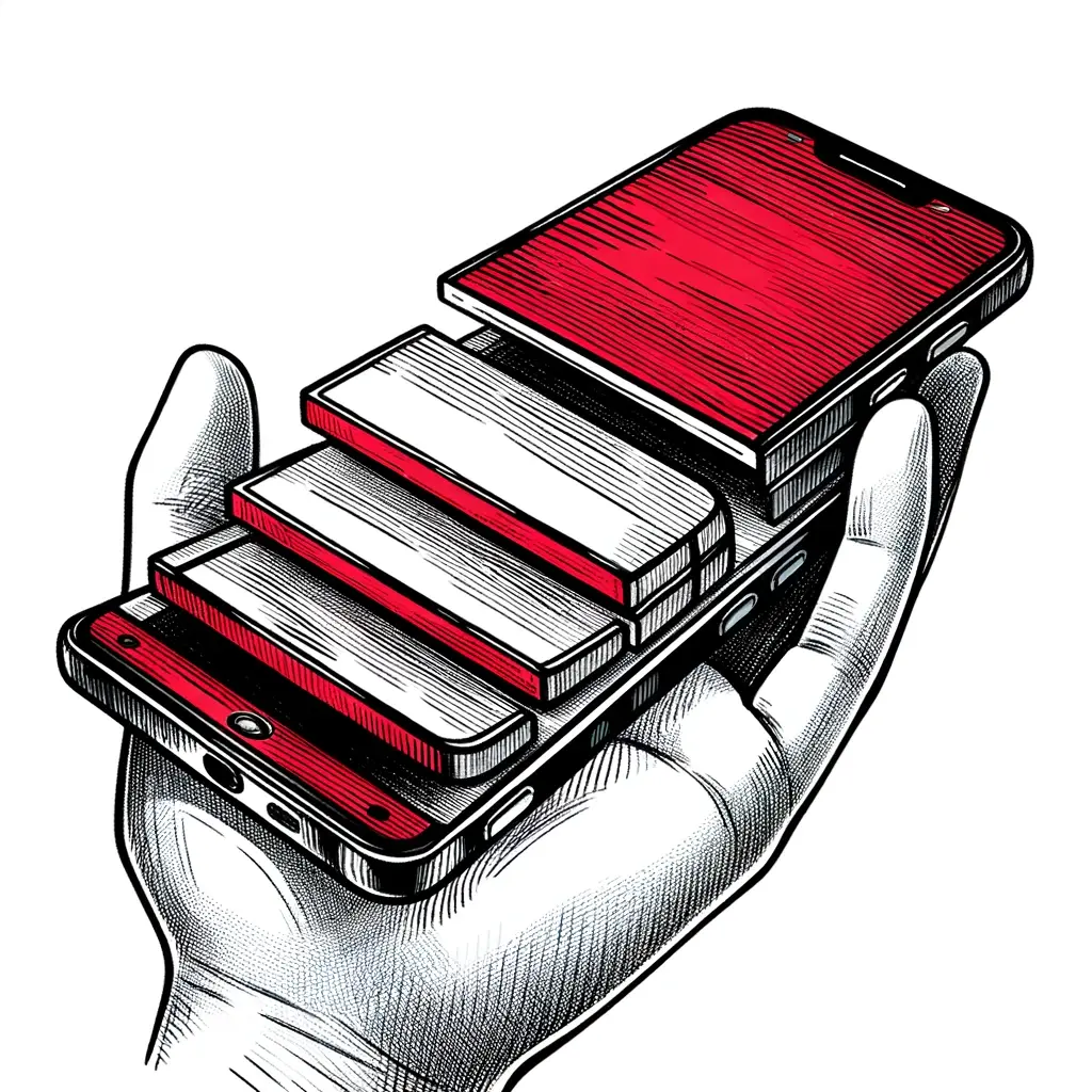
Smartphones, tablets, laptops—you name it, our websites play nice with all of them. Dive into the mobile-first era where pinching and zooming is so last year, and seamless surfing on any gadget is the cool norm.
Many websites crawl along slower than a snail on a leisurely stroll, but not the ones we build—they zip and zoom like they’ve got a rocket strapped to their back. No fluff, no clutter, just sleek, speed-demon sites streamlined for your business to soar in the fast lane.
Great mobile web design doesn’t require you to break the bank or auction off your office plants. We’ve got the skills to craft a sleek, responsive website for your SMB that’ll keep your wallet as happy as your click-through rates.

I am so impressed with the service, professionalism, and quality that Patrick and his team at RapidWebLaunch deliver! Within a day-and-a-half from my first contact they had me up and running with a professional website. Patrick was great to work with – responsive and patient. I am overwhelmed with customer satisfaction!
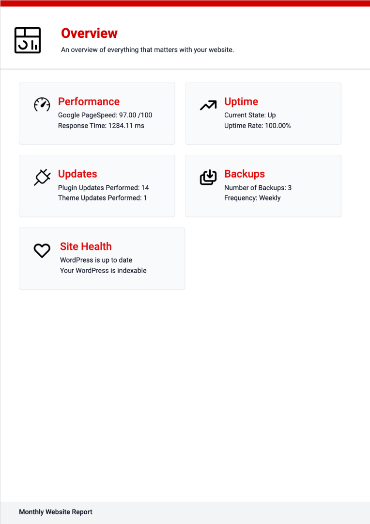
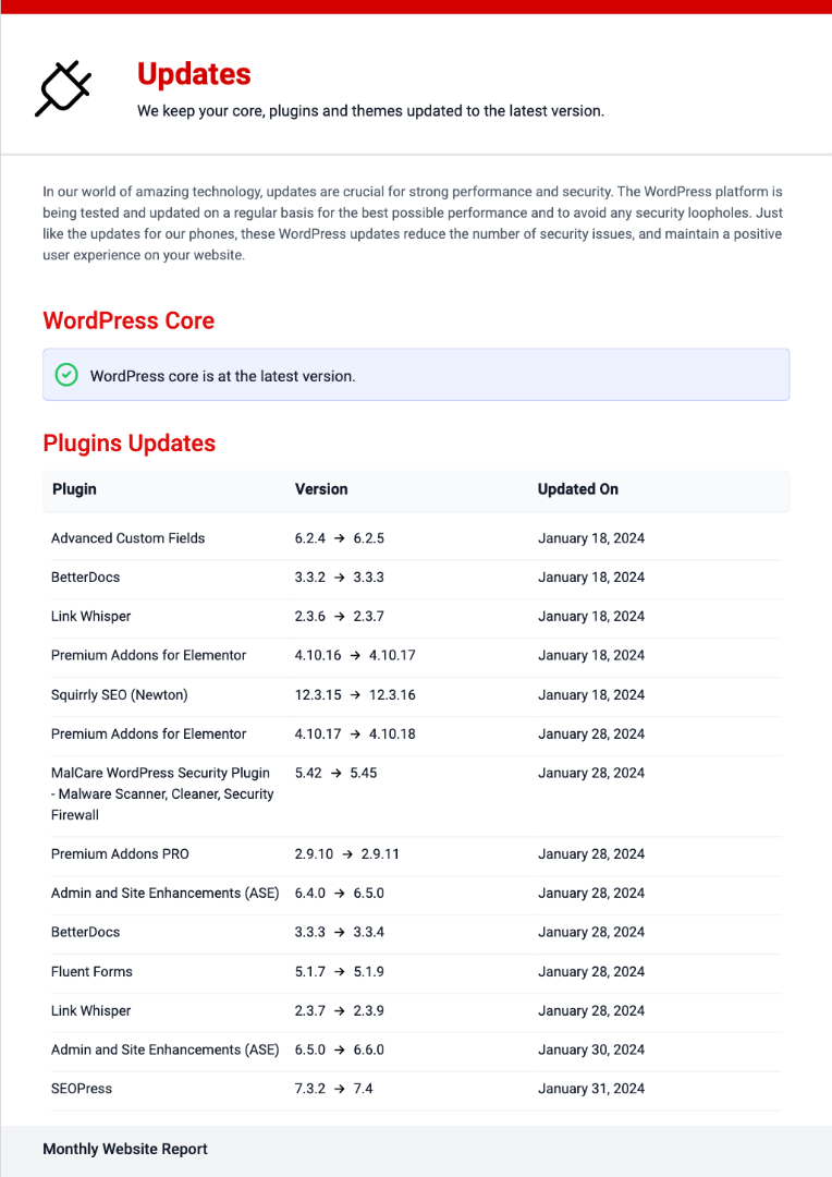
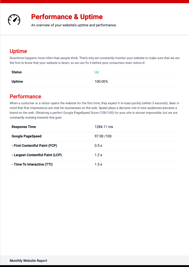
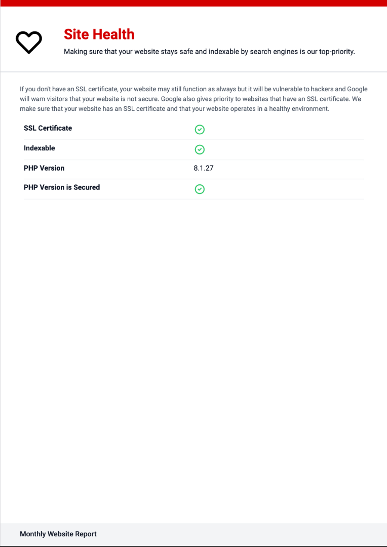
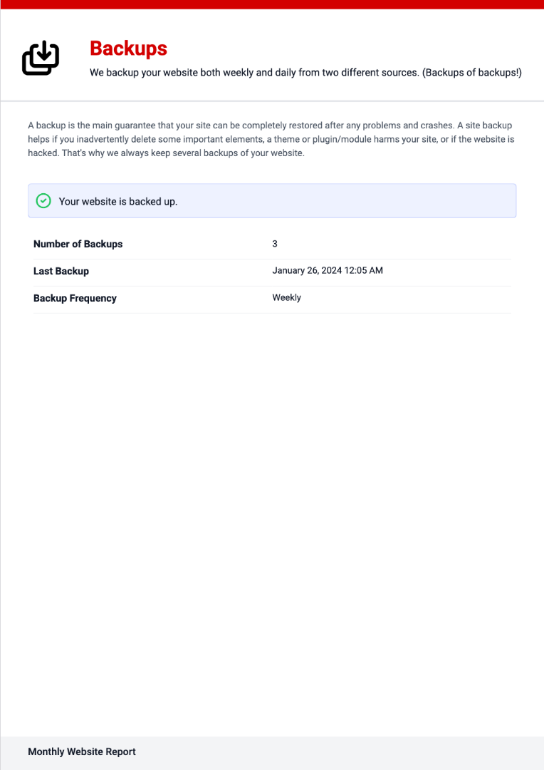
As part of our website maintenance package, breathe easy knowing your site’s in top shape with uptime monitoring, weekly security scans, and daily & weekly backups. Stay current effortlessly with weekly updates to WordPress essentials, while we fight off web gremlins with spam blocking, malware removal, and bot attack protection. It’s like having a digital superhero team – minus the capes and spandex.
Why pay too much for your Mobile web designer?
All of our websites include:
You know that super cool iPhone you got from Big Phone Carrier? Did you pay full price for it? Nope.
Why not? Because you likely don’t want to pay $1,500 cash for a phone. So Big Phone Carrier spreads the cost of your new iPhone over a period of 2-3 years. After that, you own the phone outright, and you simply pay for your monthly phone plan.
We’ve applied this same model to website design.
Why? Because most SMBs don’t have $5,000+ cash to spend on a website upfront.
So, we spread out the cost of a powerful lead-generating website over a period of 24 months. After which, you own your website outright, and you can either continue with a month-to-month plan or switch to only cover the hosting and maintenance costs.
🔑 You get to reap the benefits of a website right away, and pay it off gradually with manageable monthly payments.
No need to pay thousands up front. Make a small monthly payment for 24 months.
We’ve made this as simple as can be. Ditch the headaches and uncertainty. Get a high quality website that pays for itself.
 Freelancer Freelancer |  Freelancer Freelancer |  Agency Agency |  |
|
|---|---|---|---|---|
| Ultra-Simple Onboarding Process | ||||
| Dedicated Project & Support Manager | ||||
| Done in Under 30 Days | ||||
| Free Hosting, Maintenance & Updates for 2 Years | ||||
| Affordable Monthly Plans | ||||
| Quality Work That Generates Leads | ||||
| Complete Peace of Mind |
Get the lowdown on what makes this the best website deal you’ll find on the interwebs.
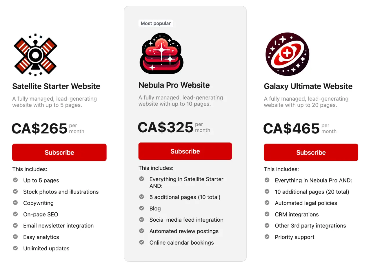
Choose a plan from our trio of website design options, each tailored to fire up your business from day 1.
You pay for your website at an affordable monthly rate for the next 24 months.
But you get to enjoy the benefits of a full lead-generating website from (say it with me) day 1.
Full website maintenance is included for free!
Fill out one quick form. For real, just one.
No endless back-and-forth emails, no pesky phone calls for one more detail or photo.
We’re here to save your time and keep headaches at bay.
Simple, swift, and stress-free.

This is where you kick back, sip your favorite drink – tea, coffee, or maybe a smooth Belgian Triple 🍺 – and watch the action unfold.
Our expert team gets to work transforming your vision into reality.
Whether it’s one week or three, depending on your chosen package, we’ll have the initial masterpiece ready for your eyes only.

We align your domain with our servers, handle all the technical mumble-jumble, and set the stage for your grand debut on the world wide web.
Press the button and… 🚀
Your website is now a gleaming, polished gem, ready to start making money for your business.

Launching a website isn’t the end, it’s the beginning.
We don’t just launch your site and vanish – we’re your co-pilots for the next two years, and it won’t cost you a dime extra.
Bug? We’ll squash it.
Break? Consider it fixed.
And those unlimited update requests? You say the word – new photos, fresh text – and we’re on it.
We are committed to an honest and transparent approach—think of us as your web design sidekick, minus the smoke and mirrors. No contracts tying you down, and no hidden fees jumping out from the dark alleys of fine print. Just crystal-clear, upfront web design services tailored for your small business success.