Say what you do in the first screen
The bigger the company, the vaguer the homepage. Resist it. Lead with what you sell, not 'empowering global solutions.' A visitor should be able to describe your business after five seconds on the page.
These are our favorite websites built for B2B companies: engineering firms, product designers, and the studios they hire.

13+ years building legendary SMB websites
A B2B website has a tough crowd: buyers comparing three vendors, engineers checking capabilities, and recruits sizing you up, all on the same homepage. The site has to route each one without making anyone think. That's an information architecture problem before it's a visual one. The company sites that fail are rarely ugly. They're disorganized, with news posts where services should be and a careers page nobody can find.
This collection pulls together 22 company websites that get it right, from engineering firms like NEI Electric Power Engineering and Carlson McCain to product designers like Sherpa Design and design studios like Pentagram and IDEO. What they share isn't a style. It's discipline: consistent navigation, one design system applied everywhere, and a homepage that says what the company does in the first screen. Those fundamentals work for a ten-person firm too.
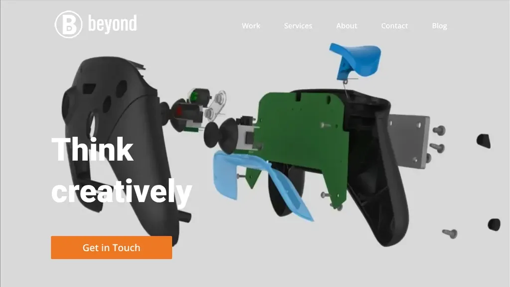
An exploded view of a handheld product, parts floating apart, shows the engineering depth at a glance, with an orange Get in Touch button under the headline.
Corporate · Chicago
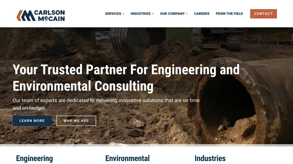
A sticky header keeps Contact one click away while the hero names both specialties: engineering and environmental.
Corporate
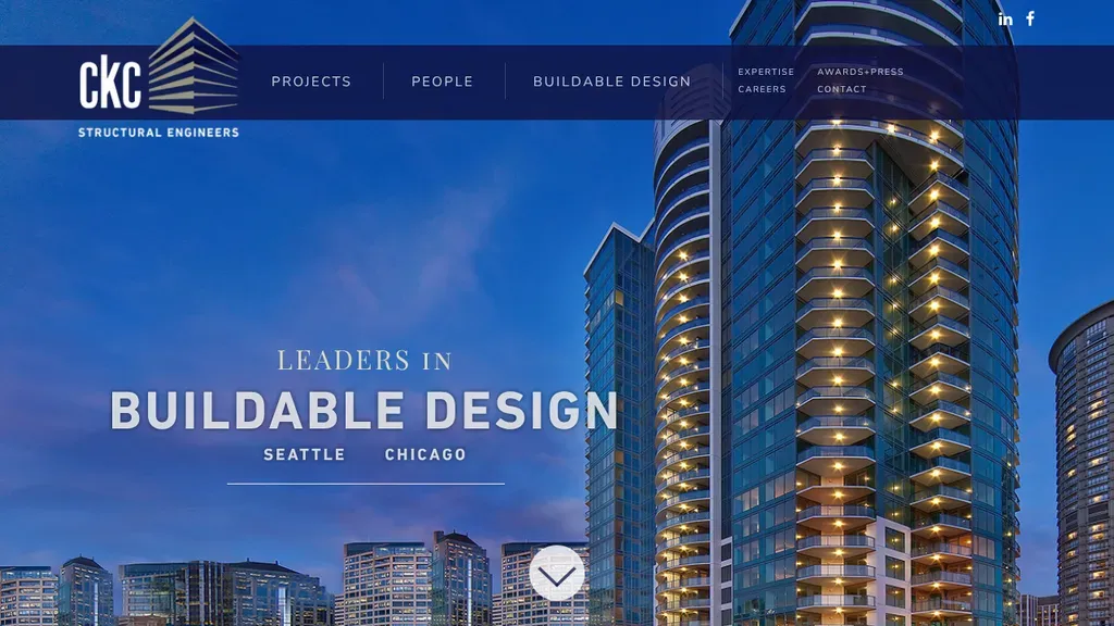
A lit residential tower at dusk frames the "Leaders in Buildable Design" headline, with the Seattle and Chicago offices named right under it.
Corporate · Bellevue
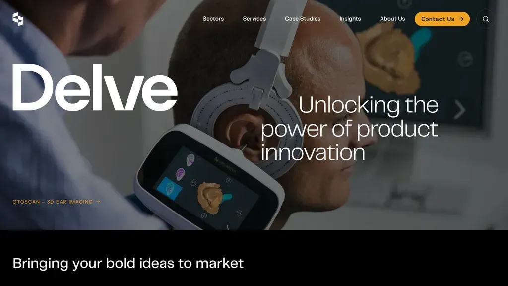
A real client device, an ear imaging scanner, anchors the hero next to "Unlocking the power of product innovation", and a bright orange Contact Us pill stands out in the menu.
Corporate · Madison
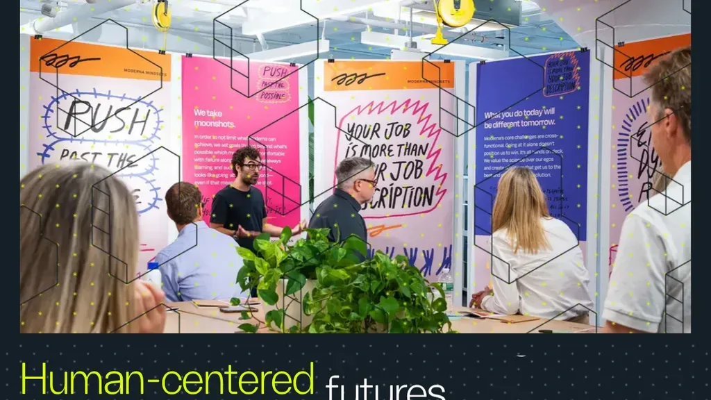
A real workshop photo, not a stock image, under a two-word theme, "Human-centered futures."
Corporate
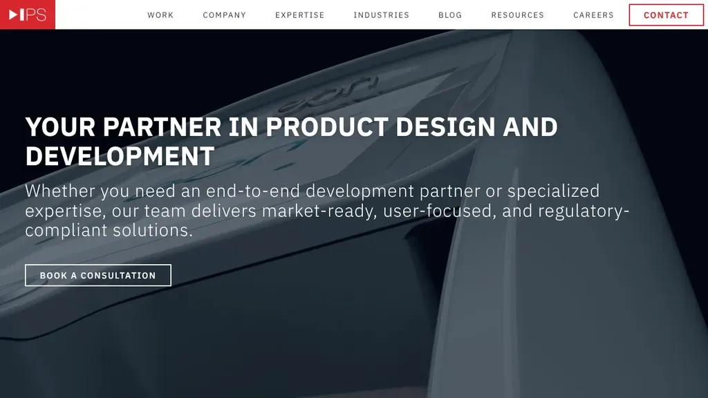
Says exactly what they do in the headline, then offers one clear next step: book a consultation.
Corporate
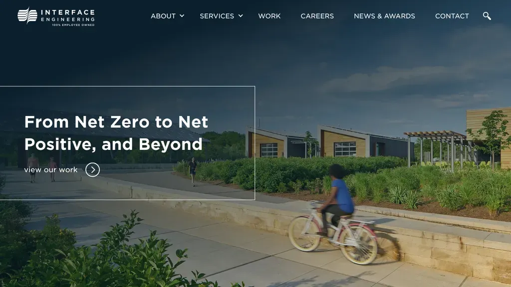
A child biking past a low, landscaped building illustrates the "From Net Zero to Net Positive" promise, with a "view our work" link inside the framed headline box.
Corporate · Portland
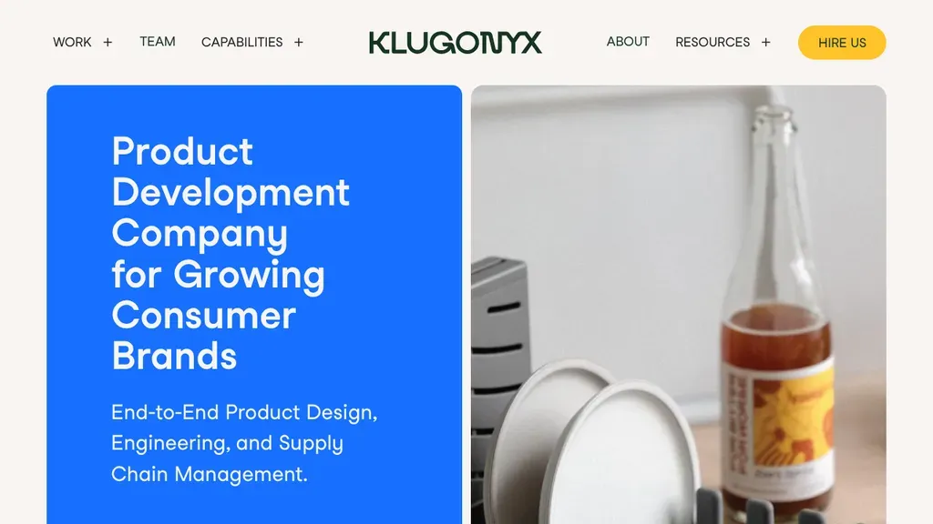
A blue panel says it plainly, "Product Development Company for Growing Consumer Brands", next to a real product shot, with a yellow Hire Us button in the header.
Corporate · Salt Lake City
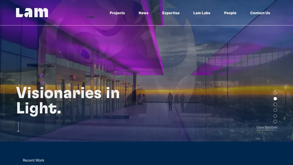
A purple-lit concourse makes the "Visionaries in Light" headline literal, so the lighting design specialty is clear from the photo alone, with Contact Us in the top menu.
Corporate · Cambridge
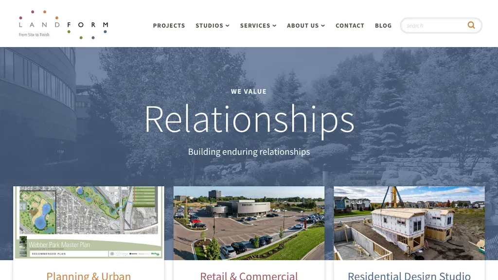
Each studio (planning, residential, retail) gets its own card with a project photo right on the homepage.
Corporate
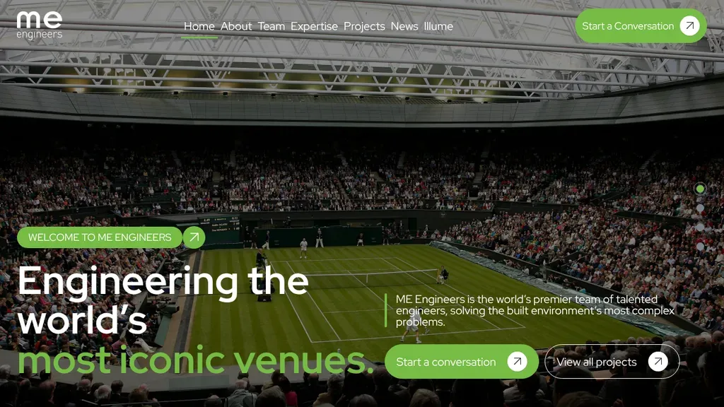
A packed tennis stadium backs "Engineering the world's most iconic venues", staking out a clear niche in big venues, with green Start a Conversation buttons in the header and the hero.
Corporate · Wheat Ridge
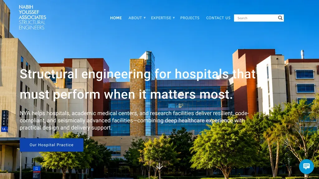
Owns one niche, structural engineering for hospitals, with a medical campus photo, a supporting paragraph and an Our Hospital Practice button right under the headline.
Corporate · Los Angeles
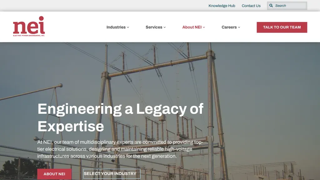
Industries and Services lead the menu, and a red "Talk to Our Team" button sits top right.
Corporate
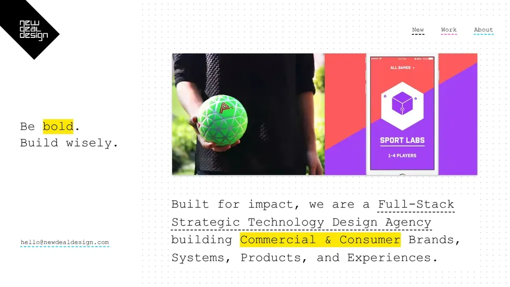
A typewriter-style headline, "Be bold. Build wisely.", sits beside a product shot, with highlighted keywords spelling out the agency's commercial and consumer focus and an email link.
Corporate · San Francisco
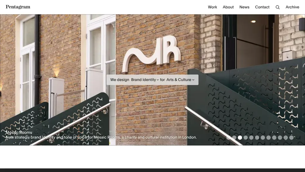
Each slide is a recent project with a one-line caption, and a sentence-style filter in the hero sorts work by discipline and sector.
Corporate
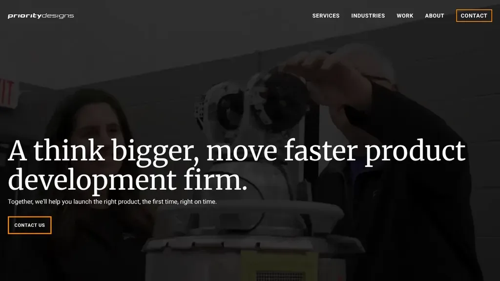
Big serif type calls Priority Designs "a think bigger, move faster product development firm" over a dim workshop photo, with an outlined Contact Us button under the promise.
Corporate · Columbus
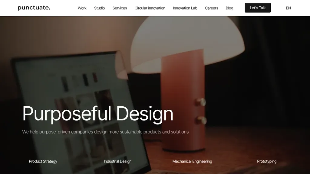
A moody lamp photo backs "Purposeful Design" and a sustainability promise, while four services along the bottom and a black Let's Talk button make the next step obvious.
Corporate · Montreal
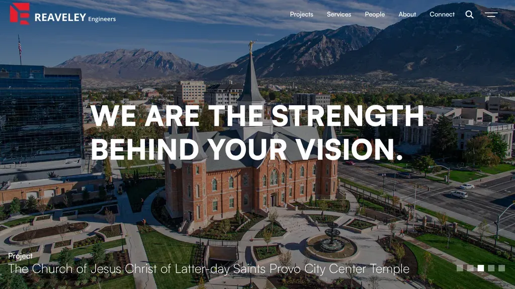
A mountain valley aerial of a finished landmark sits under "We are the strength behind your vision", with the project named in a caption and "Engineers" in the logo.
Corporate · Salt Lake City
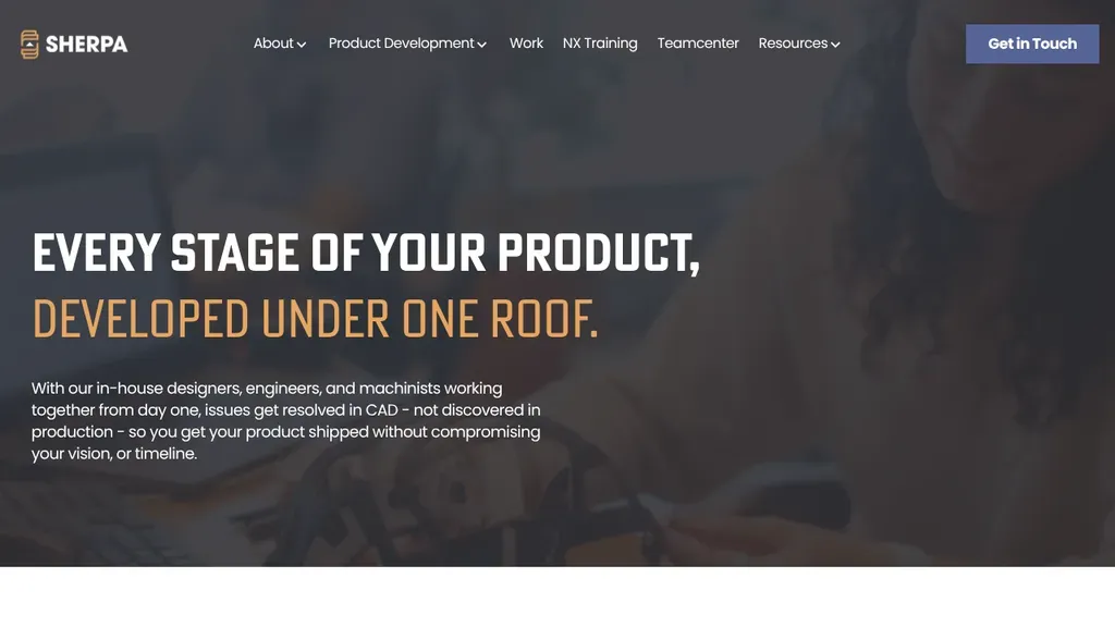
The headline explains the offer (design, engineering and machining under one roof) before you scroll.
Corporate
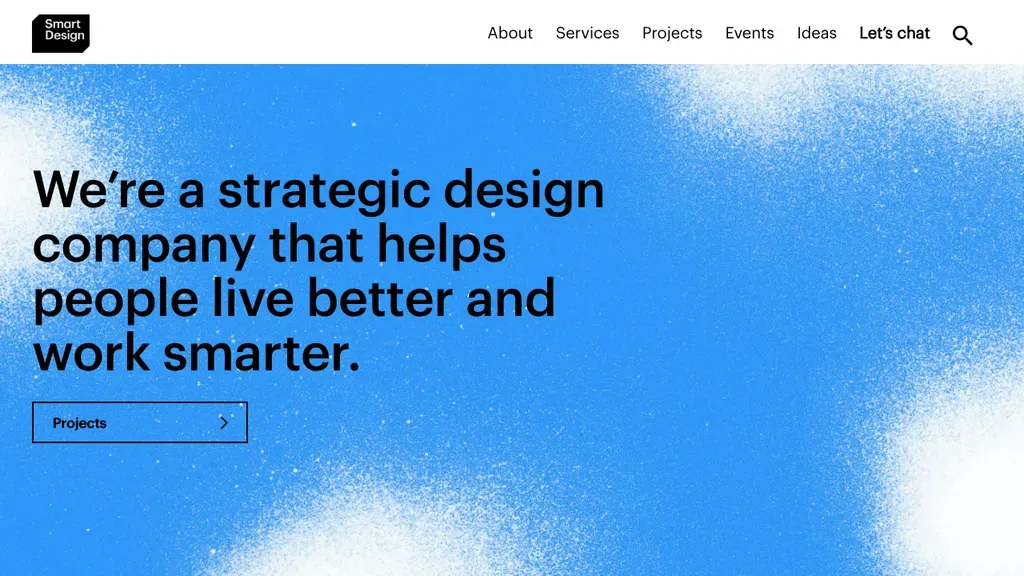
One plain sentence over a sprayed blue texture says exactly what Smart Design is, with a Projects button below and "Let's chat" in the menu.
Corporate · New York
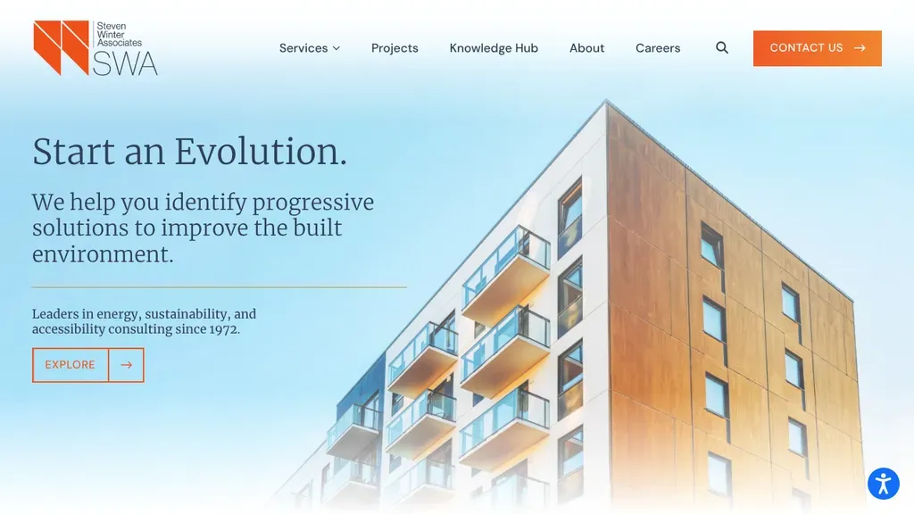
Clean white space holds "Start an Evolution" and a line on energy, sustainability and accessibility consulting, beside a crisp mid-rise photo and an orange Contact Us button.
Corporate · Norwalk
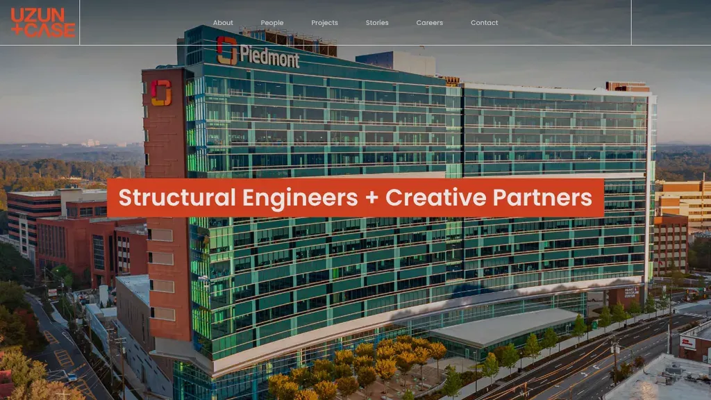
A tall hospital project fills the frame, and an orange banner reading "Structural Engineers + Creative Partners" states the trade and the attitude in one line.
Corporate · Atlanta
No websites match, try a different search or industry.
The bigger the company, the vaguer the homepage. Resist it. Lead with what you sell, not 'empowering global solutions.' A visitor should be able to describe your business after five seconds on the page.
Your org chart is not an information architecture. Visitors think in products, industries, and tasks, not divisions. Test your menu on someone who's never heard of the company and watch where they stall.
Pentagram's site works because nothing breaks the system: every case study, every bio, every page uses the same grid and type scale. Consistency reads as competence; one off-brand landing page erodes it.
A strong candidate can be the most valuable visitor you get all week. Culture, real employee stories, and a fast application flow deserve product-page polish, not an HR portal link from the footer.