Full-bleed portfolio photography first
Your projects are the pitch. Lead with large, professionally shot rooms above the fold, organized by space or style, and let visitors browse before you ask them for anything.

These are our favorite websites built for interior designers.

13+ years building legendary SMB websites
Someone landing on an interior designer's website is asking one question: can this person make my space look like that? They need proof fast. Big, gorgeous project photos, a clear sense of your style, and an obvious path to hiring you. What separates the great sites from the mediocre ones is restraint. The best designers let the work do the talking, while weaker sites bury stunning rooms under clutter, vague copy, and mystery pricing.
This collection pulls together 31 interior design sites that get it right, from studios like Lauren Keenan Home and Tara Benet Interior Design to commercial fit-out firms like S16. Don't copy the pixels. Steal the thinking. Notice how they structure portfolios, how they explain their process, where they put pricing, and how they turn press mentions and client photos into trust. Then apply those moves to your own site.
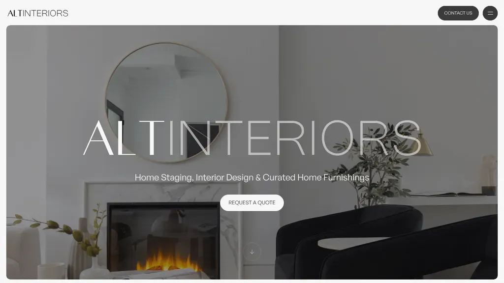
An oversized ALT INTERIORS wordmark spans a moody fireplace scene, with the three services spelled out underneath and a single quote request button.
Interior Designers · Toronto
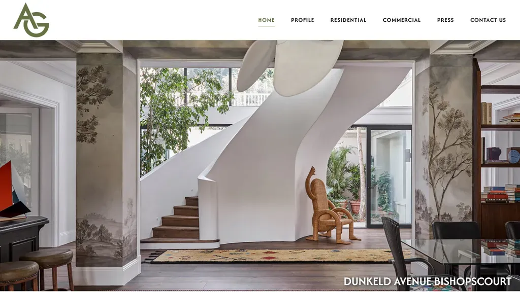
A full-width photo of one finished home, captioned with its street name, does all the selling.
Interior Designers
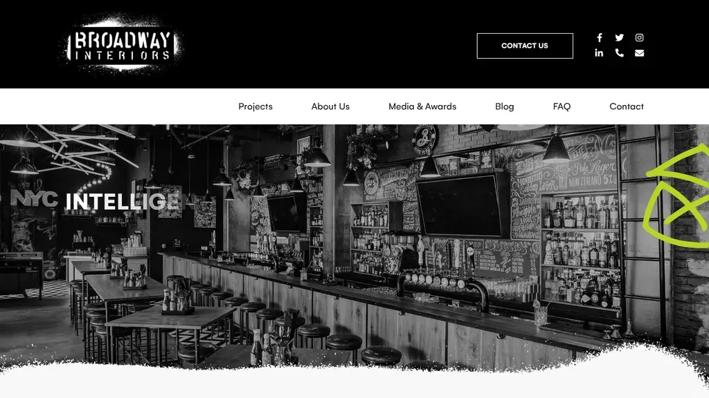
Media & Awards sits in the main menu, and Contact Us is boxed in the header beside phone and email icons.
Interior Designers
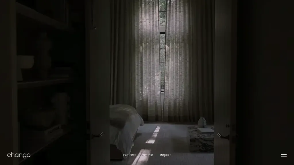
A single moody interior photo fills the screen, and the menu is three words: Projects, Studio, Inquire.
Interior Designers
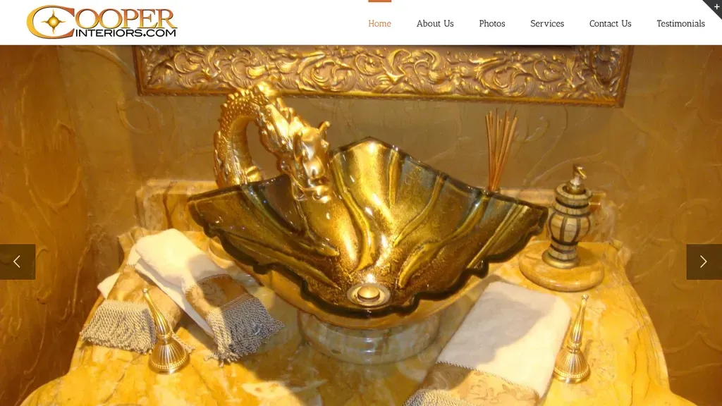
A rotating gallery of finished details fills the screen, with Photos and Testimonials right in the main menu.
Interior Designers
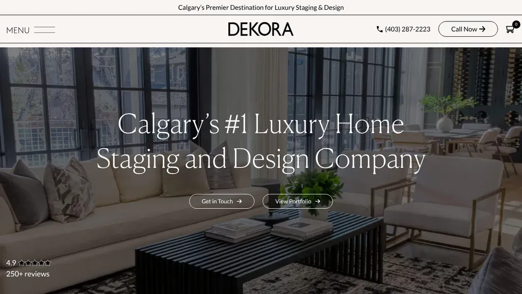
A staged luxury living room carries the "Calgary's #1 Luxury Home Staging and Design Company" headline, with portfolio and contact buttons and a 4.9 rating tucked in the corner.
Interior Designers · Calgary
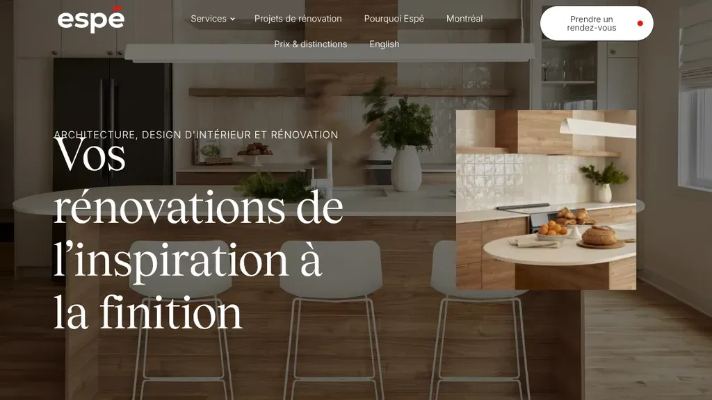
Large serif type promises renovations from inspiration to finish (in French), pairing a full kitchen photo with an inset detail shot and a rounded appointment button in the header.
Interior Designers · Montreal
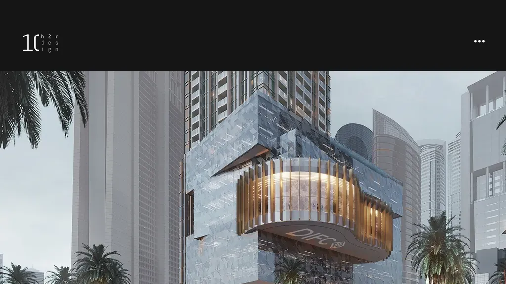
A single full-width architectural render with almost nothing else on screen: the work is the pitch.
Interior Designers
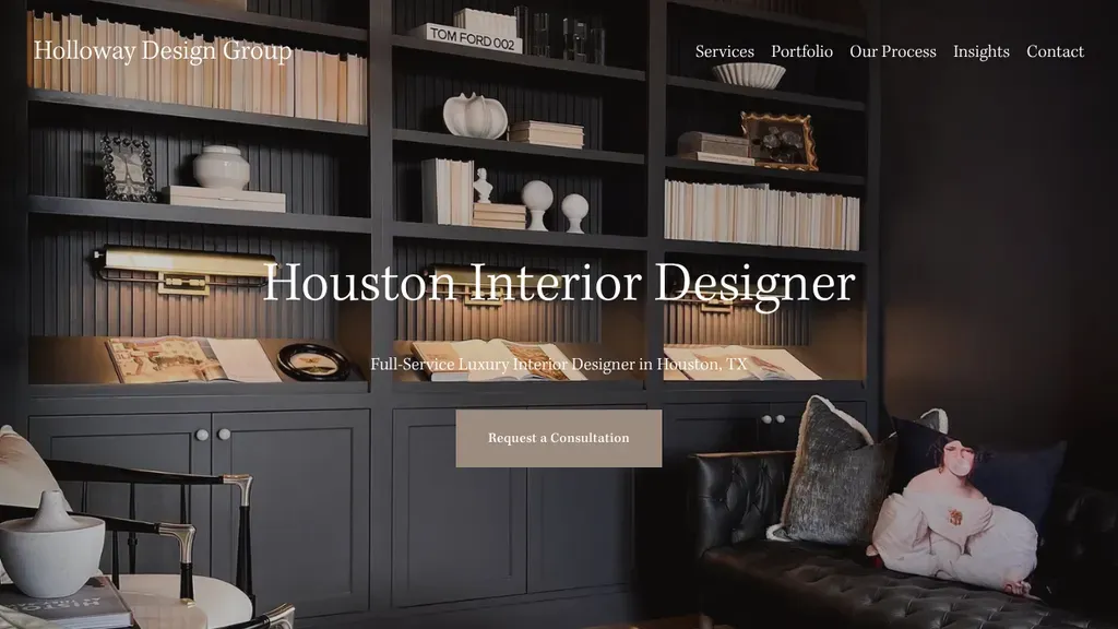
A dark built-in bookcase sets a rich mood behind the plain headline "Houston Interior Designer", with a single taupe consultation button centered underneath.
Interior Designers · Houston
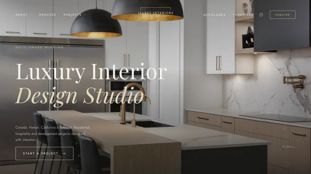
Serif type reading "Luxury Interior Design Studio" sits over a kitchen with black pendants and white marble, above a line listing Canada, Hawaii and California and a Start a Project button.
Interior Designers · Kelowna
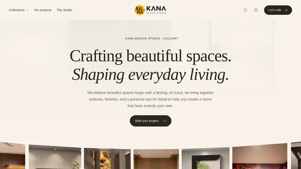
Calm serif headline "Crafting beautiful spaces. Shaping everyday living." sits on a warm cream page, with a centered dark "Start your project" button and a strip of material thumbnails below.
Interior Designers · Calgary
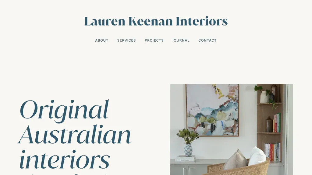
A big serif headline, "Original Australian interiors that feel like home," beside one styled room and a five-item menu.
Interior Designers
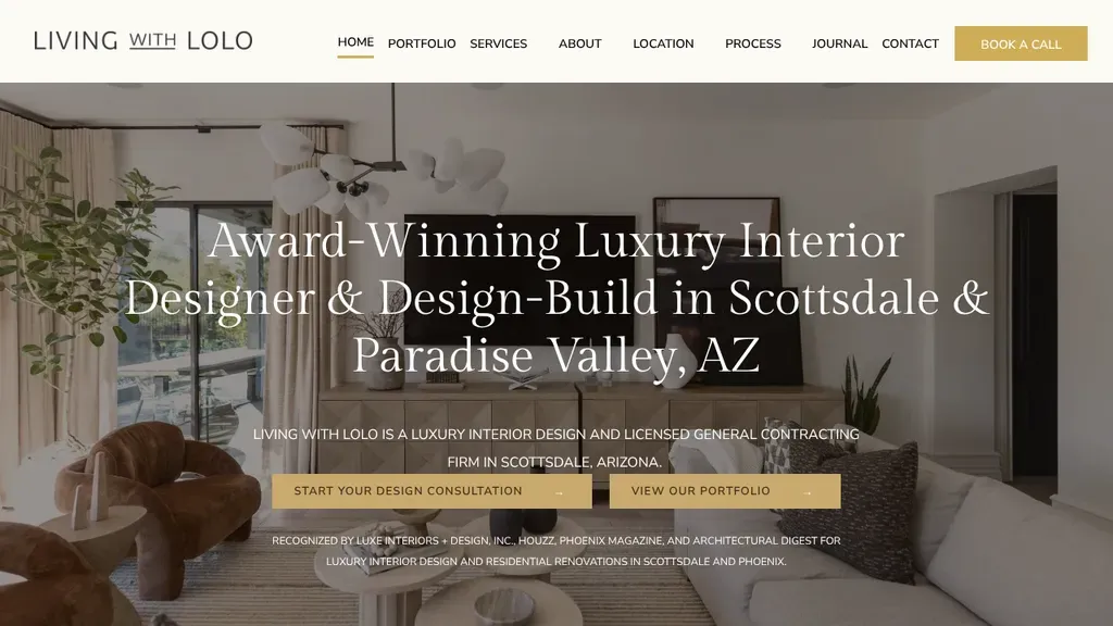
Names both services and both towns in the headline, design and design-build in Scottsdale and Paradise Valley, with two gold buttons and a row of press mentions underneath.
Interior Designers · Scottsdale
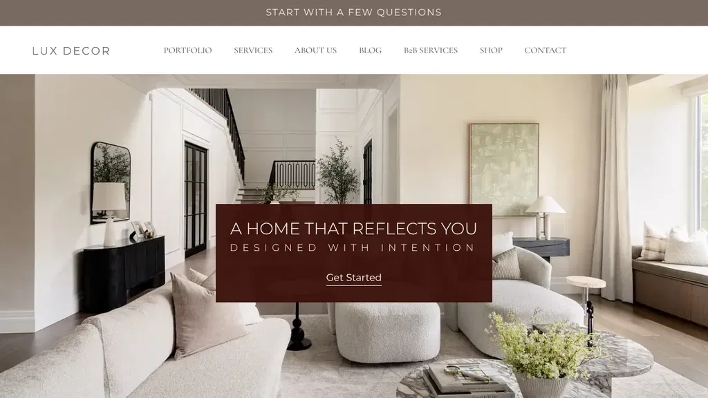
A burgundy panel over a bright living room holds "A home that reflects you" and a Get Started button, and the top bar offers to start with a few questions.
Interior Designers · Montreal
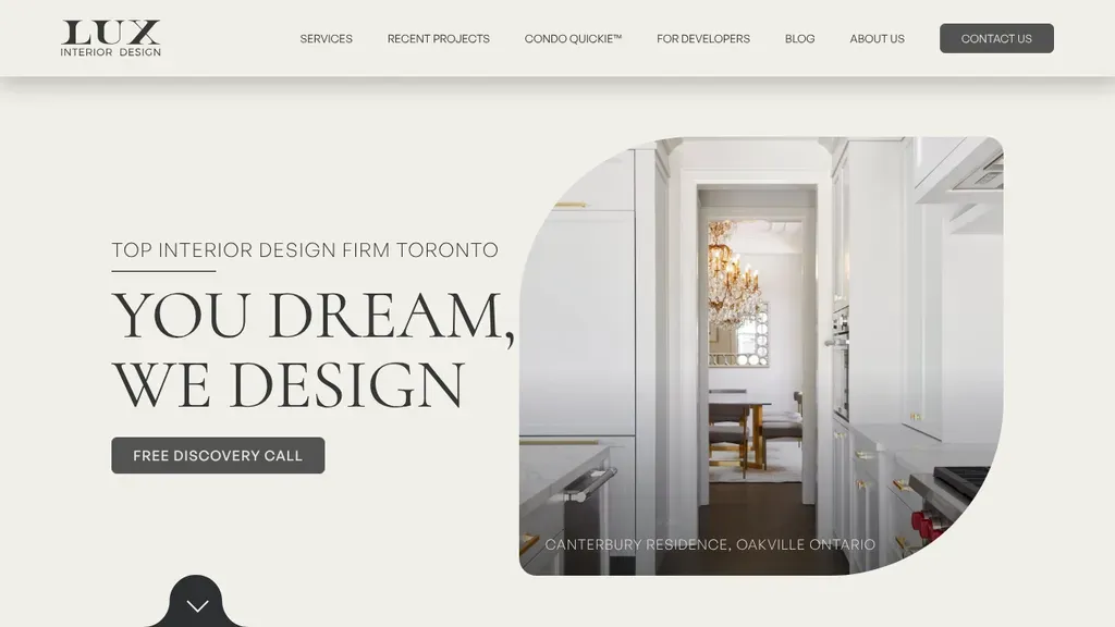
The "You Dream, We Design" headline sits beside a leaf-shaped project photo labeled with its Oakville address, with a free discovery call button right under it.
Interior Designers · Toronto
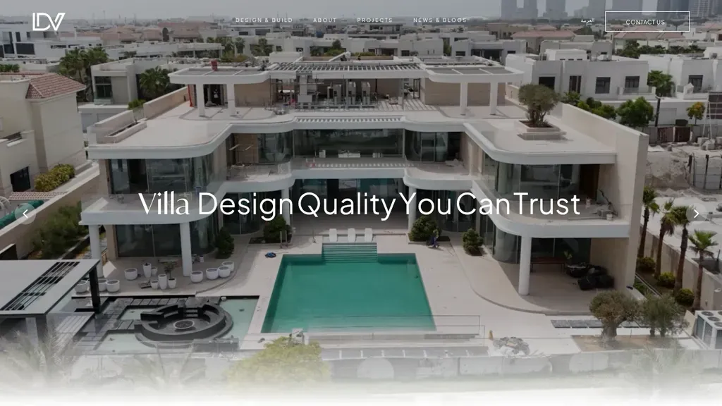
An aerial shot of a finished villa fills the screen, so buyers judge the build quality before reading a word.
Interior Designers
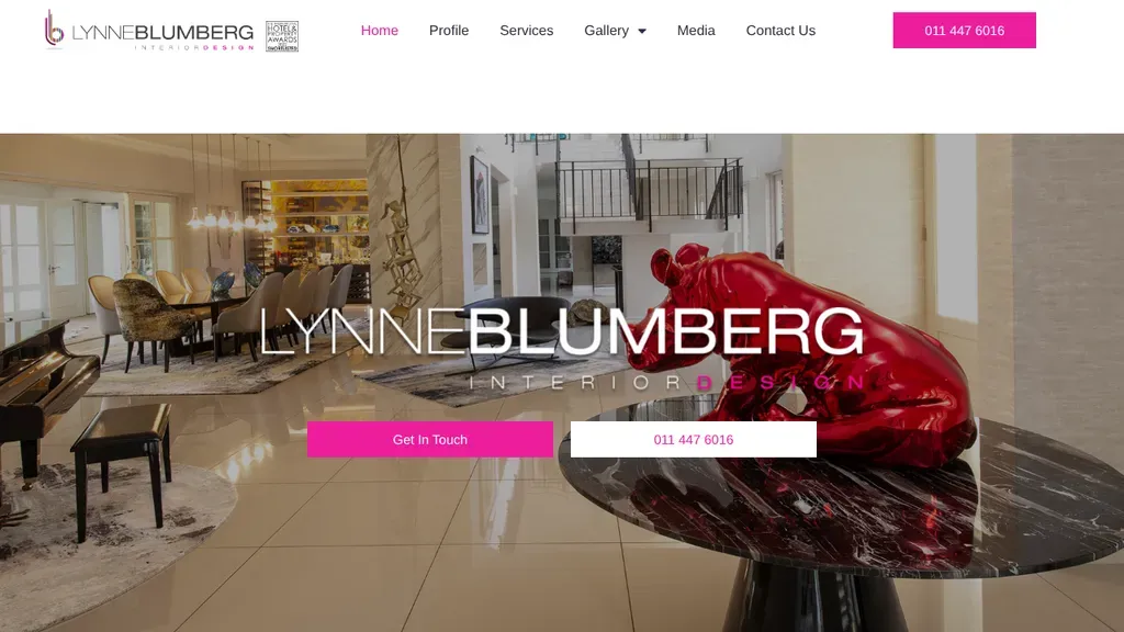
The hero offers two buttons, Get in Touch and the phone number, and the phone sits in the header too.
Interior Designers
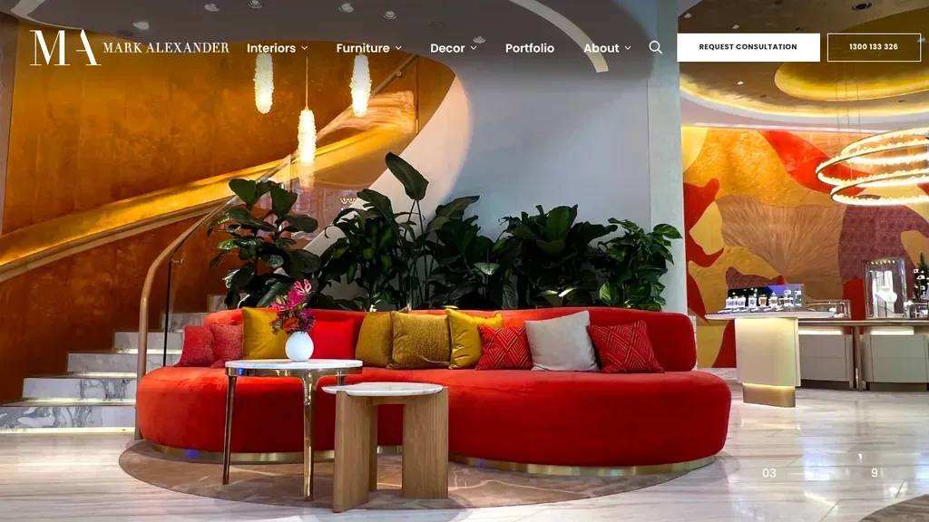
Request Consultation and the phone number are boxed side by side in the header, and furniture sells right from the menu.
Interior Designers
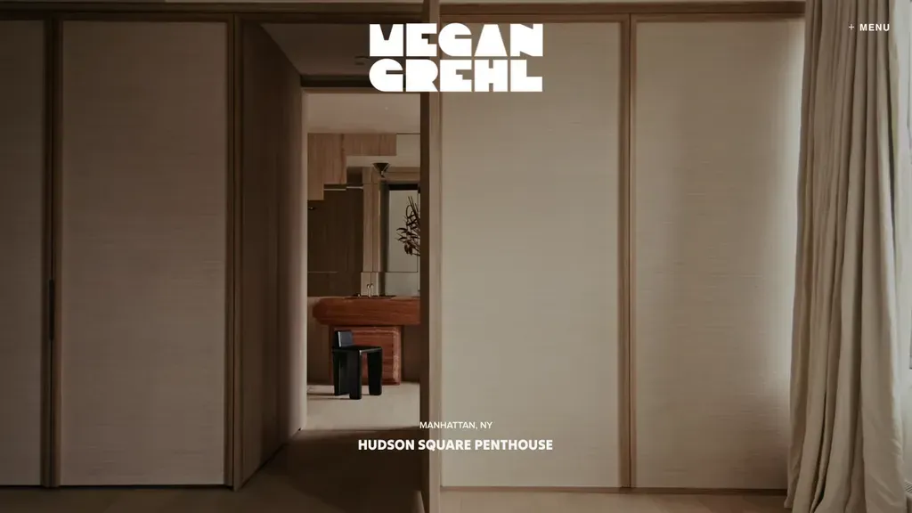
Each slide is one project, labeled with its city and name, and the menu tucks away so the room fills the screen.
Interior Designers
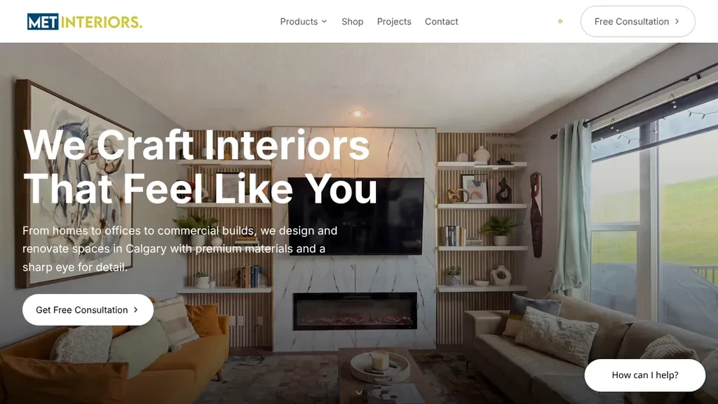
"We Craft Interiors That Feel Like You" sits in big white type over a cozy living room, and the subline names homes, offices and commercial builds in Calgary.
Interior Designers · Calgary
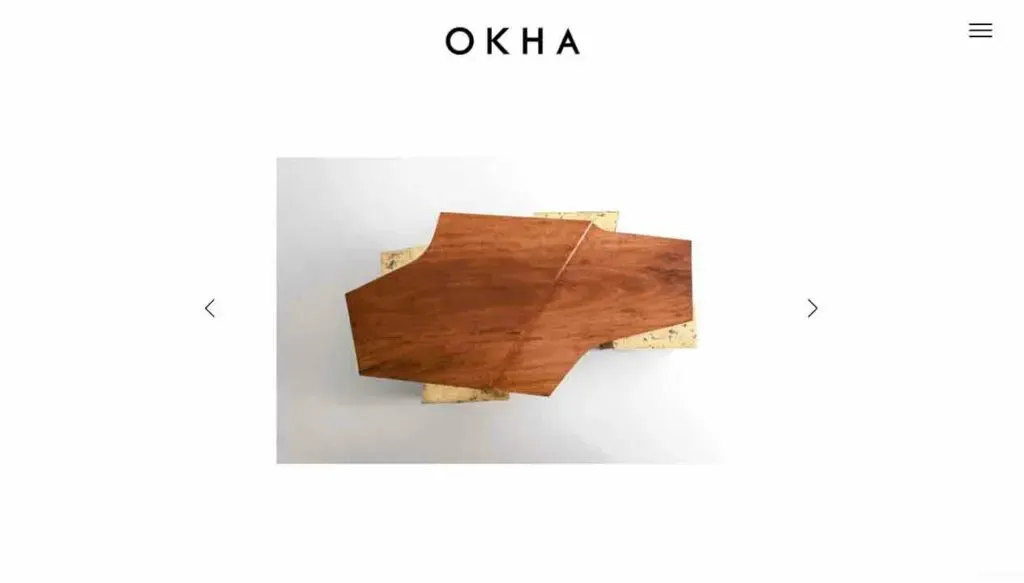
A minimal centered wordmark, and a menu that opens Products, Interiors and Brochures for trade buyers.
Interior Designers
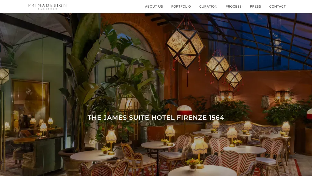
One full-screen hotel interior, captioned with the project name, and a menu that includes their design process.
Interior Designers
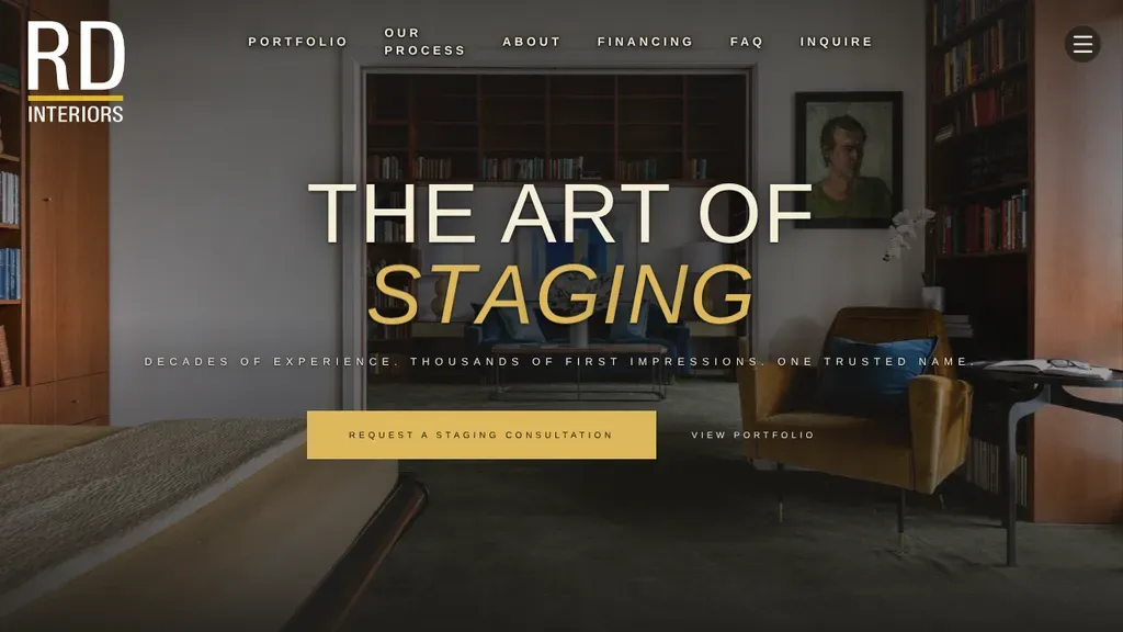
The word "Staging" in gold italics stands out against a book-lined room, with a gold staging consultation button and a portfolio link beneath.
Interior Designers · Seattle
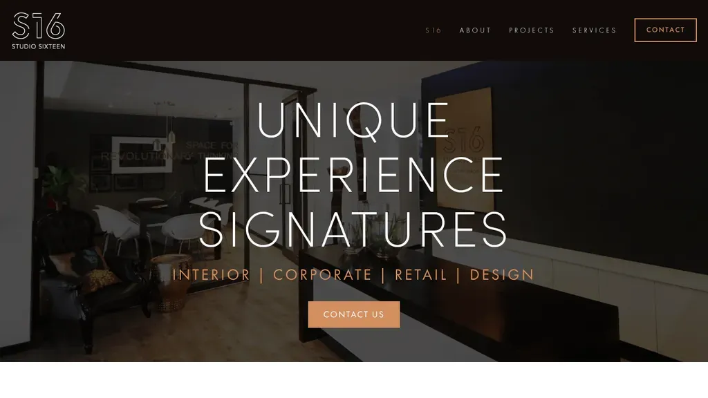
Four words spell out what they do (interior, corporate, retail, design) under a big, type-led headline and one Contact Us button.
Interior Designers
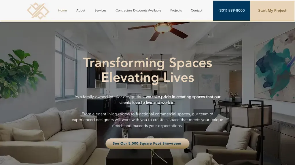
Calls itself a family-owned interior design firm in the hero copy, with a showroom button in the photo and a Start My Project tab beside the phone number.
Interior Designers · Washington DC
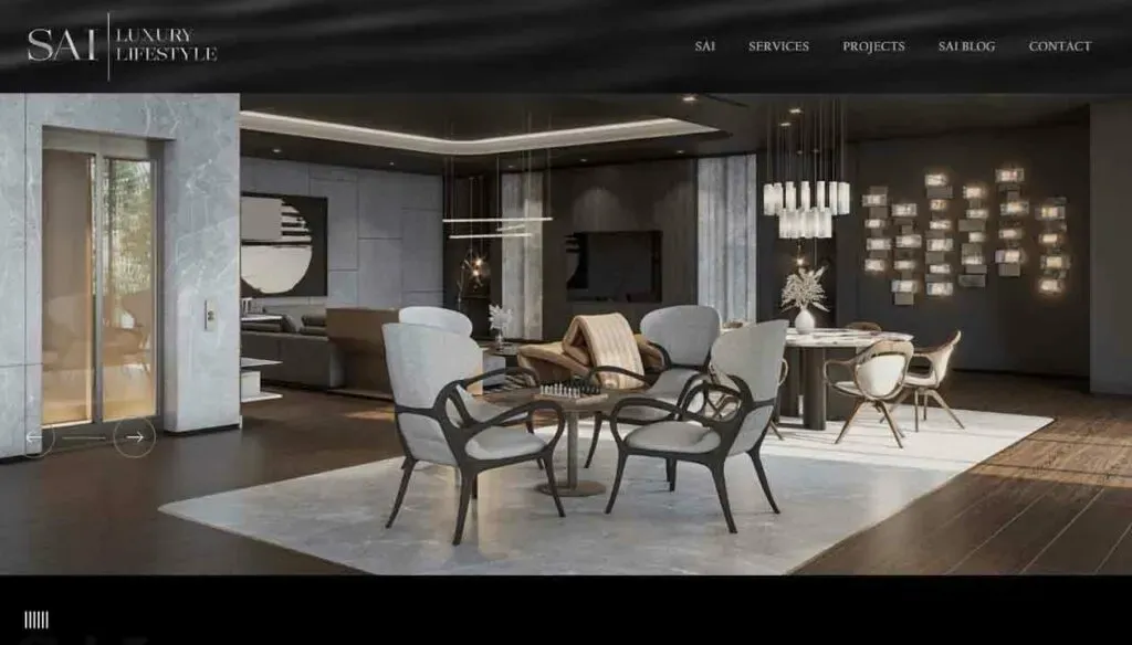
Leads with a photo of the whole team, putting the people behind the projects first.
Interior Designers
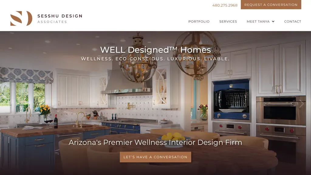
Owns a clear niche, wellness interiors, with "WELL Designed Homes" over a bright kitchen and a copper conversation button echoed in the header next to the phone number.
Interior Designers · Scottsdale
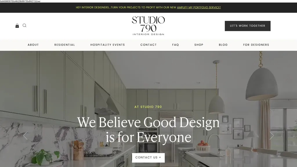
Bright kitchen photography backs the inclusive promise "We Believe Good Design is for Everyone", with a dark "Let's Work Together" button anchoring the header.
Interior Designers · Miami
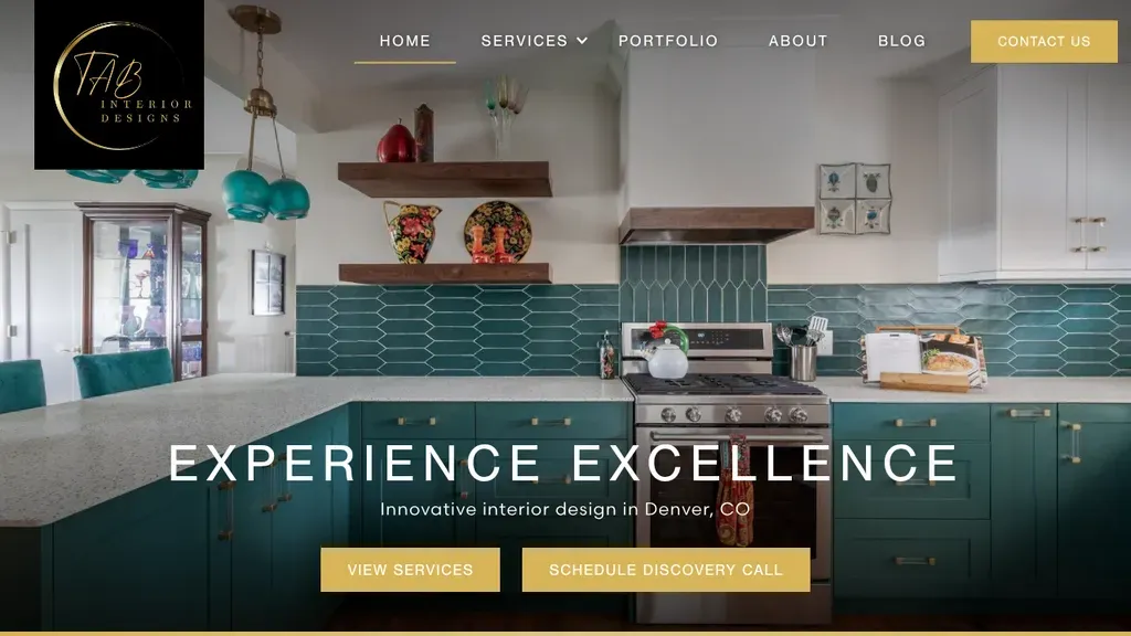
A colorful teal-tiled kitchen fills the frame, with "Innovative interior design in Denver, CO" under the headline and two gold buttons for services and a discovery call.
Interior Designers · Denver
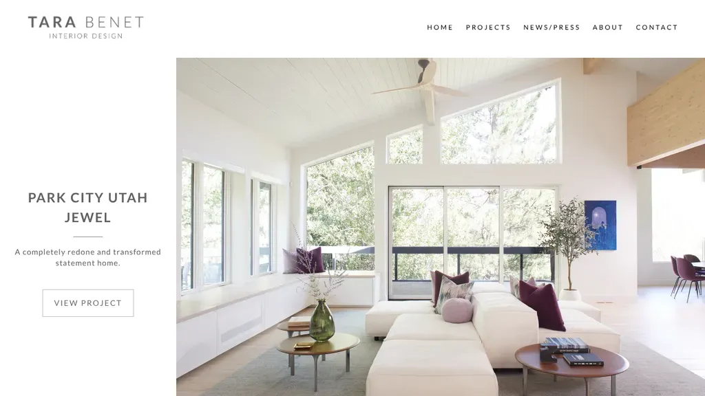
The homepage shows one featured project at a time, with a short caption and a View Project button.
Interior Designers
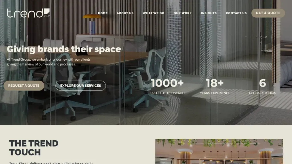
Three proof numbers sit in the hero (1000+ projects, 18+ years, 6 studios) beside Request a Quote.
Interior Designers
No websites match, try a different search or industry.
Your projects are the pitch. Lead with large, professionally shot rooms above the fold, organized by space or style, and let visitors browse before you ask them for anything.
Hiring a designer feels risky and expensive. A simple walkthrough from first consultation to final reveal tells nervous clients exactly what happens after they reach out.
Design fees are famously opaque, and silence scares off good-fit clients. Even a flat-rate package or a starting-at number filters tire-kickers and makes your inquiry form less intimidating.
A finished room is pretty. A cramped, dated room turned into that finished room is persuasive. Pair befores with afters so homeowners can picture their own space changing.
Want a website like these? See our interior designers web design services →