Make the donate button unmissable
One high-contrast donate button, pinned in the header on every page. Preset gift amounts and a monthly option cut decision friction right when someone's ready to give.

These are our favorite websites built for nonprofits.

13+ years building legendary SMB websites
People land on a nonprofit's website with two questions: is my money actually going to help someone, and how do I give it to you right now? A great nonprofit site answers both in seconds. The mediocre ones bury the donate button, drown visitors in mission-statement soup, and never show a single face the work has touched. The best ones make giving feel obvious, easy, and worth it.
This collection pulls together 37 nonprofits doing it right, from Fistula Foundation and United Way Atlanta to Red Rover. Don't copy their pixels. Steal the thinking instead: how they place their donate buttons, how they prove donations get used well, how they turn one story into a reason to give. Then apply those moves to your own cause.
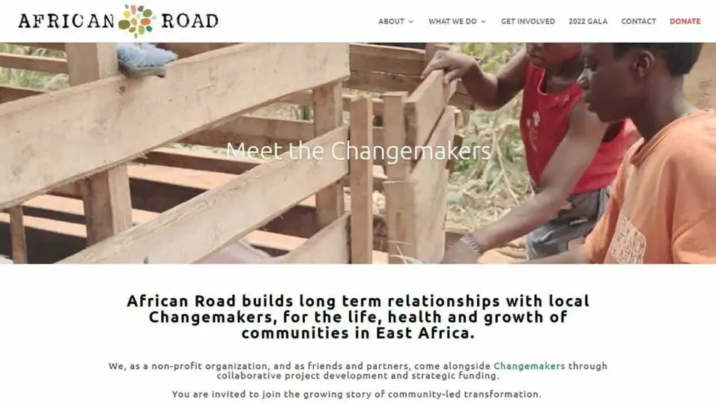
A one-sentence mission sits under the hero, and Donate stands out in color at the end of the menu.
Nonprofits
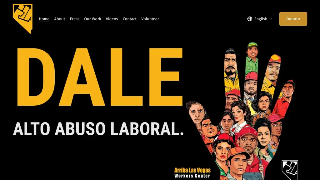
A huge yellow "DALE" and "Alto abuso laboral" sit beside an illustrated raised hand made of workers' faces, so the worker rights mission lands instantly.
Nonprofits · Las Vegas
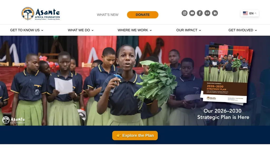
The hero promotes one new thing, the strategic plan, with a single Explore the Plan button and Donate in orange up top.
Nonprofits
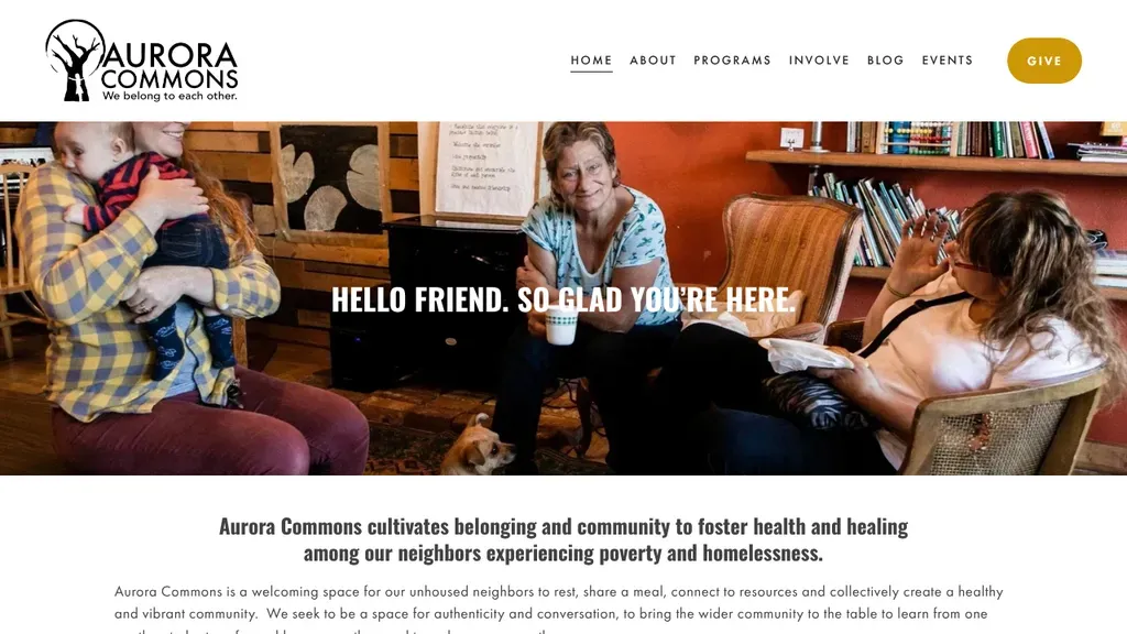
A greeting, "Hello friend. So glad you're here.", sits over a candid photo of a cozy drop-in room, followed by a clear mission line about neighbors experiencing homelessness.
Nonprofits · Seattle
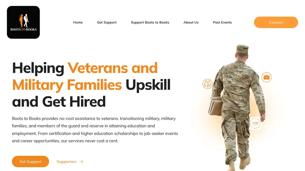
An orange-accented headline, "Helping Veterans and Military Families Upskill and Get Hired", sits beside a soldier cutout, with copy promising no-cost help and an orange Get Support button.
Nonprofits · San Francisco
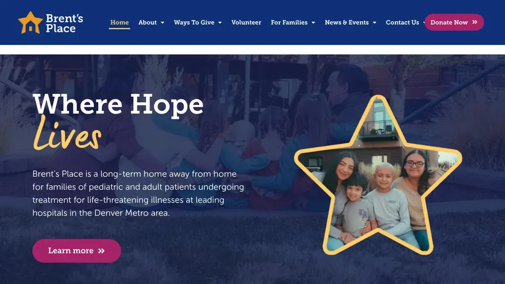
A star-shaped frame around a smiling family sits beside "Where Hope Lives", and the copy explains the long-term home for patients near Denver hospitals.
Nonprofits · Denver
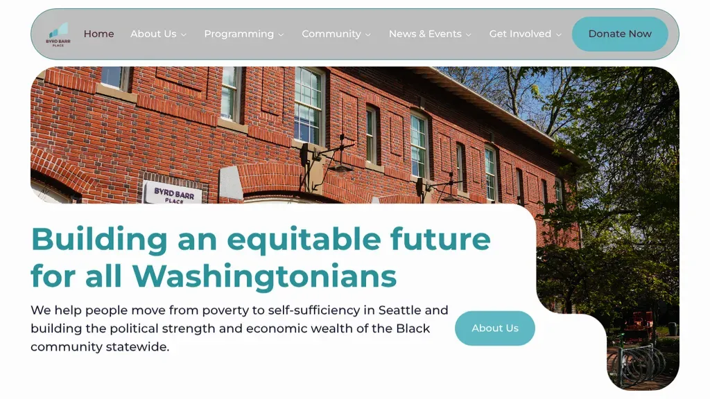
A rounded photo of the brick building frames "Building an equitable future for all Washingtonians", with a short Seattle mission line and Donate Now in the pill-shaped nav.
Nonprofits · Seattle
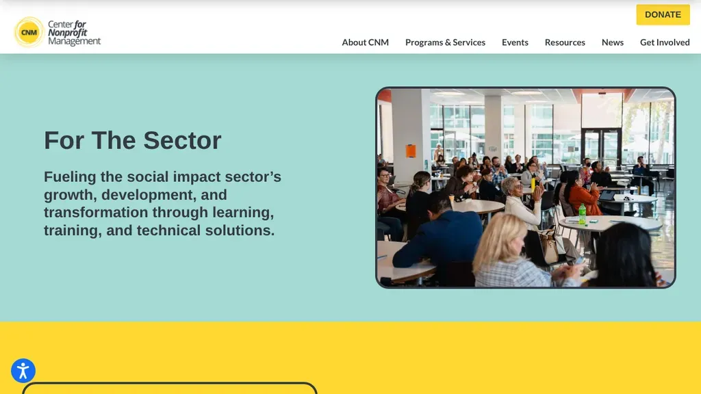
The headline names the audience, "For the Sector," and a yellow Donate button sits above the menu.
Nonprofits
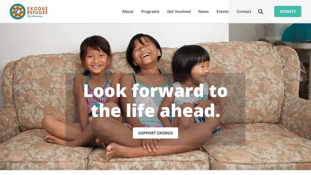
Three laughing children on a couch carry the message "Look forward to the life ahead," with a single Support Exodus button and a teal Donate button in the header.
Nonprofits · Indianapolis
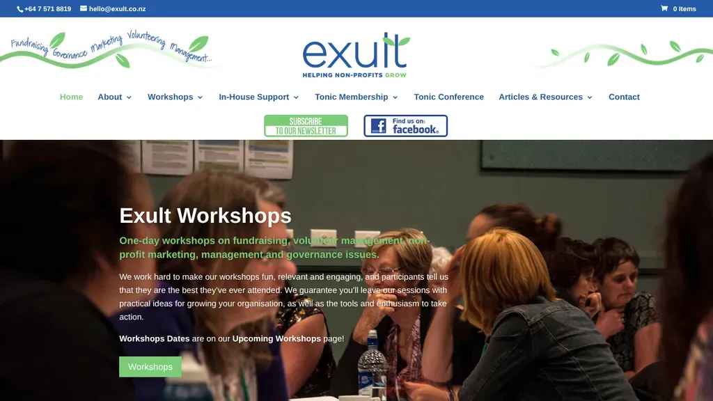
Phone and email sit in a top bar, and the hero explains the workshops in one line with a button to the dates.
Nonprofits
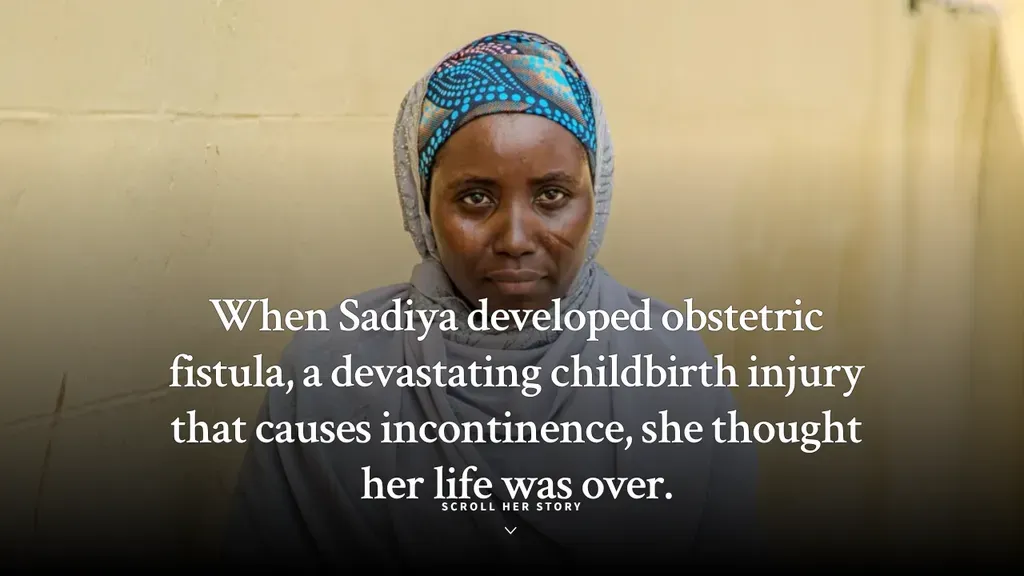
Opens with one woman's story in a single sentence over her portrait, then invites you to scroll for the rest.
Nonprofits
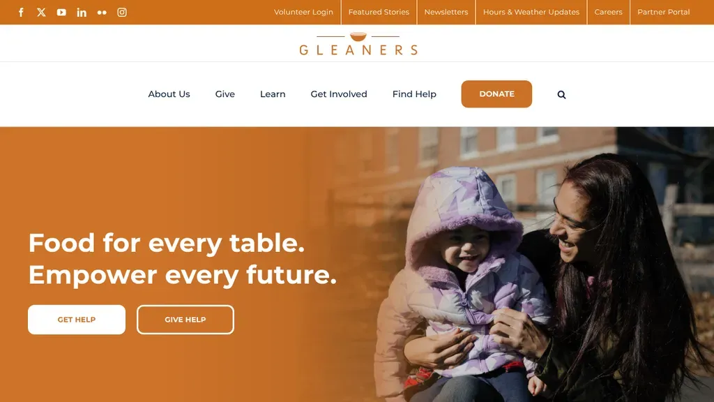
A warm orange-toned photo of a mother and child carries "Food for every table", with Get Help and Give Help buttons serving both audiences at once.
Nonprofits · Indianapolis
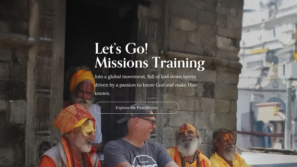
A bold invitation, "Let's Go! Missions Training," over a real photo from the field.
Nonprofits
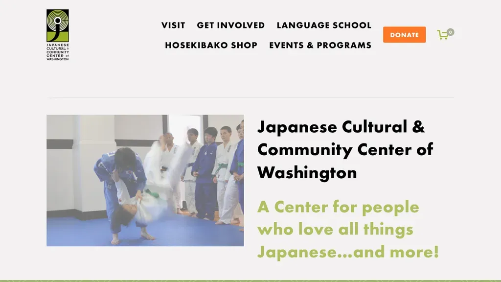
A judo class photo beside the full center name and a playful line, "A Center for people who love all things Japanese...and more!", sets a friendly tone.
Nonprofits · Seattle
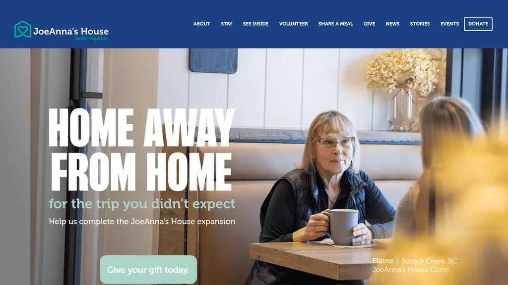
Bold type, "Home away from home for the trip you didn't expect", runs over a real guest at a kitchen table, with a soft Give your gift today button.
Nonprofits · Kelowna
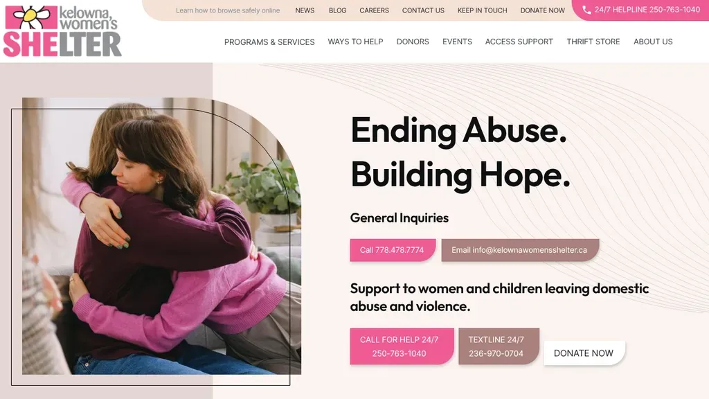
Puts 24/7 helpline and textline buttons right under "Ending Abuse. Building Hope." next to a warm embrace photo, plus a safe browsing link at the very top.
Nonprofits · Kelowna
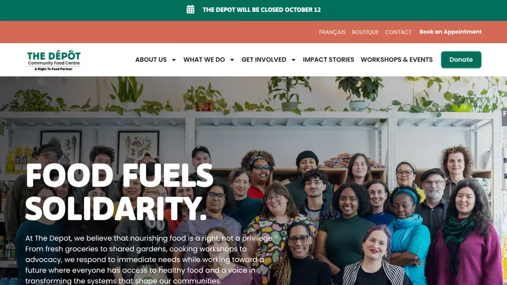
"Food fuels solidarity" spans a group photo of staff and neighbors among plants, with Book an Appointment and Donate buttons both in the header.
Nonprofits · Montreal
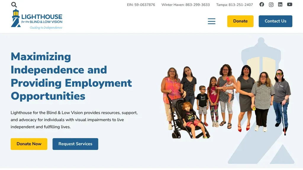
A cutout group of people of all ages stands beside "Maximizing Independence and Providing Employment Opportunities", with Donate Now and Request Services buttons and Tampa and Winter Haven numbers.
Nonprofits · Tampa
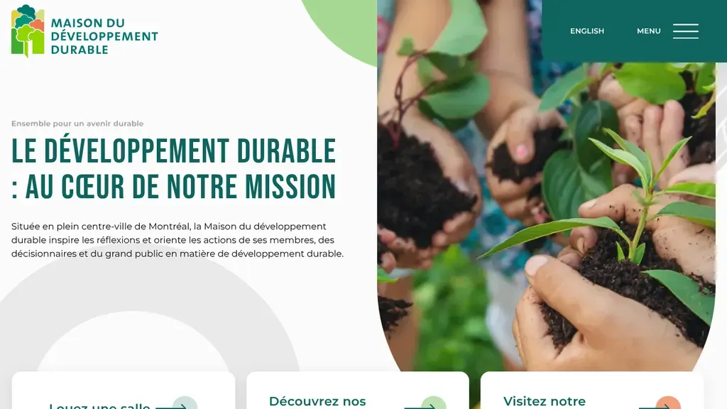
Hands holding seedlings fill a rounded panel beside a mission headline, and cards along the bottom offer room rentals, activities and building visits in downtown Montreal.
Nonprofits · Montreal
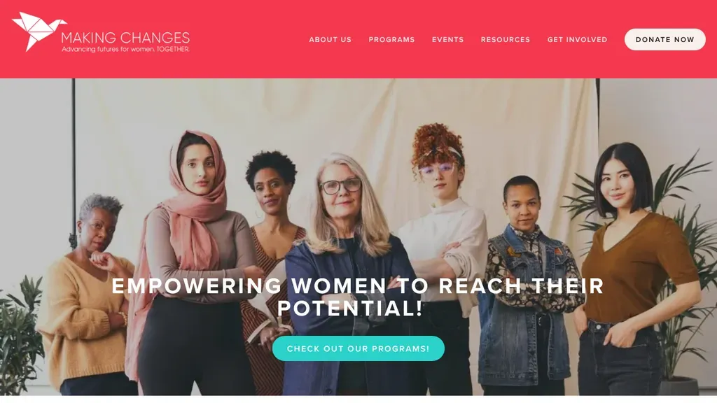
A group portrait of women of different ages backs the line "Empowering women to reach their potential!" with a teal button to explore programs and Donate Now in the coral header.
Nonprofits · Calgary
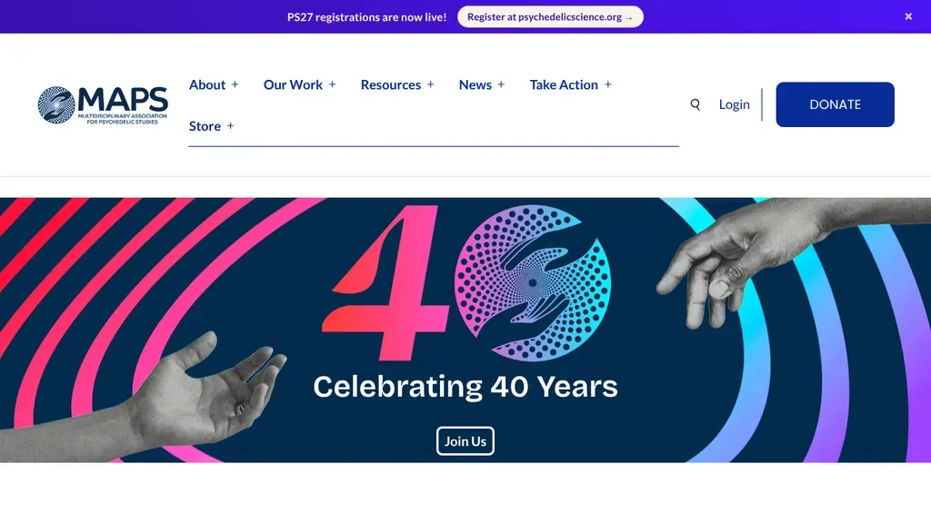
A blue Donate button anchors the header, and the hero celebrates a 40-year milestone with a Join Us button.
Nonprofits
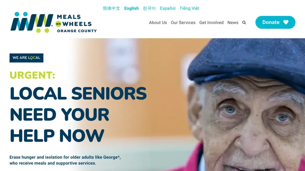
An urgent appeal, "Local seniors need your help now", runs beside a close portrait of an older man, with a "We are local" tag and a Donate button in the header.
Nonprofits · Anaheim
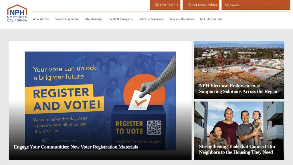
Give, Get Email Updates and Search are color-coded buttons above the menu, and the hero promotes the current campaign.
Nonprofits
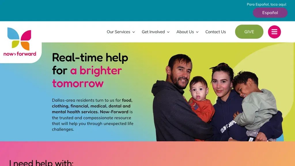
Leads with "Real-time help for a brighter tomorrow" beside a family photo, lists food, clothing and medical help for Dallas-area residents, and starts an "I need help with" selector below.
Nonprofits · Dallas
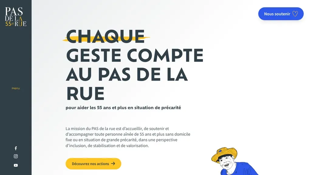
An airy layout pairs the headline "Chaque geste compte au PAS de la rue" with a short mission about seniors 55 and older facing homelessness, plus a yellow button to explore their work.
Nonprofits · Montreal
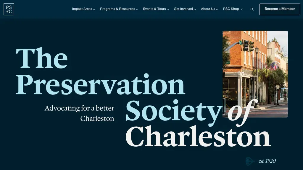
Large serif type spells out the society's name on deep navy beside a single Charleston streetscape photo, with Become a Member placed top right.
Nonprofits · Charleston
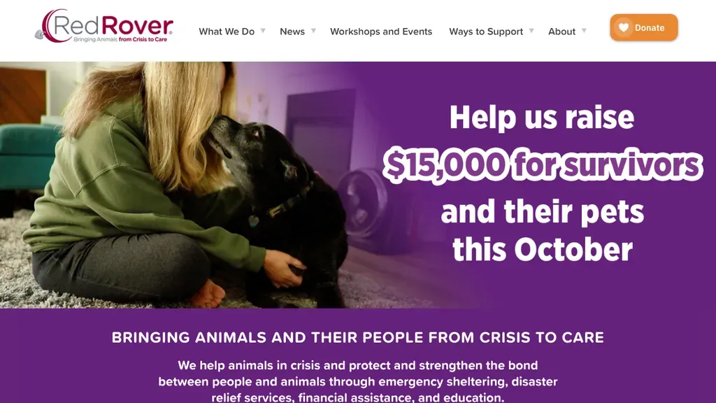
The hero is a live campaign with a dollar goal and a month, and Donate glows orange in the header.
Nonprofits
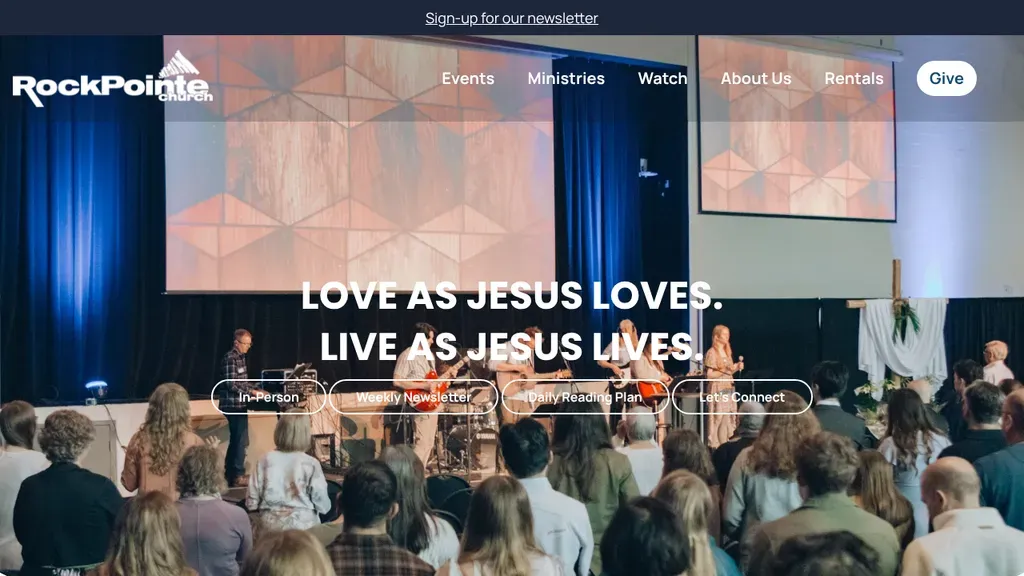
A real worship service photo, band on stage and congregation in the seats, sits under the two-line promise "Love as Jesus loves. Live as Jesus lives," with four quick links for newcomers.
Nonprofits · Calgary
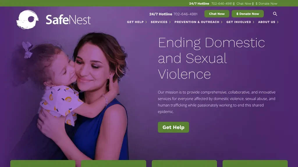
A tender mother and child photo on a purple field pairs with "Ending Domestic and Sexual Violence", and the 24/7 hotline and Chat Now sit in the top bar.
Nonprofits · Las Vegas
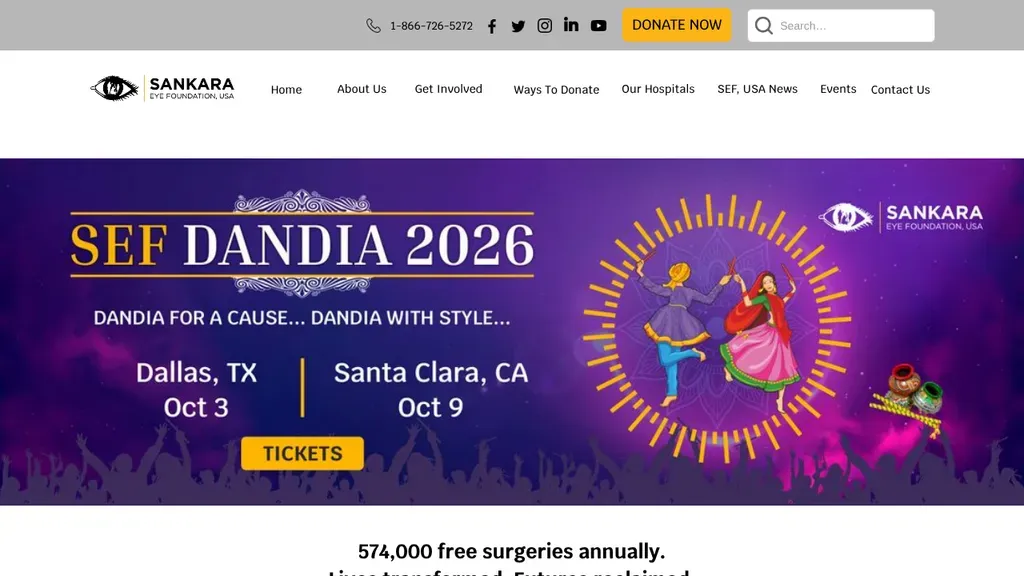
Donate Now is the brightest button on the page, and the hero promotes the next fundraising event with dates and cities.
Nonprofits
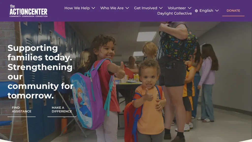
Kids with backpacks in a school hallway sit behind "Supporting families today", with Find Assistance and Make a Difference links for people seeking help and people giving it.
Nonprofits · Denver
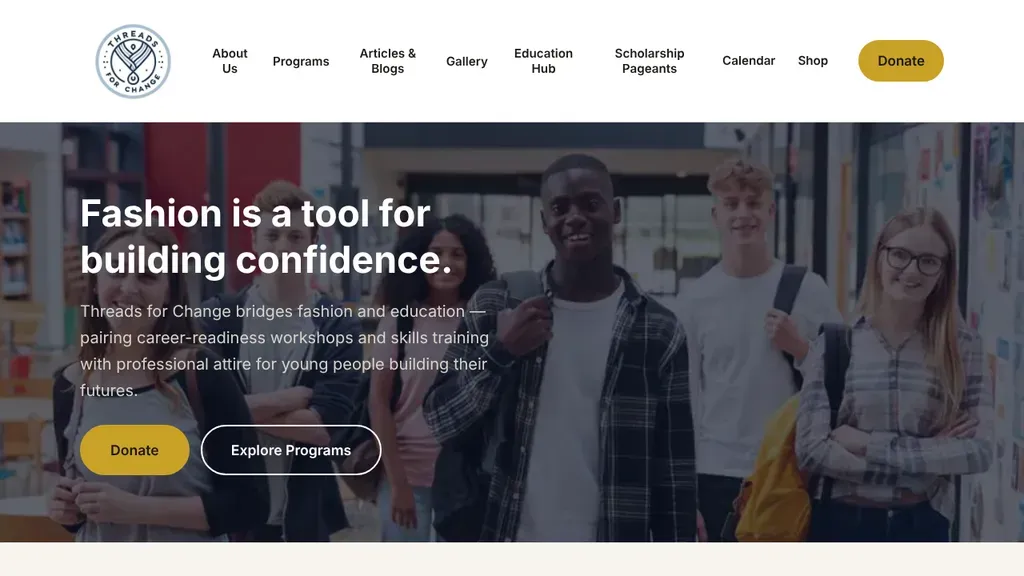
"Fashion is a tool for building confidence" sits over a photo of young people, with gold Donate and outlined Explore Programs buttons right under the mission line.
Nonprofits · Dallas
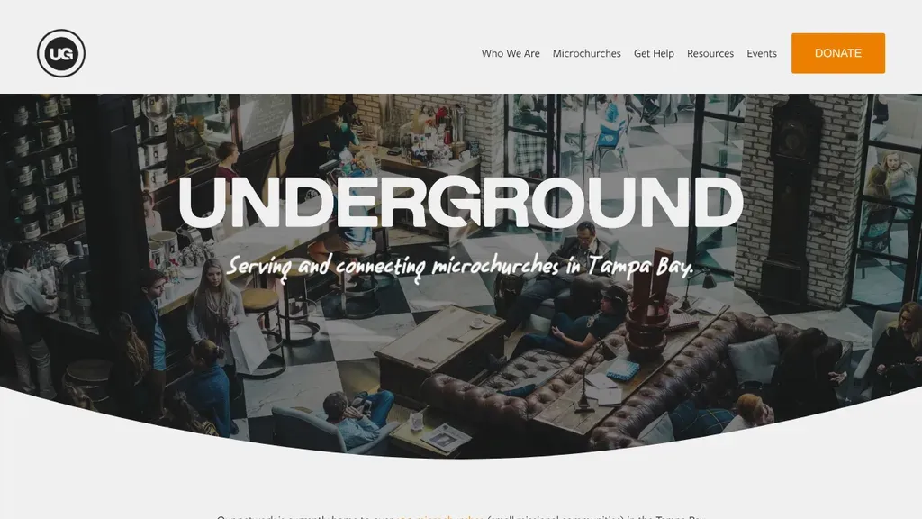
A bold "Underground" wordmark over a photo of people gathered in a café, with a script line naming the mission in Tampa Bay and an orange Donate button.
Nonprofits · Tampa
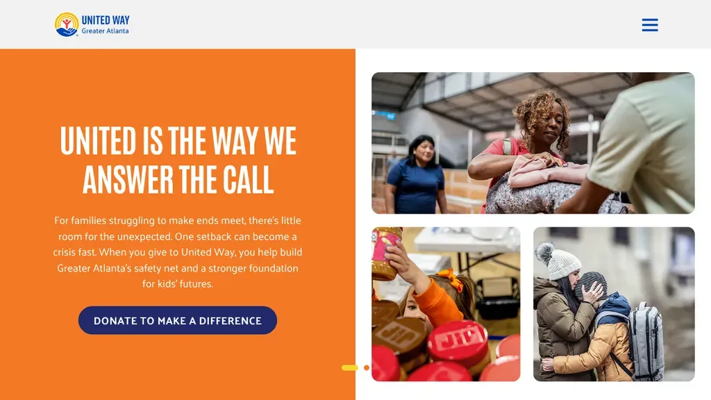
A bold orange panel with one ask, Donate to Make a Difference, beside photos of the families it serves.
Nonprofits
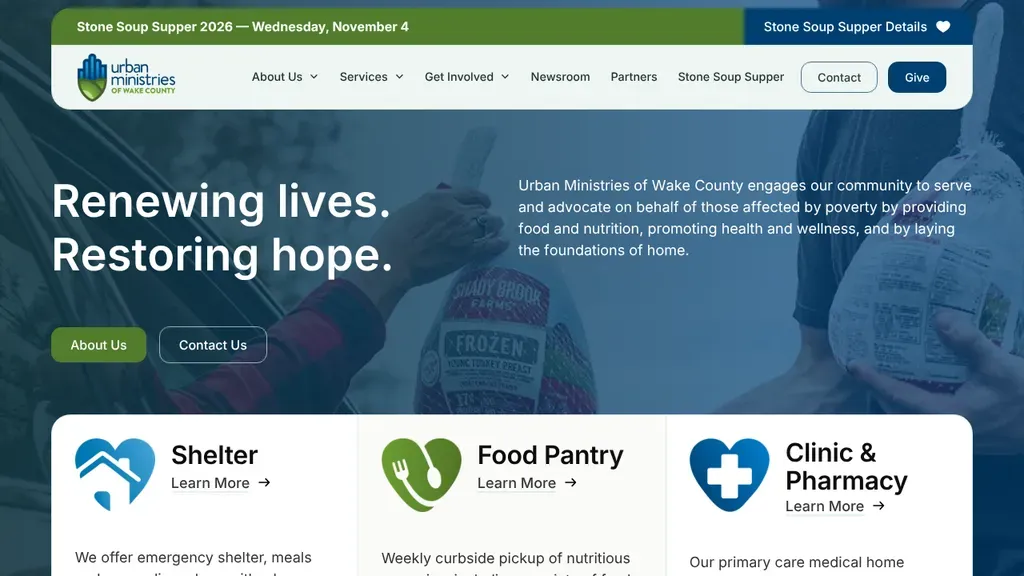
"Renewing lives. Restoring hope." leads into three icon cards for Shelter, Food Pantry and Clinic and Pharmacy, so each service is one click from the first screen.
Nonprofits · Raleigh
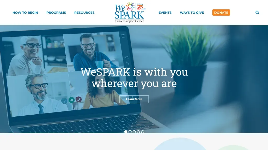
The menu opens with How to Begin, the first question a new visitor has, and Donate is highlighted in orange.
Nonprofits
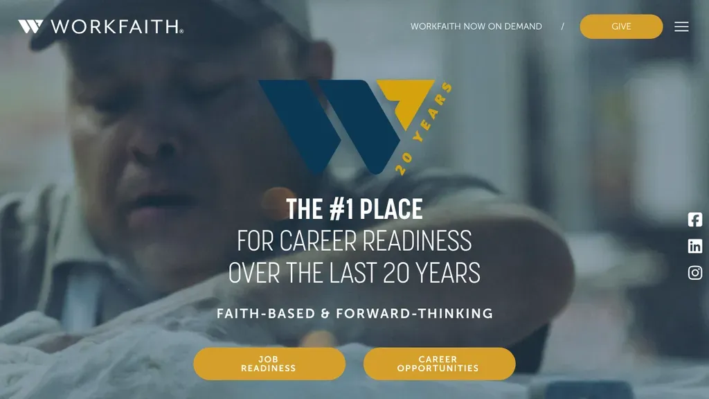
A dimmed photo backdrop keeps the career readiness headline readable, and under a faith-based tagline two gold buttons split visitors between Job Readiness and Career Opportunities.
Nonprofits · Houston
No websites match, try a different search or industry.
One high-contrast donate button, pinned in the header on every page. Preset gift amounts and a monthly option cut decision friction right when someone's ready to give.
Donors fear waste. Publish your financials, charity ratings, and impact breakdowns like "$50 feeds a family for a week." Concrete numbers beat vague promises about changing the world.
A single named person your work helped, with a real photo, moves people more than crowd shots and abstract mission copy.
Not everyone can give cash today. Surface volunteering, fundraising, email signup, and event pages prominently, so a broke-but-willing visitor still becomes a supporter instead of bouncing.
Want a website like these? See our nonprofits web design services →