Show the product immediately
Your visitors want to see the software before they commit to anything. Put a real screenshot, GIF, or interactive demo in the hero. Abstract illustrations sell nothing.
These are our favorite websites built for SaaS.

13+ years building legendary SMB websites
Someone landing on a SaaS website has one question: will this tool fix my problem, and how fast can I find out? They want to see the product, understand the price, and start a trial without talking to anyone. The great ones answer all three above the fold. The mediocre ones bury the product behind vague headlines about "empowering teams" and make you book a demo just to see a screenshot.
These 42 sites earned their spot by making complicated software feel obvious. Study how Basecamp writes headlines that pick a fight, then compare how Buffer, Hubstaff and Veed each explain a very different product. Steal the ideas, not the pixels: the layout logic, the copy moves, the trust signals. Then apply them to whatever you're building.
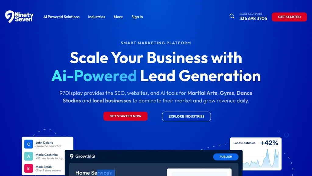
Names its audience in the subline (martial arts schools, gyms, dance studios and local businesses) and floats dashboard cards with lead stats below the two buttons.
SaaS · Winston-Salem
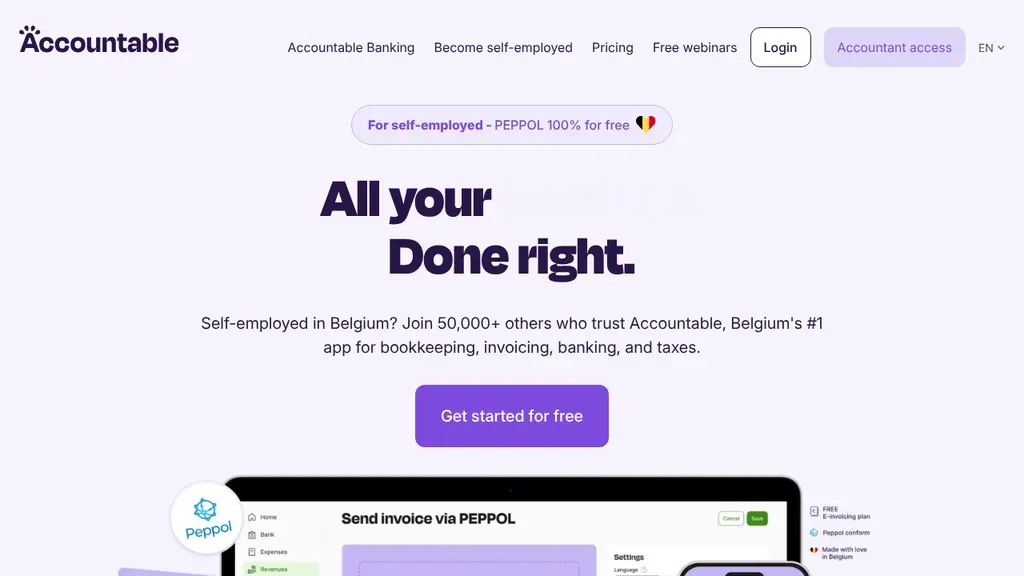
The hero names exactly who it's for, self-employed people in Belgium, with one Get Started for Free button.
SaaS
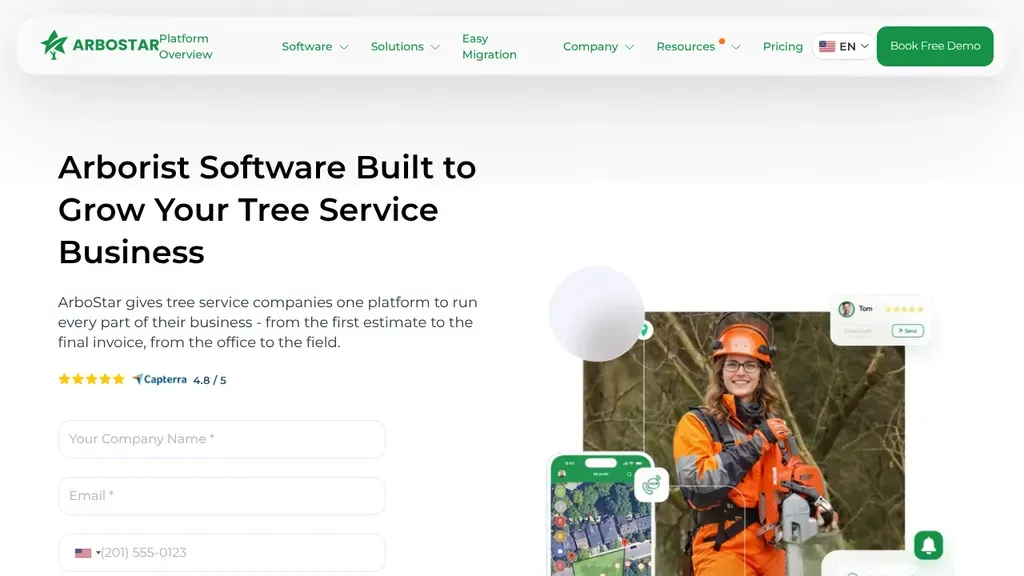
A real arborist in orange safety gear anchors the hero beside app screens, while a short demo request form sits right under the tree service headline and Capterra rating.
SaaS · Toronto
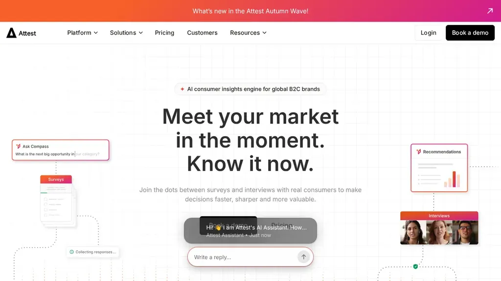
A clean three-line headline, a live AI assistant demo in the hero, and Book a Demo kept black in the header.
SaaS
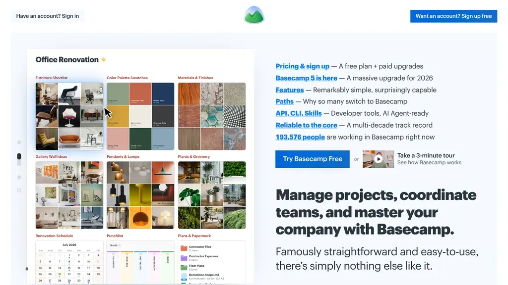
Instead of a hero image, a list of plain-language links answers the top questions: pricing, features, why people switch.
SaaS
 Built by us
 The headline rotates places (school, work, the hospital), and "Trusted by 2,000+ schools & facilities" sits under the buttons.
SaaS
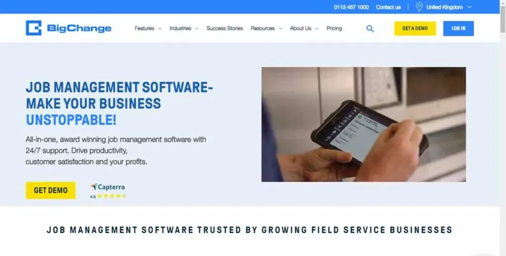
The headline names the niche, UK field service businesses, with Get Demo in both the header and the hero.
SaaS
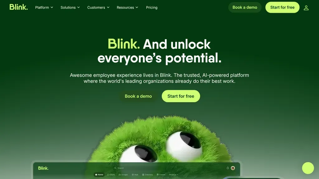
A friendly mascot under a short headline, and the hero offers both Book a Demo and Start for Free.
SaaS
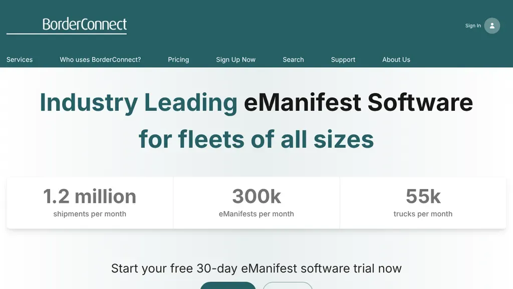
Large usage numbers for shipments, eManifests and trucks sit in cards under the headline, giving fleet owners proof before the free trial offer.
SaaS · Windsor
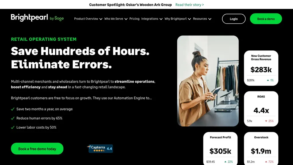
Results do the selling: three checkmarked outcomes beside dashboard cards full of realistic numbers.
SaaS
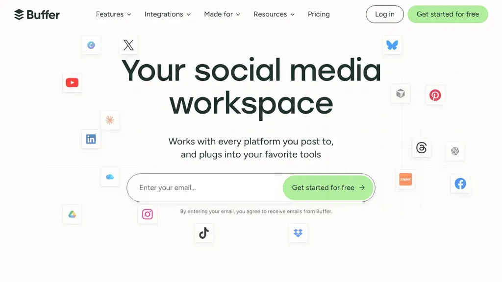
The email sign-up is built into the hero, with icons of every social network floating around it to show what it connects to.
SaaS
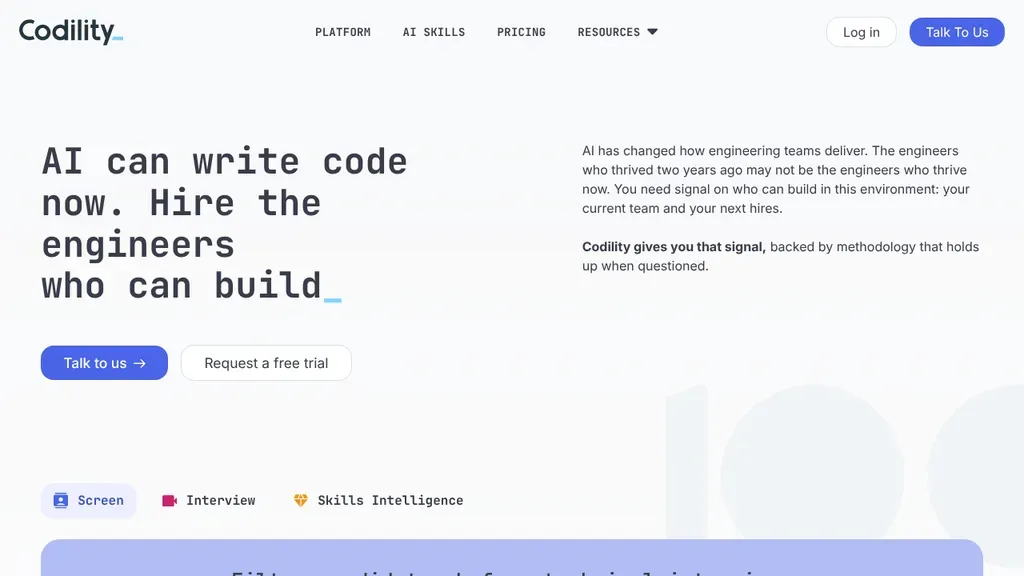
A typewriter-style headline speaks to a current hiring worry, with Talk to Us and Request a Free Trial below.
SaaS
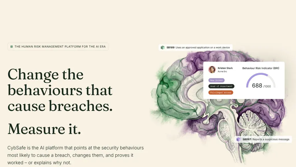
A big serif headline names the problem, "Change the behaviours that cause breaches," beside an illustrated product card.
SaaS
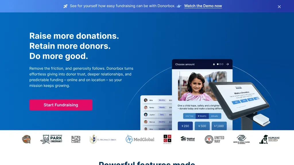
Three short promises in the headline, one Start Fundraising button, and a row of nonprofit customer logos below.
SaaS
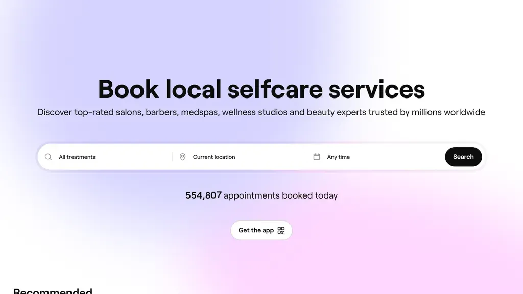
The hero is a search bar (treatment, location, time), with a live count of appointments booked today under it.
SaaS
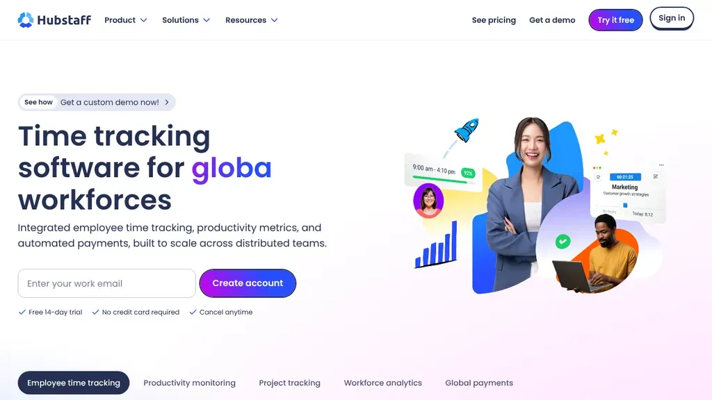
The sign-up form sits in the hero, with free trial, no credit card and cancel anytime spelled out underneath.
SaaS
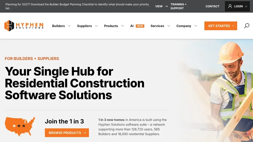
Speaks straight to builders and suppliers, pairing a hard-hat worker photo and get started button with a US map block saying 1 in 3 new homes use its software.
SaaS · Dallas
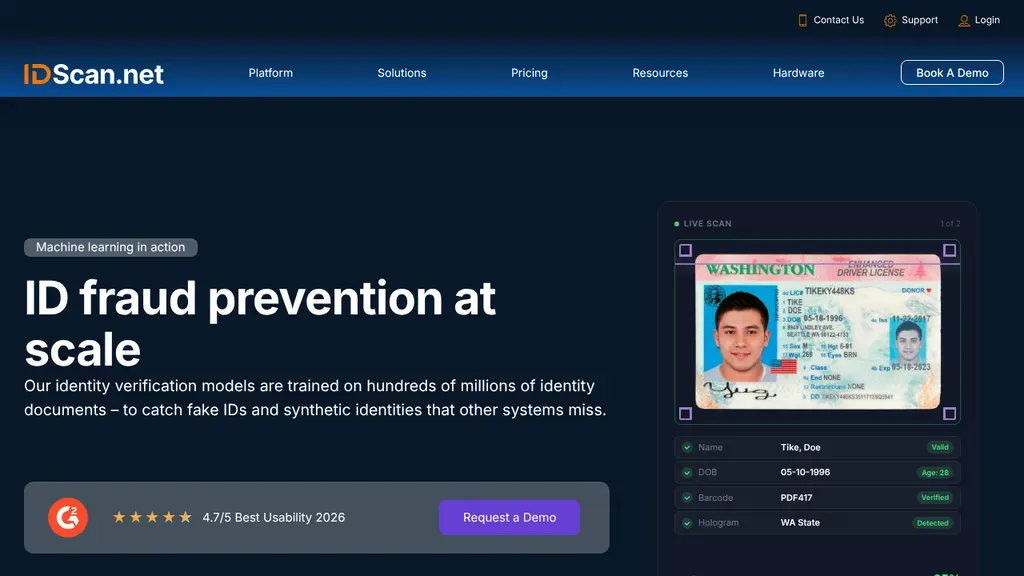
A live ID scan mockup shows the product working, while a 4.7 usability rating strip under the headline holds the Request a Demo button.
SaaS · New Orleans
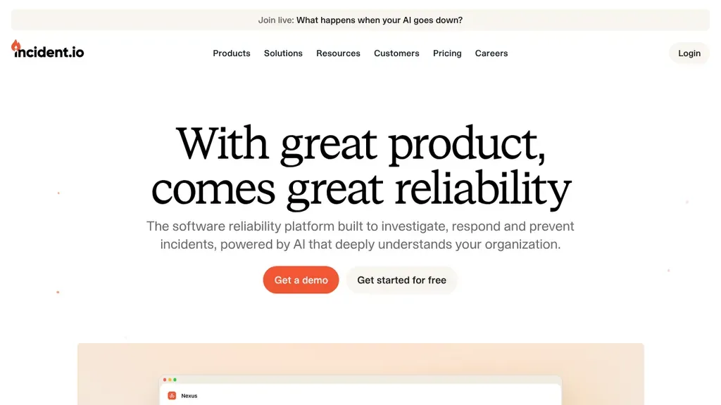
A witty serif headline, "With great product, comes great reliability," with Get a Demo and Get Started for Free side by side.
SaaS
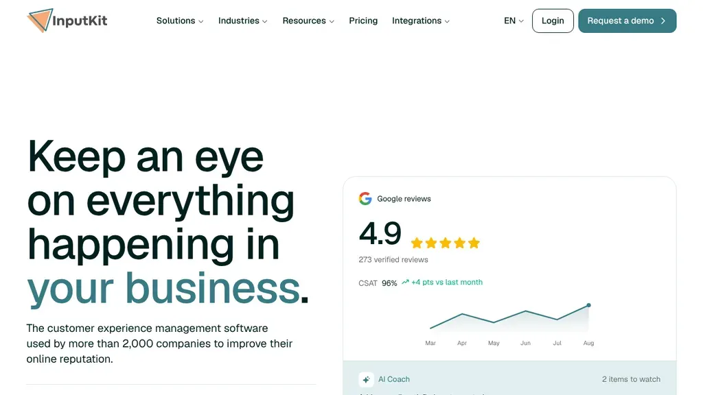
Oversized "Keep an eye on everything happening in your business" type faces a card showing a Google rating, review count and satisfaction trend, so the product proves its pitch.
SaaS · Montreal
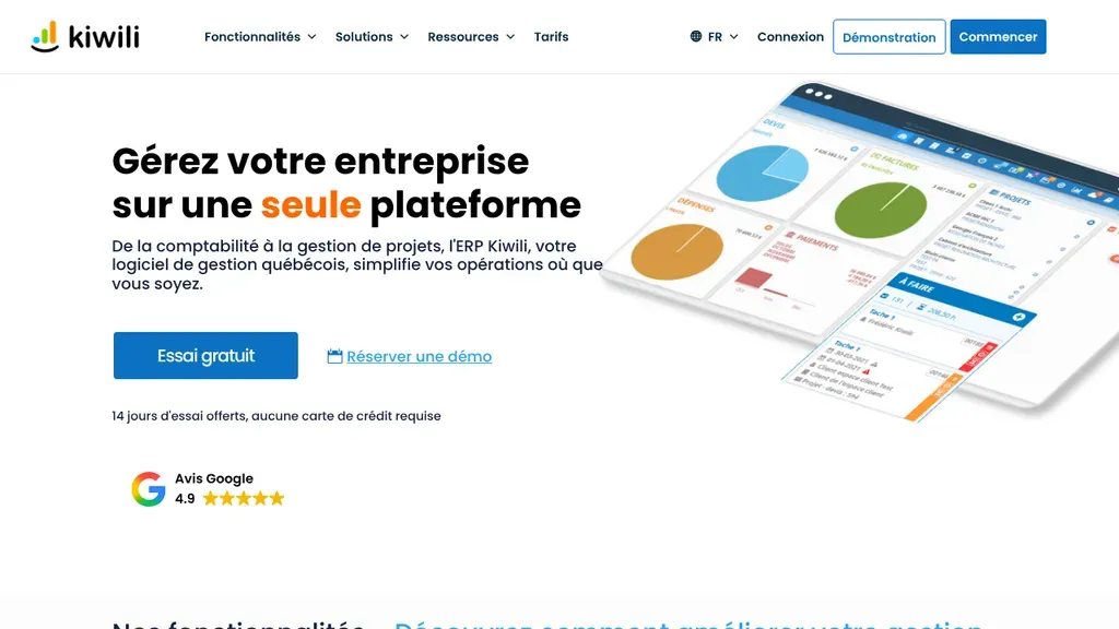
Written for Quebec businesses in French, the hero pairs a colorful dashboard screenshot with a free trial button, a no credit card note and a Google rating badge below.
SaaS · Montreal
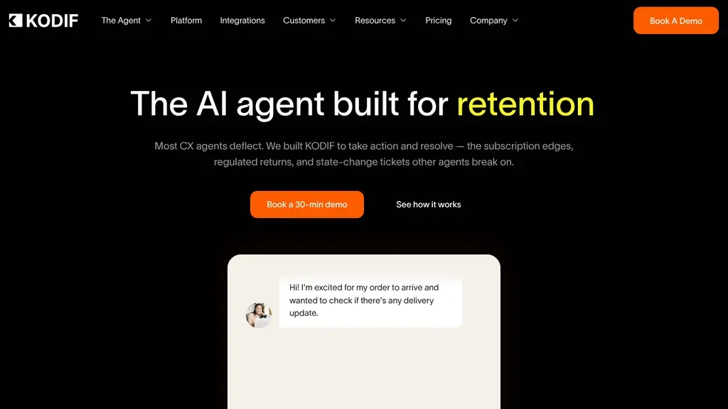
One bold line about retention with the key word in yellow, an orange demo button and a chat mockup underneath keep the product story tight.
SaaS · San Francisco
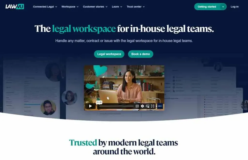
The headline speaks to the buyer's standing, "In-house legal has earned influence," with Request Demo and How We Compare buttons.
SaaS
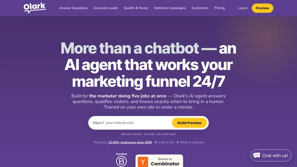
Visitors paste their own website into the hero to build a preview, so the demo starts before any sales call.
SaaS
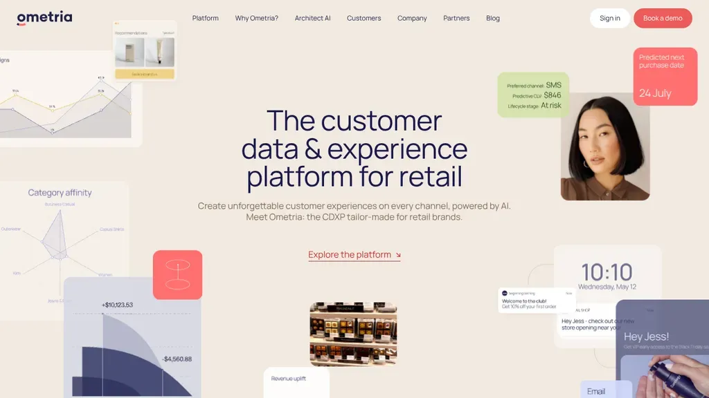
Floating product cards around the headline show real features (segments, messages, reports) at a glance.
SaaS
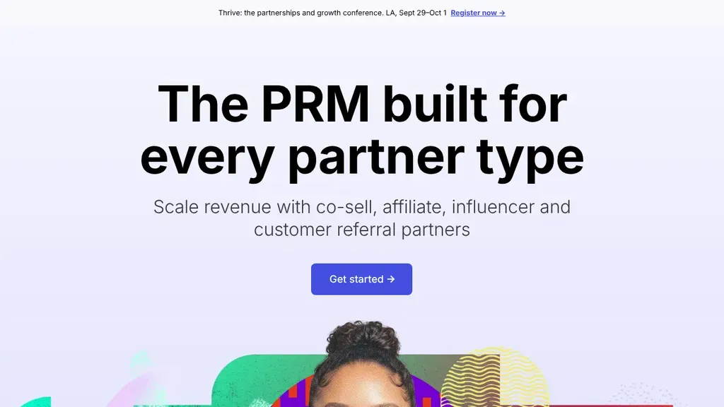
One big headline, one line of explanation and one Get Started button, with a conference promo in the top bar.
SaaS
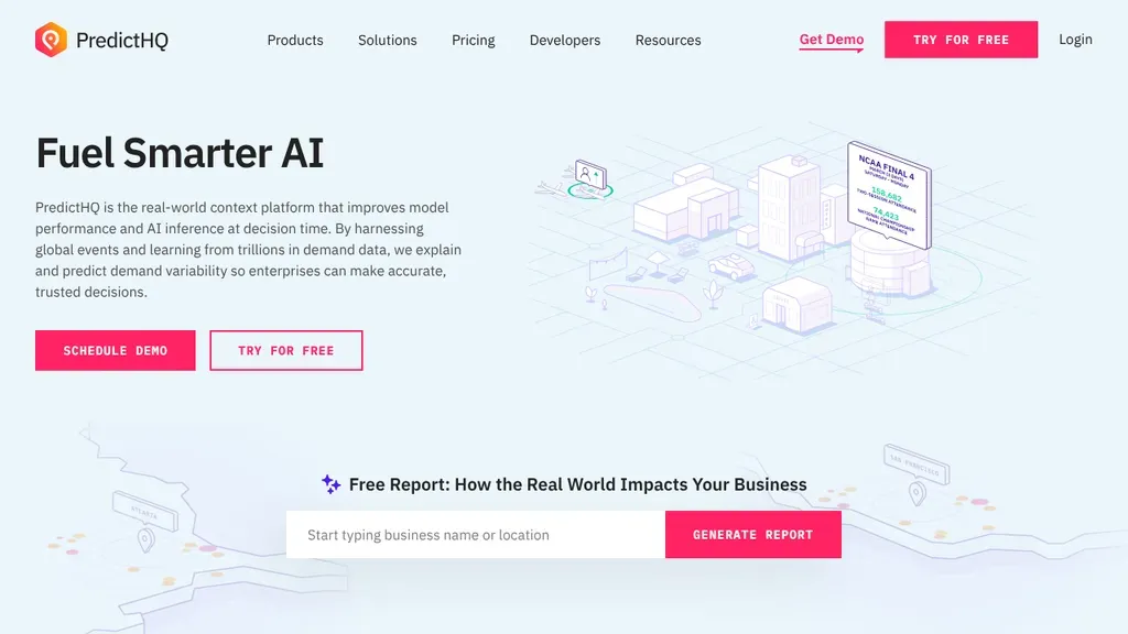
Beside Schedule Demo and Try for Free, a lead magnet invites visitors to generate a free report for their own business.
SaaS
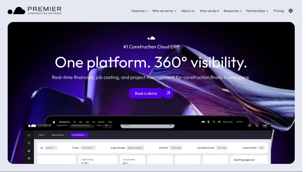
A rounded violet hero card states "One platform. 360° visibility." for construction finance, with a single demo button and the real project dashboard peeking up from below.
SaaS · Toronto
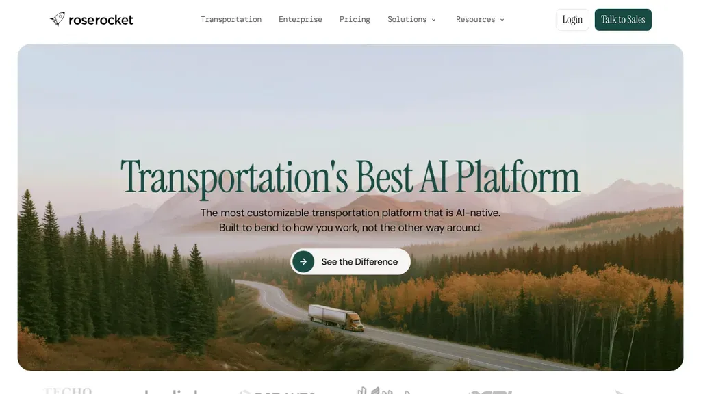
A wide mountain highway photo with a lone truck sets the freight scene, and the serif headline plus one "See the Difference" button keep the first screen calm and focused.
SaaS · Toronto
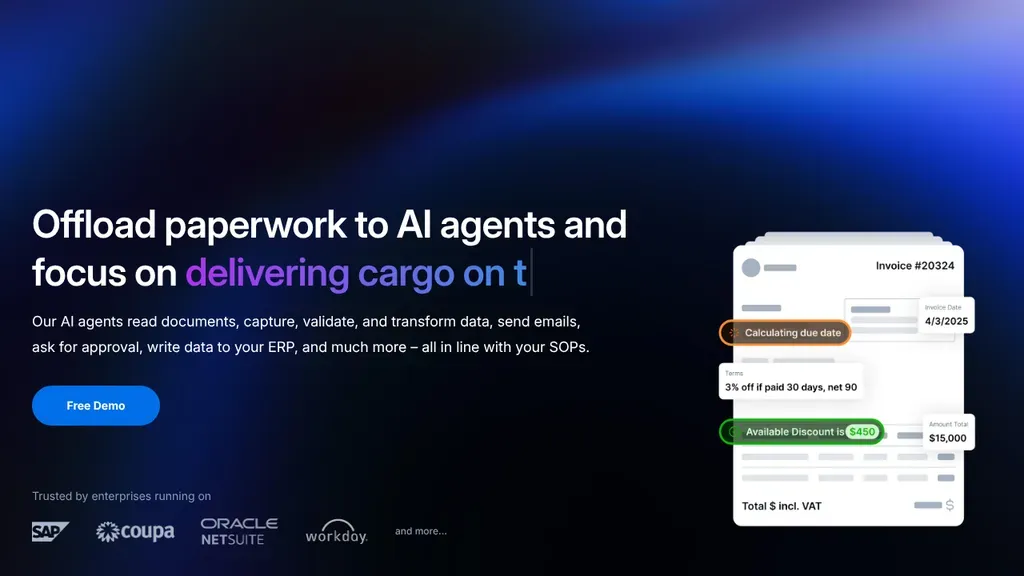
The headline finishes with an industry-specific line ("delivering cargo on time"), and logos of the systems it plugs into sit under Free Demo.
SaaS
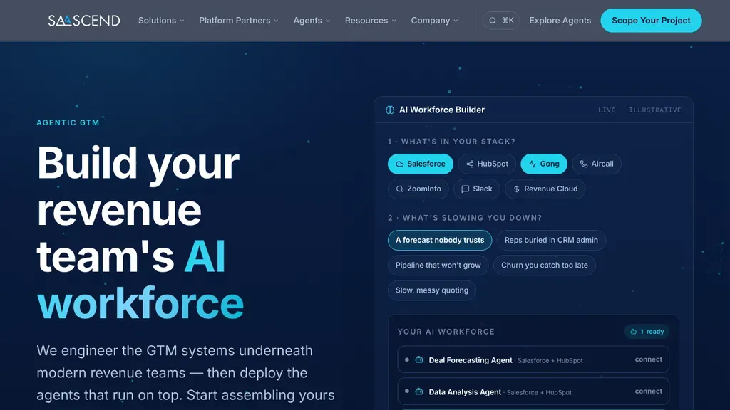
An interactive builder sits beside the headline, asking about your tools and pain points to assemble a recommended setup.
SaaS
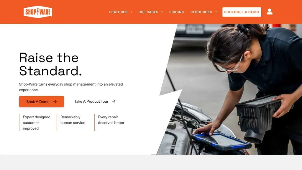
A technician tapping a tablet over an open engine bay shows the software in a real repair shop, beside "Raise the Standard." and an orange demo button.
SaaS · San Francisco
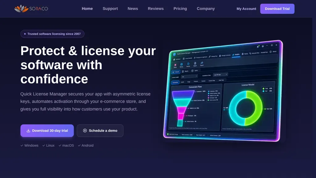
A glowing dashboard mockup on deep navy shows the licensing software at work, with a 30-day trial download button and a demo link under the headline.
SaaS · Montreal
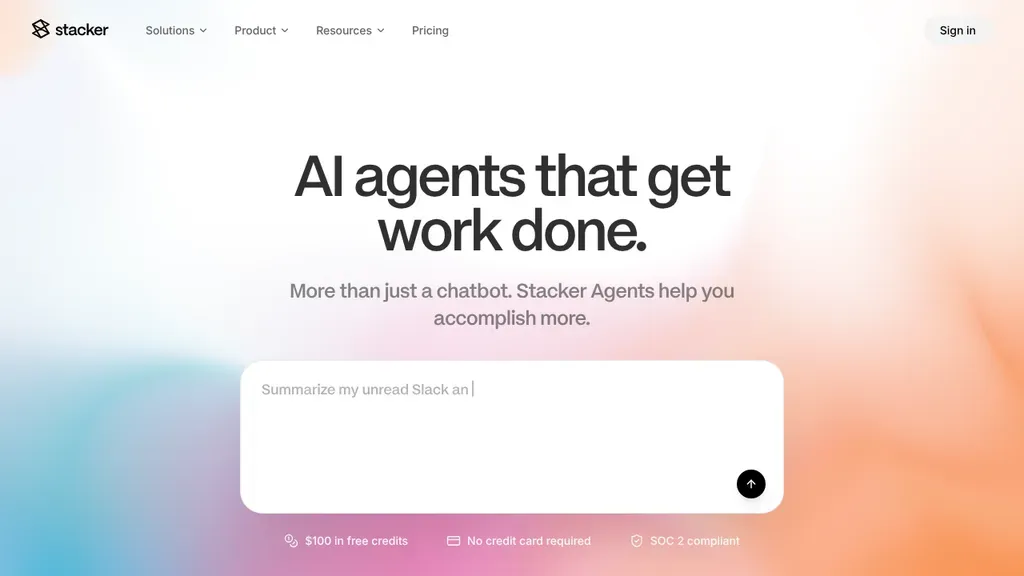
The hero is a prompt box you can type into, with "$100 in free credits, no credit card required" right under it.
SaaS
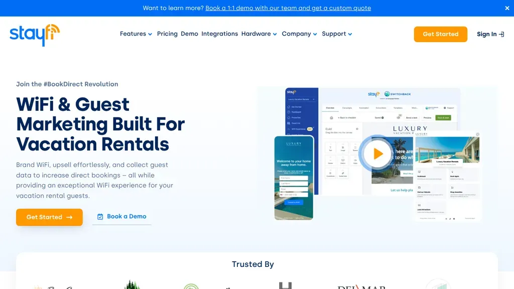
Owns one niche, vacation rental WiFi marketing, and backs the headline with phone and tablet screens of the guest experience plus an orange Get Started button and demo link.
SaaS · New York City
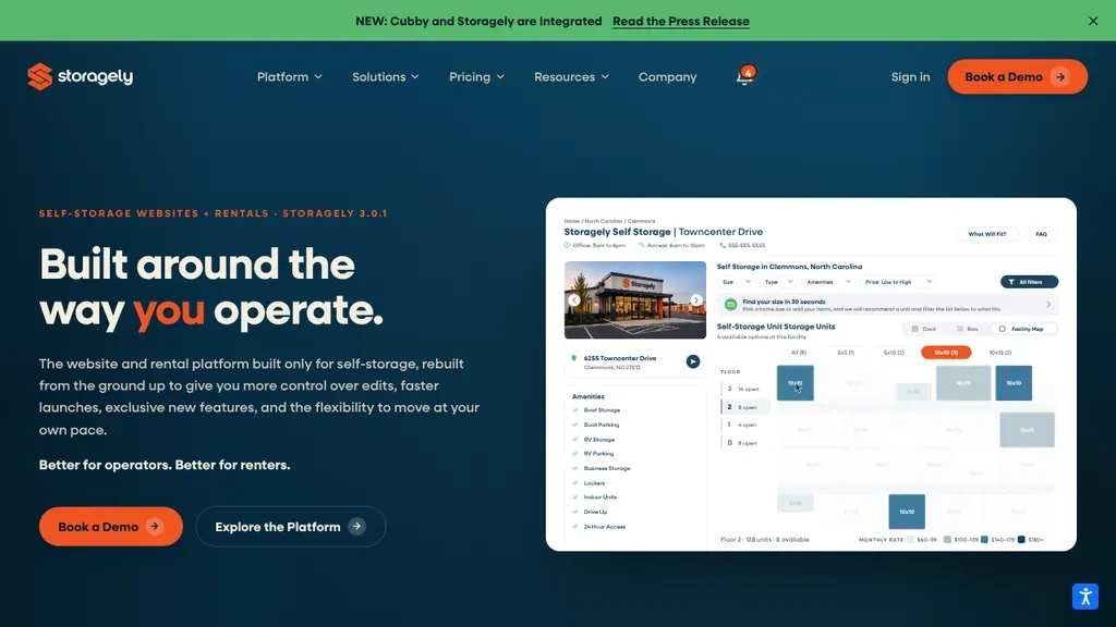
A live product screenshot of a self-storage rental page sits beside the headline, so operators see the software before clicking the orange Book a Demo button.
SaaS · Winston-Salem
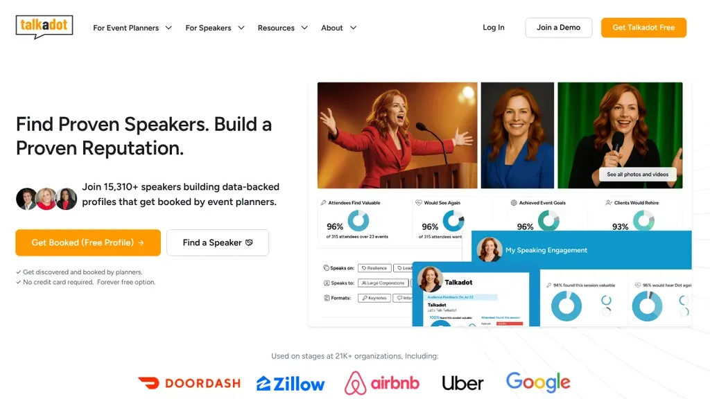
Speaker photos and audience data cards on the right back up the headline, while two buttons split visitors into speakers and event planners.
SaaS · Las Vegas
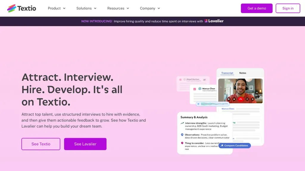
A soft pink hero spells out the hiring cycle in four verbs, "Attract. Interview. Hire. Develop.", next to an interview notes screen with a candidate on video.
SaaS · Seattle
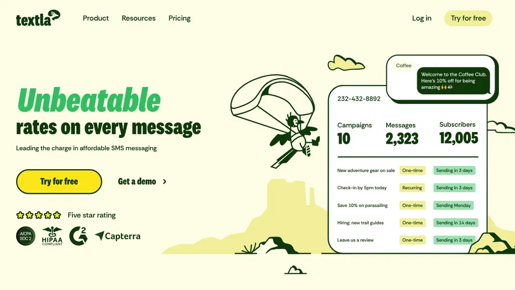
A bright green headline about message rates pairs with a hand-drawn paraglider and a campaign dashboard, so the product and its personality show at once.
SaaS · San Francisco
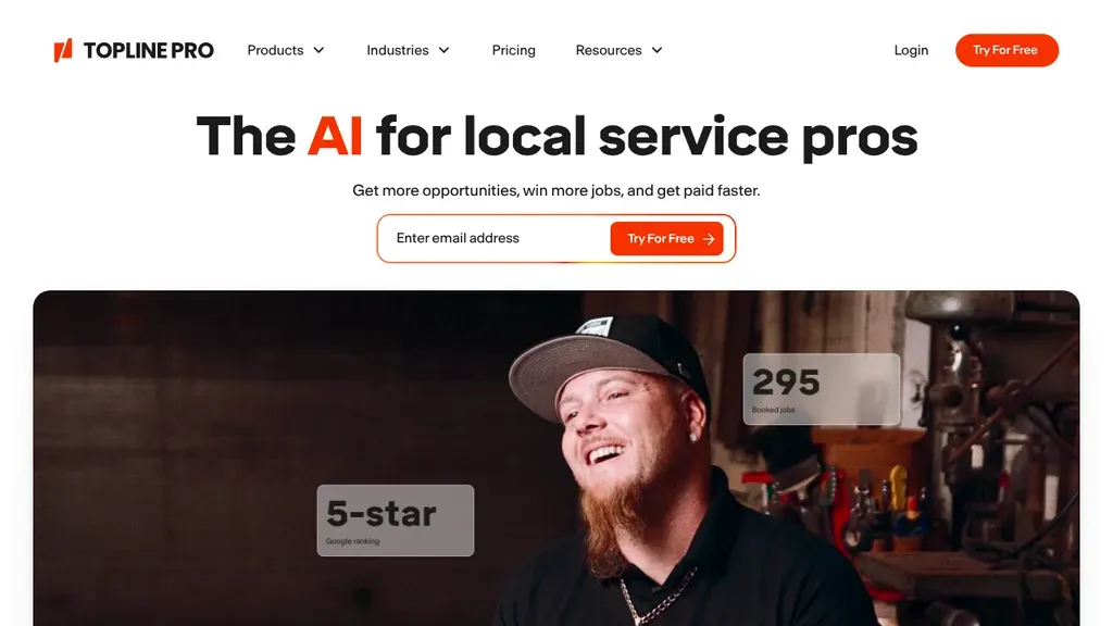
"The AI for local service pros" tops an email signup field, and a large portrait carries floating result cards such as 295 booked jobs and a 5-star tag.
SaaS · New York City
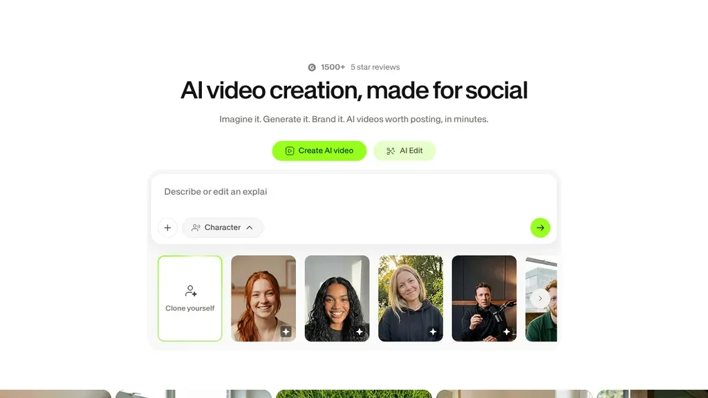
A prompt box and a row of AI presenter faces turn the hero into the product itself.
SaaS
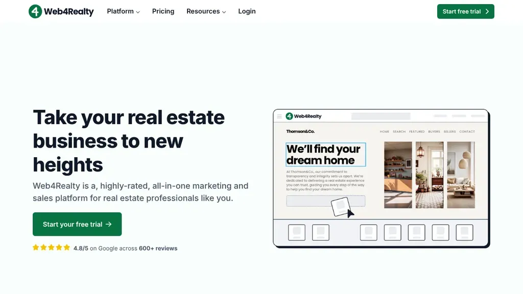
A sample agent website, "We'll find your dream home", sits in a browser frame so realtors see what they would get, plus a free trial button and Google rating line.
SaaS · Toronto
No websites match, try a different search or industry.
Your visitors want to see the software before they commit to anything. Put a real screenshot, GIF, or interactive demo in the hero. Abstract illustrations sell nothing.
Nobody wakes up wanting "workflow automation." They want to stop copying data between apps. Zapier's copy names the pain in plain words. Write your headline about the customer's problem, not your architecture.
A hidden pricing page reads as "expensive and complicated." Publish your tiers, name who each plan is for, and flag the free option. Basecamp's one-price page removes every excuse to hesitate.
Every extra form field costs you signups. Offer "start free" with an email or Google login, no credit card, no sales call. Calendly turns visitors into users before doubt has time to set in.
Want a website like these? See our SaaS web design services →