Lead with the client's pain
Your headline should name what the visitor is feeling, not your modality. "Anxiety keeping you up at night?" beats "Integrative CBT-informed psychotherapy" every time. Speak human first, clinician second.

These are our favorite websites built for therapists.

13+ years building legendary SMB websites
Someone landing on a therapist's website is usually anxious, overwhelmed, or working up the nerve to ask for help. They need three things fast: proof you can help with their specific problem, a sense of what working with you feels like, and a low-pressure way to take the first step. Great therapy sites answer all three above the fold. Mediocre ones bury credentials in jargon and hide the booking button.
This collection pulls together 38 therapist and mental health websites, from group practices like Heidi Sturgeon & Associates to online platforms like Inkblot and Shift. Study how they structure their homepages, write their headlines, and build trust before asking for a commitment. Steal the thinking, not the pixels: borrow a layout pattern here, a copy angle there, and adapt it to your own practice and personality.
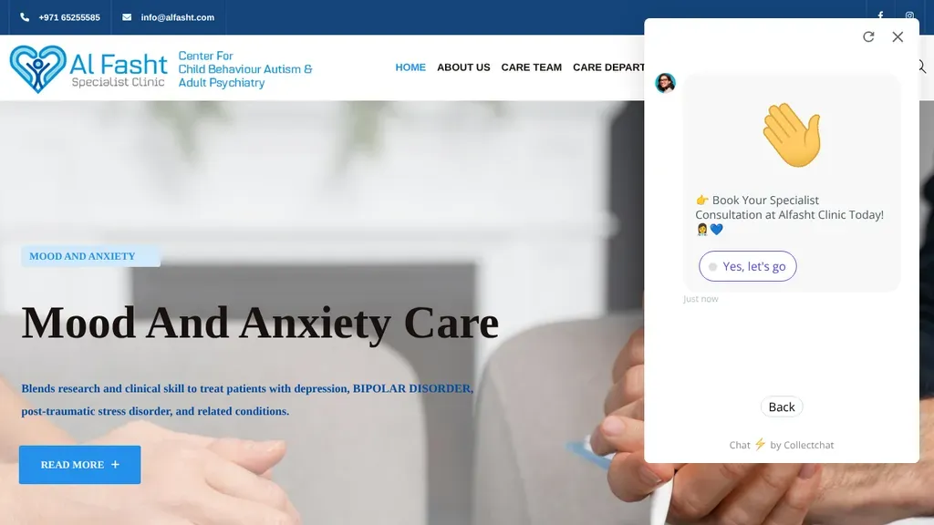
Phone and email lead the top bar, and each hero slide focuses on one condition they treat, like mood and anxiety.
Therapists
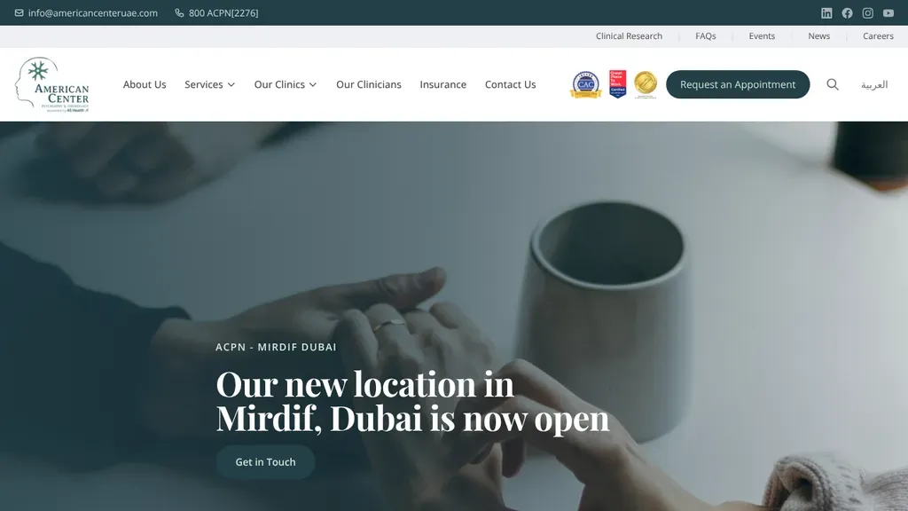
The hero announces a new location, and Insurance gets its own spot in the main menu next to Request an Appointment.
Therapists
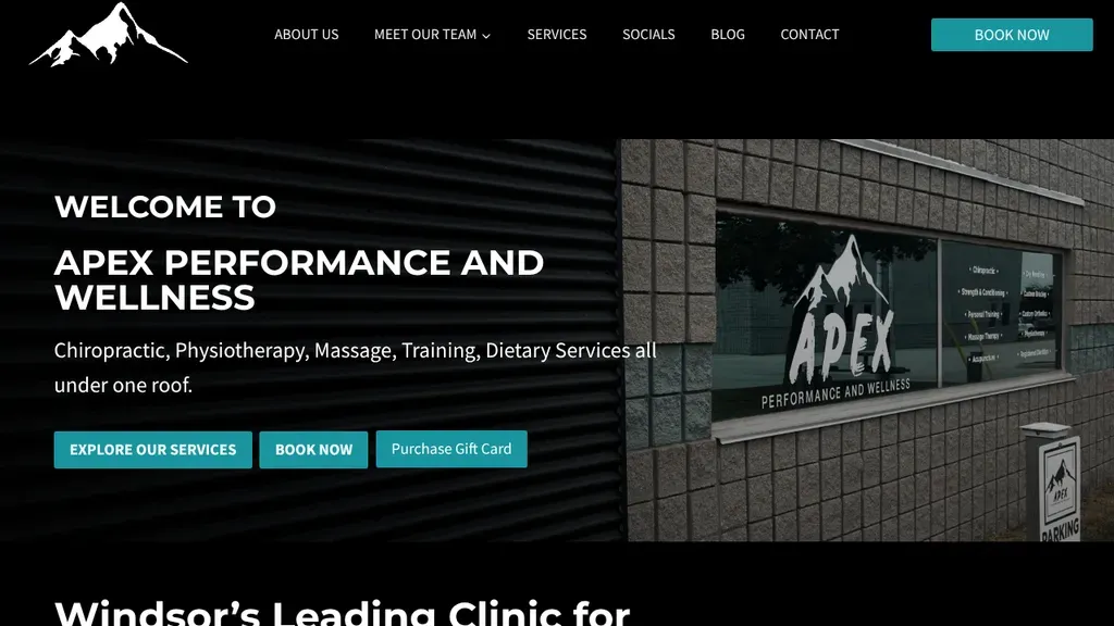
The real storefront with its mountain logo anchors the hero, and a short list of services under one roof leads into three clear buttons, including gift cards.
Therapists · Windsor
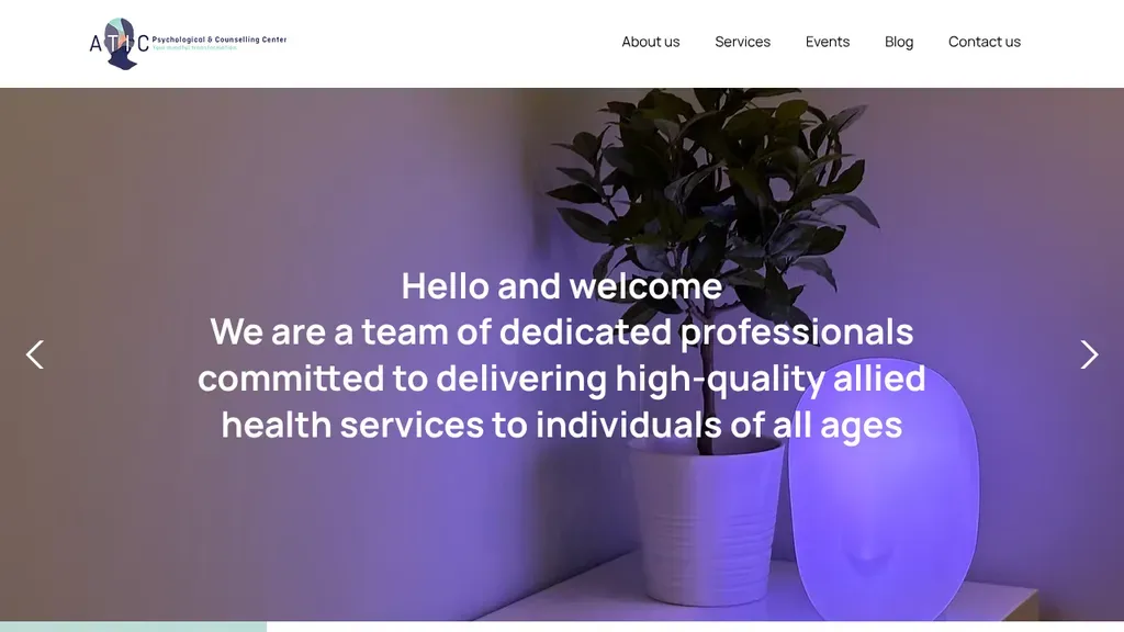
A warm welcome line in the hero says who they serve, individuals of all ages, under a short five-item menu.
Therapists
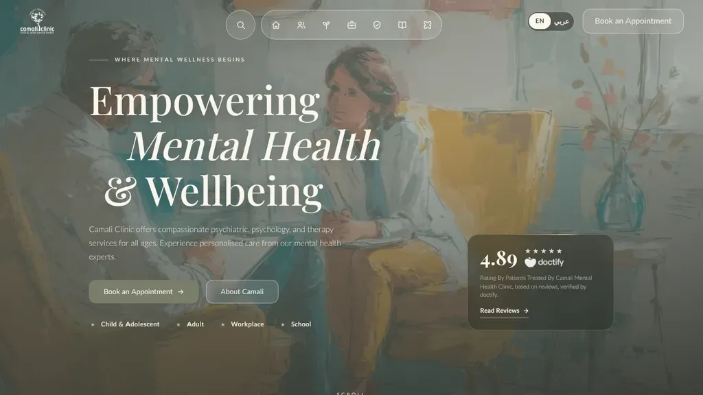
A 4.89 rating card floats on the hero, the site switches to Arabic in one tap, and audiences are listed: child, adult, workplace, school.
Therapists
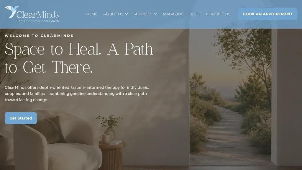
A calm, poetic headline, "Space to Heal. A Path to Get There," with one Get Started button and Book an Appointment in the header.
Therapists
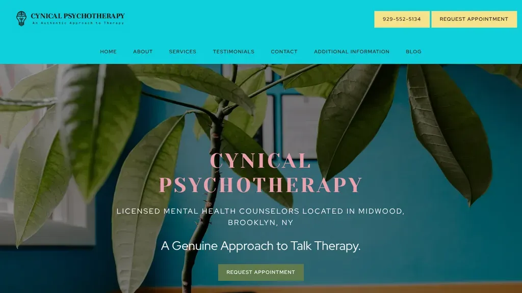
A leafy plant against a teal wall sets a calm mood, while the hero spells out licensed counselors in Midwood, Brooklyn, with the phone number and Request Appointment as yellow header buttons.
Therapists · New York City
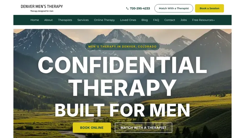
Huge white type over a mountain valley states the niche, therapy built for men, with Match With a Therapist beside Book Online for visitors unsure where to start.
Therapists · Denver
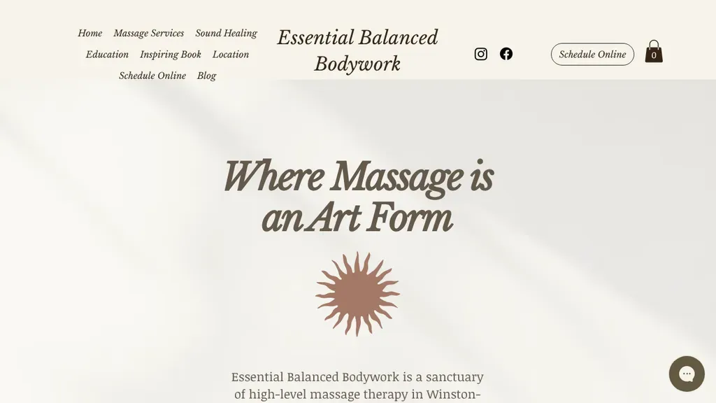
Restrained cream background, italic serif headline "Where Massage is an Art Form" and a single sun mark position the studio as a high-end experience, with Schedule Online in the header.
Therapists · Winston-Salem
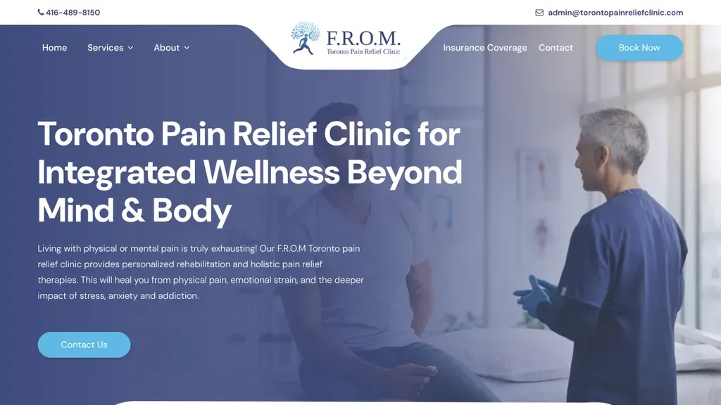
A clinician mid-consultation fills the blue-tinted hero beside a headline naming Toronto and pain relief, with phone, email and Book Now all reachable from the header.
Therapists · Toronto
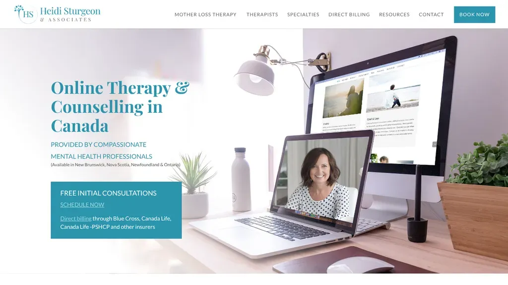
The hero answers the practical questions: which provinces they cover, free initial consultations and direct billing to insurers.
Therapists
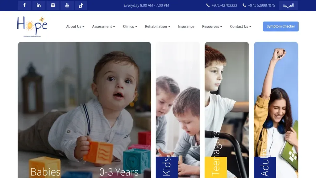
Four photo cards split visitors by age (babies, kids, teenagers, adults), and a Symptom Checker button sits in the header.
Therapists
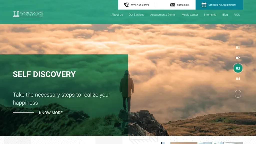
Schedule an Appointment is a solid green tab in the top corner, and an Assessments Center gets its own menu item.
Therapists
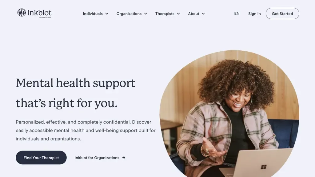
Two clear paths in the hero: Find Your Therapist for individuals, and a separate link for organizations.
Therapists
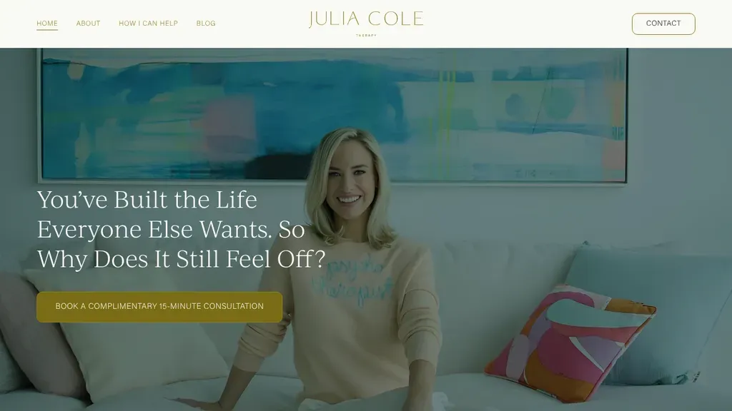
Speaks straight to high achievers with "You've Built the Life Everyone Else Wants. So Why Does It Still Feel Off?" and a gold button for a free 15-minute consultation.
Therapists · Miami
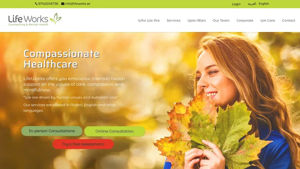
Three buttons cover the ways to start: in-person consultation, online consultation, or a free assessment.
Therapists
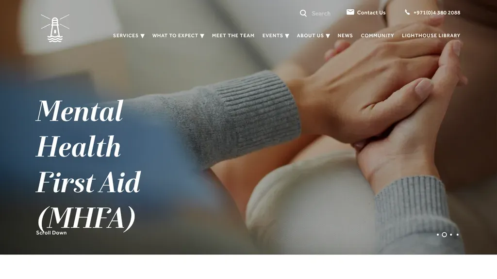
Each hero slide highlights one community program, like Mental Health First Aid, with the phone number up top.
Therapists

The team poses in the clinic behind a headline about Las Vegas personal injury physical therapy, and an orange Call Now button puts the next step one tap away.
Therapists · Las Vegas

A laughing couple and a soft green palette keep a counseling practice approachable, with a free consultation button, a call button and a HIPAA compliance note under the Houston headline.
Therapists · Houston
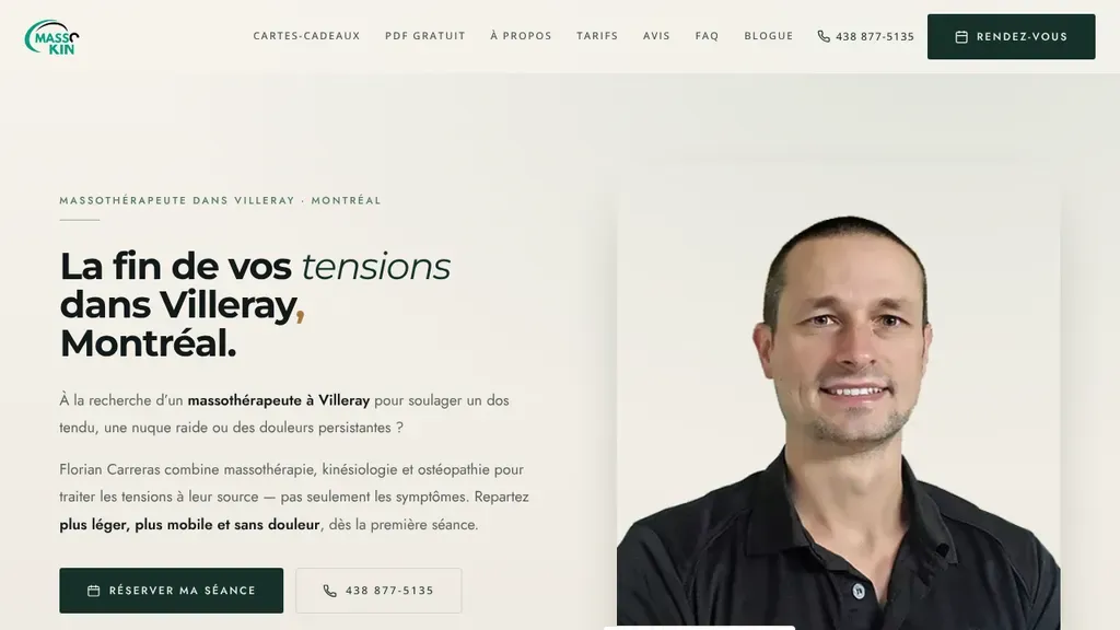
A friendly portrait of the therapist sits beside a French headline promising the end of tension in Villeray, Montréal, with book and call buttons directly under the intro.
Therapists · Montreal
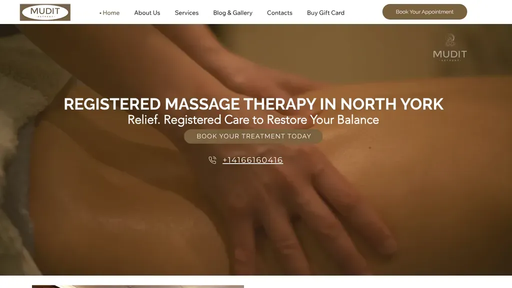
A warm close-up of hands at work sets a calm tone under "Registered Massage Therapy in North York", with a booking button and phone number centered right below.
Therapists · Toronto
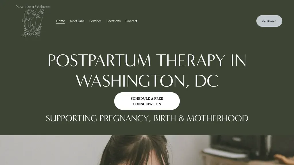
Owns one niche, postpartum therapy in Washington, DC, announced in large thin capitals on deep olive green, with a white Schedule a Free Consultation button right beneath the headline.
Therapists · Washington DC
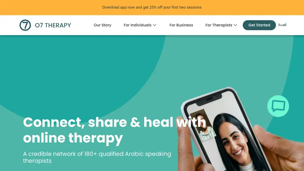
A top bar offers an app-download discount, and the hero says exactly what they are: 180+ Arabic-speaking therapists online.
Therapists
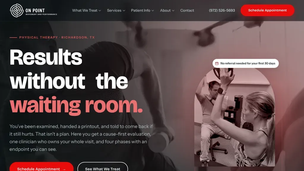
"Results without the waiting room" takes a clear stance against rushed care, and a "No referral needed" tag on the photo answers a common question before anyone has to ask.
Therapists · Dallas
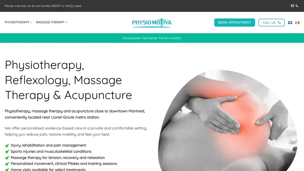
Lists four services in a large light headline, then a short checklist of care options and a note about the Lionel-Groulx metro, with booking and call buttons up top.
Therapists · Montreal
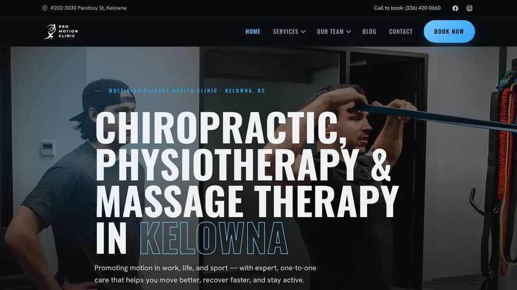
Bold stacked headline naming chiropractic, physiotherapy and massage therapy in Kelowna sits over a real training photo, with a bright Book Now button in the nav.
Therapists · Kelowna
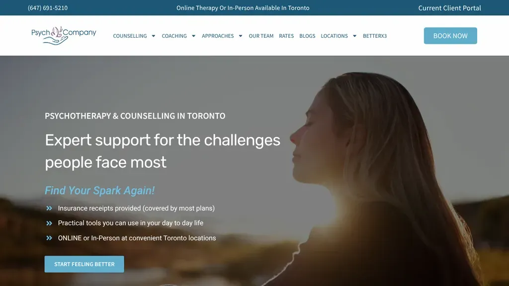
The top bar answers the first question, online or in person in Toronto, and the hero lists insurance receipts and practical tools.
Therapists
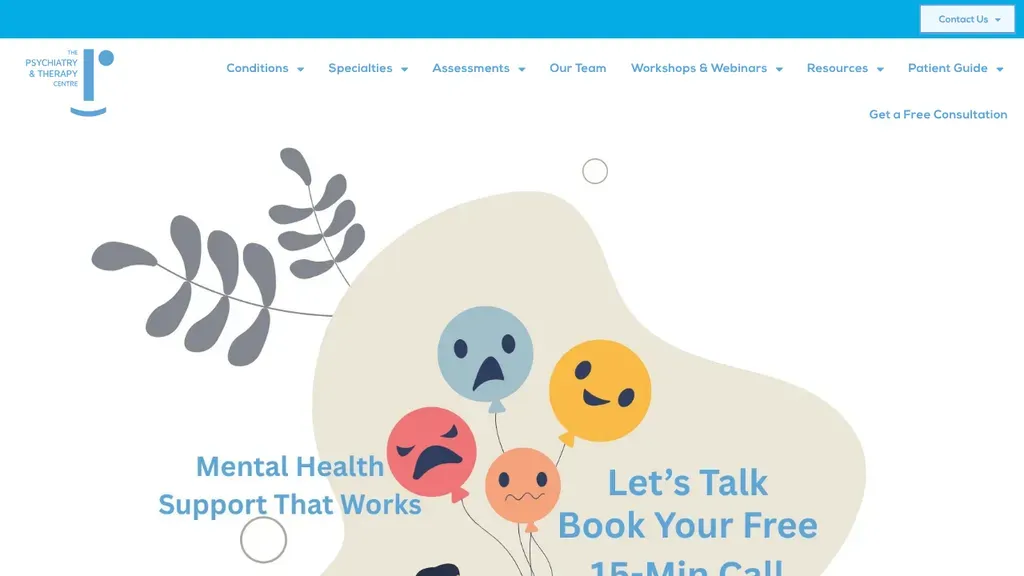
A soft illustration of feelings and a clear offer, a free 15-minute call, with Get a Free Consultation in the header.
Therapists
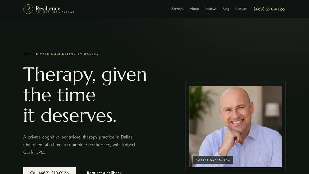
A dark, editorial layout leads with "Therapy, given the time it deserves." beside a framed portrait of the counselor, offering both a call button and a callback request.
Therapists · Dallas
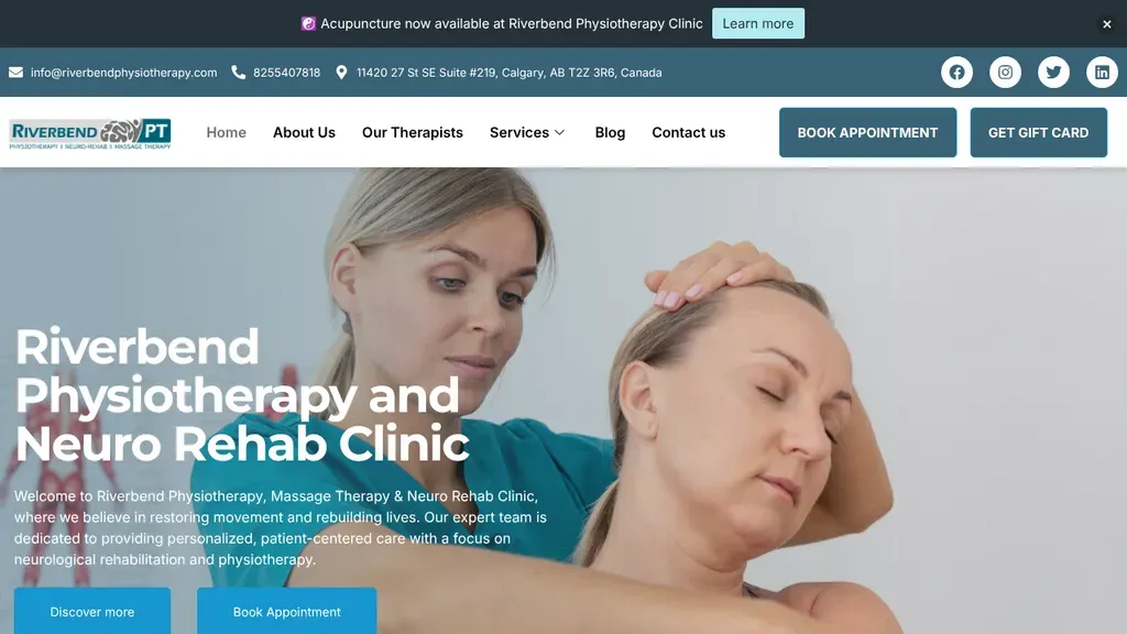
A therapist treating a patient's neck fills the hero under a neuro rehab headline, with the full address up top and booking and gift card buttons in the nav.
Therapists · Calgary
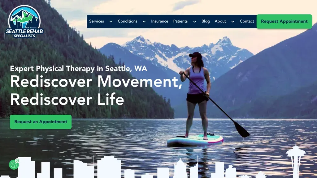
A paddleboarder on a mountain lake and a Seattle skyline silhouette tie the clinic to its city, with a green Request an Appointment button repeated in hero and nav.
Therapists · Seattle

The homepage is a grid of colorful program banners, each one a clear door to a service like speech therapy or early intervention.
Therapists
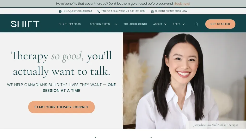
A playful headline, "Therapy so good, you'll actually want to talk," plus a "Talk to a real person" phone number in the top bar.
Therapists
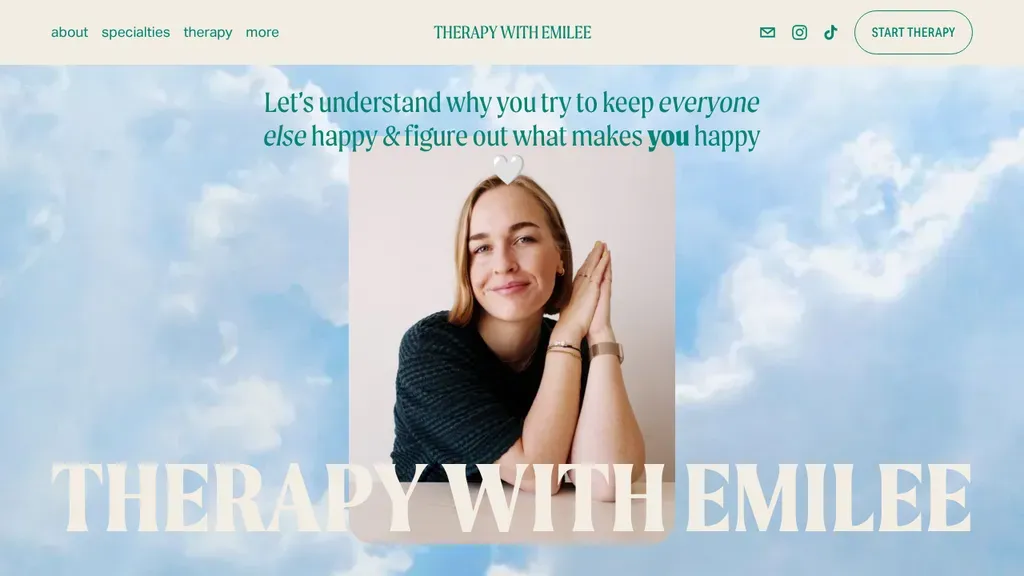
A bold personal brand: the therapist's portrait floats on a cloudy sky with her name in giant letters and a people-pleasing headline aimed squarely at women.
Therapists · Dallas
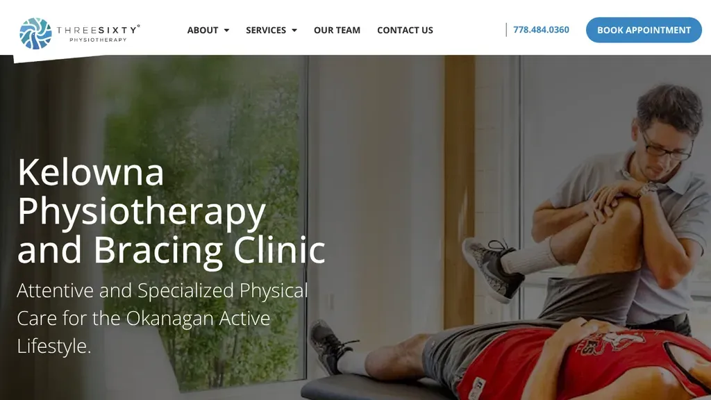
Names its niche, physiotherapy and bracing, plus the city in the headline, next to a therapist working on a patient's knee, with phone and booking button in the nav.
Therapists · Kelowna
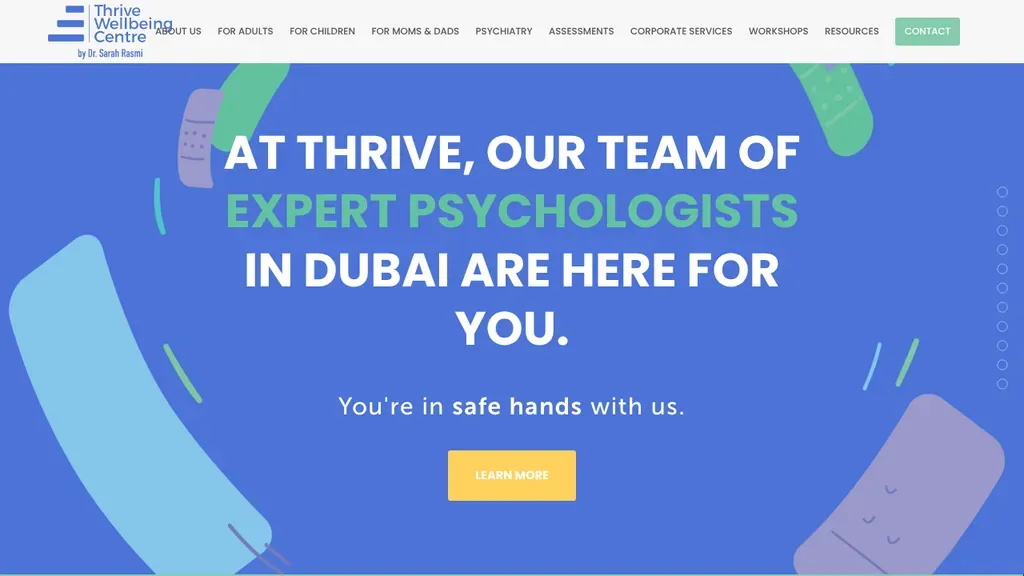
The menu splits services by who they're for (adults, children, moms and dads), under a bright, friendly hero.
Therapists
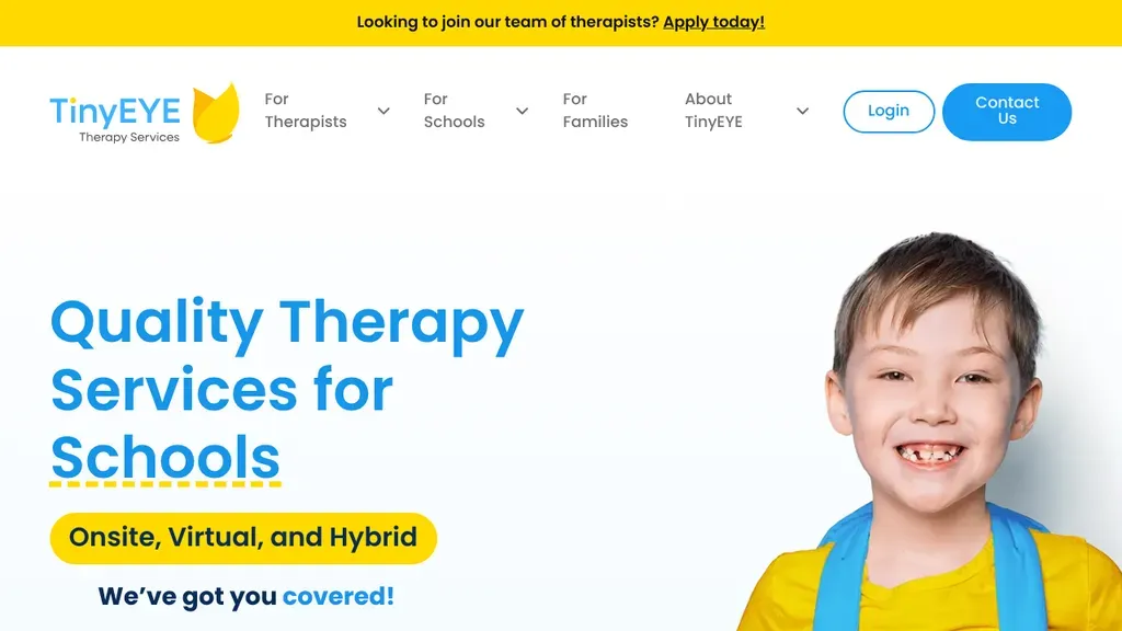
The menu has a path for each audience (therapists, schools, families), and the hero promises onsite, virtual and hybrid service.
Therapists
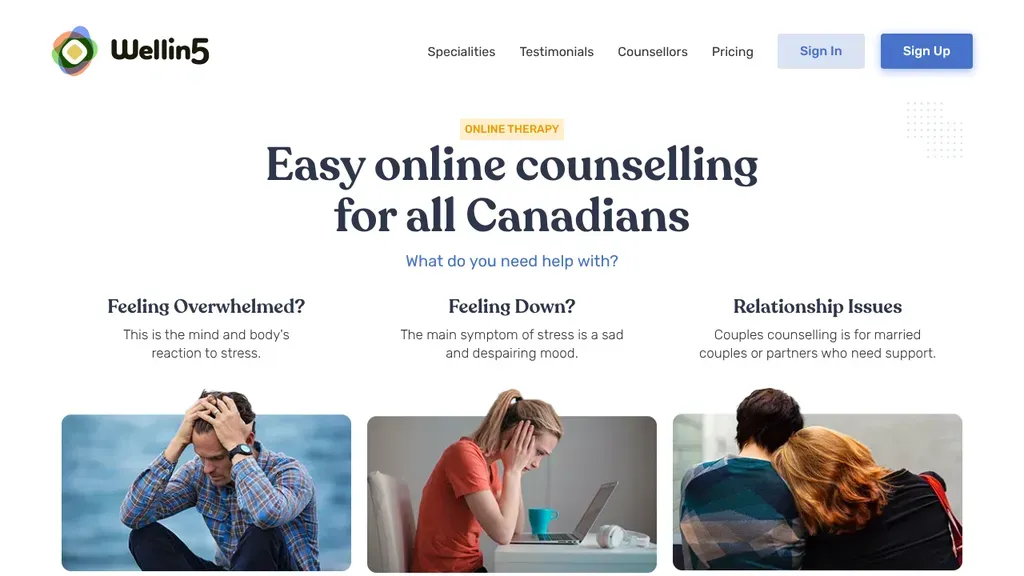
The hero asks "What do you need help with?" and answers with three photo cards: overwhelmed, down, relationship issues.
Therapists
No websites match, try a different search or industry.
Your headline should name what the visitor is feeling, not your modality. "Anxiety keeping you up at night?" beats "Integrative CBT-informed psychotherapy" every time. Speak human first, clinician second.
Nobody wants to commit to months of therapy from a homepage. Offer a free 15-minute consultation or a simple matching quiz, and repeat that soft ask throughout the page.
Nobody wants to guess what therapy costs. List session rates, accepted insurance, and sliding-scale options on a visible page. Vagueness reads as expensive and drives people away.
Clients choose a person, not a practice. A warm, professional photo plus a bio written in plain first person builds more trust than any list of acronyms after your name.
Want a website like these? See our therapists web design services →