Publish thinking, not brochures
Clients hire consultants for judgment, so show yours before the first call. A few genuinely useful articles or reports on your niche outsell ten pages of vague capability statements.

These are our favorite websites built for consultants.

13+ years building legendary SMB websites
Nobody hires a consultant off a pretty homepage. Visitors land on your site asking one question: does this firm actually understand my problem? A great consulting website answers fast, with a sharp statement of who you help, proof you've solved this exact problem before, and thinking that demonstrates expertise instead of just claiming it. The mediocre ones drown in vague promises about "driving transformation" and hope a stock photo of a handshake closes the deal.
This collection pulls together 33 consulting sites, from 9 Points and Graytitude to Pontem Sales. You don't need a giant firm's budget to look sharp online. What you can take is the playbook: how a good consulting site explains who it helps, shows its proof, and turns its thinking into a reason to come back. Steal the layout logic, the copy patterns and the trust signals. Leave the pixels alone.
 Built by us
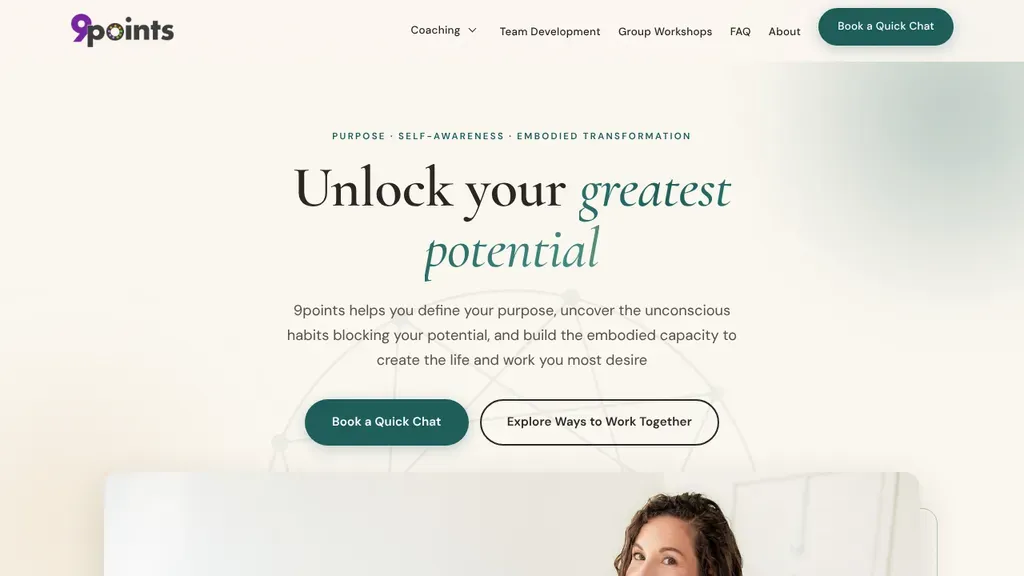
 Two clear choices under the headline: book a quick chat, or explore ways to work together.
Consultants
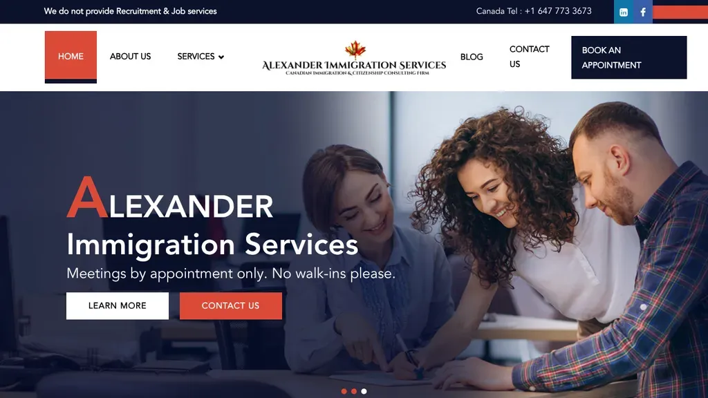
Sets expectations right in the hero with "Meetings by appointment only. No walk-ins please," paired with a contact button and a photo of a consultant helping a couple.
Consultants · Toronto
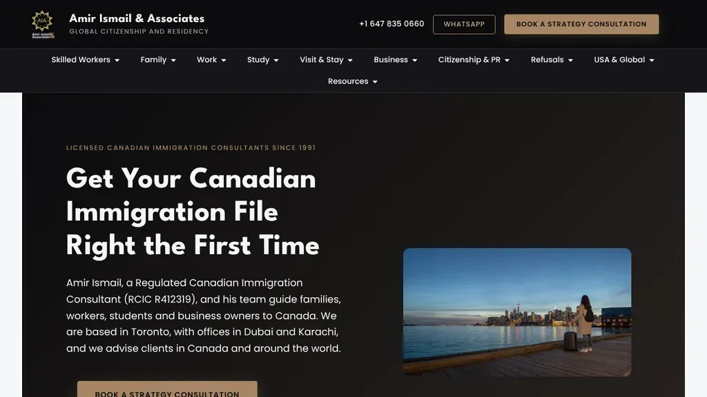
"Get your Canadian immigration file right the first time" speaks to a real fear, and the intro shows the consultant's licence number, with a gold strategy consultation button in the header.
Consultants · Toronto
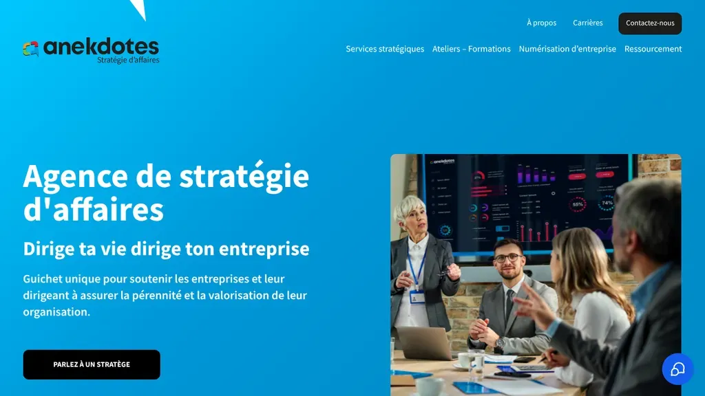
A bright blue hero with a meeting photo states the agency's purpose in French, "Dirige ta vie dirige ton entreprise", with one black button to talk to a strategist.
Consultants · Montreal
 Built by us
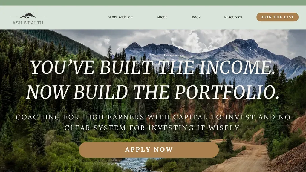
 The headline speaks to one audience, high earners with no system for investing, and the single button says Apply Now.
Consultants
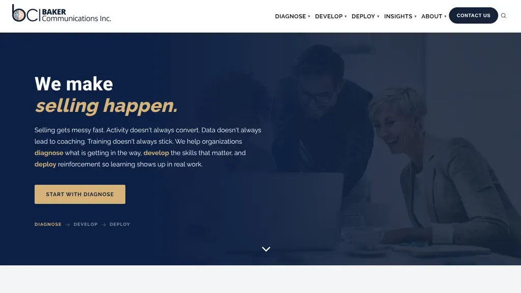
The italic gold "selling happen" headline over a muted office photo sums up the offer, and a Diagnose, Develop, Deploy path under the button explains the process.
Consultants · Houston
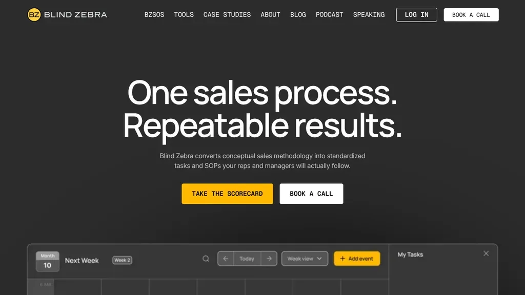
"One sales process. Repeatable results." sits over a preview of the task planner the method produces, with a yellow scorecard button beside Book a Call.
Consultants · Indianapolis
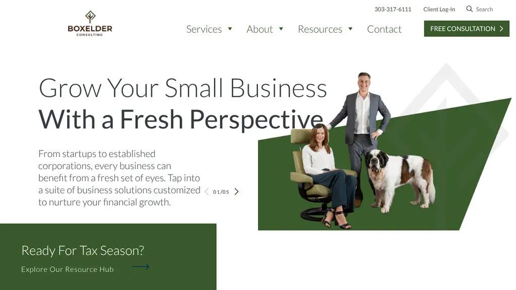
Cut-out photos of the team and a St. Bernard on a green shape give the small business pitch some personality, with a free consultation button in the header.
Consultants · Denver
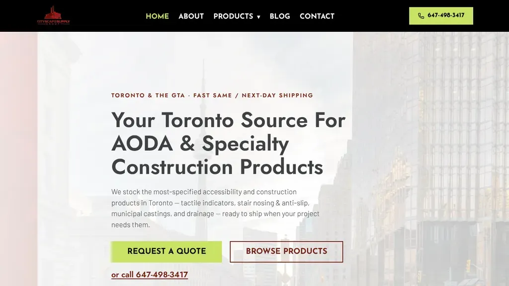 Built by us
 The hero promises same or next-day shipping across Toronto, then offers a quote, the product catalog or a phone call.
Consultants · Toronto
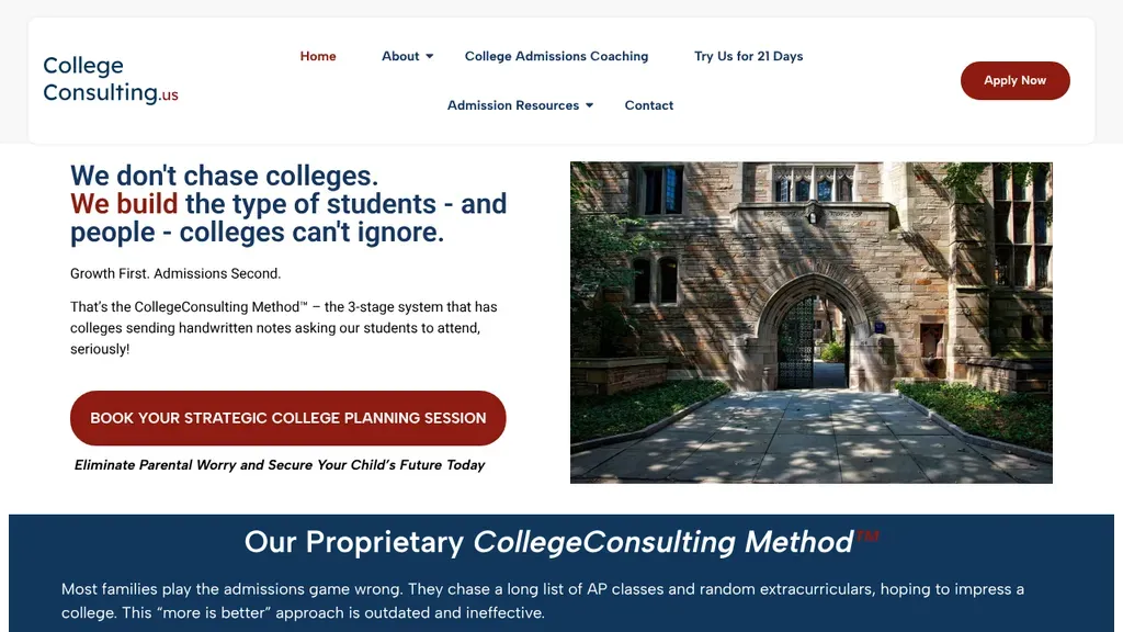
Opens with a contrarian line, "We don't chase colleges," then a single red button to book a strategic college planning session next to a campus archway photo.
Consultants · Denver
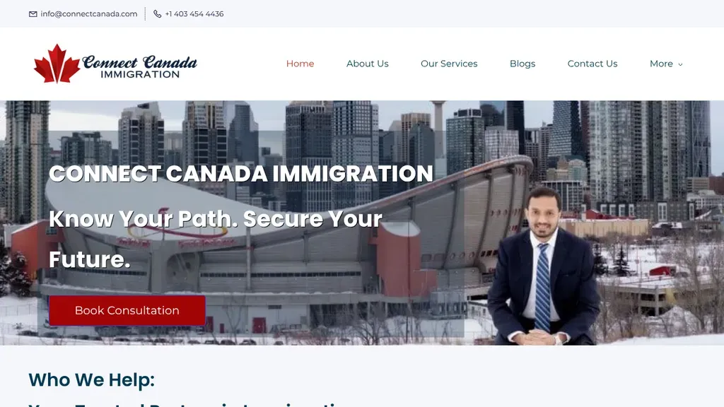
The consultant stands in front of the Calgary skyline beside a "Know Your Path. Secure Your Future." promise, with a red Book Consultation button right below.
Consultants · Calgary
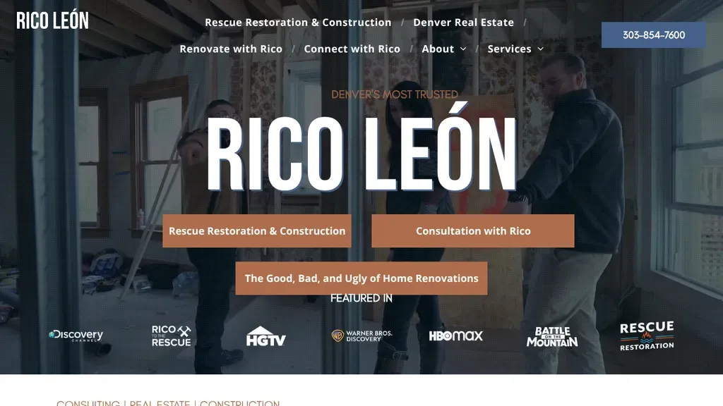
Rico León's name fills the hero in huge type over a job site, above buttons for restoration, consultation and renovation tips and a "Featured In" row of TV logos.
Consultants · Denver
 Built by us
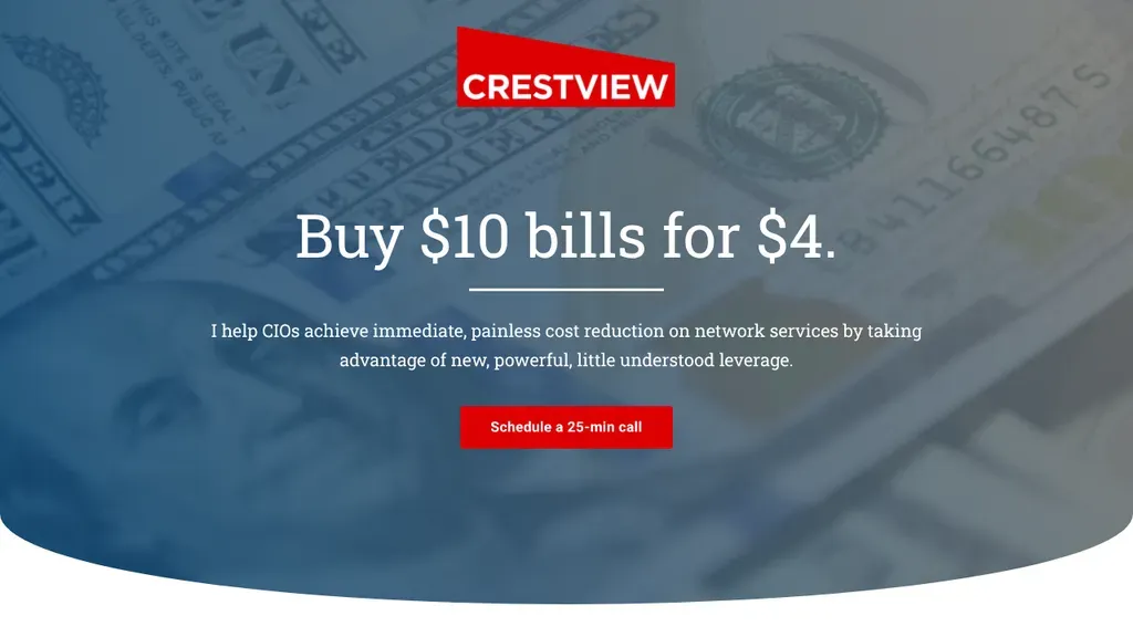
 A hook of a headline, "Buy $10 bills for $4," and one next step: schedule a 25-minute call.
Consultants
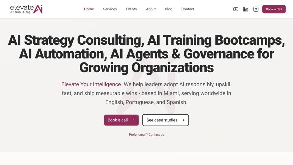
An all-type hero lists every AI service in the headline, then notes it is based in Miami and works in three languages before Book a Call and case study buttons.
Consultants · Miami
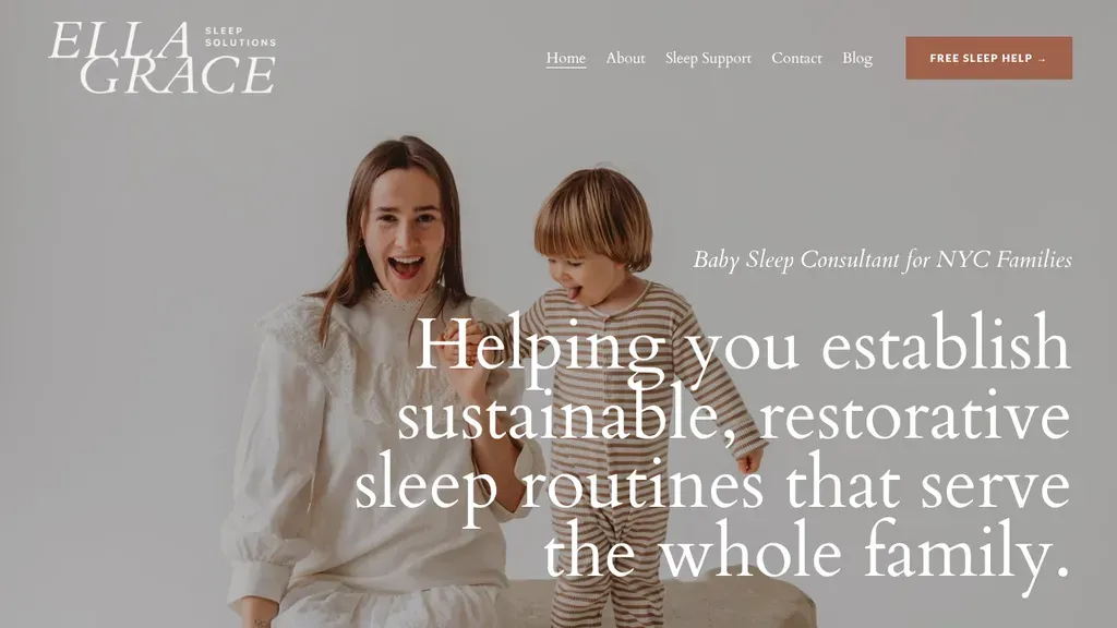
A laughing mother and toddler fill the frame, so tired NYC parents see the outcome first, with a free sleep help button tucked in the header.
Consultants · New York City
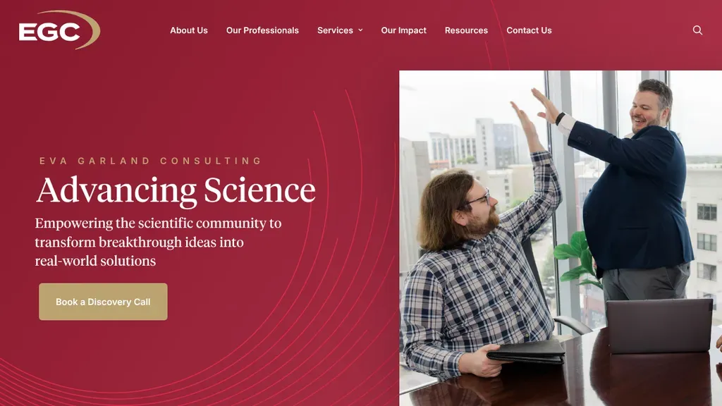
A deep red panel with "Advancing Science" and a gold discovery call button states the niche, grant funding for researchers, beside a photo of two colleagues celebrating.
Consultants · Raleigh
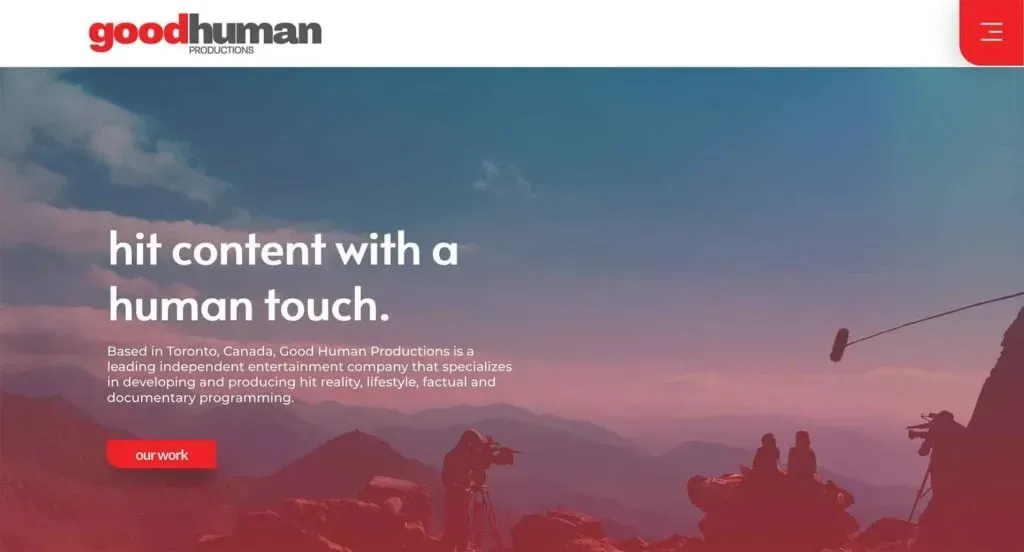 Built by us
 A Toronto TV production company. Their site is offline for now, so this card opens our case study.
Consultants See the case study →
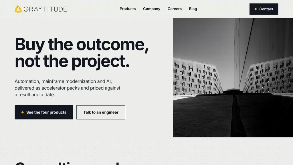
A contrarian headline, "Buy the outcome, not the project," backed by packages priced against a result and a date.
Consultants
 Built by us
 A drone inspection company in Calgary. Their site is offline now, so this card opens our case study.
Consultants See the case study →
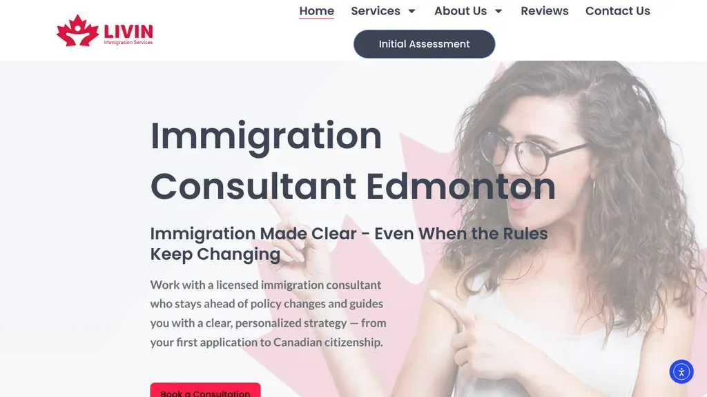
A soft pink hero with a woman pointing at the headline promises immigration "made clear" even as rules change, with an Initial Assessment button in the header.
Consultants · Calgary
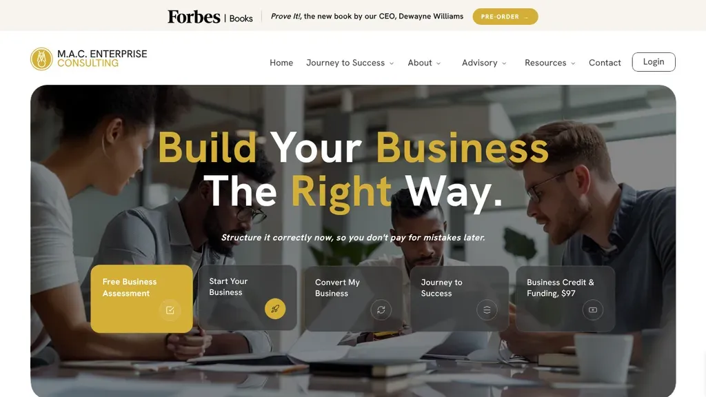
"Build Your Business The Right Way" sits over a team photo, and a row of tiles lets founders pick a path, from a free business assessment to converting a company.
Consultants · Houston
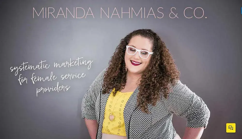
The name and a handwritten promise, "make your business easy + fun with systems," sit over a friendly portrait.
Consultants
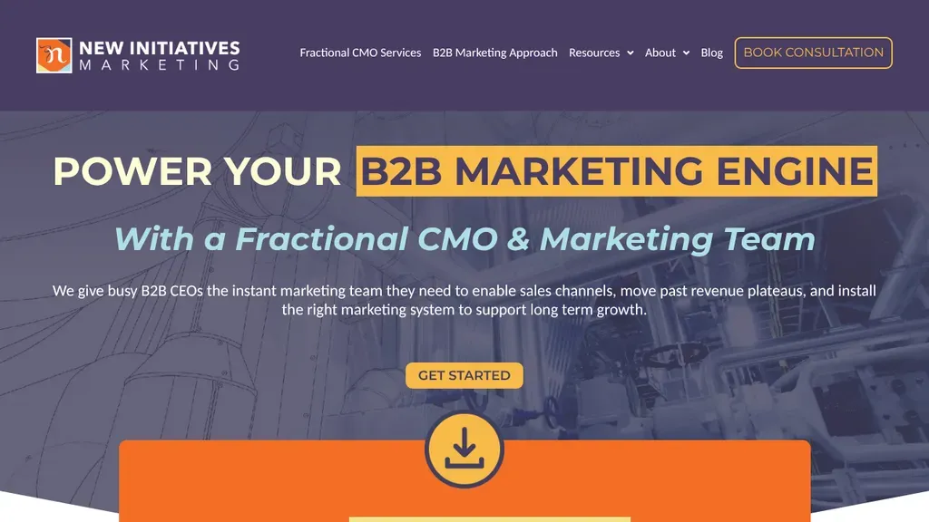
Speaks straight to B2B CEOs with "Power Your B2B Marketing Engine" highlighted in yellow, and names the offer, a fractional CMO and team, right below it.
Consultants · Toronto
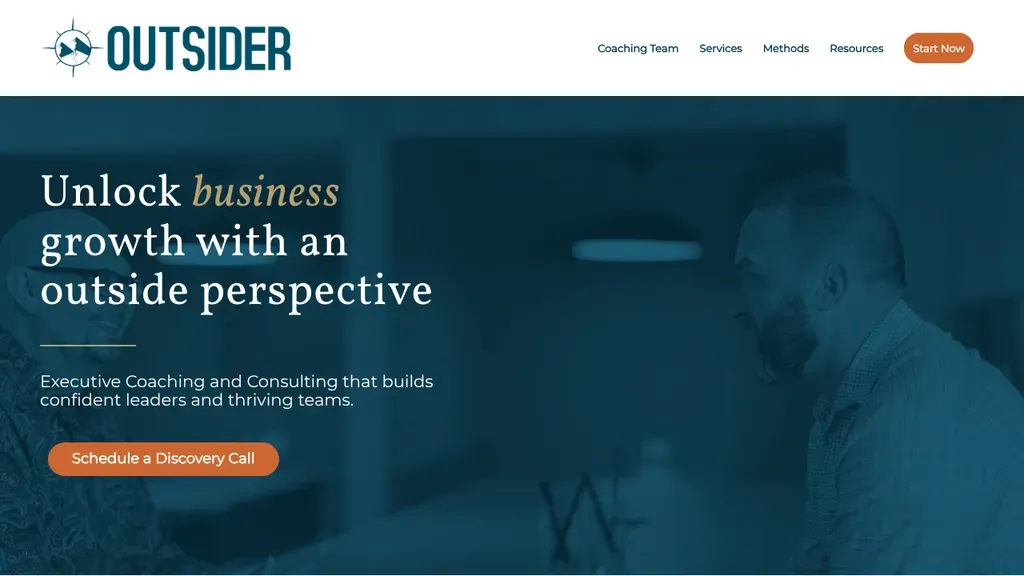
The firm name becomes the pitch, "Unlock business growth with an outside perspective", set in a calm serif over deep blue with an orange discovery call button.
Consultants · Scottsdale
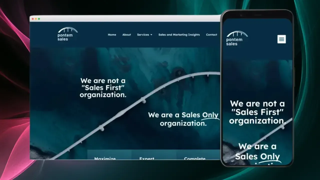 Built by us
 A Toronto sales and marketing consultancy. Their site is offline for now, so this card opens our case study.
Consultants See the case study →
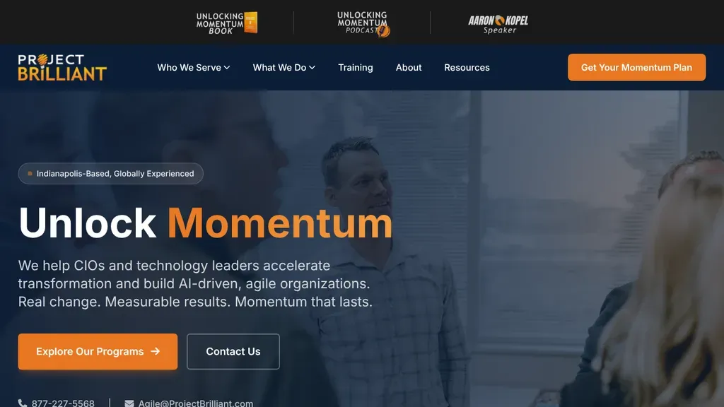
"Unlock Momentum" with the second word in orange speaks to CIOs, and a small "Indianapolis-Based, Globally Experienced" badge above it handles the where.
Consultants · Indianapolis
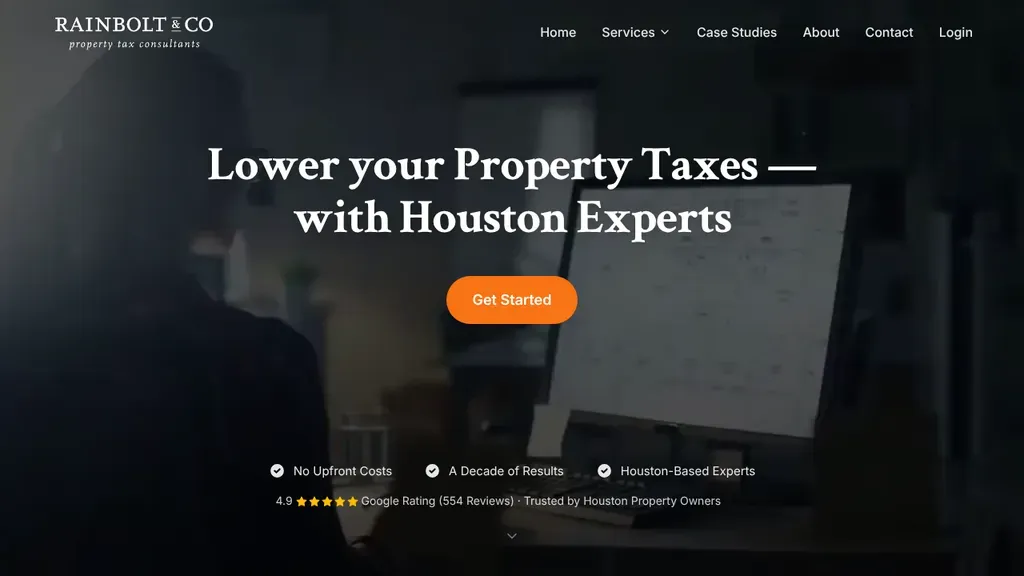
One promise about lowering Houston property taxes, one orange Get Started button, and a row of trust points with the Google rating underneath keep the dark hero focused.
Consultants · Houston
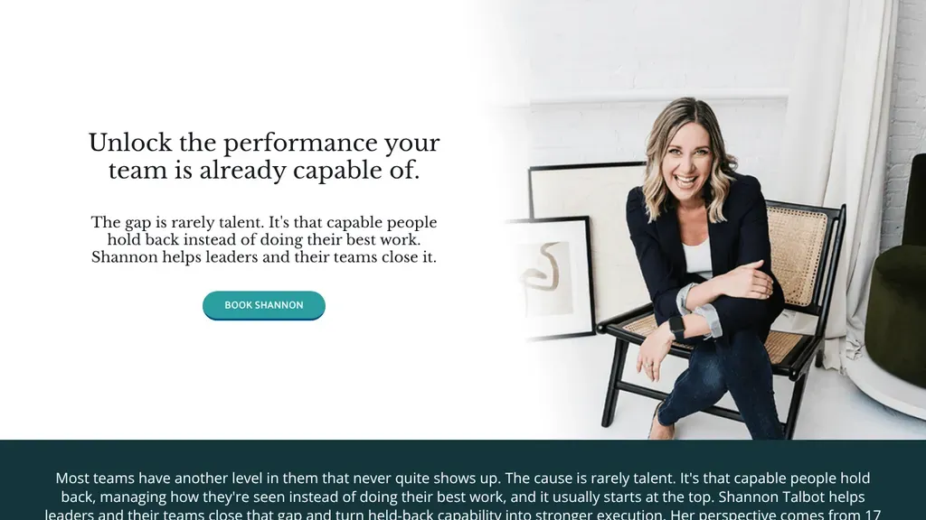 Built by us
 The headline speaks to the buyer's problem, untapped team performance, with a single Book Shannon button.
Consultants
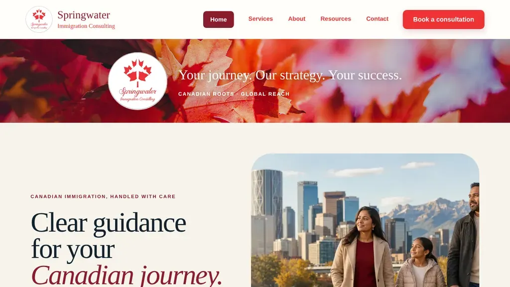
Red maple leaves and a family walking with the Calgary skyline and Rockies behind them set a local, hopeful tone, with Book a consultation in bright red.
Consultants · Calgary
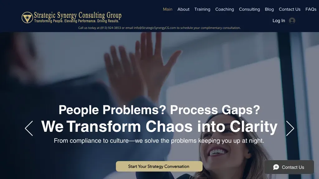
Two blunt questions, "People Problems? Process Gaps?", lead into the promise of turning chaos into clarity, with a gold button to start a strategy conversation.
Consultants · Tampa
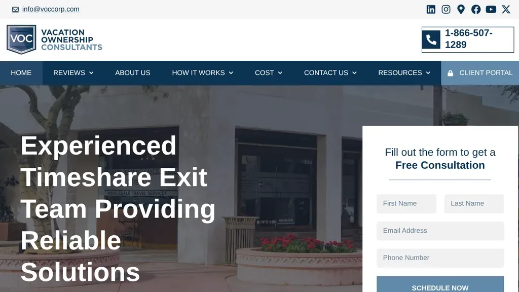
Owns one niche, getting out of timeshares, and puts a free consultation form right beside the large headline with the toll-free number boxed above.
Consultants · Scottsdale
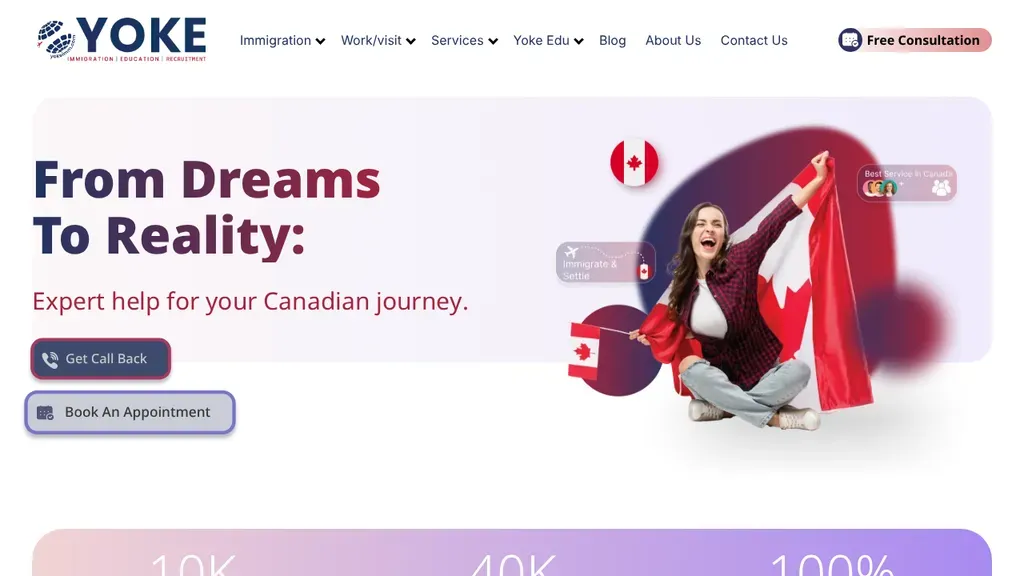
A woman wrapped in a Canadian flag beside "From Dreams To Reality:" sets the immigration theme, with Get Call Back and Book An Appointment buttons below.
Consultants · Toronto
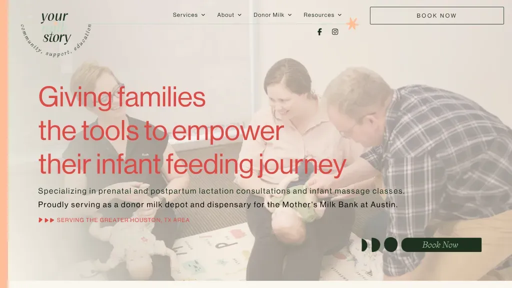
A warm family photo frames the infant feeding promise, and the copy spells out prenatal and postpartum consults plus its donor milk depot before a Book Now button.
Consultants · Houston
No websites match, try a different search or industry.
Clients hire consultants for judgment, so show yours before the first call. A few genuinely useful articles or reports on your niche outsell ten pages of vague capability statements.
"Helped a client grow" convinces nobody. Structure every engagement story as problem, approach, measurable result. Even anonymized clients with concrete outcomes beat named logos with fluffy praise.
"Strategy consulting for everyone" reads as expertise in nothing. Your hero section should say exactly who you serve and what problem you fix, so the right prospect self-selects in seconds.
Clients buy the consultant, not the firm. Real photos, specific bios and credentials that matter to your niche build more trust than any abstract graphic of connected dots ever will.
Want a website like these? See our consultants web design services →