Online booking front and center
Let patients book at 9pm on a Sunday, when your front desk is asleep. A book-appointment button in the header and hero captures them on the spot instead of losing them to a voicemail.
These are our favorite websites built for dentists.

13+ years building legendary SMB websites
Nobody browses dentist websites for fun. Your visitors show up with a toothache, a nervous kid, or a nagging question about cost, and they want three things fast: can I book an appointment, do you take my insurance, and will this hurt my wallet. The great dental sites answer all three above the fold. The mediocre ones bury booking behind a contact form and hope you'll call during office hours.
These 69 sites earned their spot by making it stupidly easy to become a patient. Study how they place their booking buttons, how they talk about insurance and financing, and how they use real smiles and real reviews to calm nervous visitors. Then steal the ideas, not the pixels. Borrow the structure and the trust signals, and pour your own practice's personality into them.
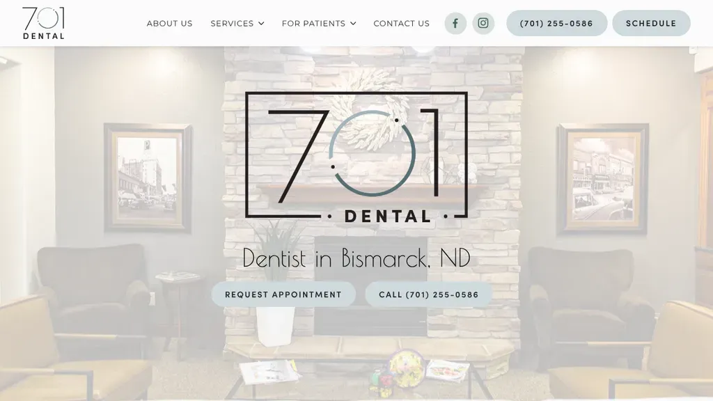
A framed area-code logo sits over a softened photo of the stone-walled lobby, with "Dentist in Bismarck, ND" and request and call buttons centered beneath.
Dentists · Bismarck
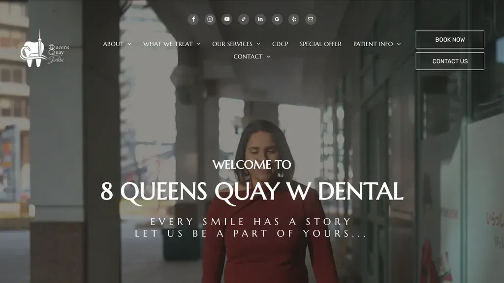
A patient walking down a softly lit hallway fills the hero, with the street-address practice name centered in large serif type and Book Now and Contact Us in the corner.
Dentists · Toronto
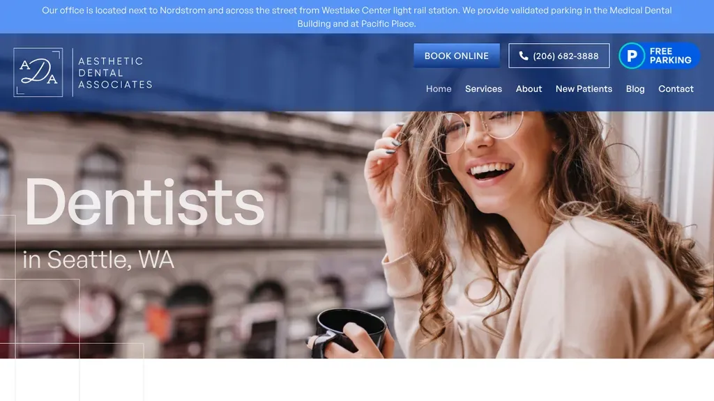
Big "Dentists in Seattle, WA" type sits over a laughing woman with coffee, and a free parking badge beside the booking and phone buttons answers a downtown worry upfront.
Dentists · Seattle
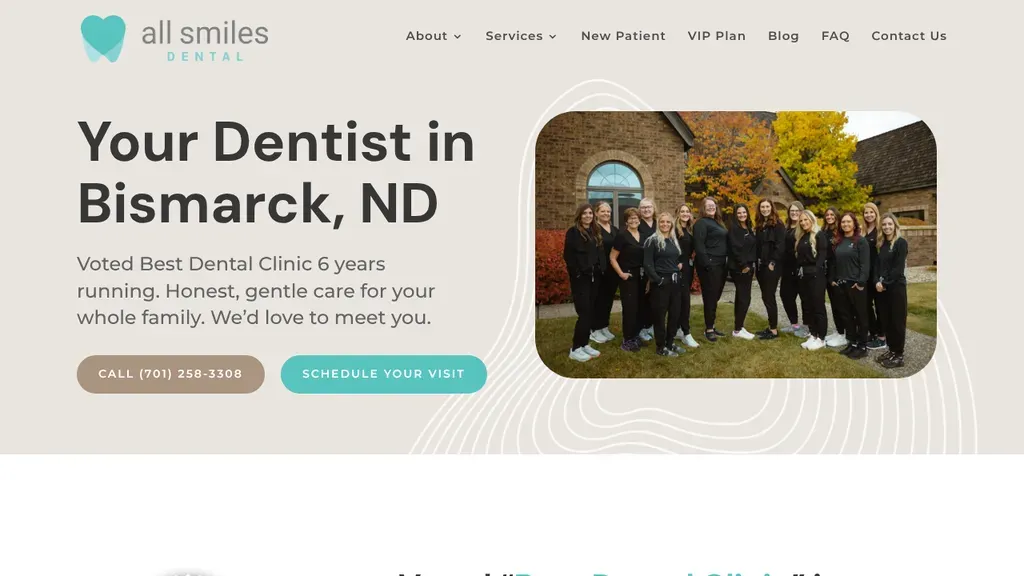
The whole staff stands outside the clinic in a rounded photo beside "Your Dentist in Bismarck, ND", a local award line and two soft pill buttons.
Dentists · Bismarck
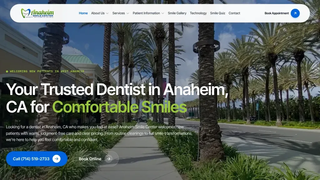
A palm-lined Anaheim street sets the local scene, with "Comfortable Smiles" in lime green and a solid call button next to Book Online.
Dentists · Anaheim
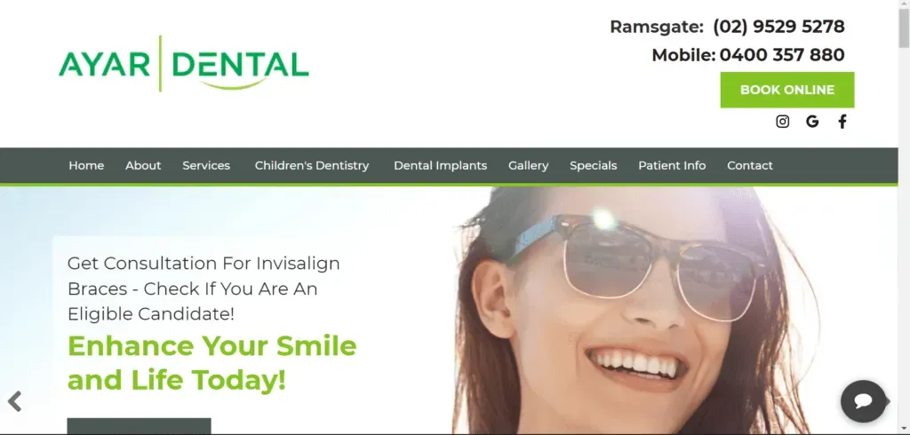
Email, phone and a text-only number sit in the top bar, and Book Online closes out the menu.
Dentists
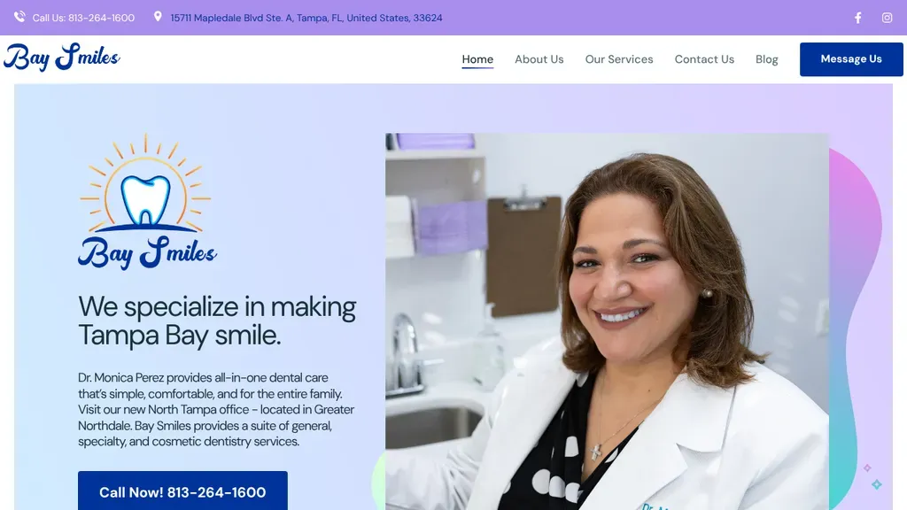
Puts Dr. Monica Perez's portrait front and center beside "We specialize in making Tampa Bay smile", with a dark blue call button showing the phone number.
Dentists · Tampa
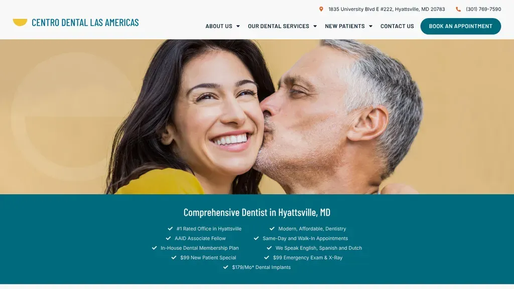
Under a tender couple photo, a teal band lists checkmarked reasons to visit, from walk-in appointments and an in-house plan to languages spoken and new patient pricing.
Dentists · Washington DC
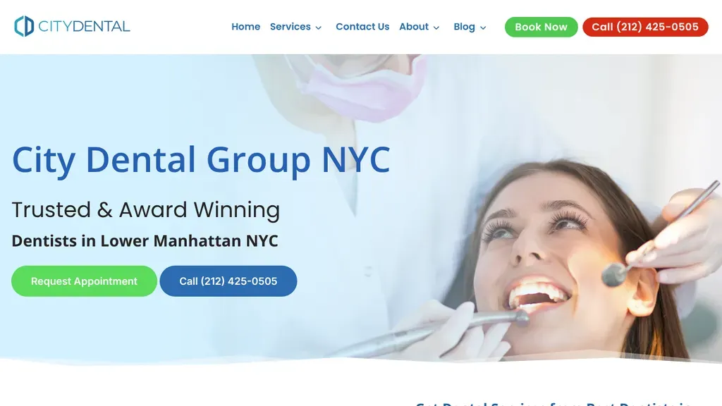
Names its neighborhood, Lower Manhattan, right in the headline and pairs a green Request Appointment button with a blue call button over a bright chairside photo.
Dentists · New York City
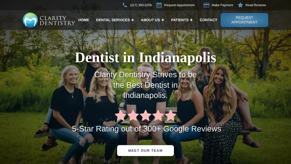
The whole team posing outdoors backs the headline "Dentist in Indianapolis", with large pink stars and a Google review count right under it.
Dentists · Indianapolis
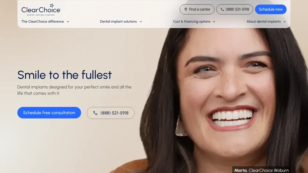
Find a Center, the phone number and Schedule Now are grouped in the header, and the hero offers a free consultation.
Dentists
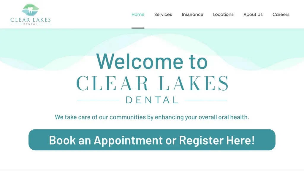
Insurance gets its own top-level menu item, and one big button handles both booking and new-patient registration.
Dentists
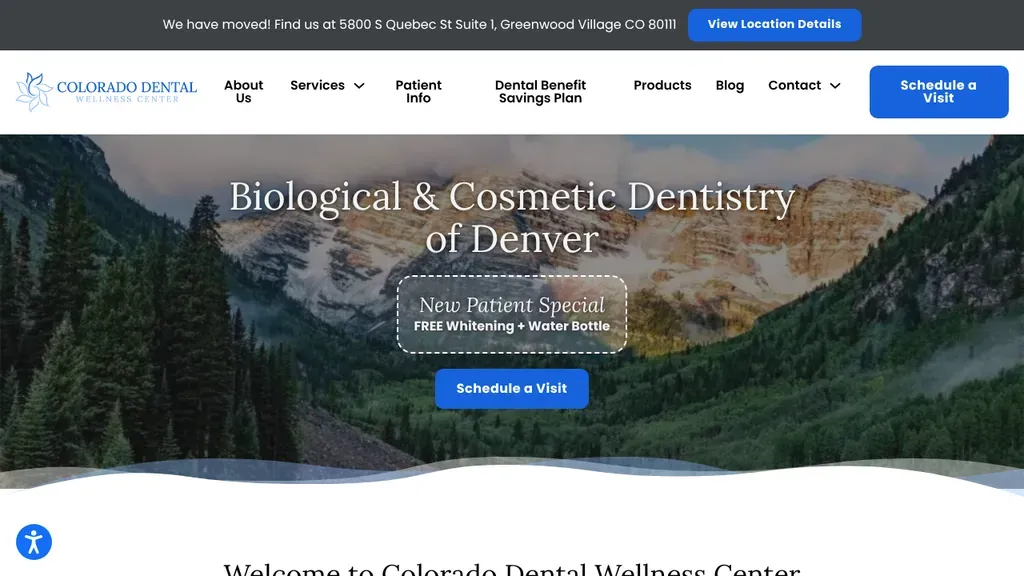
A Rocky Mountain landscape frames a niche headline, biological and cosmetic dentistry, with a new patient whitening offer in a dashed badge above the button.
Dentists · Denver
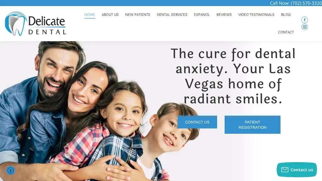
Speaks straight to nervous patients with "The cure for dental anxiety" in a light serif headline, next to a smiling family photo and two clear buttons.
Dentists · Las Vegas
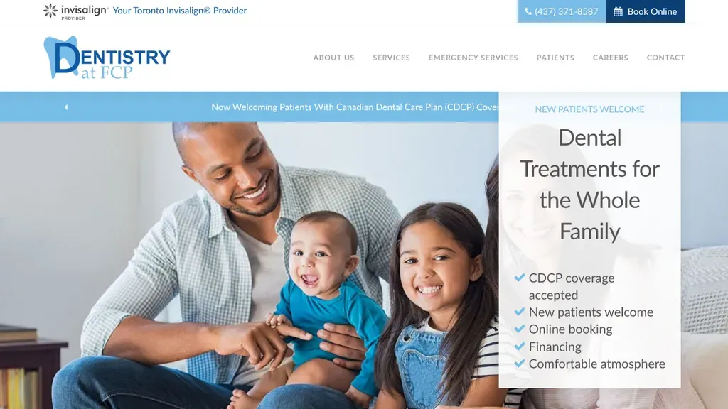
A checklist beside the hero answers the big questions at once: coverage accepted, new patients welcome, online booking, financing.
Dentists
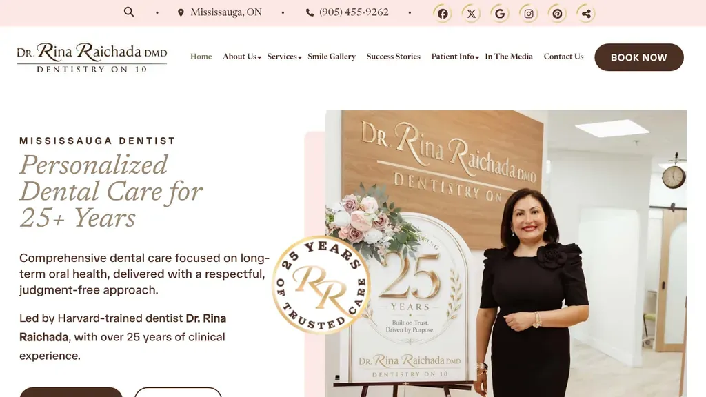
Dr. Rina Raichada stands beside her 25-year anniversary sign, which backs up the "Personalized Dental Care for 25+ Years" headline and a short bio line.
Dentists · Toronto
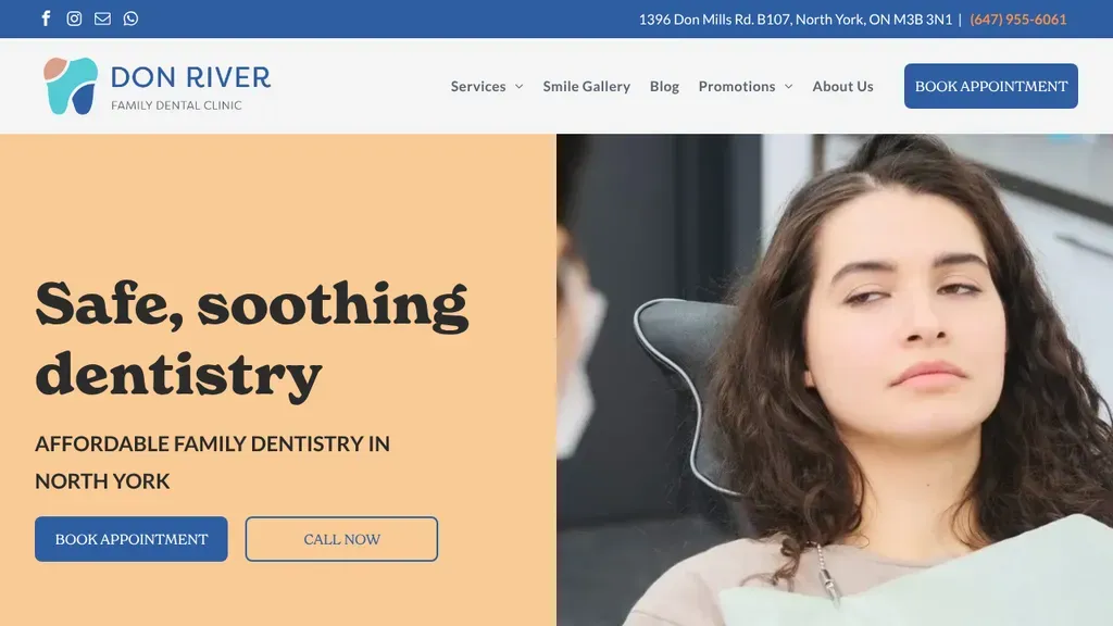
"Safe, soothing dentistry" sits on a warm peach panel aimed at anxious patients, with the North York location and book or call buttons right below.
Dentists · Toronto
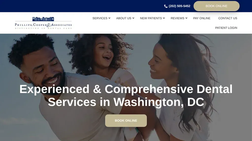
A joyful family photo backs a centered headline naming comprehensive dental services in Washington, DC, with one tan Book Online button below.
Dentists · Washington DC
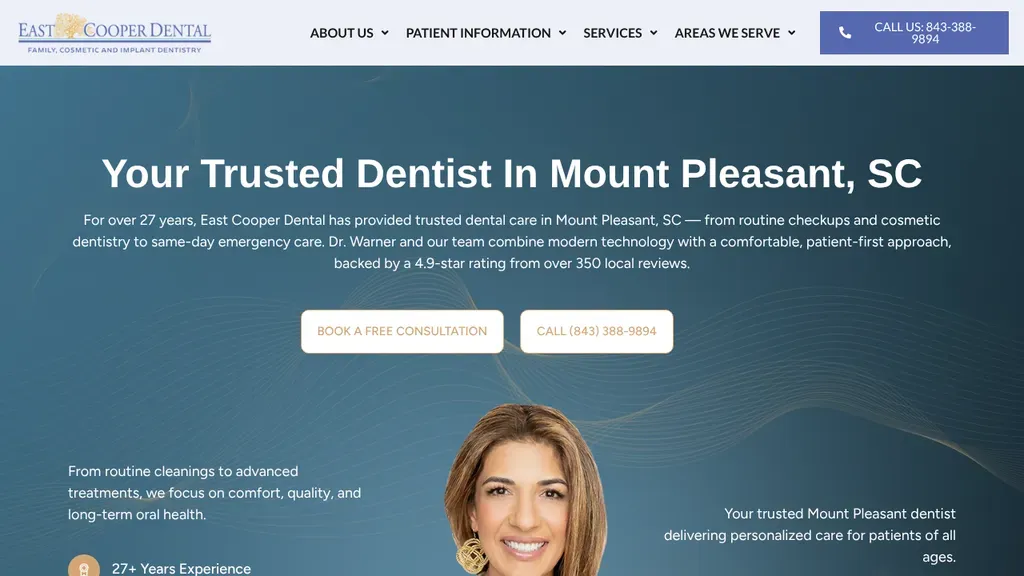
Opens with a centered Mount Pleasant headline and a short paragraph citing years in practice and review rating, then offers a free consultation button.
Dentists · Charleston
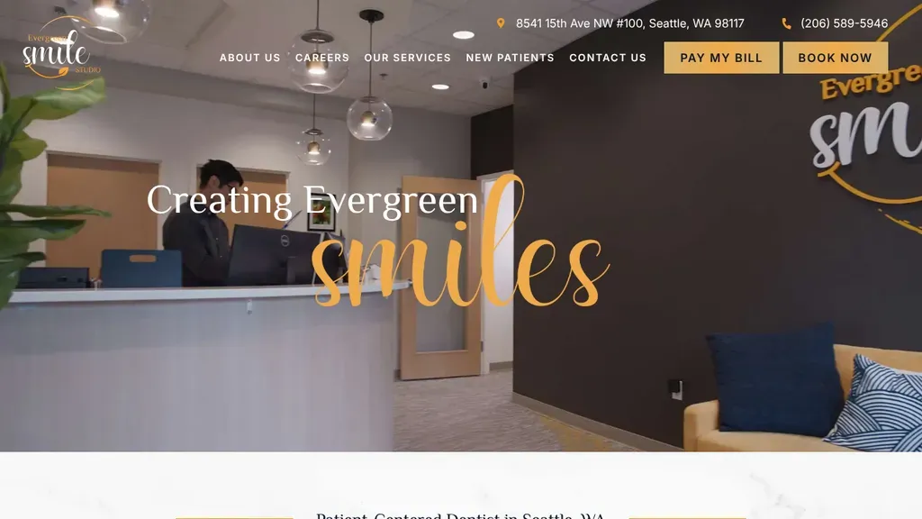
The actual front desk sets the scene behind a gold script "smiles", and Pay My Bill and Book Now buttons sit beside the address in the header.
Dentists · Seattle
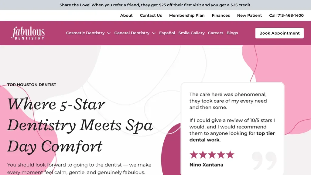
The italic headline pitches spa-day comfort, and a five-star patient quote card sits right beside it, framed by soft pink shapes that match the brand.
Dentists · Houston
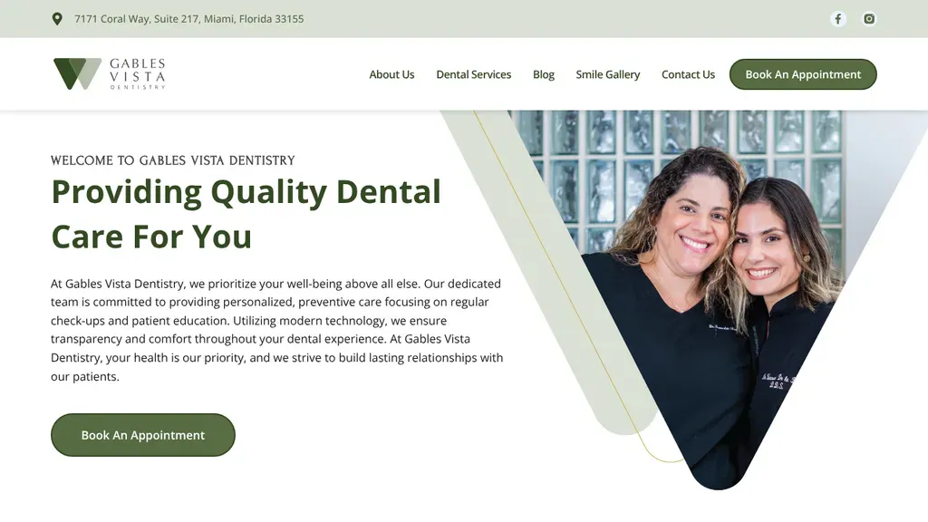
Two smiling team members appear inside a bold V shape echoing the logo, beside a clear "Providing Quality Dental Care For You" headline and one green booking button.
Dentists · Miami
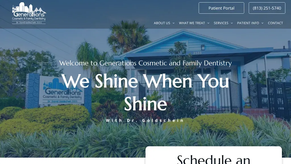
The palm-lined office building with its own sign sits behind "We Shine When You Shine", and a schedule card rises from the bottom of the screen.
Dentists · Tampa
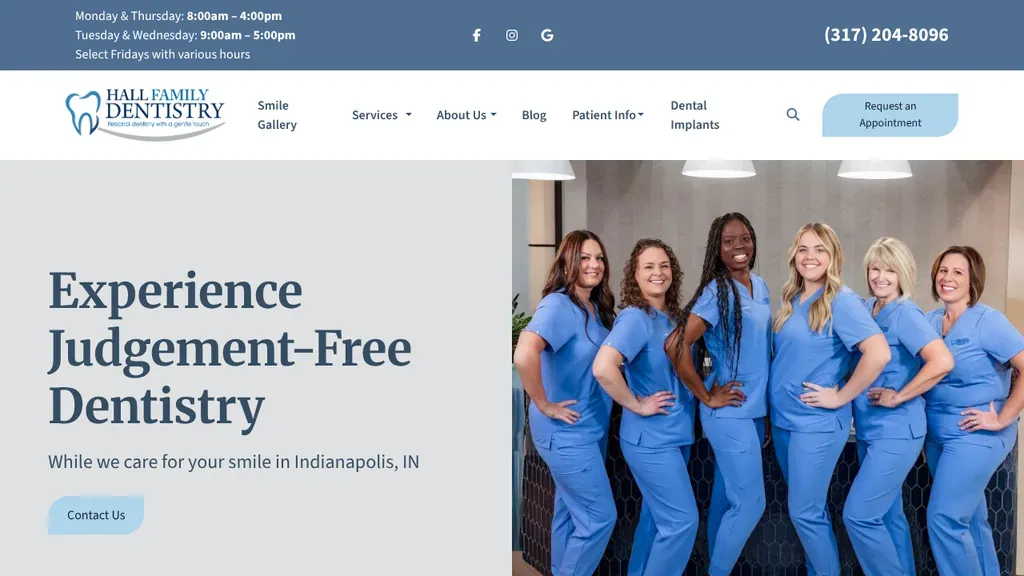
"Experience Judgement-Free Dentistry" speaks straight to nervous patients, next to a bright photo of six team members in matching blue scrubs, with Indianapolis named just below.
Dentists · Indianapolis
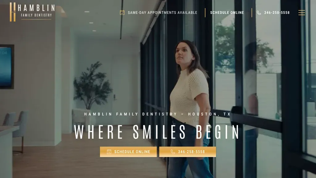
A woman walking through the sunlit office gives a calm, real feel, and "Where Smiles Begin" sits above matching gold schedule and phone buttons.
Dentists · Houston
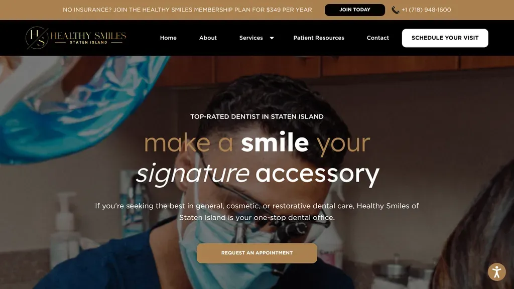
Playful mixed type, "make a smile your signature accessory", sits over a chairside photo, while a top bar pitches an in-house membership plan for patients without insurance.
Dentists · New York City
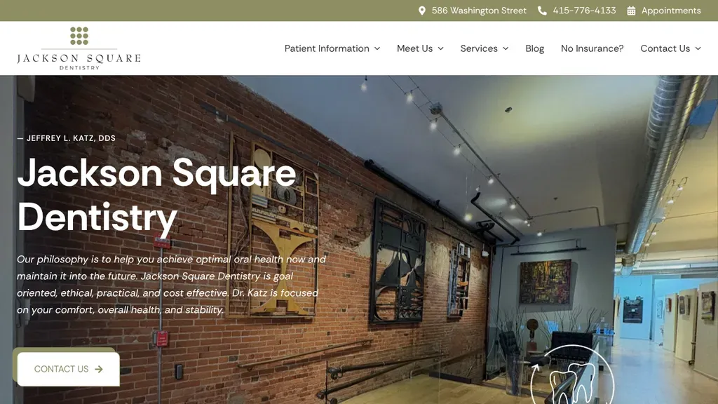
An exposed brick interior with track lighting fills the hero, with Dr. Jeffrey L. Katz credited above the headline and a short philosophy statement over a contact button.
Dentists · San Francisco
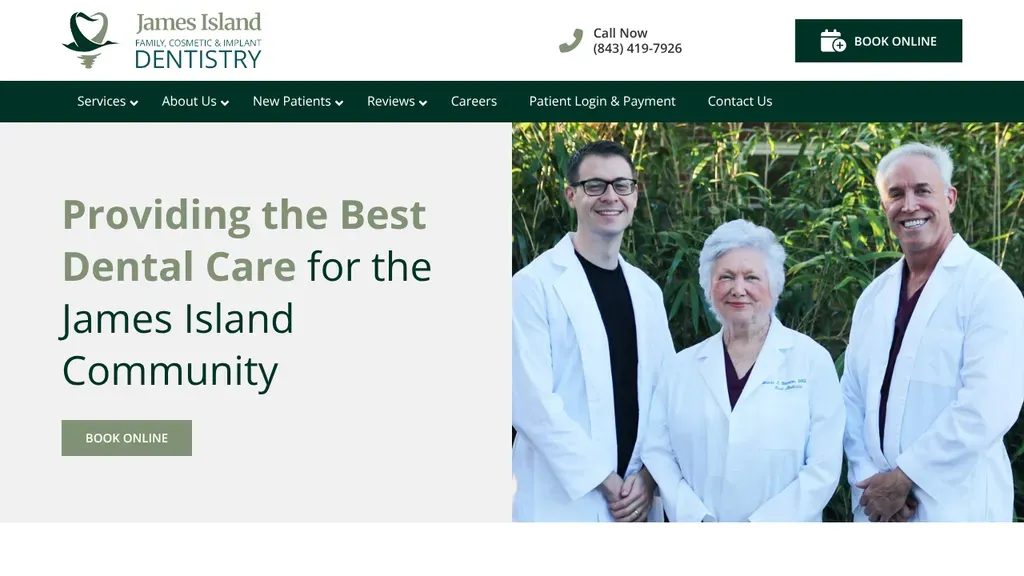
The three dentists pose together outdoors beside "Providing the Best Dental Care for the James Island Community", with booking buttons in both the header and hero.
Dentists · Charleston
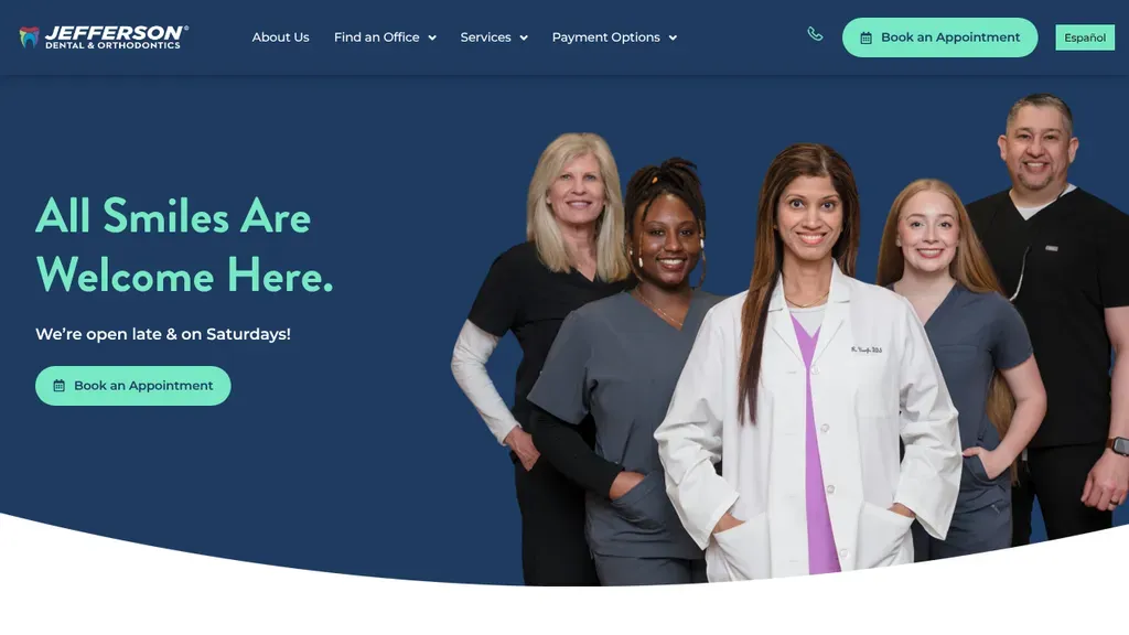
The hero answers the scheduling worry up front, "open late & on Saturdays," with Español and Book an Appointment in the header.
Dentists
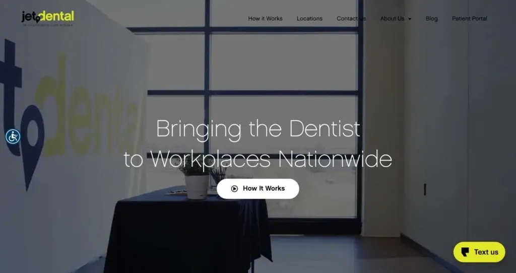
The headline explains a different model in a few words, "Bringing the Dentist to Workplaces Nationwide," with a How It Works button.
Dentists
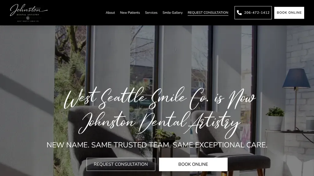
Uses the hero to announce a rebrand in flowing script, "West Seattle Smile Co. is Now Johnston Dental Artistry", so returning patients are not confused.
Dentists · Seattle
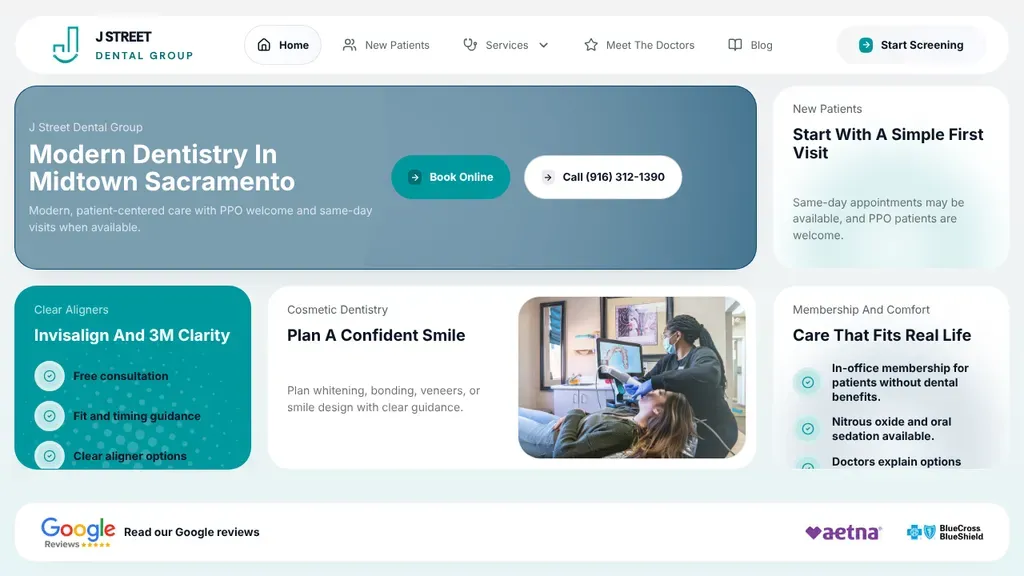
The homepage is a grid of answers: book online, call, first-visit info, and Google reviews with accepted insurers along the bottom.
Dentists
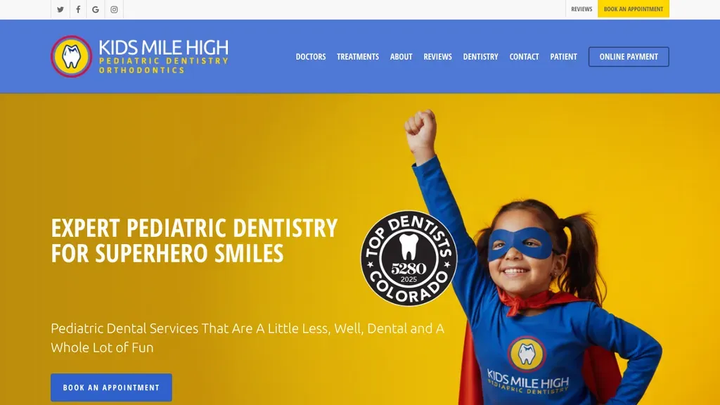
A little girl in a superhero mask and cape owns the bright yellow hero, matching the "Superhero Smiles" headline and a local award badge.
Dentists · Denver
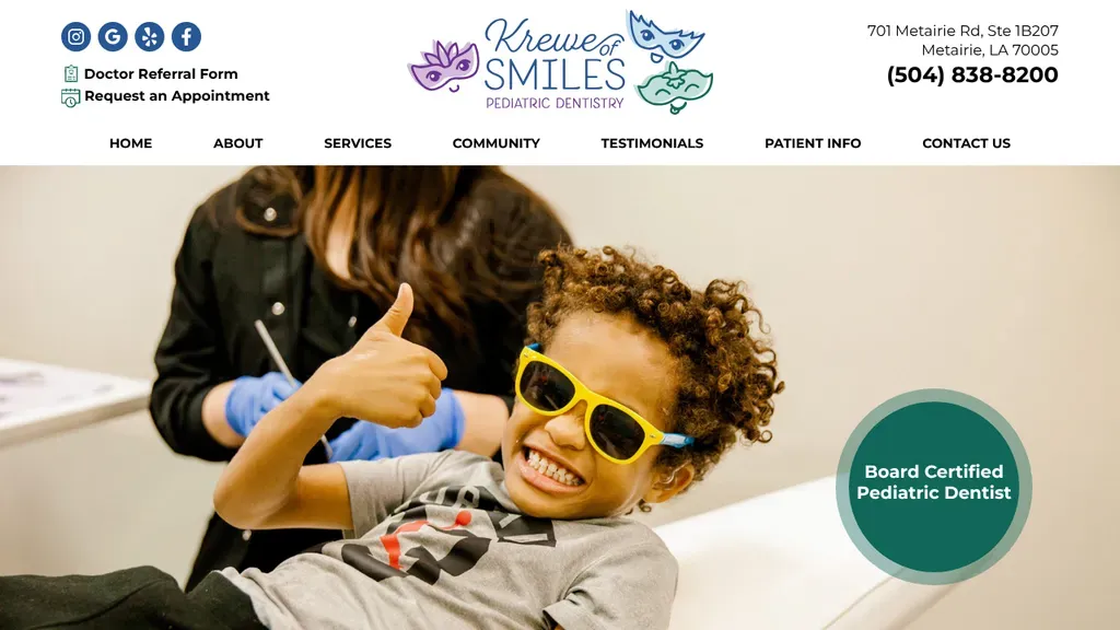
A kid in yellow sunglasses giving a thumbs up in the chair says pediatric dentistry instantly, with a Board Certified badge and phone number close by.
Dentists · New Orleans
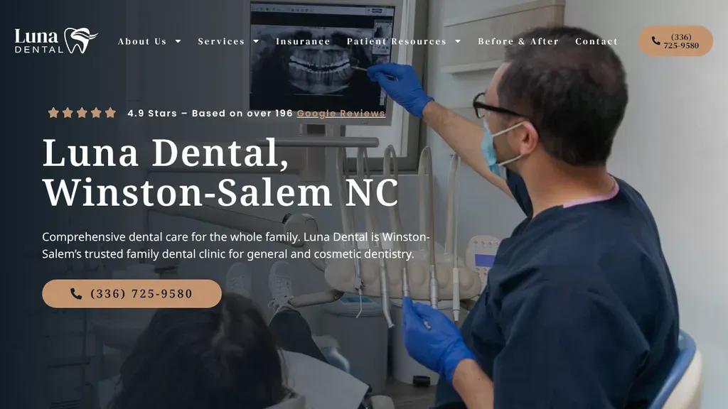
A dentist reviewing an X-ray sets a clinical but friendly tone, with a star rating line above the name and city and one tan call button.
Dentists · Winston-Salem
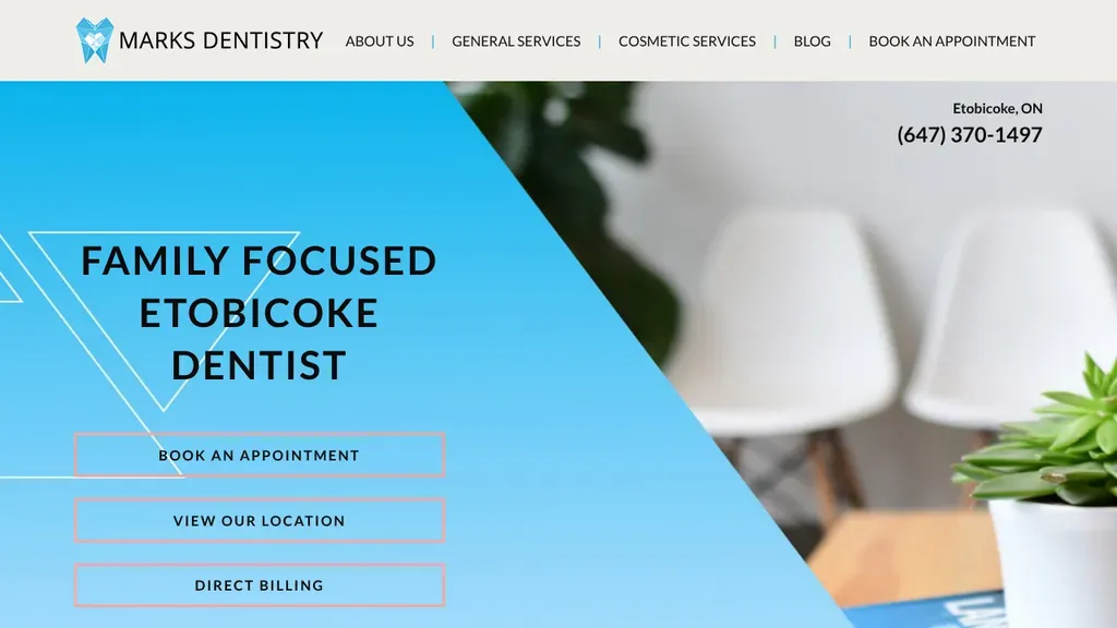
A bold blue triangle carries "Family Focused Etobicoke Dentist" and three outlined buttons for booking, directions and direct billing.
Dentists · Toronto
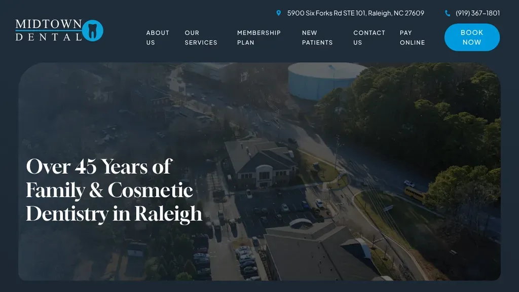
An aerial shot of the office building backs a serif headline about decades of family and cosmetic care in Raleigh, with a round Book Now button up top.
Dentists · Raleigh
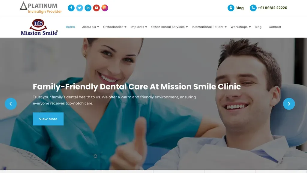
The phone number sits up top, and international patients get their own item in the main menu.
Dentists
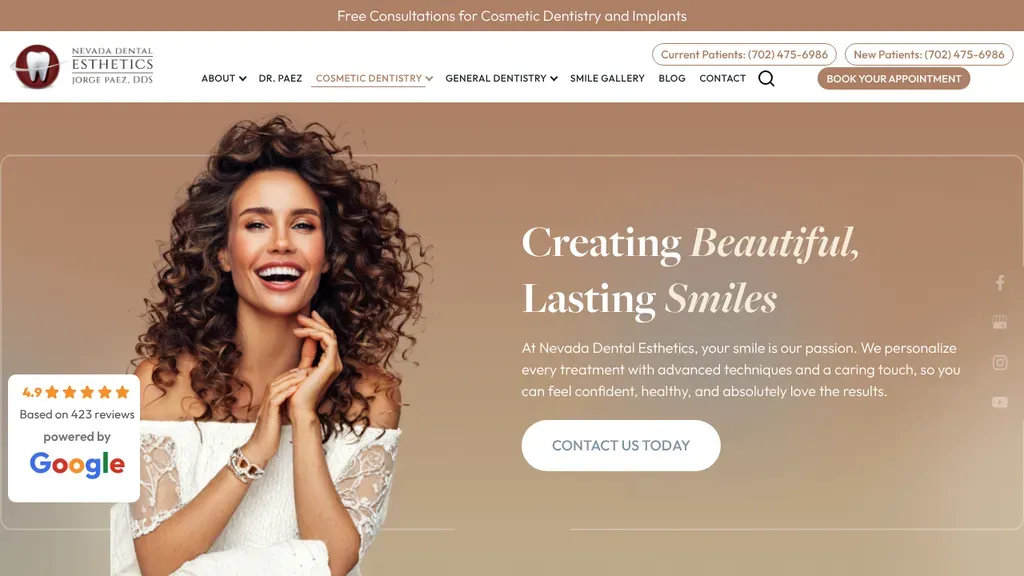
Warm rose tones frame a smiling model and "Creating Beautiful, Lasting Smiles", while a Google rating badge sits at the left edge and a free consultation strip runs above.
Dentists · Las Vegas
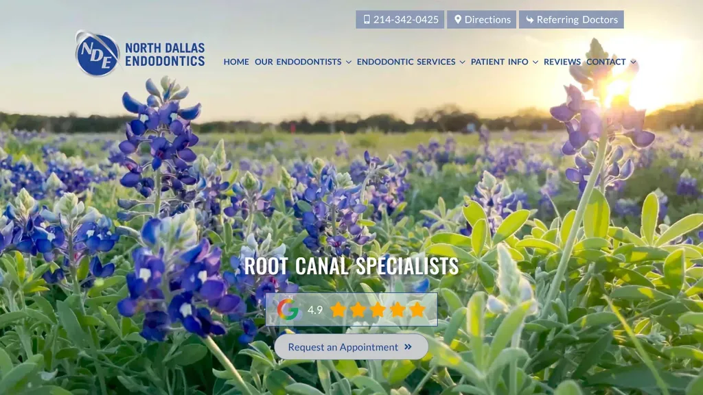
A field of Texas bluebonnets gives a root canal specialist an unexpectedly calm, local first impression, with a Google rating and appointment button centered below.
Dentists · Dallas
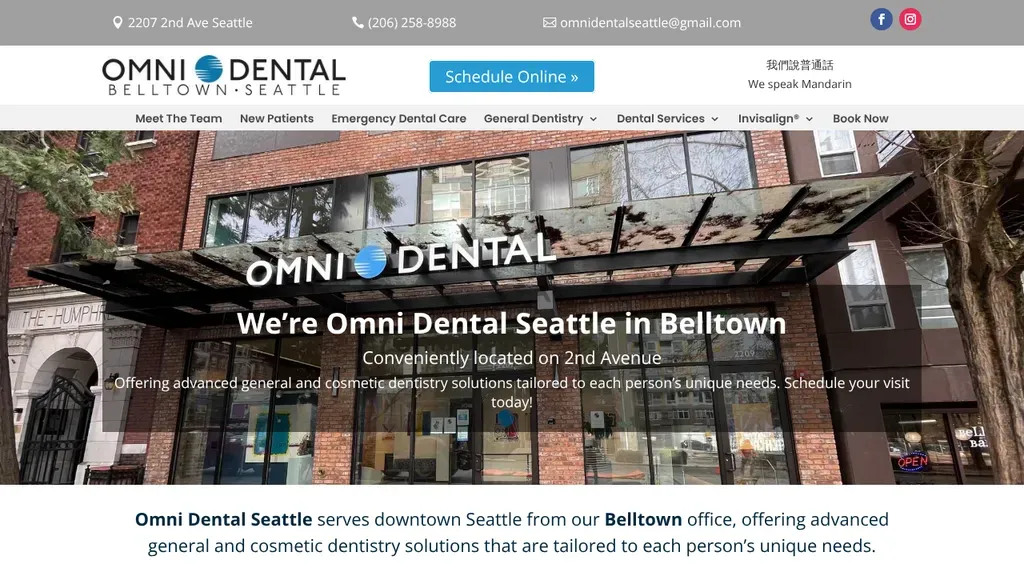
The real storefront on 2nd Avenue fills the hero, so visitors recognize the building, with a blue Schedule Online button and a Mandarin-speaking note in the header.
Dentists · Seattle
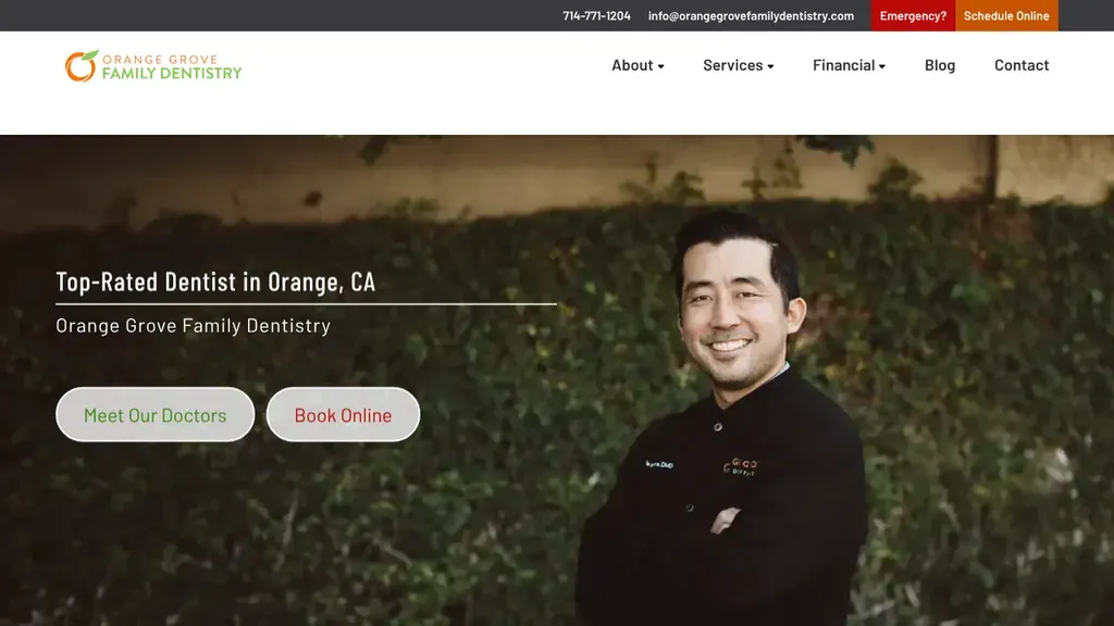
A relaxed portrait of the dentist against a green hedge sits beside "Top-Rated Dentist in Orange, CA" with Meet Our Doctors and Book Online buttons.
Dentists · Anaheim
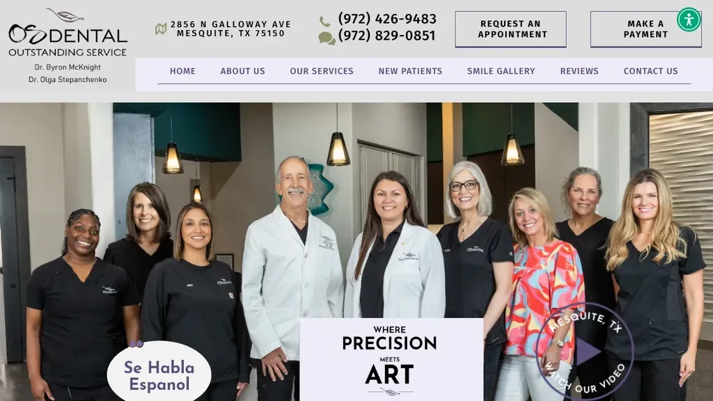
The full team lines up across the hero, with a "Where Precision Meets Art" card, a Se Habla Español badge and a play-video button.
Dentists · Dallas
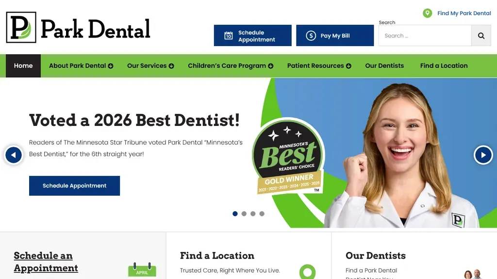
A readers' choice award leads the hero, with Schedule an Appointment, Find a Location and Our Dentists as cards right below.
Dentists
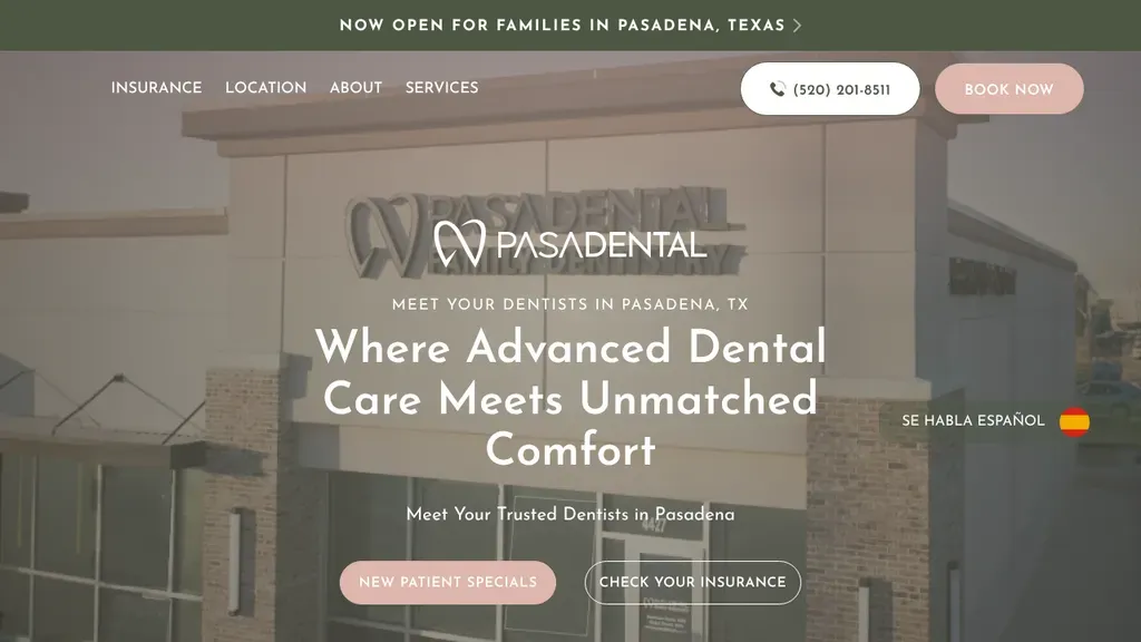
The branded building facade anchors the hero, with a now-open banner, a Spanish-speaking note and buttons for new patient specials and insurance checks.
Dentists · Houston
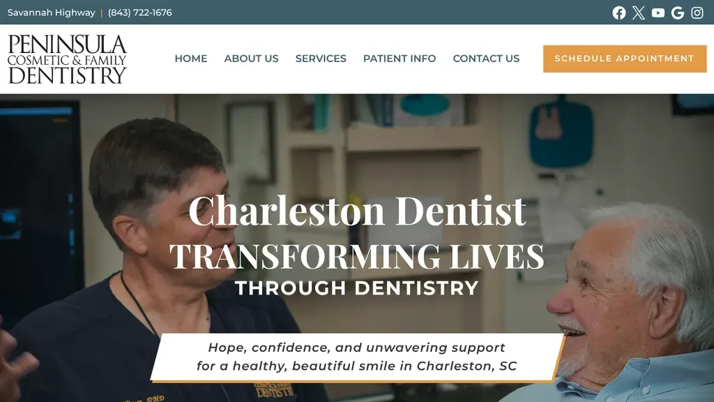
A real photo of the dentist with a smiling patient sits under "Charleston Dentist, Transforming Lives Through Dentistry", with an orange scheduling button in the header.
Dentists · Charleston
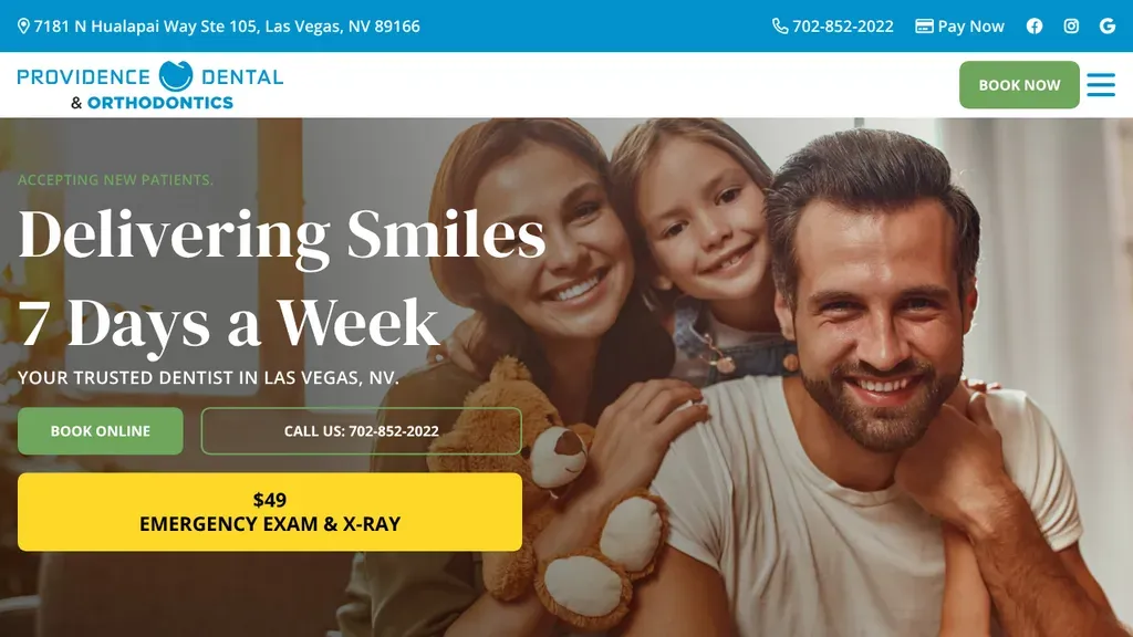
"Delivering Smiles 7 Days a Week" leads over a smiling family photo, and a yellow $49 emergency exam button stands out beside the book and call options.
Dentists · Las Vegas
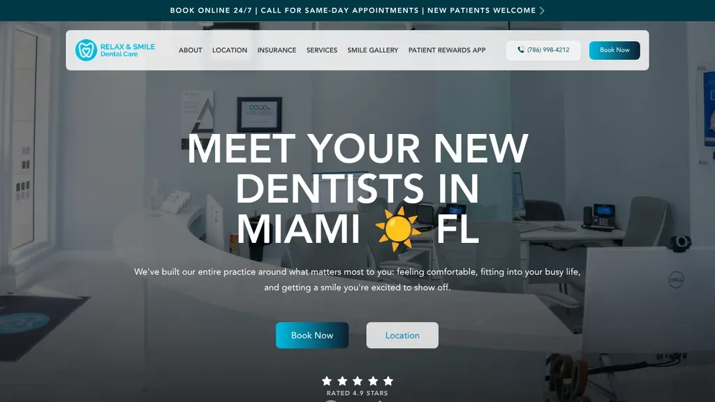
The bold headline "Meet Your New Dentists in Miami" sits over a dimmed office photo, with Book Now and Location buttons and a 4.9 star rating just below.
Dentists · Miami
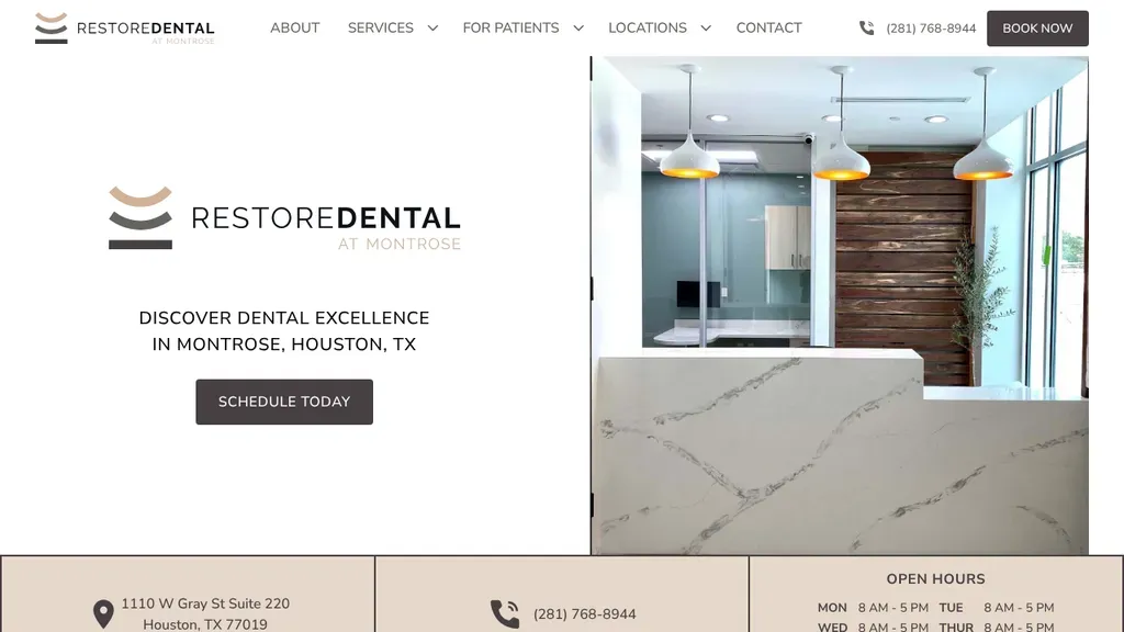
A split layout pairs the logo and "Discover dental excellence in Montrose, Houston" with a reception photo, and puts address, phone and hours in a strip below.
Dentists · Houston
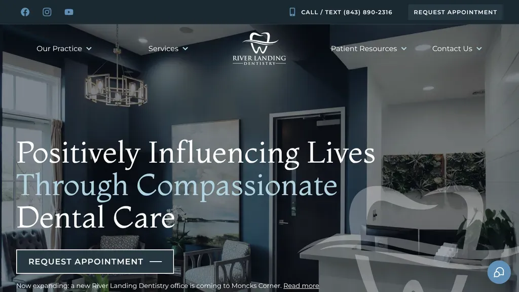
Moody navy walls and a large serif headline about compassionate care give a calm, upscale feel, with call or text and request buttons up top.
Dentists · Charleston
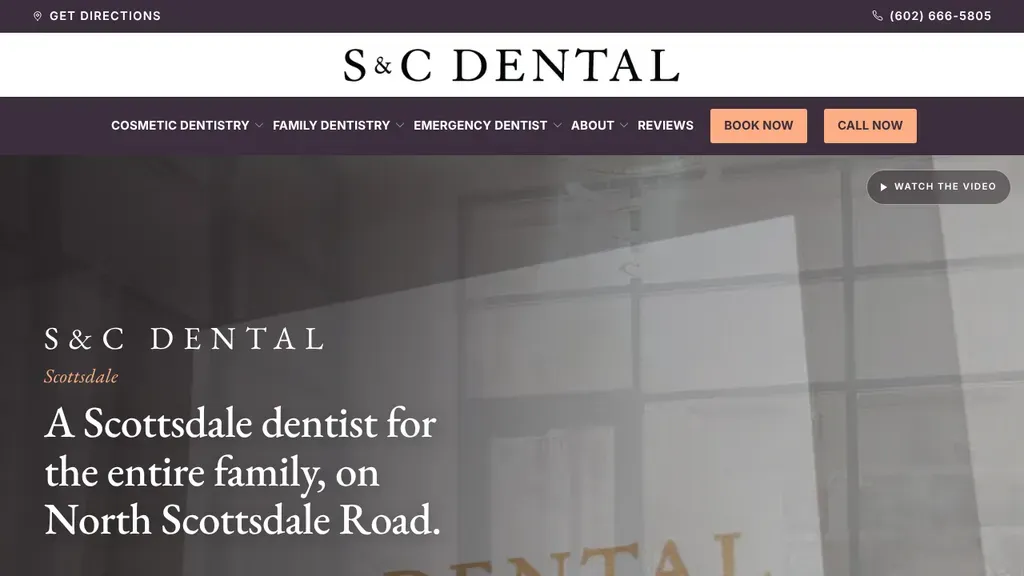
An elegant serif headline names the street, "on North Scottsdale Road", while Book Now and Call Now sit in bright peach buttons in the menu bar.
Dentists · Scottsdale
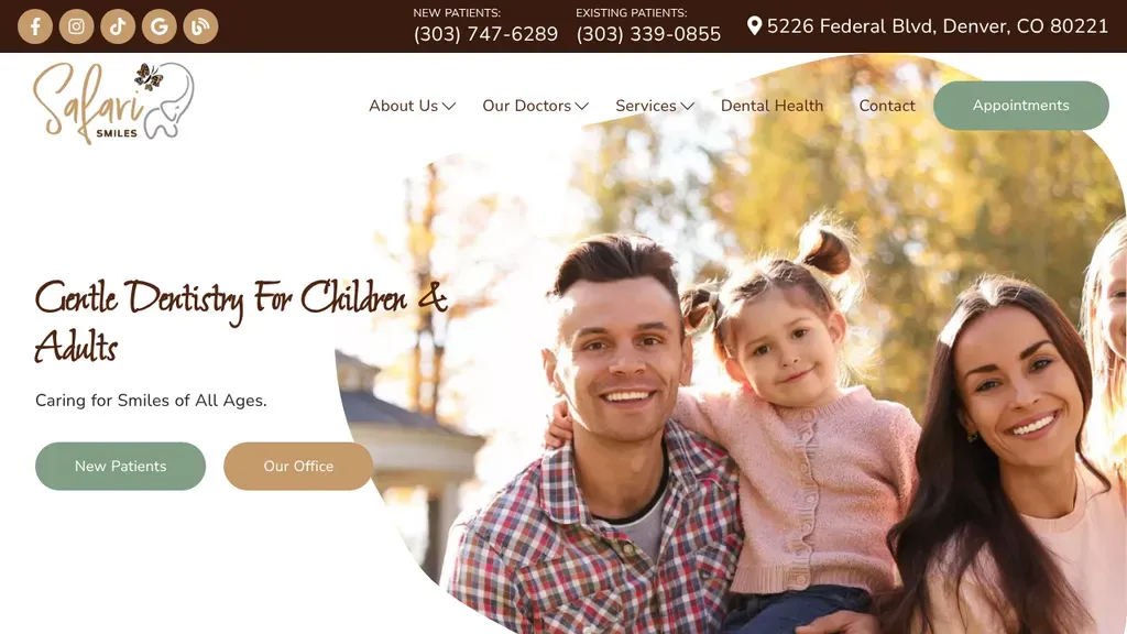
A sunny family portrait carries the promise of gentle care for kids and adults, while separate new and existing patient phone numbers sit in the top bar.
Dentists · Denver
The phone number is a bold button in the header beside Google and social icons, and Become a Patient leads the menu.
Dentists
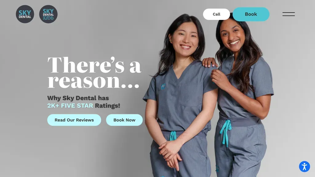
The headline turns reviews into the pitch, "There's a reason... 2K+ five-star ratings," with Read Our Reviews and Book Now.
Dentists
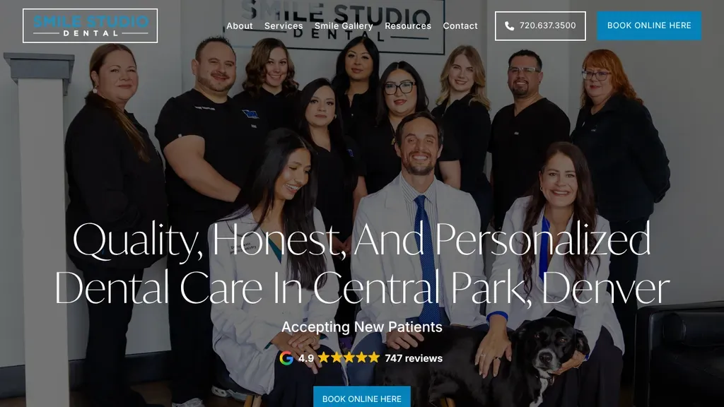
The full team, office dog included, fills the hero behind a Central Park, Denver headline, with a star rating and Book Online button stacked underneath.
Dentists · Denver
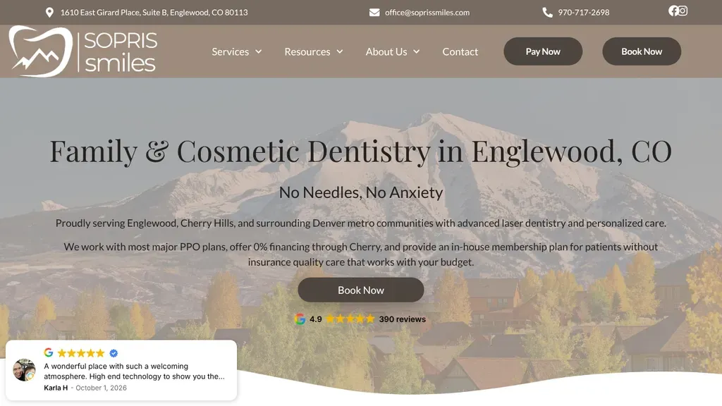
A snowy Colorado mountain backs the headline naming Englewood, with the "No Needles, No Anxiety" promise and a Google rating line under the Book Now button.
Dentists · Denver
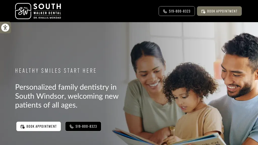
A mother, father and son sharing a picture book set a warm tone beside a short promise of personalized family dentistry in South Windsor, with book and call buttons.
Dentists · Windsor
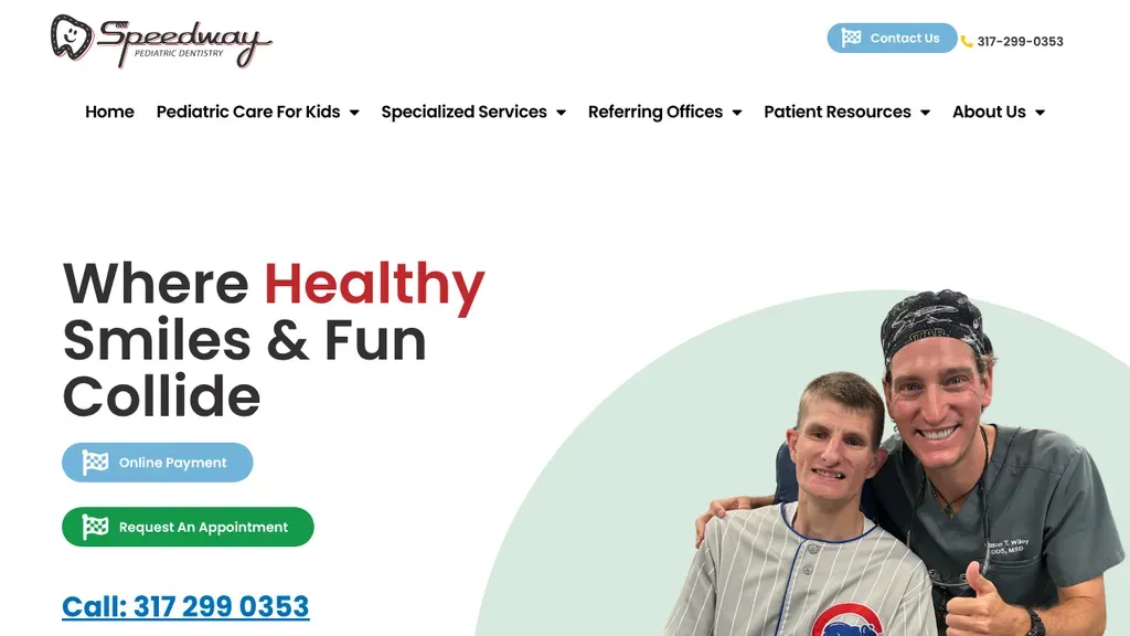
A pediatric practice that shows the dentist grinning beside a young patient under "Where Healthy Smiles & Fun Collide", with a big underlined phone number for parents.
Dentists · Indianapolis
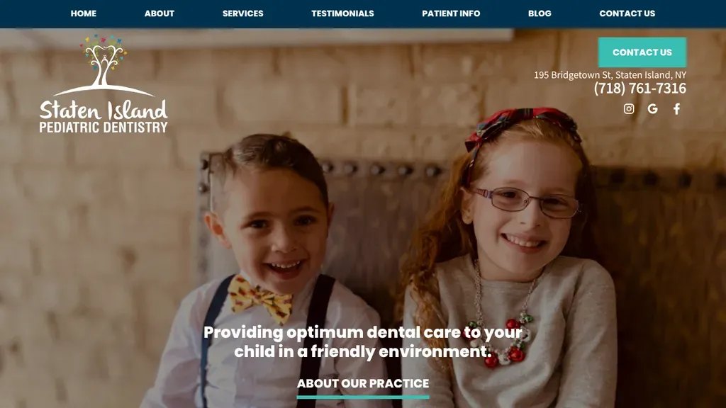
Two dressed-up kids grinning in front of a brick wall make the pediatric focus obvious, with the street address and phone number in the top corner.
Dentists · New York City
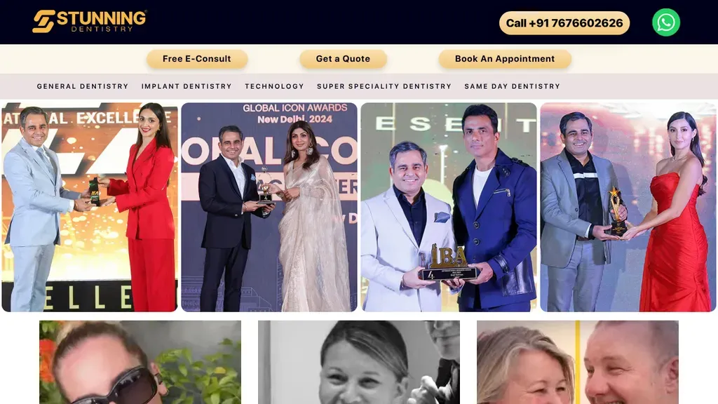
Call, WhatsApp, Free E-Consult, Get a Quote and Book an Appointment all live in the header, so every visitor finds a way in.
Dentists
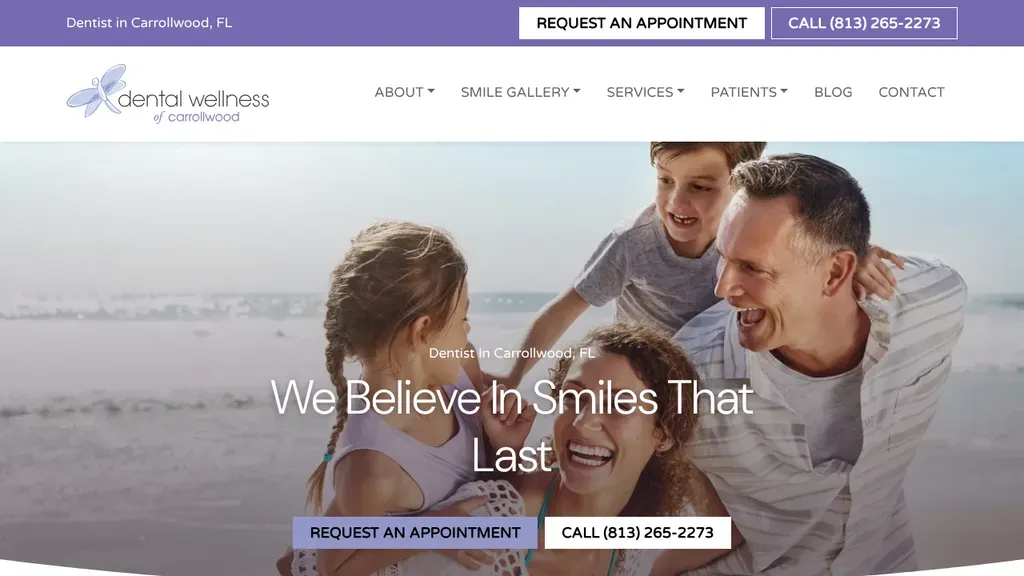
A family laughing on the beach sets a relaxed Florida mood, and "We Believe In Smiles That Last" sits over paired appointment and call buttons.
Dentists · Tampa
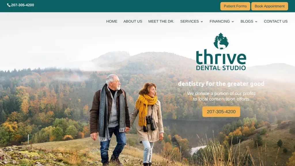
The hero leads with values (part of the profits go to local conservation) and keeps Patient Forms and Book Appointment top right.
Dentists
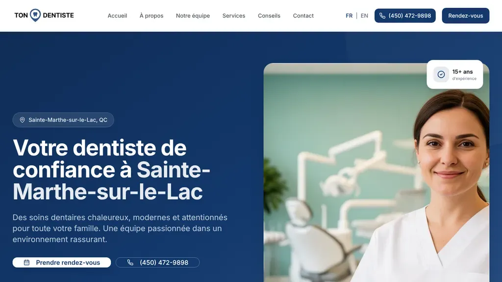
A deep blue hero names the town with a location pin, adds a "15+ ans" experience badge on the dentist photo, and offers booking and calling side by side.
Dentists · Montreal
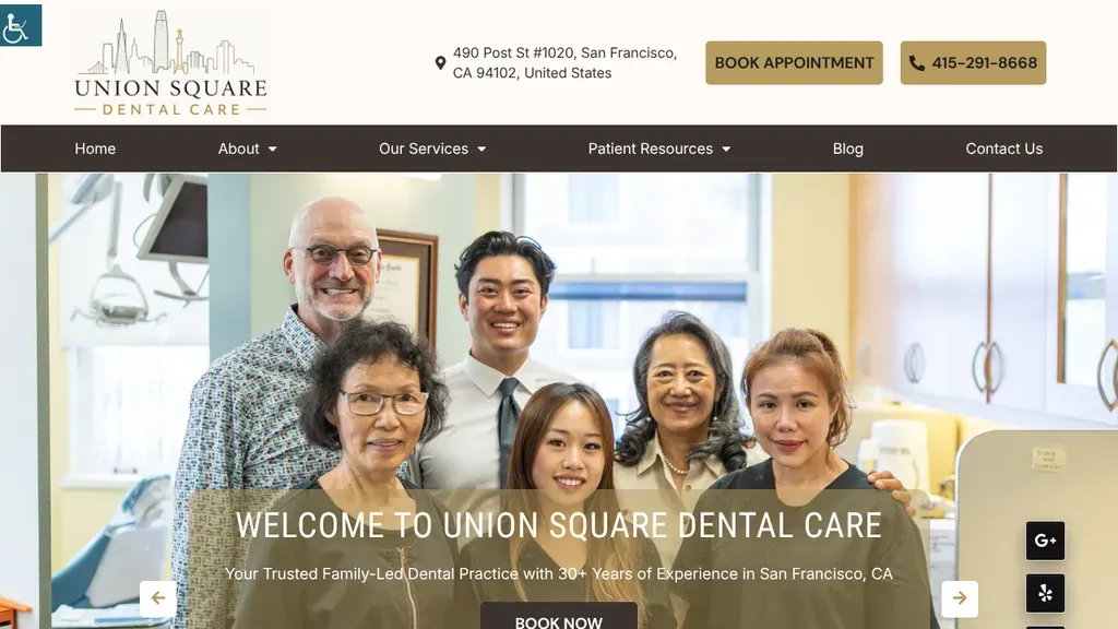
A multigenerational family photo backs up the family-led practice message, with the Post Street address and a book appointment button in the header.
Dentists · San Francisco
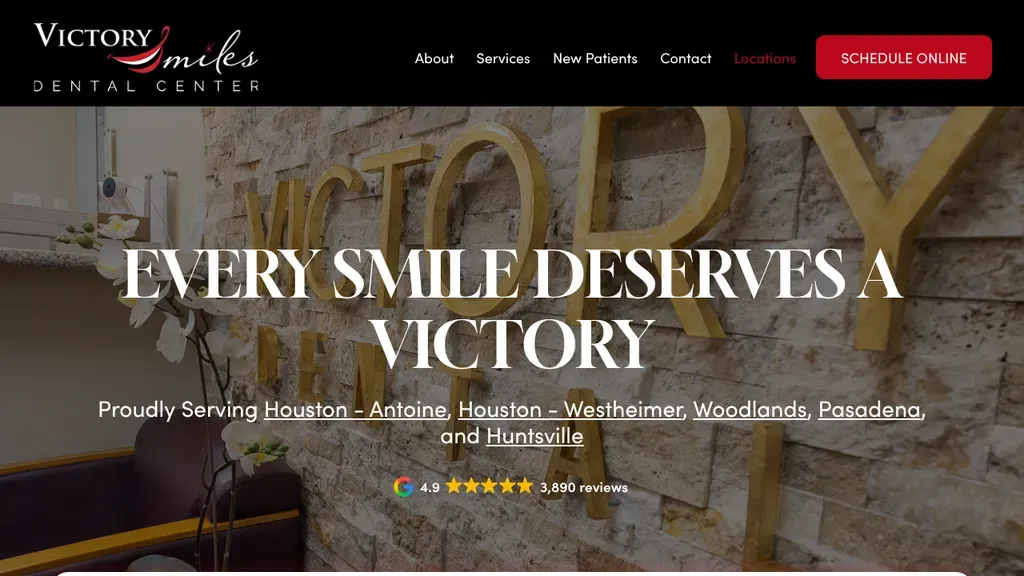
Gold lettering on a stone wall backs "Every Smile Deserves a Victory", with all five Texas locations linked beneath and a Google review count under that.
Dentists · Houston
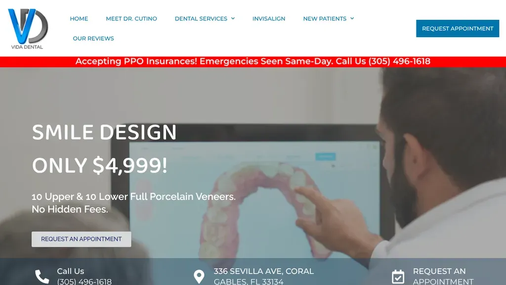
Leads with one priced offer, a smile design for a flat fee, while a red strip calls out PPO insurance and same-day emergencies above it.
Dentists · Miami
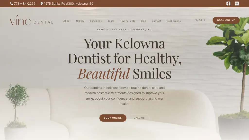
"Your Kelowna Dentist for Healthy, Beautiful Smiles" sits on a soft, airy background with a Book Online button and a quieter call link underneath.
Dentists · Kelowna
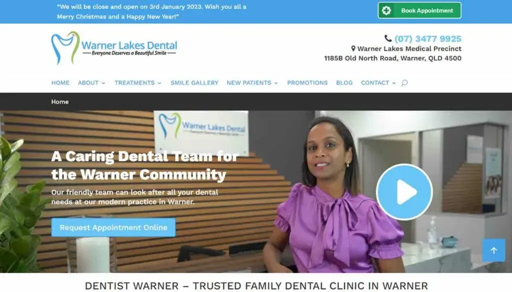
A 500+ Google reviews badge and the opening hours sit right on the homepage, with Make an Appointment and the phone up top.
Dentists
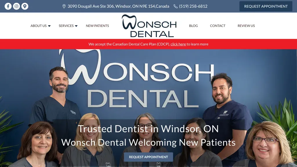
The real team poses in front of a giant Wonsch Dental wordmark, with "Trusted Dentist in Windsor, ON" and a request button set right over the group photo.
Dentists · Windsor
No websites match, try a different search or industry.
Let patients book at 9pm on a Sunday, when your front desk is asleep. A book-appointment button in the header and hero captures them on the spot instead of losing them to a voicemail.
It's the first thing patients check before committing. List accepted plans, spell out financing and payment options for the uninsured, and you'll stop losing visitors who assume they can't afford you.
Plenty of your visitors are genuinely scared of the chair. Warm photos of your actual team and office, sedation options stated plainly, and a calm tone convert nervous browsers into booked patients.
Before-and-after photos of actual patients prove your work better than any headline. Pair them with named, local reviews so visitors see people like them who walked out happy.
Want a website like these? See our dentists web design services →