Quote form above the fold
A moving quote is the whole reason visitors showed up. Put a short form (origin, destination, move date) in the hero. Every scroll or click before it costs you leads.

These are our favorite websites built for movers.

13+ years building legendary SMB websites
Nobody browses moving company websites for fun. Your visitors are stressed, on a deadline, and juggling three tabs of competitors. They want one thing fast: a price, or at least a clear path to one. The great sites get that. They put the quote form front and center, answer the scary questions (licensing, insurance, hidden fees) before anyone asks, and prove real humans will show up on moving day. The mediocre ones bury all of it under stock photos of cardboard boxes.
This collection pulls together 49 moving company websites that actually convert, from national van lines to scrappy local crews. Study how they structure their quote flows, how they word their guarantees, and where they place reviews and credentials. Then steal the ideas, not the pixels. Copy the thinking behind a layout, the tone of a headline, the placement of a trust badge. Your site should feel like yours, just built on principles that already work.
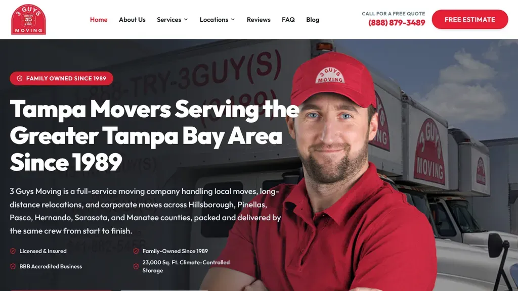
A mover in a red cap looks straight at the camera beside "Tampa Movers Serving the Greater Tampa Bay Area Since 1989", with a family owned label above it.
Moving Companies · Tampa
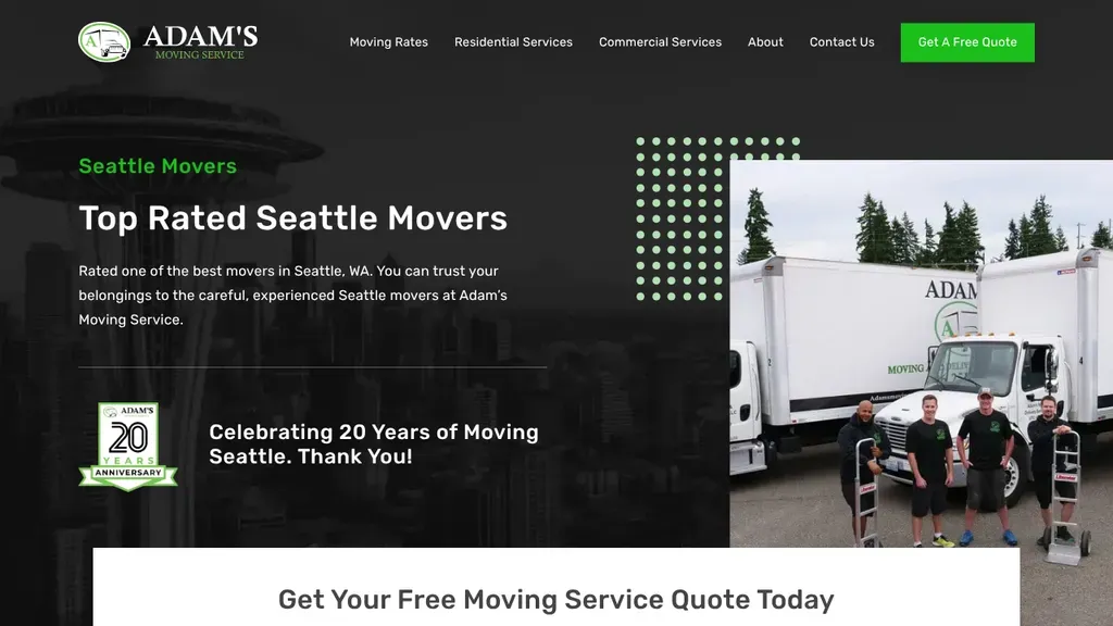
The real crew stands beside a line of lettered trucks, and a 20th anniversary badge thanking Seattle adds local history.
Moving Companies · Seattle
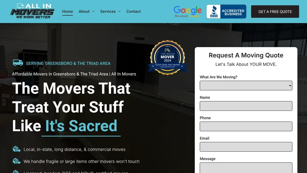
"The Movers That Treat Your Stuff Like It's Sacred" pairs with bullets about fragile items other movers won't touch, plus Google and BBB marks in the header.
Moving Companies · Winston-Salem
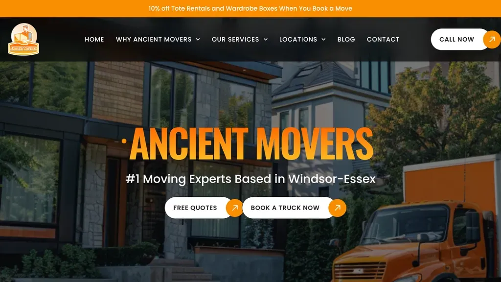
An orange box truck beside a modern house sits behind the bold orange name, with "#1 Moving Experts Based in Windsor-Essex" and pill buttons for quotes and truck booking.
Moving Companies · Windsor
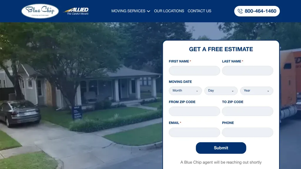
A full estimate form (move date, from and to ZIP codes) is the hero, so the first thing visitors do is start a quote.
Moving Companies
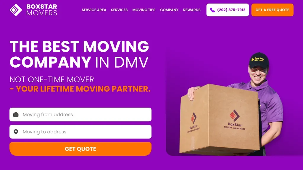
A bold purple backdrop frames a uniformed mover holding a branded box, while from and to address fields sit above an orange Get Quote button.
Moving Companies · Washington DC
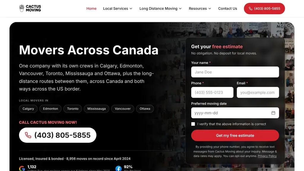
Every city with its own crew appears as a chip under the headline, and a free estimate form with a red button sits beside the big phone number.
Moving Companies · Calgary
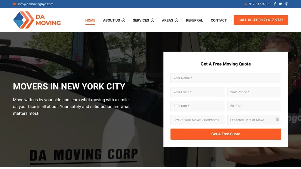
The company's lettered truck sits behind a short welcoming line, and a white quote form asks for move size and date without leaving the first screen.
Moving Companies · New York City
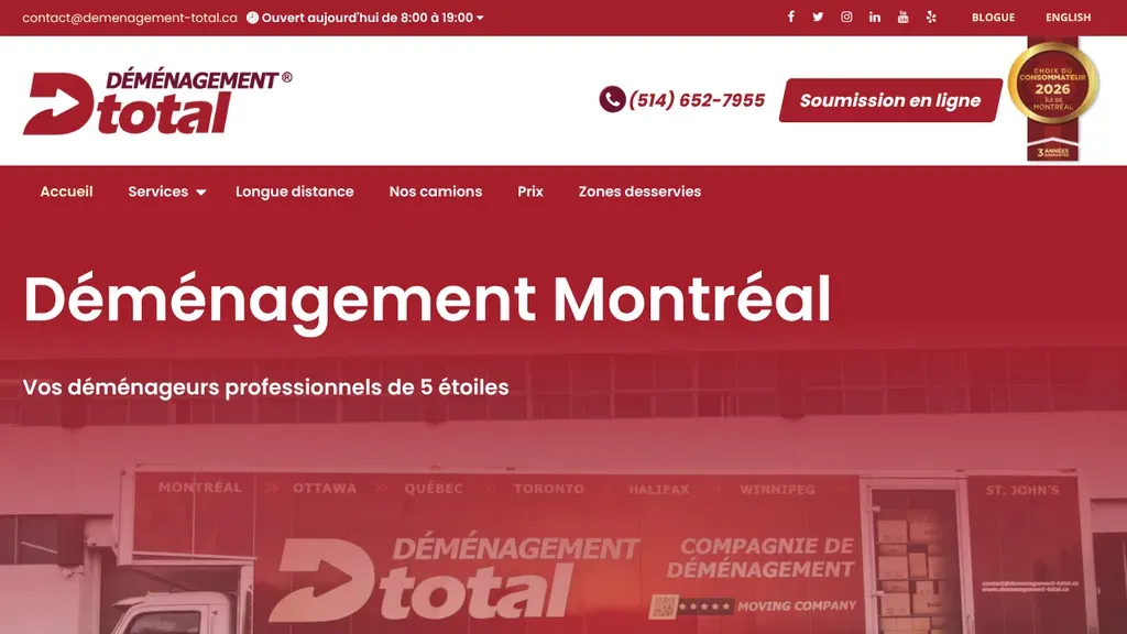
Bold red branding carries from the logo through the hero, where a lettered truck sits under "Déménagement Montréal" and an online quote button waits in the header.
Moving Companies · Montreal
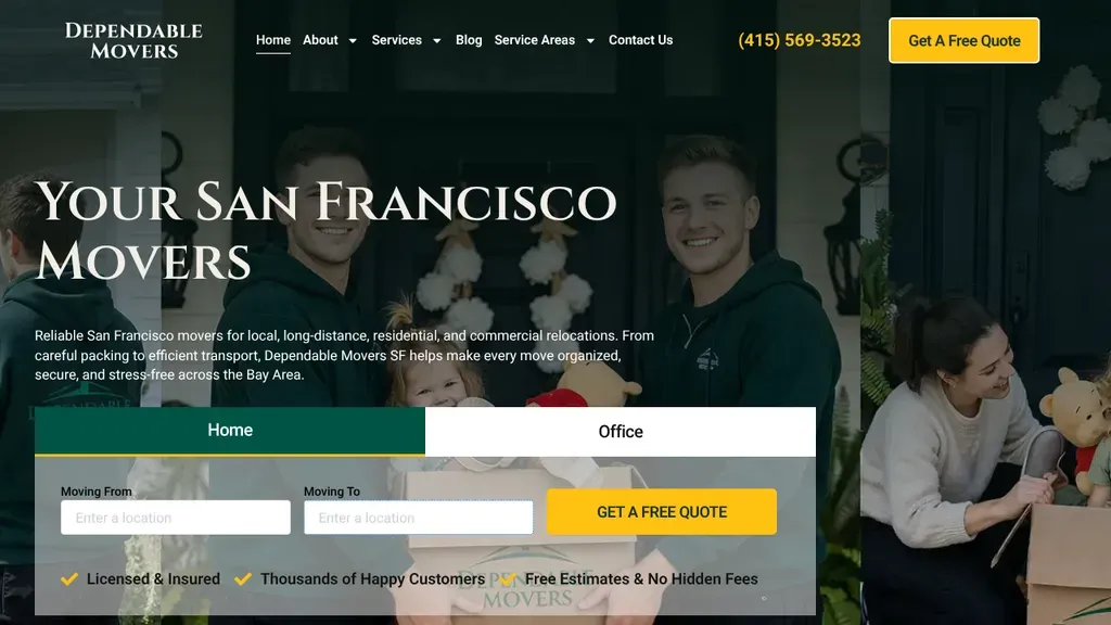
A family unpacking in a new home sets a warm tone, and Home and Office tabs on the quote bar let visitors pick their move type first.
Moving Companies · San Francisco
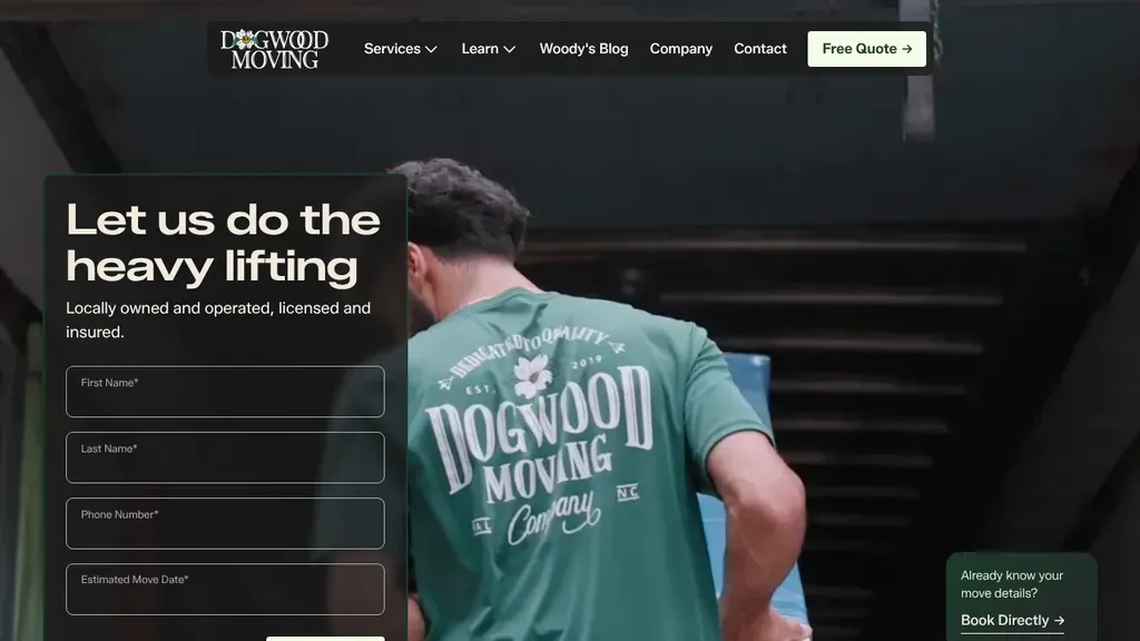
Shot from behind, a mover in a Dogwood Moving shirt carries the brand into the photo, while a dark form under "Let us do the heavy lifting" collects the move date.
Moving Companies · Raleigh
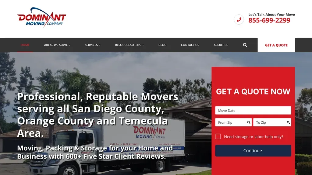
A red Get a Quote Now form sits on the hero, beside a line naming every county they serve and their 600+ five-star reviews.
Moving Companies
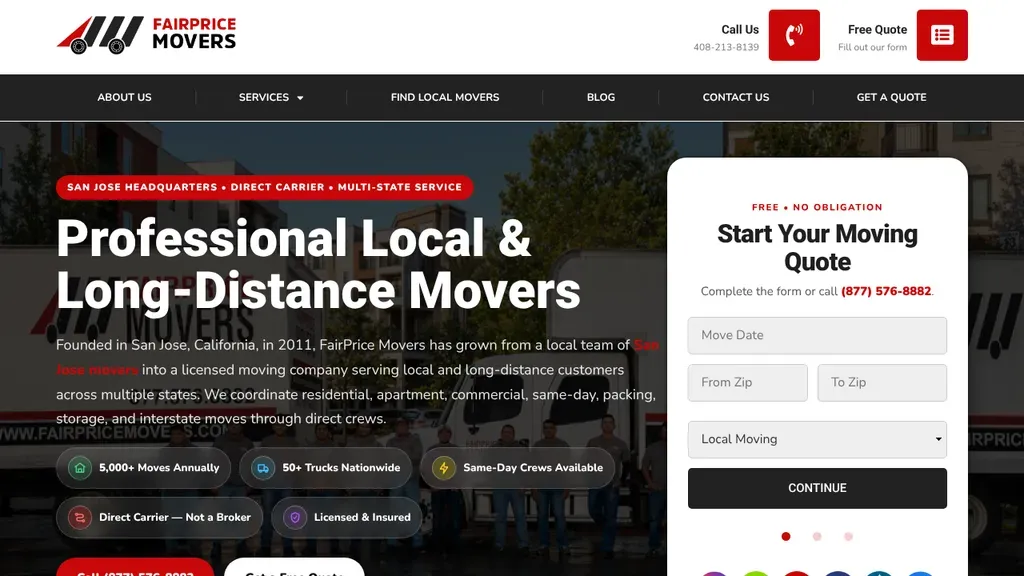
Trust chips under the headline (direct carrier, not a broker, same day crews, licensed and insured) answer the biggest worry in long distance moving before anyone scrolls.
Moving Companies · San Francisco
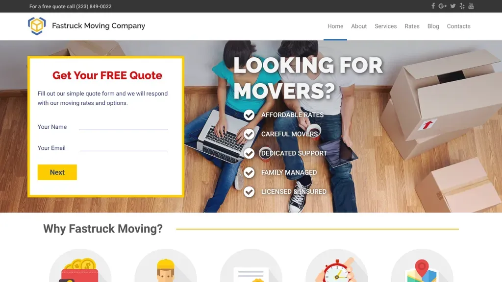
A free-quote form sits on the hero, beside five checkmarked promises from affordable rates to licensed and insured.
Moving Companies
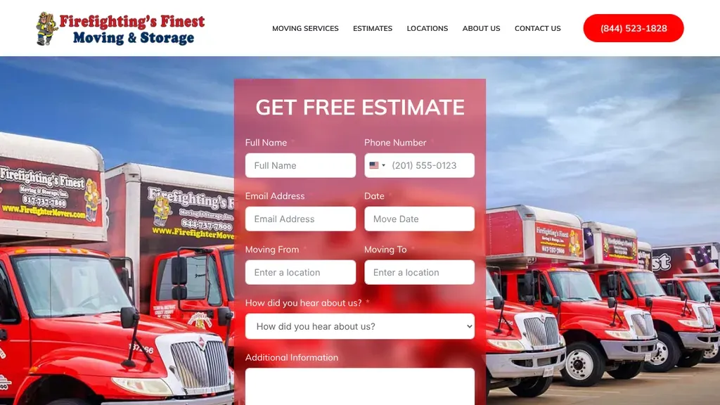
A row of fire engine red trucks behind the estimate form drives home the firefighter theme that the company name and logo announce.
Moving Companies · Dallas
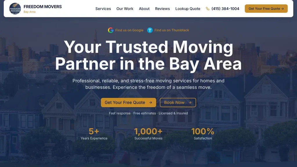
"Your Trusted Moving Partner in the Bay Area" sits over painted Victorian houses, with a Get Your Free Quote button and a row of experience and move counts below.
Moving Companies · San Francisco
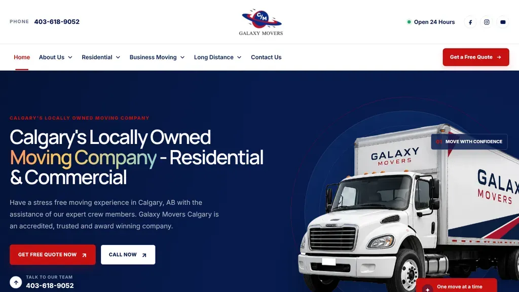
Says "Calgary's Locally Owned Moving Company" in the headline next to a crisp cutout of the branded white truck, with quote and call buttons in contrasting colors.
Moving Companies · Calgary
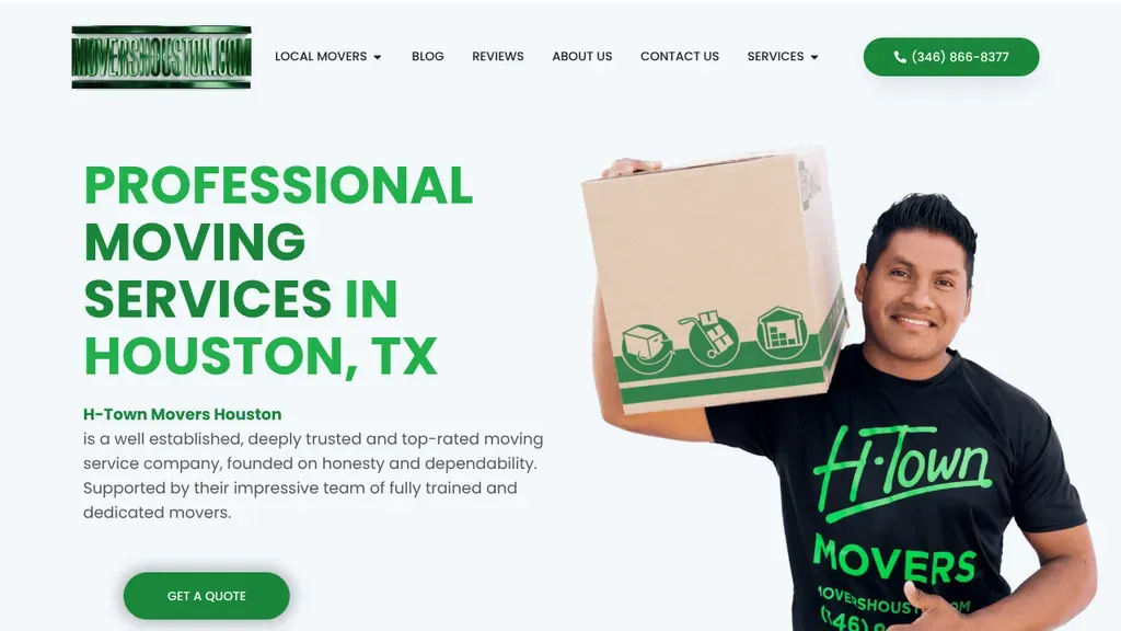
Big green type names the service and city, and a mover in an H-Town shirt holding a branded box makes the crew feel real.
Moving Companies · Houston
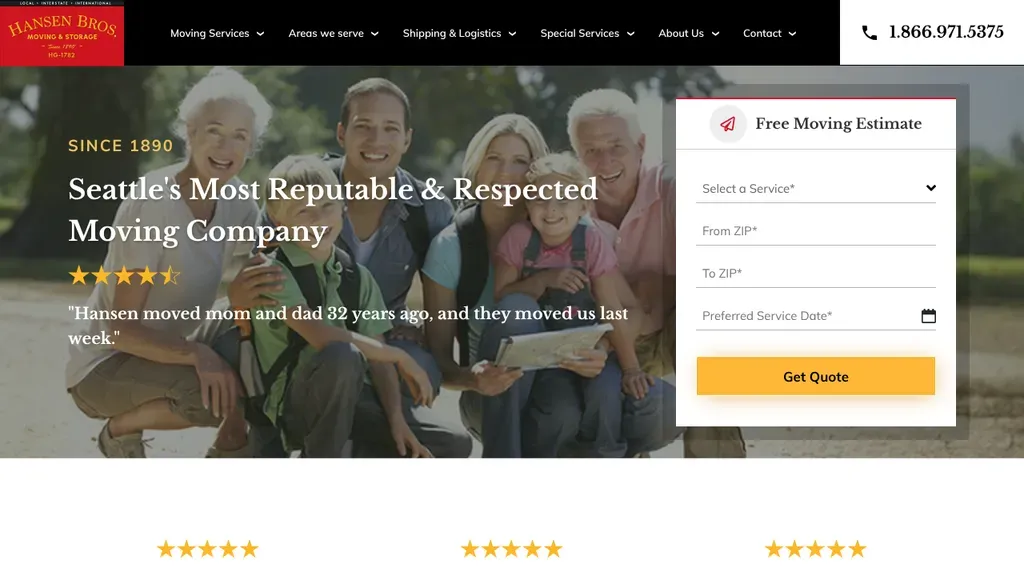
Heritage leads, with a "Since 1890" label and a customer quote about moving two generations of one family sitting beside a short estimate form.
Moving Companies · Seattle
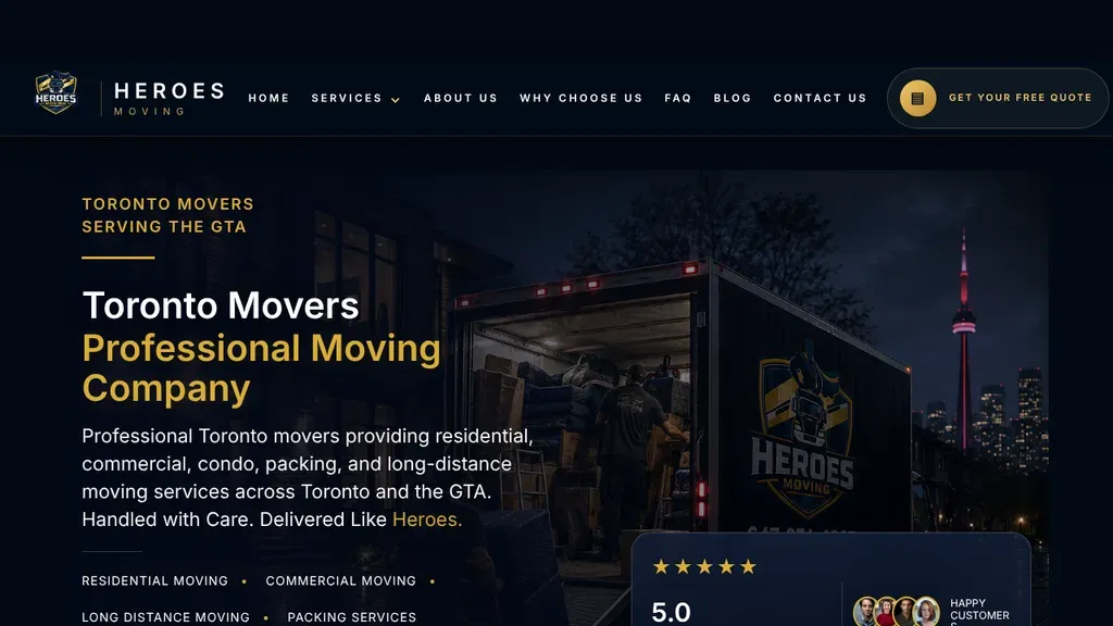
A branded truck parked under the lit CN Tower at night ties the brand to Toronto, with gold accents and a rating card tucked into the corner.
Moving Companies · Toronto
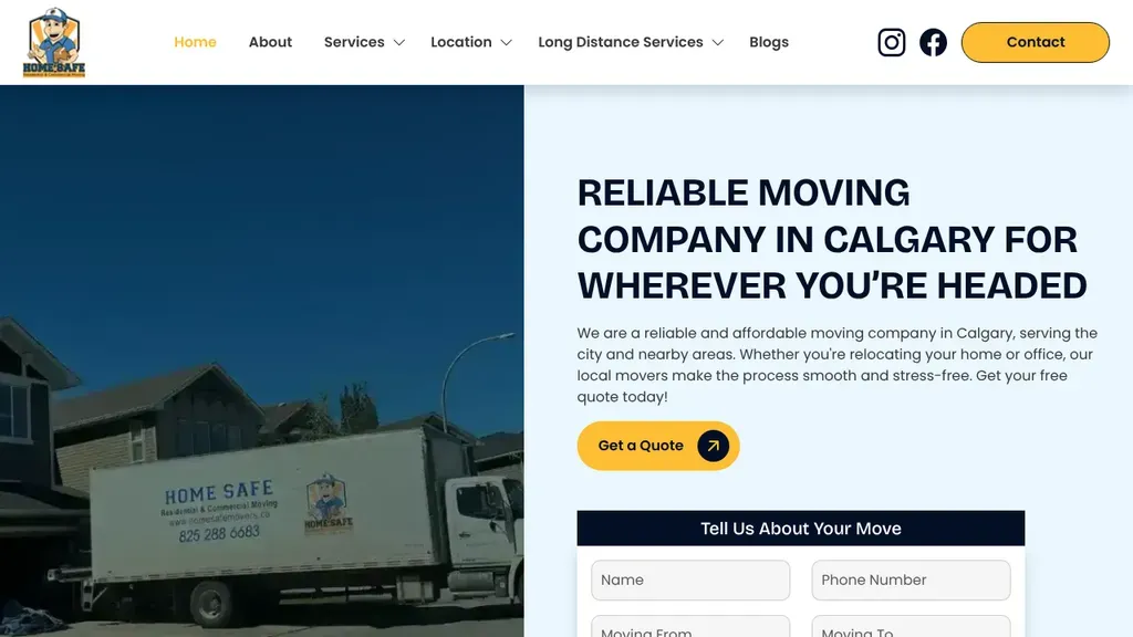
Split down the middle, a photo of the lettered truck on one side and a clear Calgary headline with a short move form on the other.
Moving Companies · Calgary
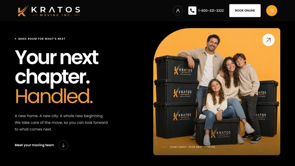
"Your next chapter. Handled." sits on black beside a family perched on moving bins stamped with the orange Kratos logo, with one Book Online button up top.
Moving Companies · Toronto
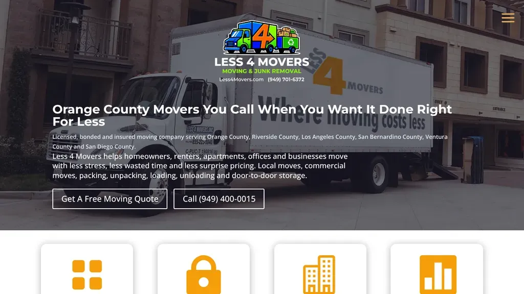
The headline promises a result and a price advantage, with Get a Free Moving Quote and a phone button side by side.
Moving Companies
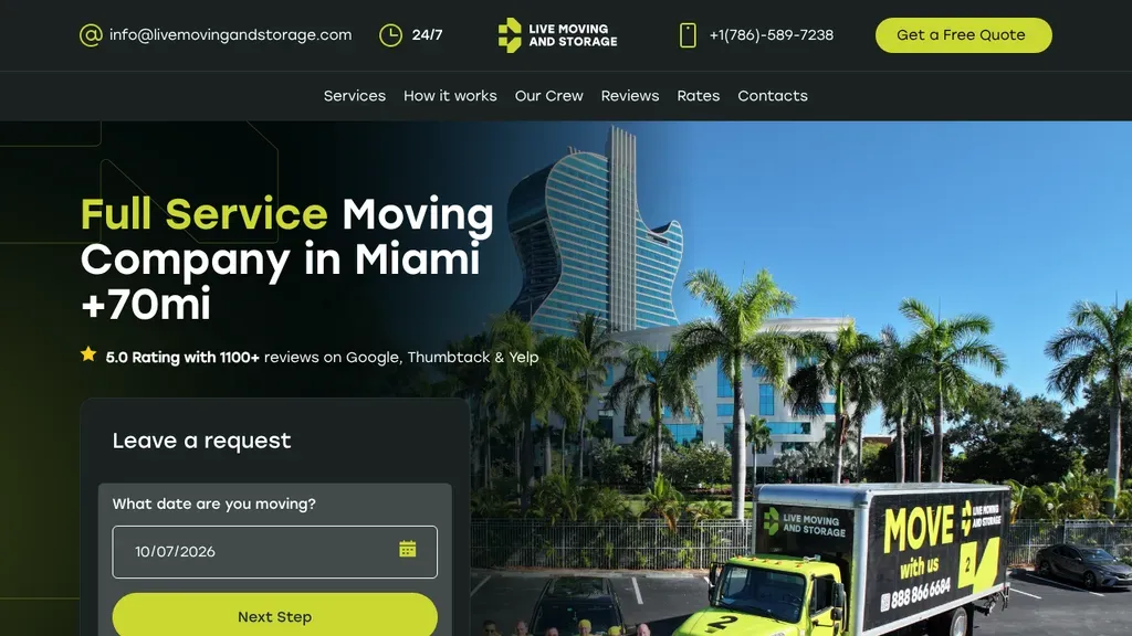
A lime green truck parked under palm trees and a guitar shaped tower matches the accent color, and the request card opens with a date picker for the move.
Moving Companies · Miami
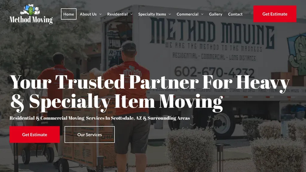
Claims a niche in heavy and specialty item moving, set in a confident serif over the crew loading their lettered truck, with red and outlined buttons below.
Moving Companies · Scottsdale
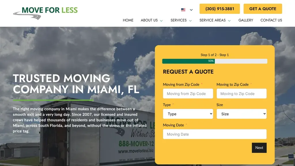
A two-step quote form shows a progress bar, so the request feels short before it even starts.
Moving Companies
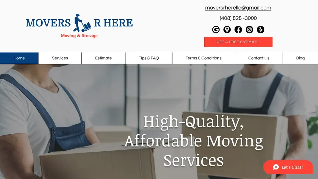
A bright Get a Free Estimate button sits right under the phone number, and Estimate has its own menu tab.
Moving Companies
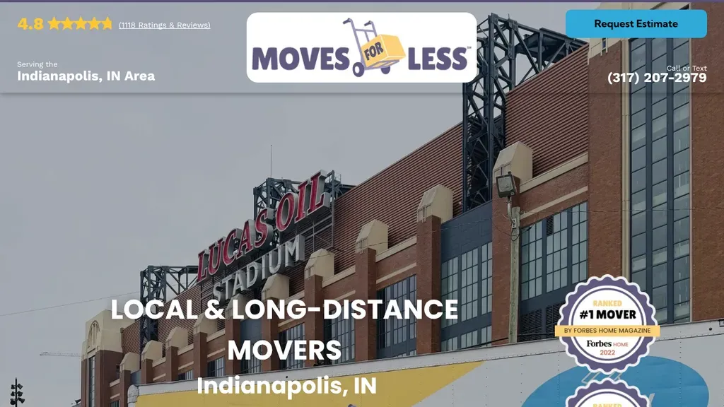
A local stadium anchors the photo to Indianapolis, with the review score in the top corner and a magazine award badge beside the headline.
Moving Companies · Indianapolis
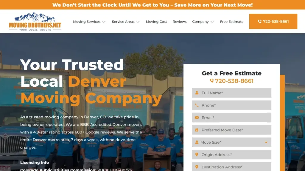
An orange top bar promises the clock starts only when the crew arrives, and the whole team poses in matching shirts behind a long estimate form.
Moving Companies · Denver
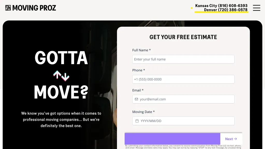
A punchy "GOTTA MOVE?" with swapping arrows owns the left side, and a cheeky line about being the best option sits beside a clean estimate form.
Moving Companies · Denver
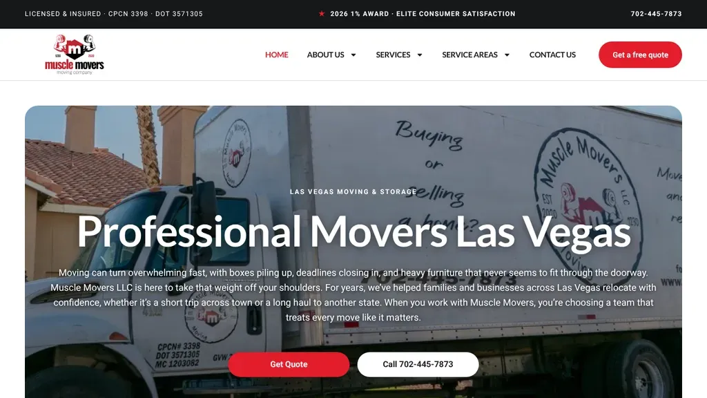
The company's own lettered truck backs the rounded hero card, and license numbers in the top bar reassure visitors before the red Get Quote button.
Moving Companies · Las Vegas
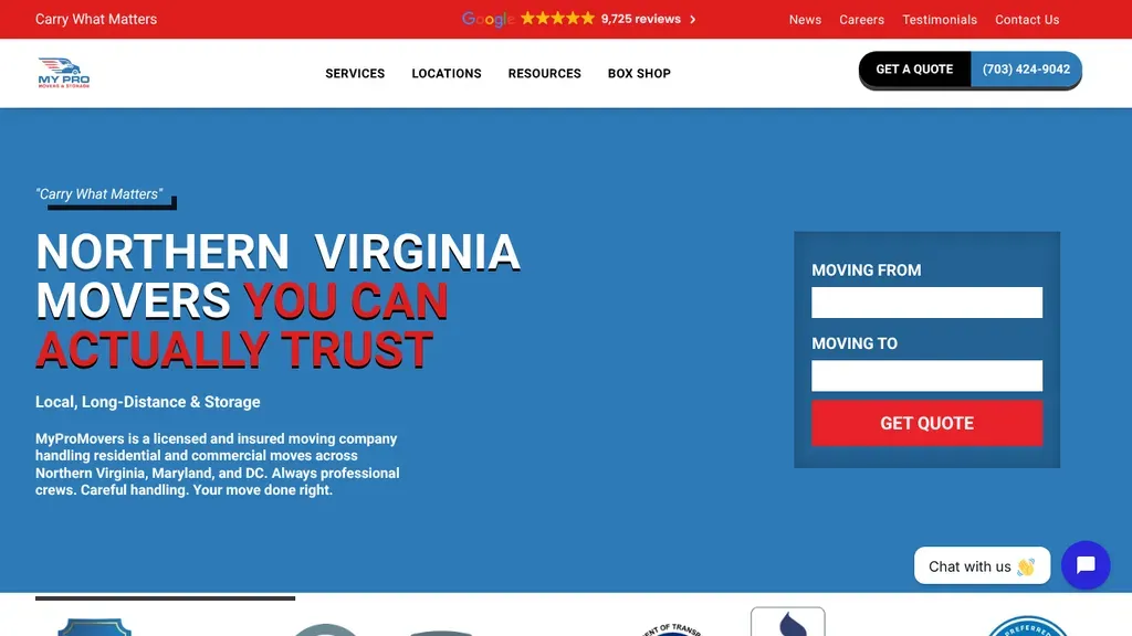
"Movers you can actually trust" in red and white owns the left, a large review count sits in the top bar, and the from and to fields start a quote right away.
Moving Companies · Washington DC
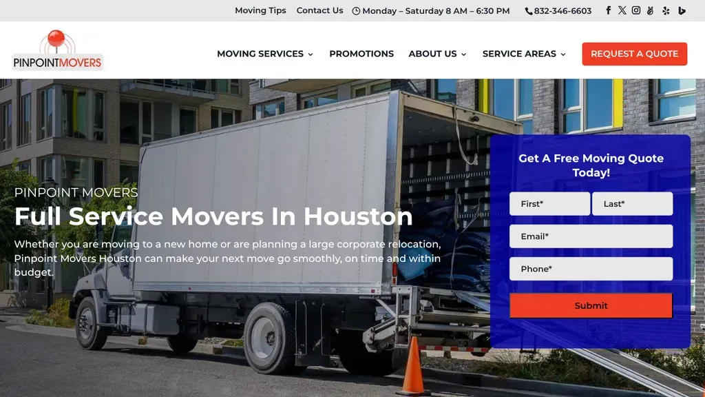
A box truck with its ramp down at a Houston apartment block fills the hero, and a bold blue quote card sits right where the eye lands.
Moving Companies · Houston
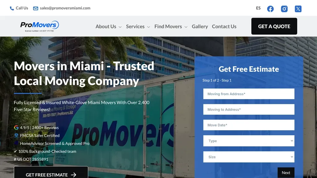
The lettered truck fills the background while a short trust list (review count, safety certification, background checked team) runs beside a two step estimate form.
Moving Companies · Miami
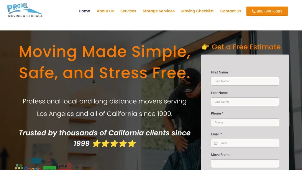
A free-estimate form sits beside the headline, with "since 1999" and five stars as the trust line.
Moving Companies
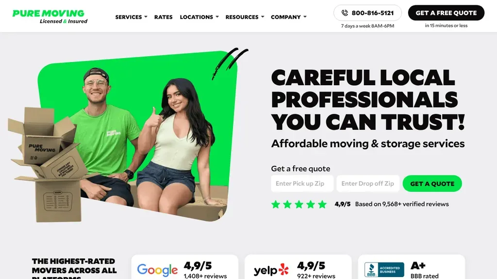
A mover and a smiling woman pop out of a bright green shape beside the trust headline, with Google, Yelp and BBB score cards lined up below.
Moving Companies · Seattle
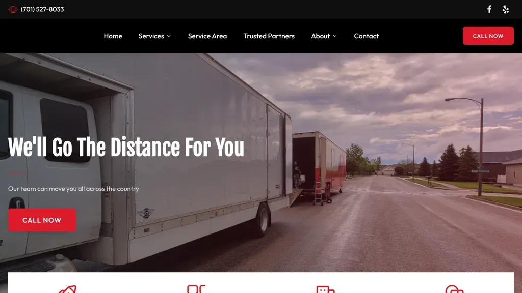
A moving truck parked on a quiet street backs the "We'll Go The Distance For You" headline, with a red Call Now button in the hero and in the nav.
Moving Companies · Bismarck
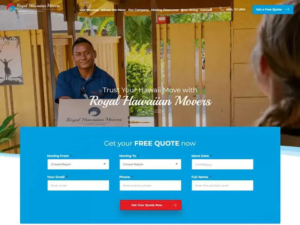
Get a Free Quote is the one blue button in the header, and the hero shows a real crew member at work.
Moving Companies
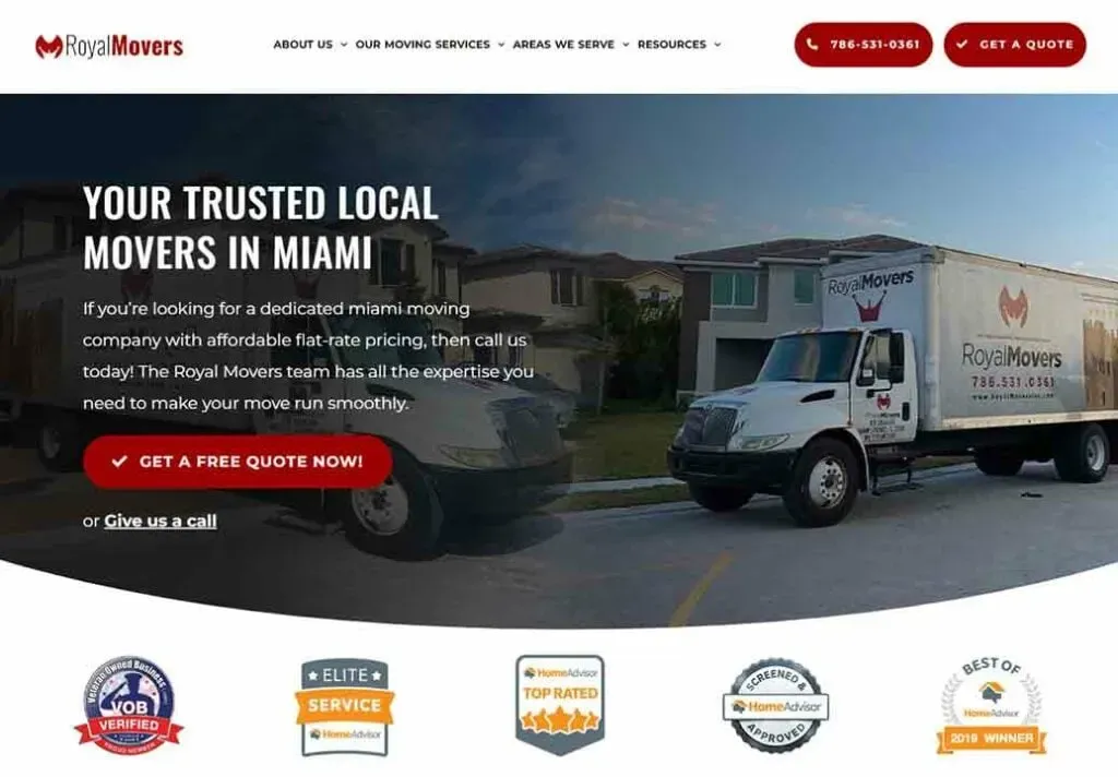
Trust points lead the hero (award-winning, veteran owned, honest pricing), with Get a Free Quote in the header.
Moving Companies
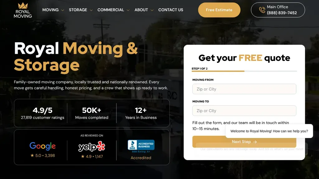
Proof stacks under the headline, with a customer rating, moves completed and years in business, then Google, Yelp and BBB scores beside a two step quote form.
Moving Companies · San Francisco
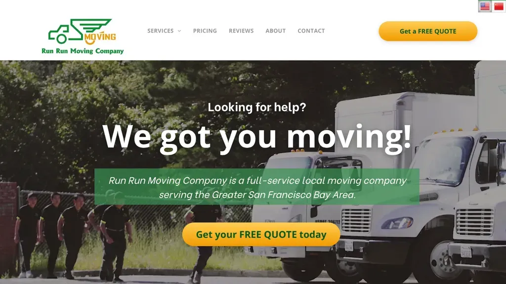
"We got you moving!" headlines a real crew lined up beside their truck, with a bilingual English and Chinese switch and a big yellow free quote button.
Moving Companies · San Francisco
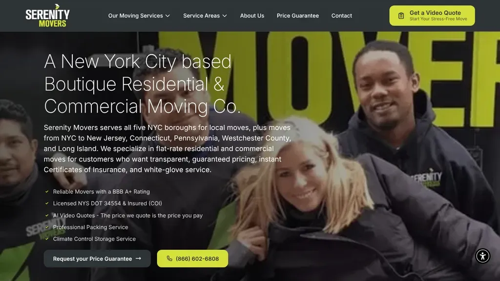
Positions itself as a boutique NYC mover, with a real uniformed crew photo, a checklist of licenses and price guarantees, and a yellow Video Quote button up top.
Moving Companies · New York City
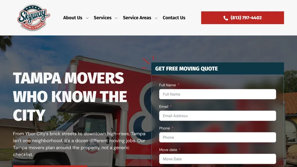
"Tampa movers who know the city" is backed by copy naming Ybor City's brick streets and downtown high rises, local detail most competitors skip.
Moving Companies · Tampa
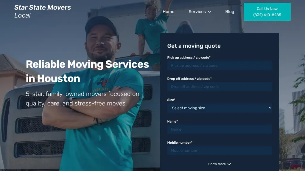
A smiling mover with crossed arms stands beside a full quote form that asks for pickup, drop off and move size right on the first screen.
Moving Companies · Houston
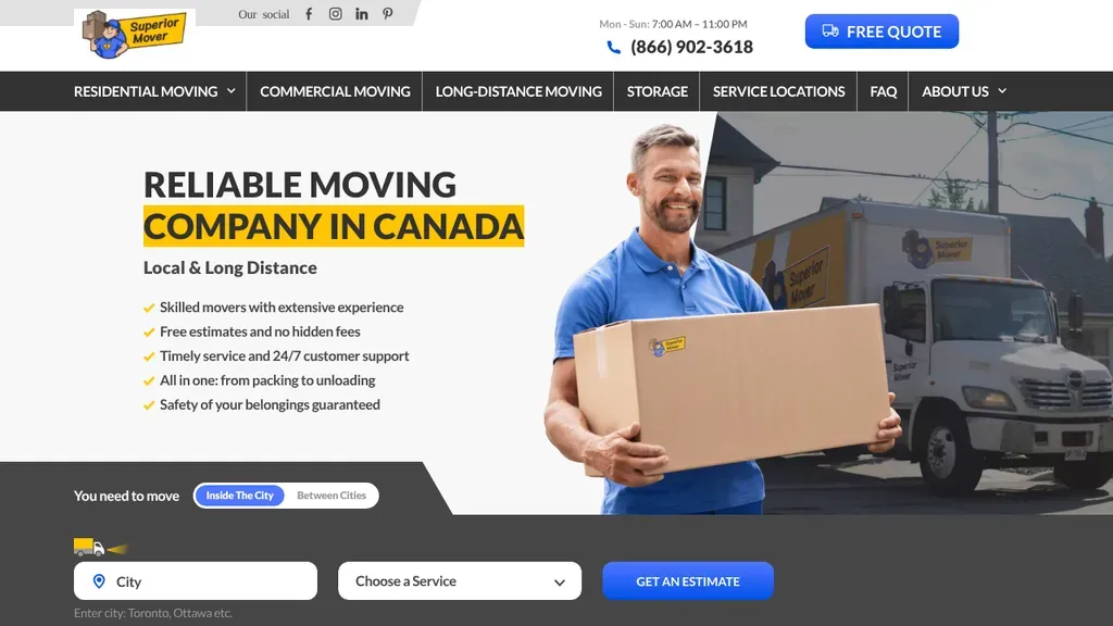
A checklist of promises sits beside a mover hoisting a box, and a toggle between moving inside the city or between cities starts the estimate right on the hero.
Moving Companies · Toronto
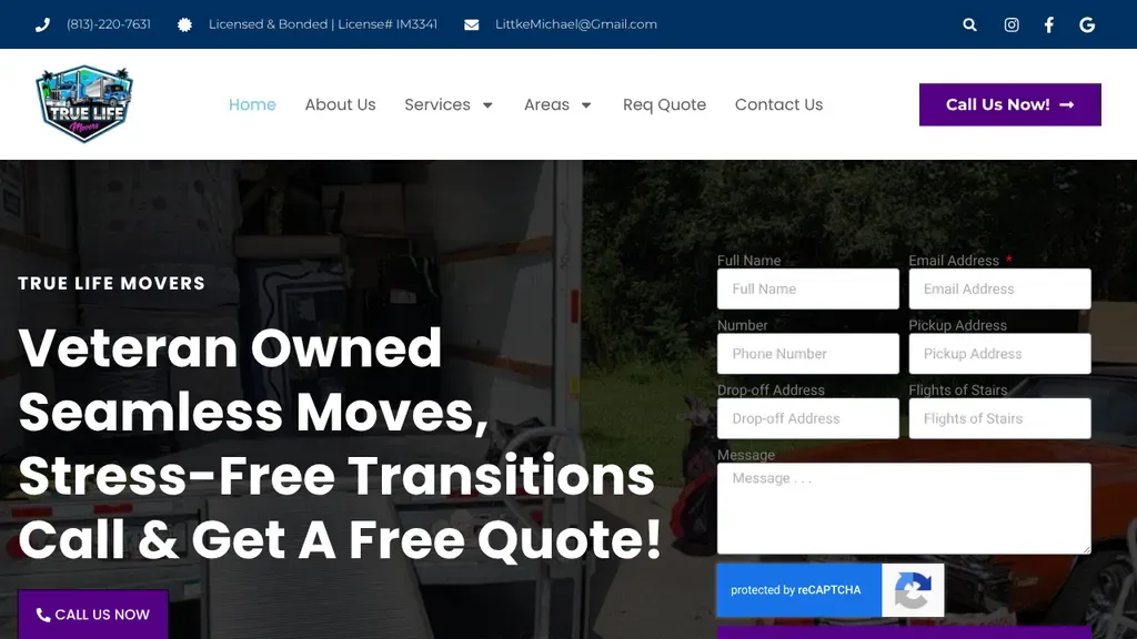
Veteran ownership leads the headline, and the form beside it asks for flights of stairs, a detail that shows the crew knows what drives a moving quote.
Moving Companies · Tampa
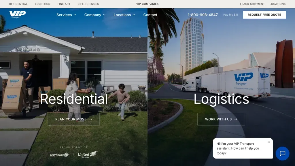
The hero splits into two big panels, Residential and Logistics, so each kind of customer picks a lane.
Moving Companies
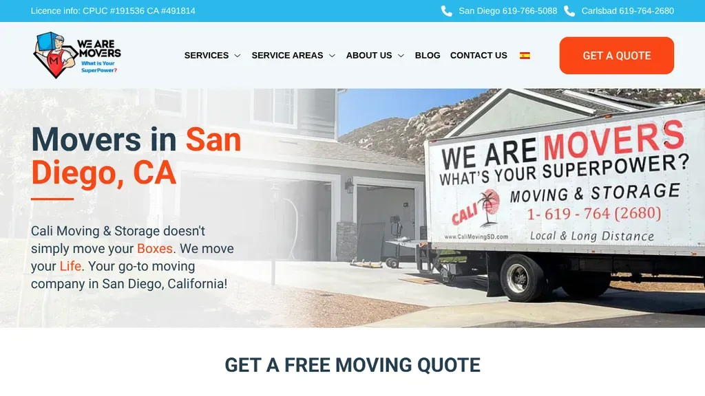
License numbers sit in the top bar with a phone number for each city, a quiet trust signal.
Moving Companies
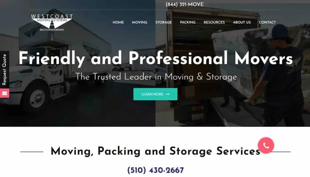
The phone number is spelled as a word, (844) 321-MOVE, and a Request Quote tab sticks to the side of the page.
Moving Companies
No websites match, try a different search or industry.
A moving quote is the whole reason visitors showed up. Put a short form (origin, destination, move date) in the hero. Every scroll or click before it costs you leads.
Movers touch everything people own, and horror stories are everywhere. Display your DOT number, insurance coverage, and any AMSA or BBB credentials near the top, not buried in the footer.
A cross-country relocation and a move across town are different sales. Give each its own page with its own pricing logic, timeline expectations, and quote path so visitors self-sort instantly.
Strangers are entering someone's home. Real photos of your uniformed crew, trucks, and actual jobs beat stock imagery every time. Pair them with reviews that mention movers by name.
Want a website like these? See our moving companies web design services →