Menu on the page, never PDF
A pinch-and-zoom PDF menu is where hungry visitors give up. Build your menu as real, searchable web pages with prices and photos, so it loads fast and works on any phone.
These are our favorite websites built for restaurants.

13+ years building legendary SMB websites
Someone lands on a restaurant website with three questions: what's on the menu, where are you, and are you open right now. That's it. The mediocre ones bury the menu in a PDF, hide the hours in the footer, and lead with a mission statement nobody asked for. The great ones answer all three questions in about five seconds, then make the food look so good you're reaching for your car keys.
The 39 sites in this collection all nail that job, each in their own way. Some win with mouthwatering photography, some with dead-simple online ordering, some with location pages that actually work. As you browse, don't copy pixels. Steal the thinking: how they structure the menu, where they put the order button, how they show off the food, how they handle multiple locations. Then apply those moves to your own site.
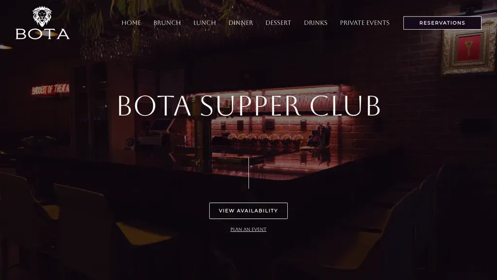
A moody, low-lit dining room frames the BOTA Supper Club name, with a single View Availability button centered beneath it and Reservations boxed in the header.
Restaurants · New York City
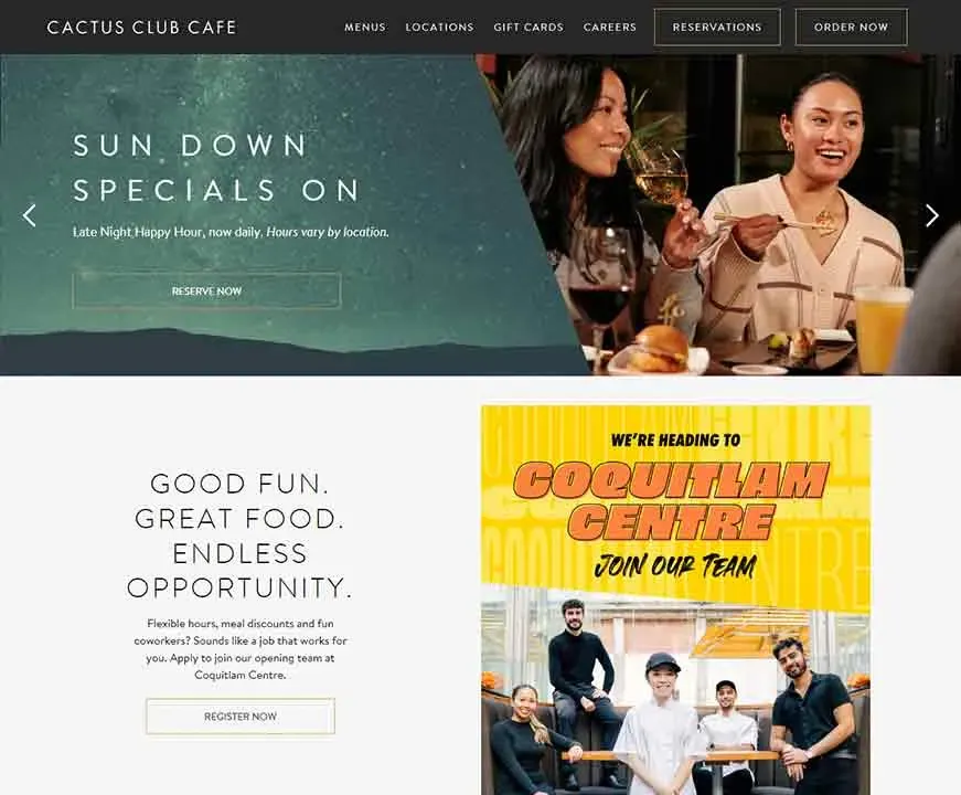
Reservations and Order Now sit side by side in the header, and a banner above them pushes holiday event bookings.
Restaurants
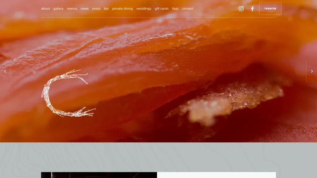
An extreme close-up of one dish fills the screen, with a quiet lowercase menu and a single Reserve button.
Restaurants
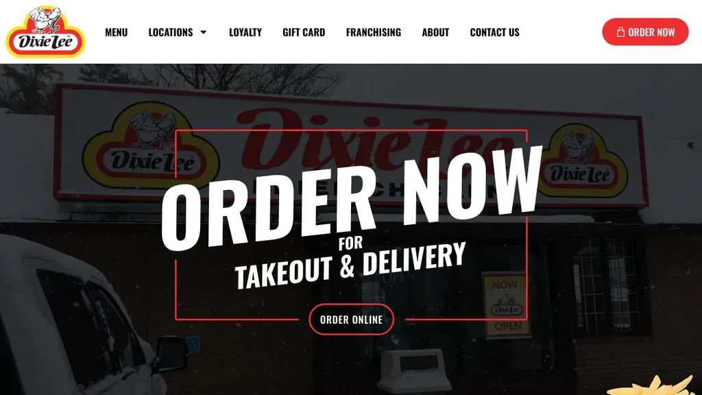
The hero is one giant instruction, "Order Now for takeout & delivery," over a photo of a real storefront.
Restaurants
Set Your Location, Order Pickup, Get Delivery and Book a Table sit together in the header, covering every way to eat.
Restaurants
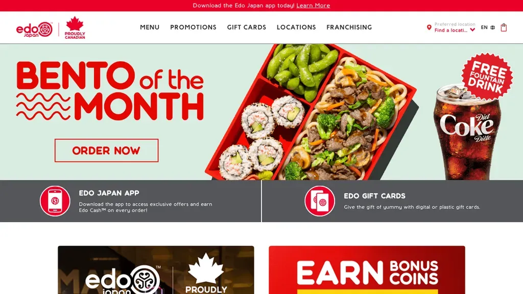
A monthly special leads the hero with its own Order Now button, and a location picker sits in the header.
Restaurants
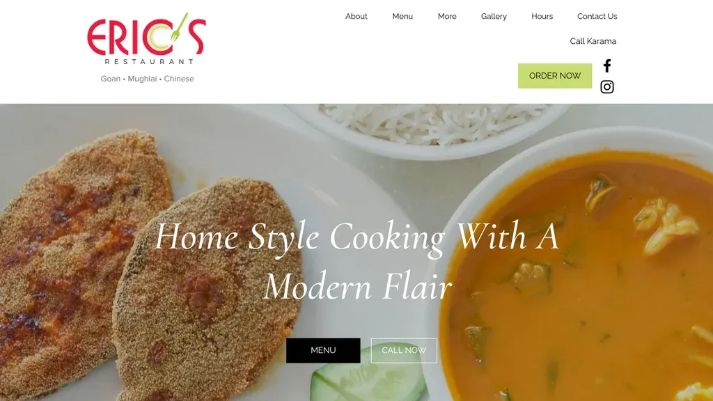
The cuisines are listed under the logo (Goan, Mughlai, Chinese), with Menu and Call Now buttons on the hero.
Restaurants
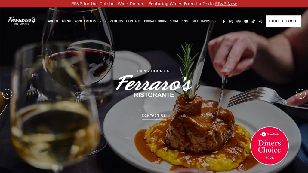
A close-up of plated steak beside a wine glass sets an upscale tone, with a Diners' Choice badge in the corner and a Book a Table button pinned top right.
Restaurants · Las Vegas
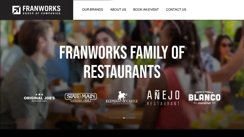
The logos of every restaurant in the group line up across the hero, so diners see the whole family at a glance.
Restaurants
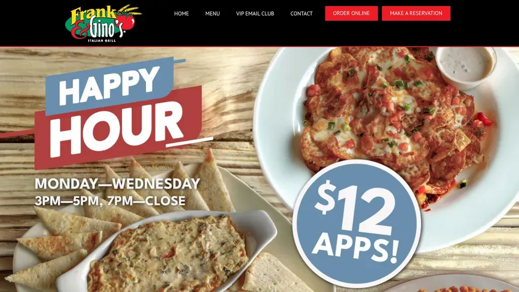
Order Online and Make a Reservation are red buttons in the header, and the hero sells a specific deal with days and times.
Restaurants
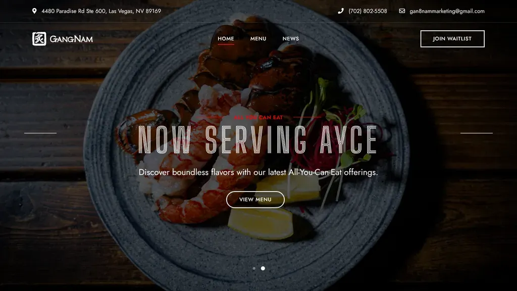
Dark slate plating behind "Now Serving AYCE" announces the all-you-can-eat offer at a glance, with a Join Waitlist button in the header and the address and phone above it.
Restaurants · Las Vegas
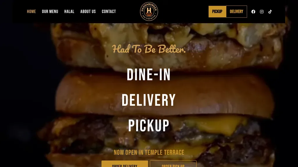
A towering smash burger fills the screen behind "Had To Be Better" and the three ways to eat, with a Temple Terrace opening line above the order buttons.
Restaurants · Tampa
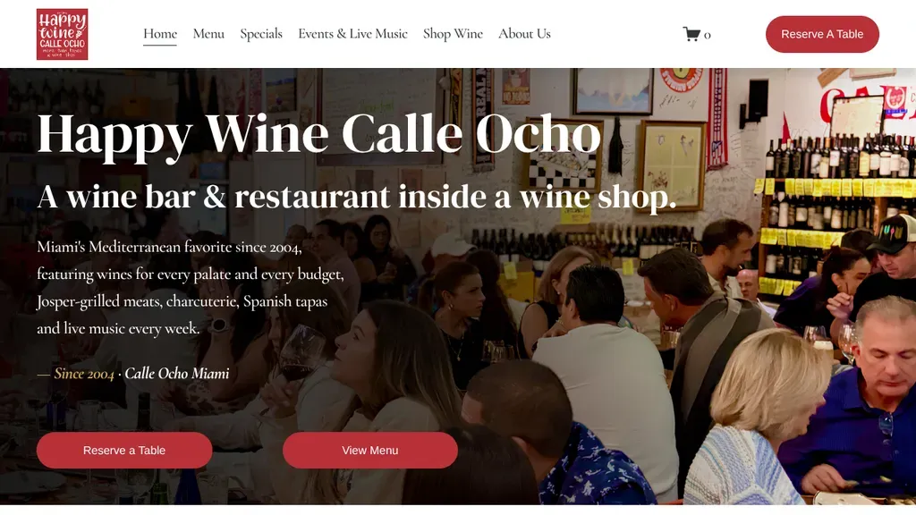
Spells out its unusual concept, a wine bar and restaurant inside a wine shop, over a packed dining room photo, with Reserve a Table and View Menu buttons below.
Restaurants · Miami
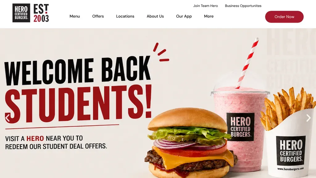
The hero rotates timely offers, like a student deal, and Order Now stays the one red button in the header.
Restaurants
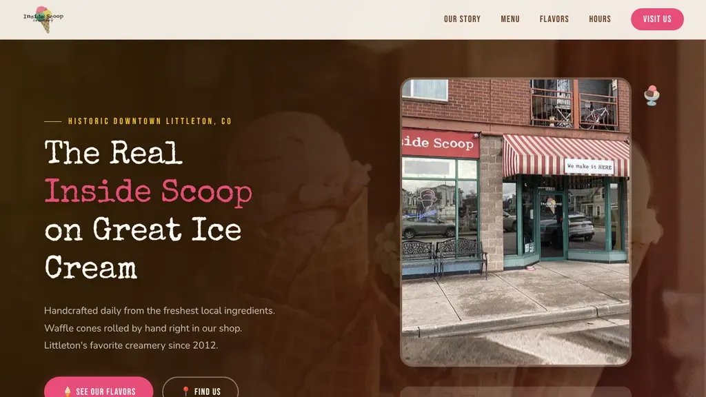
A real photo of the striped-awning storefront in historic downtown Littleton sits beside a playful headline, with flavor and directions buttons below.
Restaurants · Denver
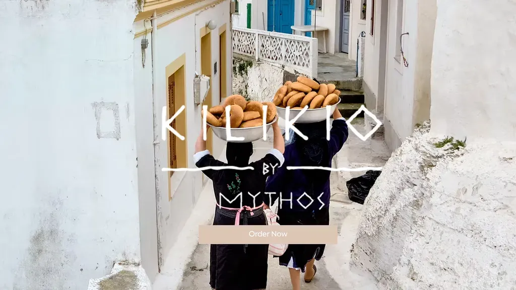
A travel-style photo of a Greek street sets the mood, with one Order Now button under the logo.
Restaurants
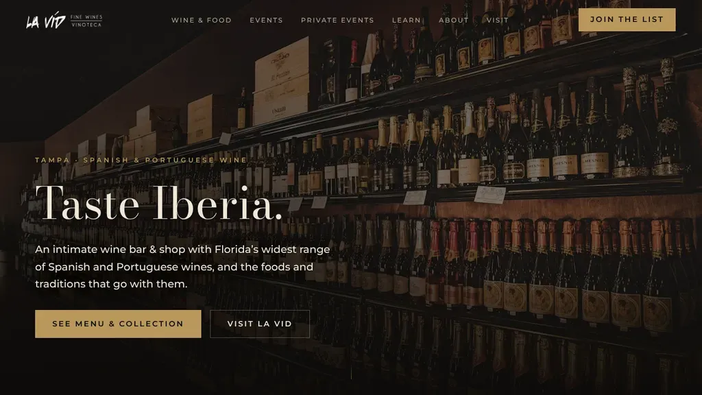
The two-word headline "Taste Iberia" sits over shelves of bottles in low light, followed by a niche pitch for Spanish and Portuguese wines and a gold menu button.
Restaurants · Tampa
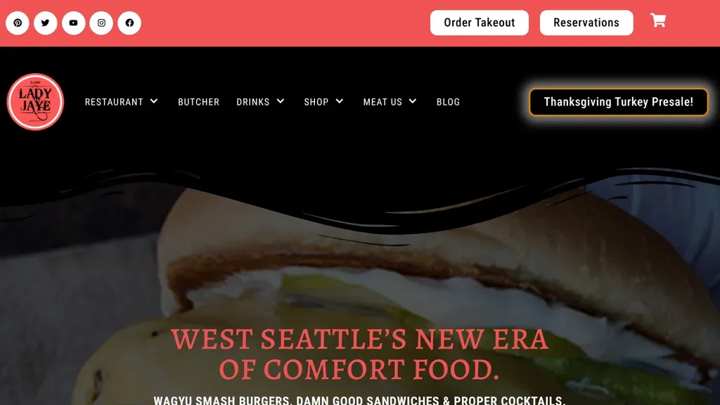
Red serif type declares "West Seattle's new era of comfort food" over a sandwich close-up, while Order Takeout and Reservations buttons sit in the top bar.
Restaurants · Seattle
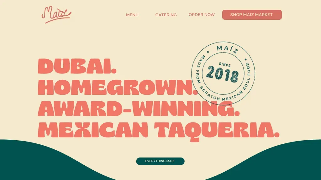
A four-line headline says everything (Dubai, homegrown, award-winning, Mexican taqueria), with Order Now and a shop in the menu.
Restaurants
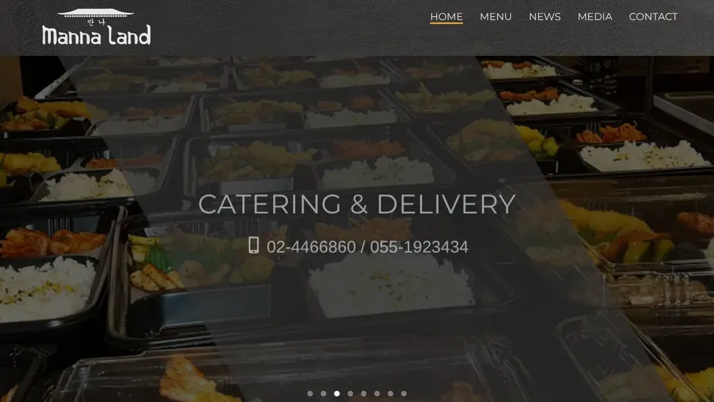
The hero promotes catering and delivery with both phone numbers printed right on it.
Restaurants
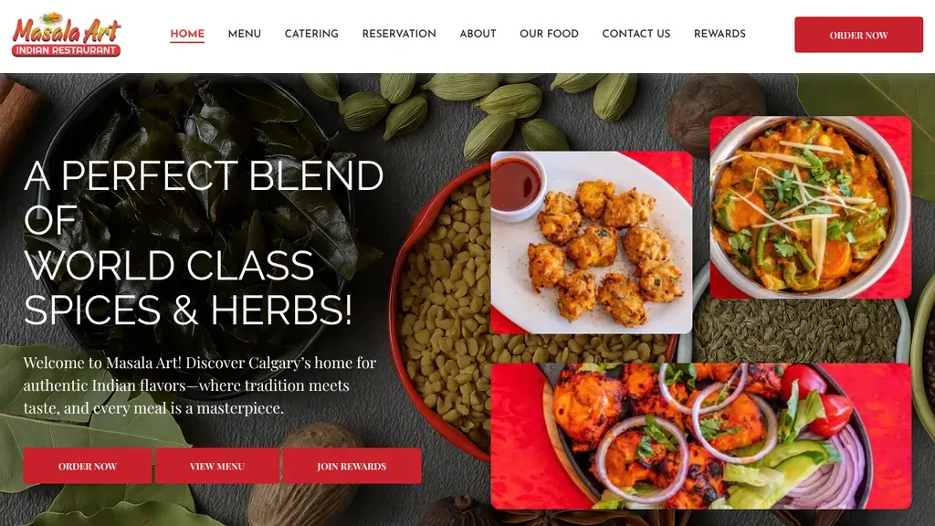
Bright tiles of curry and tandoori dishes stack beside the headline, and three red buttons (order, menu, rewards) give a next step for every kind of visitor.
Restaurants · Calgary
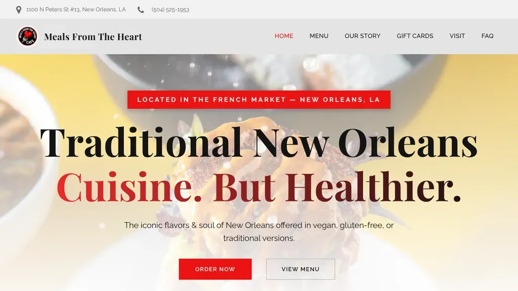
"Traditional New Orleans Cuisine. But Healthier." states the niche in one bold line, with a French Market location tag above and Order Now and View Menu buttons below.
Restaurants · New Orleans
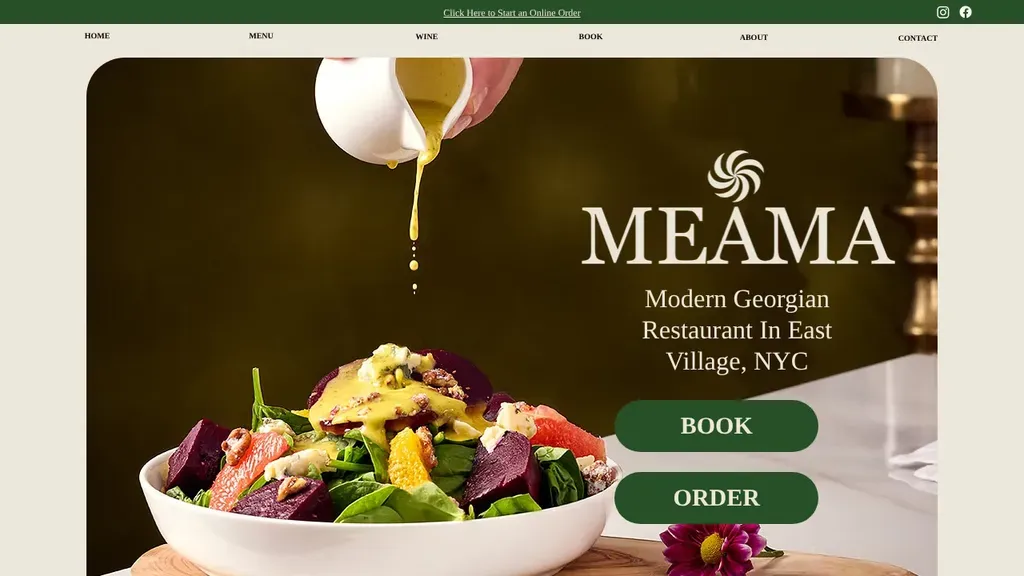
A framed shot of dressing pouring over a beet salad does the selling, set beside "Modern Georgian Restaurant in East Village, NYC" and two green Book and Order buttons.
Restaurants · New York City
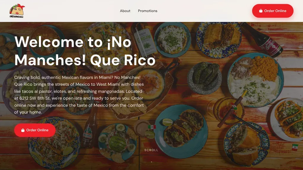
A colorful spread of tacos and Mexican dishes sits behind a welcome headline and an intro naming the street address, with red Order Online buttons top and bottom.
Restaurants · Miami
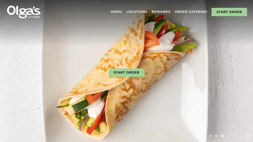
Start Order appears twice, in the header and on the hero, over a single close-up of a wrap.
Restaurants
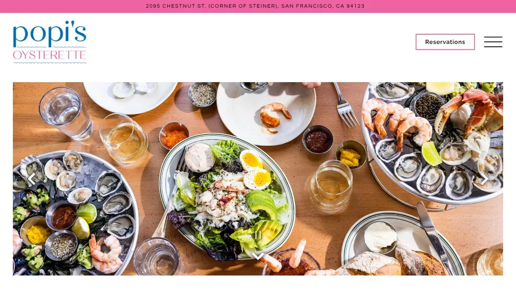
An overhead spread of oysters, shrimp and shared plates does the selling, with the Chestnut and Steiner corner in a pink top bar and a Reservations button in the header.
Restaurants · San Francisco
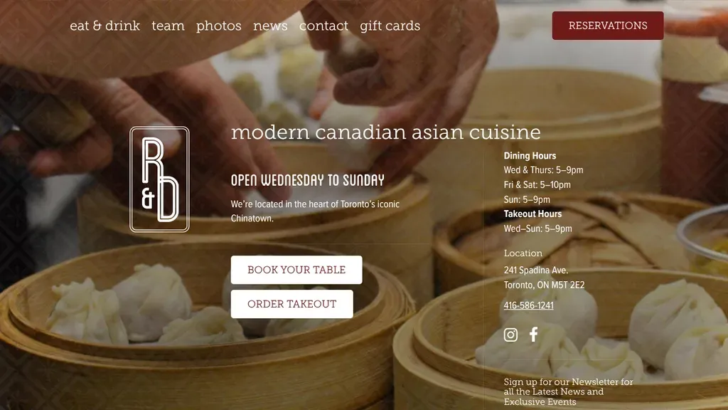
Hours, address and phone sit right on the hero next to Book Your Table and Order Takeout, no clicking needed.
Restaurants
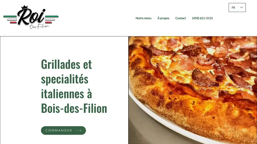
A clean split layout puts the headline naming grills, Italian specialties and Bois-des-Filion on the left and a bubbling pizza on the right, with one Commander button.
Restaurants · Montreal
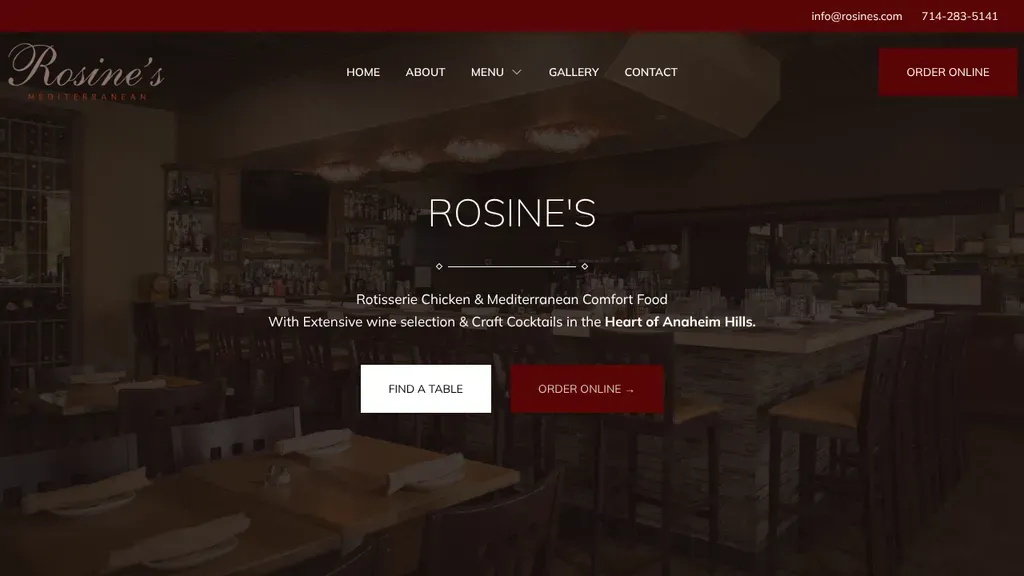
A warm, low-lit dining room sets the mood while the subhead names rotisserie chicken, Mediterranean comfort food and Anaheim Hills, with Find a Table and Order Online side by side.
Restaurants · Anaheim
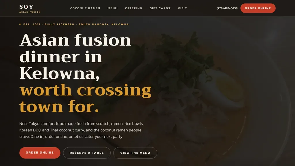
"Asian fusion dinner in Kelowna, worth crossing town for" pairs the city with a confident promise, followed by a short dish list and order, reserve and menu buttons.
Restaurants · Kelowna
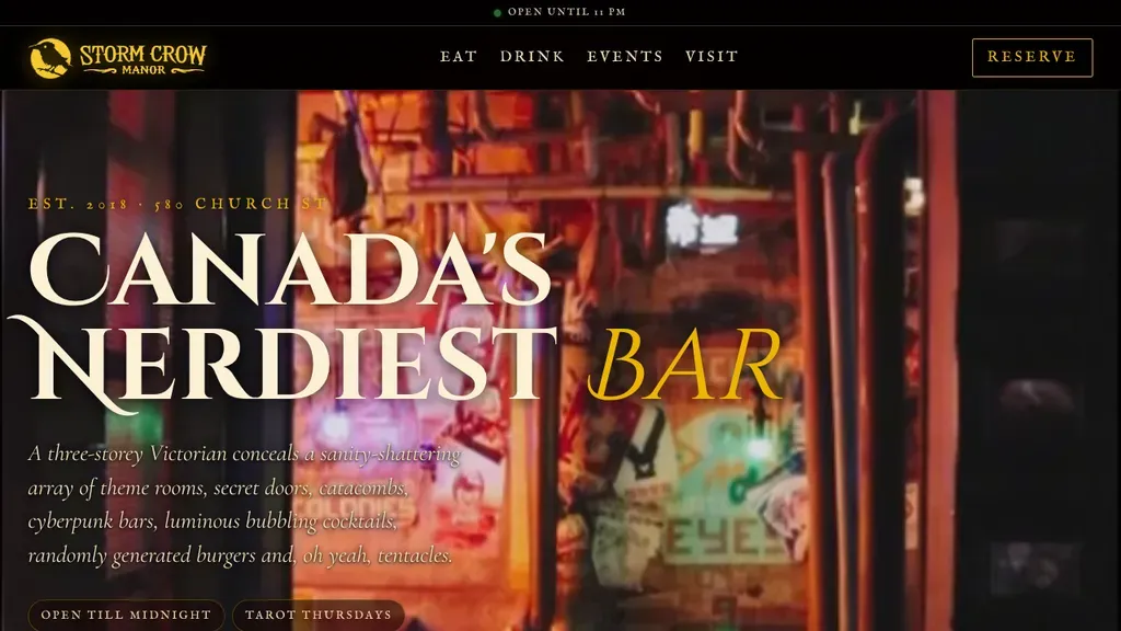
A serif headline, "Canada's Nerdiest Bar", sits over a dim photo of the themed interior, with an "open until" status line above the nav and a framed Reserve button.
Restaurants · Vancouver
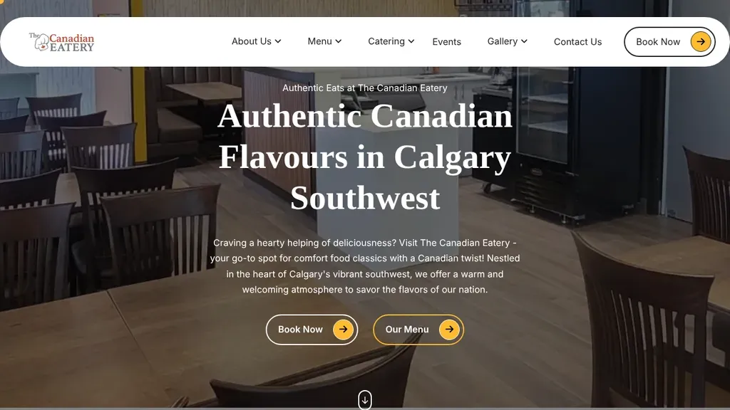
The headline names both the food and the neighborhood (Calgary Southwest) over a warm dining room photo, with Book Now and Our Menu buttons directly underneath.
Restaurants · Calgary
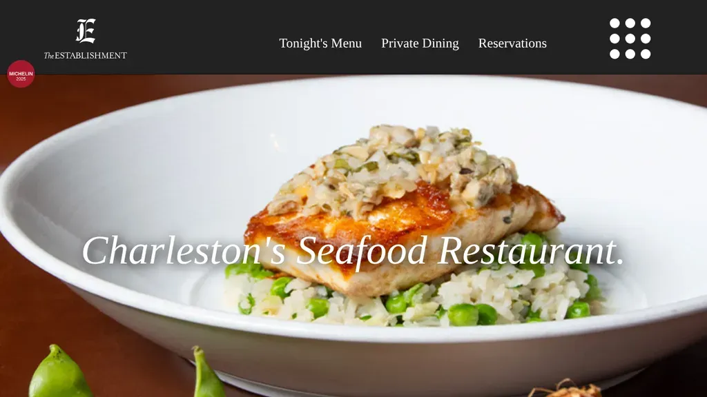
One plated fish dish and the line "Charleston's Seafood Restaurant." say exactly what and where, while Reservations, Private Dining and Tonight's Menu sit alone in a clean header.
Restaurants · Charleston
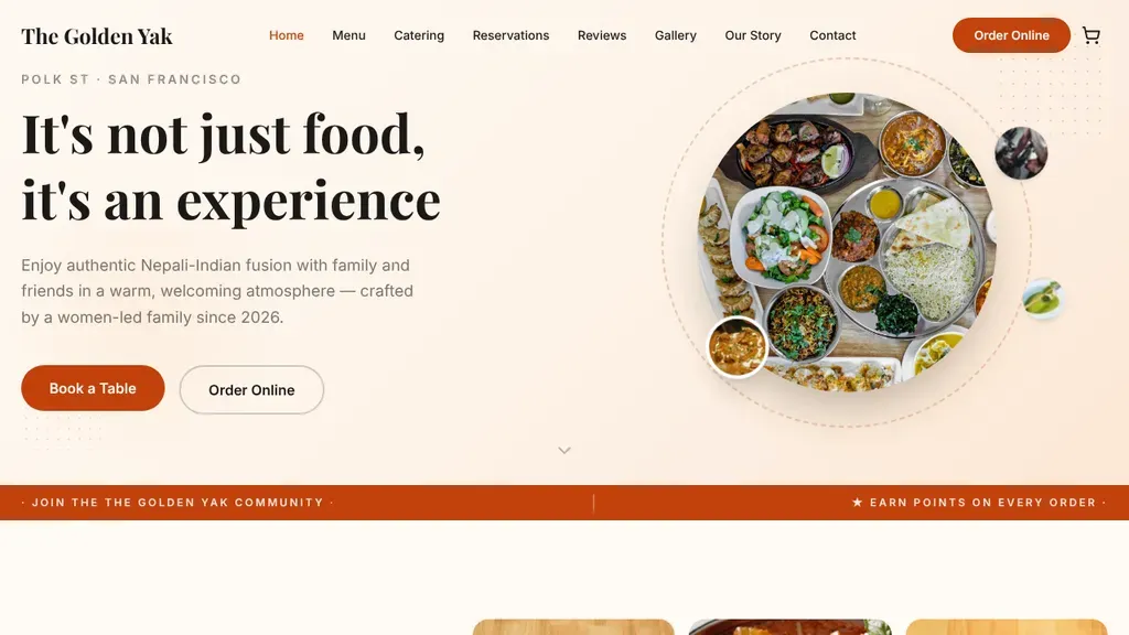
A round platter of Nepali-Indian dishes floats beside "It's not just food, it's an experience," with a Polk St location tag and Book a Table and Order Online buttons.
Restaurants · San Francisco
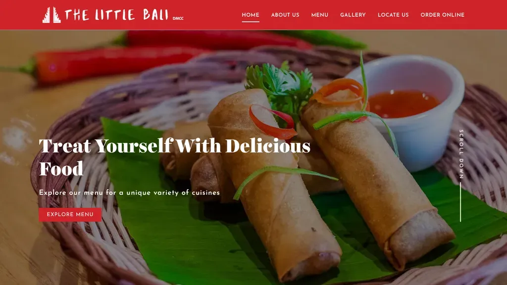
A close-up of spring rolls with one Explore Menu button, and Locate Us and Order Online in the menu.
Restaurants
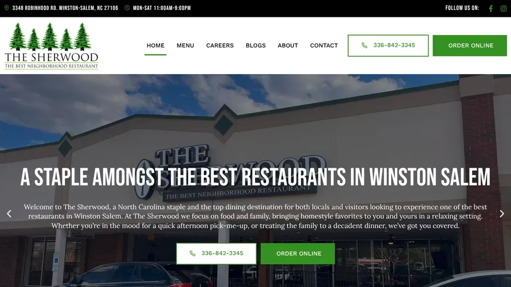
The restaurant's own building fills the hero under a headline naming Winston Salem, with the phone number and an Order Online button repeated in the header and below the intro.
Restaurants · Winston-Salem
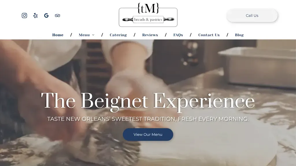
A close-up of dough being worked sets up the "Beignet Experience" headline, with a single View Our Menu button and a Call Us pill in the header.
Restaurants · New Orleans
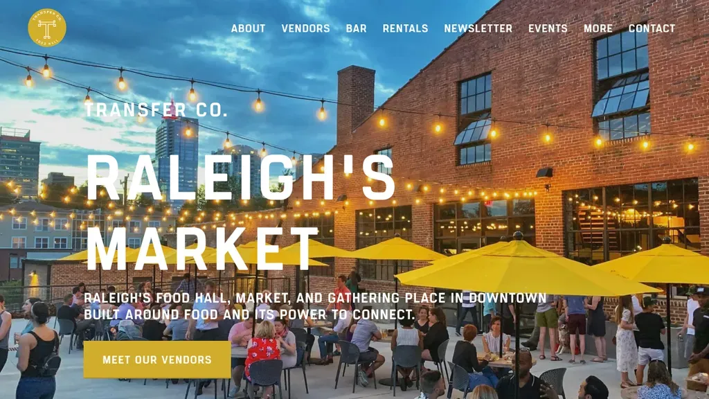
Golden hour on a patio full of yellow umbrellas and string lights sets the mood, with big "Raleigh's Market" type and a Meet Our Vendors button.
Restaurants · Raleigh
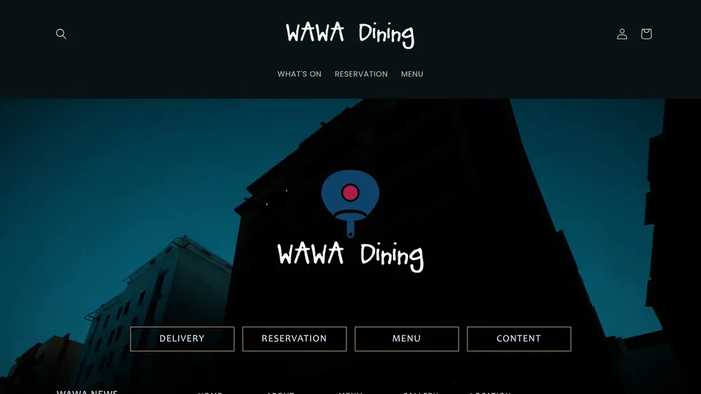
Four big buttons under the logo cover what diners want: delivery, reservation, menu and news.
Restaurants
No websites match, try a different search or industry.
A pinch-and-zoom PDF menu is where hungry visitors give up. Build your menu as real, searchable web pages with prices and photos, so it loads fast and works on any phone.
Whether it's online ordering, delivery, or a table booking, put that button in the header and repeat it down the page. Every scroll without a way to act is money walking out.
Show today's hours, address, and a tap-to-navigate map link near the top. Multi-location spot? A location finder beats a dropdown of ten addresses nobody can tell apart.
Nobody craves a stock photo of a fork. Invest in real shots of your actual dishes, shot close and in good light. One great burger photo sells harder than any paragraph about quality.
Want a website like these? See our restaurants web design services →