The Clinic Stock Photo I Won’t Buy You
Healthcare describes 60.0% of the images on its websites, 4 of 47 when I rank the trades. So I took one clinic homepage, changed four photographs and nothing else, and wrote down both versions.

There’s one line I have never once put on an invoice, and clients ask me for it on about every third project.
Stock photos.
I won’t buy them for a clinic. Not the doctor with folded arms in front of a window, not the stethoscope arranged on a clipboard, not the family of four laughing at something happening just off camera.
The reason isn’t taste, although I could make the taste argument for an hour if you let me.
A photograph on a clinic website is a promise about a room, and someone nervous is going to walk into that room on Thursday morning having already decided in her head what it looks like.
Buy that promise from a photo library and you’ve told her a small lie before the two of you have even met. It’s the cheapest lie on the menu, and it costs you more than the pictures do.
The lie stings more in your trade than in most, because the writing around your photographs is already good. Healthcare sites describe 60.0% of the images on them, which is 4 of 47 among the trades I grade, against 54.9% across every site I audited.
The page, before
A family practice sent me their homepage last spring, wanting to know whether the thing needed rebuilding.
Across the top ran a wide shot of a glass atrium with a staircase curving through it, lit like a hotel. Their actual building is a converted bungalow on a main road with a bus shelter outside the gate.
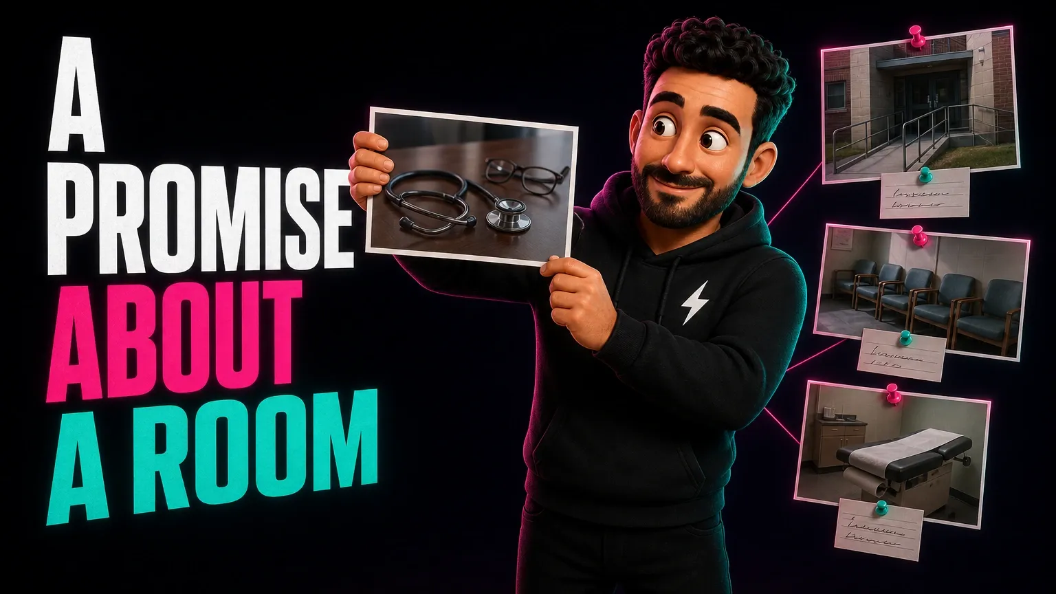
Underneath sat a strip of three squares. A woman in scrubs holding a clipboard and laughing at it. A stethoscope coiled on a wooden desk next to a pair of reading glasses. An older couple walking away down a beach, because every medical website ever built has an older couple walking away down a beach.
It was a nice page, honestly. Clean, modern, quick to load, and it could have belonged to a dermatology group two thousand miles away without a single pixel being changed.
Does any of that sound like your own homepage? The couple on the beach gets around, and your web designer bought them from the same shelf everyone else did.
Then I looked behind the pictures. All four of them carried the same line of text: Medical Center. Typed once, copied across, saved.
Whose practice was that page describing? Anybody’s.
What Google does with that line
Every picture on a website drags a short written description along behind it, sitting in the code where no visitor will ever meet it.
Google reads that description and takes your word for what the photograph shows, then hands the picture to people who went looking for that particular thing.
So four descriptions saying Medical Center told it there was a medical center on the page and not one thing more. No waiting room. No ramp. No children’s corner, no blood draw, no town, no Thursday morning.
What would a stranger have to type to be shown your building? Right now, on most clinic sites I open, the honest answer is your own name, which she doesn’t know yet.
The page, after
Same layout. Same wide shot at the top, same three squares underneath it, nothing moved and nothing redesigned.
The top of the page is now the front of their own building at eight in the morning, taken from the sidewalk, with the wheelchair ramp to the left of the doors and the pharmacy sign two doors down inside the frame, because the pharmacy is what people navigate by from the car.
Square one is the waiting room with its truly terrible green chairs, which they asked me to crop out and I refused to crop out.
Your building has a green chair of its own, and you’ve probably been apologizing for it since the day you moved in. Put it on the website.
Square two is an empty treatment room, door open, paper roll on the table, nobody sitting in it, because no one wants to look at a stranger occupying the chair they’re about to occupy.
Square three is their practice nurse in the corridor with her coat over one arm, taken on a phone by the receptionist in about four seconds flat.
Then the boxes underneath, which took that same receptionist a shade under five minutes for all four of them.
Front entrance with the wheelchair ramp to the left of the doors.
Waiting room with green chairs and the children’s corner by the window.
Treatment room set up for a blood draw.
Our practice nurse in the main corridor.
What changed, and what didn’t
Nothing on that page got faster, cheaper or better looking. The layout is the one they paid for two years ago, and I didn’t earn a penny redesigning any of it.
What changed is that the page now describes a real place, in words, for the two visitors who can’t see a photograph: a search engine, and a patient whose phone is reading the page out loud to her while she walks.
I can’t hand you a graph off the back of a change that small, and anybody who offers you one is selling you something. What I can tell you is that a picture of a green chair in a room you can find is worth more than a beach nobody’s ever been to.
Which of the two versions would you want a nervous patient to meet first?
Your trade is already good at this
Something surprised me when I lined the trades up, and it’s the reason I stopped nagging this trade about its photographs years ago.
The boxes get filled in around here. Someone in the building cares enough to type a sentence, which is more than I can say for most of the trades I grade.
One tab on a laptop and one on your phone will show you how your own practice does on that check tonight, along with the one number this trade would rather not discuss.
Which makes the stock photo worse rather than better. A carefully written description of a room that doesn’t exist is a false statement, typed with care, repeated on every page of the site.
Would you rather be unfindable, or findable as a building you don’t own?
But won’t real photos slow the page down
That objection turns up every time, and it always comes from the person who picked the stock ones. A plumber phoned me with the same worry last year and his page turned out to be one of the quickest I opened all year.
These sites average 61 out of 100 for how quickly they arrive on a phone, against 58 across everything I put through the same test, so your trade is carrying its weight better than most already.
When did you last ask anyone what the picture at the top of your homepage weighs? Nobody ever has, in my experience, and it’s usually the heaviest thing on the site.
A photo taken on a phone this year isn’t what slows a website down. A twelve megabyte header image that nobody shrank is what slows a website down, and that’s equally true whether the person in it works for you or lives in Latvia.
Shrinking that one file, and the handful of other jobs that actually move a load time, will beat any argument about where the photograph came from.
The rule I actually work to
Every website I build for a practice goes out with photographs of the real building, the real corridor and the real people, and every one of those photographs gets a sentence typed underneath it by whoever was standing there.
Not by me. I wasn’t in the room, and the sentence reads like it when I write it.
Does your website show a patient the door she’s going to walk through? Mine didn’t, for years, and I had a stock photo of a laptop on a desk to prove it.
Send me the page
One page. The one with your pictures on it.
Send me the address and I’ll open every photograph on it and tell you what each one is currently claiming to be, which takes me about ten minutes and costs you nothing at all. The form is here.
And if every box is full and every picture is a room I could walk into tomorrow, I’ll say so out loud, and you’ll have wasted four minutes of my afternoon. I’d enjoy that enormously. It doesn’t happen anywhere near often enough.