Booking beats browsing
A patient who can't book online will call your competitor instead. Put a scheduling button in the header, repeat it on every service page, and show real availability if you can.

These are our favorite websites built for healthcare.

13+ years building legendary SMB websites
Nobody browses a healthcare website for fun. Your visitors are worried, in pain, or booking care for someone they love. They need three things fast: can you help me, can I trust you, and how do I book. The great sites answer all three above the fold. The mediocre ones bury appointment buttons under mission statements and stock photos of smiling doctors nobody has ever met.
This collection pulls 40 healthcare sites that get it right, from family practices like Ballarat Doctors and Lilydale Doctors to dermatology clinics like The Harley Street Dermatology Clinic and Epiphany Dermatology. Study how they structure service pages, word their reassurances, and place credentials where anxious visitors actually look. Then steal the thinking, not the pixels. Your clinic doesn't need a hospital system's budget to borrow its clarity.
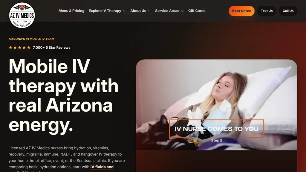
A patient resting at home beside an "IV nurse comes to you" caption shows the mobile service at once, with Book Online, Text Us and Call Us up top.
Healthcare · Scottsdale
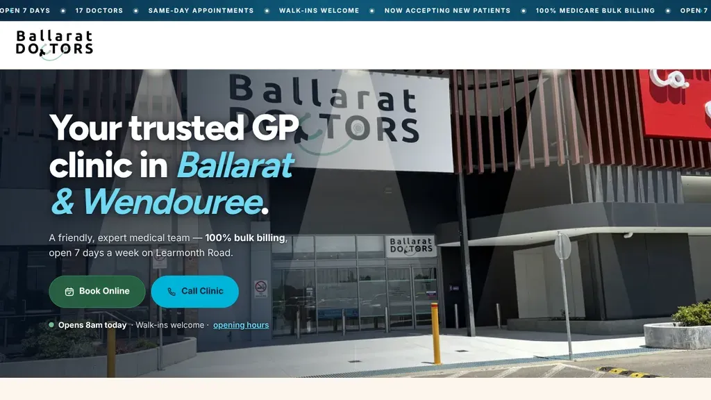
A scrolling ticker answers the key questions first: bulk billing, open 7 days, same-day appointments, walk-ins welcome.
Healthcare
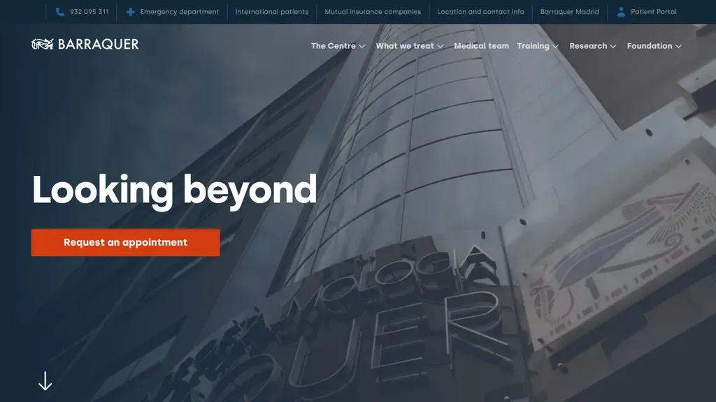
A slim top bar routes the urgent paths first: emergency department, international patients and insurers.
Healthcare
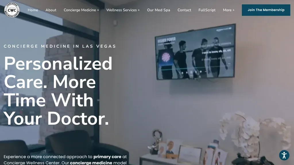
States its niche, concierge medicine in Las Vegas, above a bold "Personalized Care. More Time With Your Doctor." promise, with one Join The Membership button in the menu bar.
Healthcare · Las Vegas
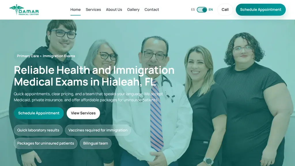
A group photo of the care team fills the hero, the headline names immigration exams and Hialeah, and chips below mention a bilingual team and packages for uninsured patients.
Healthcare · Miami

A rotating hero names each service line in large white type, starting with concierge medicine, while Book Consultation and the phone number sit at opposite ends of the header.
Healthcare · Denver
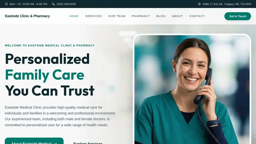
Address, hours and phone sit in a slim top bar, and a smiling staffer on the phone backs up the "Personalized Family Care You Can Trust" headline.
Healthcare · Calgary
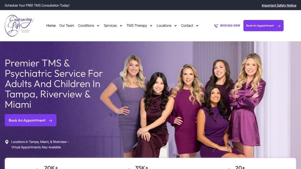
The whole clinical team poses in matching purple beside a headline naming Tampa, Riverview and Miami, with one booking button and a location note directly underneath.
Healthcare · Tampa
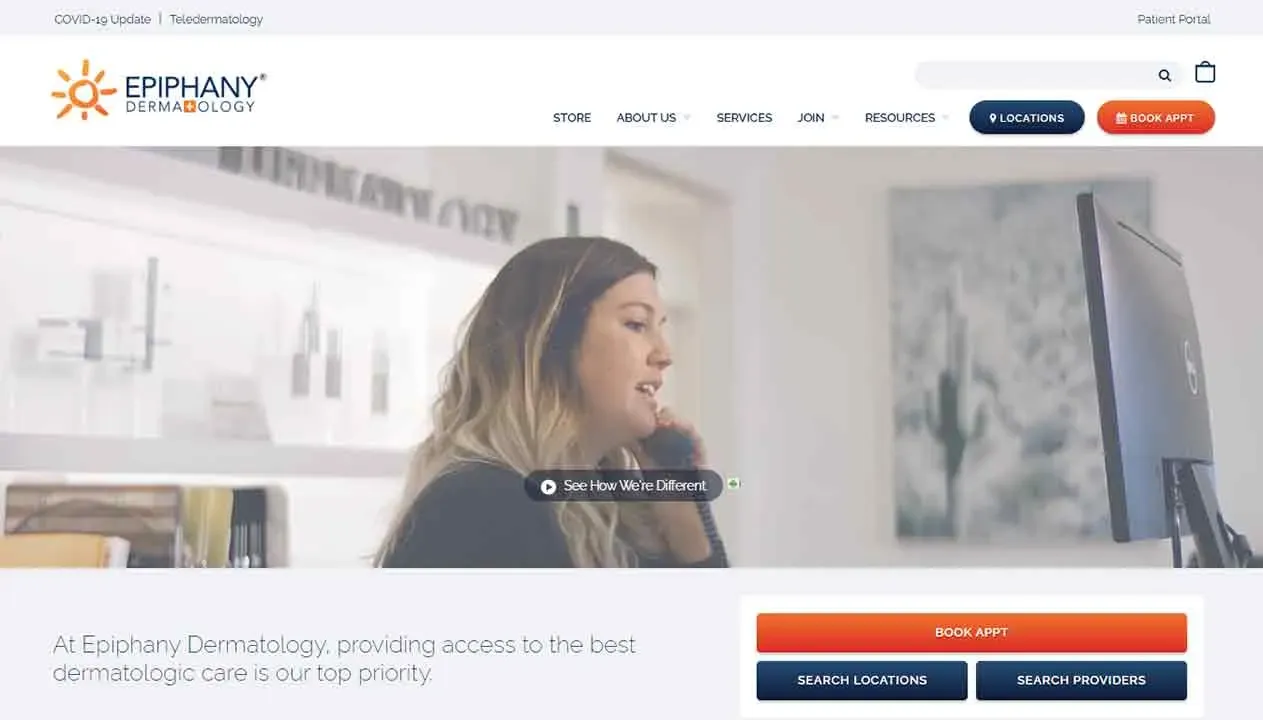
Book Appt sits in both the header and a hero card, beside Search Locations and Search Providers buttons.
Healthcare
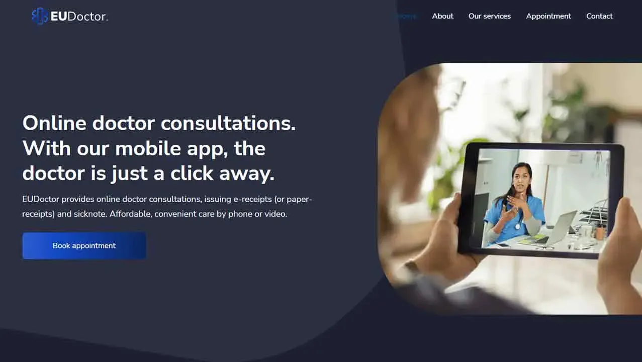
The headline explains the service in two short sentences, with one Book Appointment button and a photo of a video consult.
Healthcare
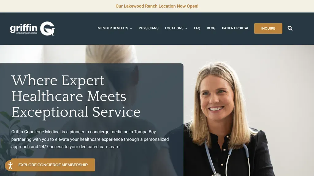
A physician portrait beside a dark text panel explains concierge care in Tampa Bay, with a gold Explore Concierge Membership button and a ribbon announcing a new location.
Healthcare · Tampa
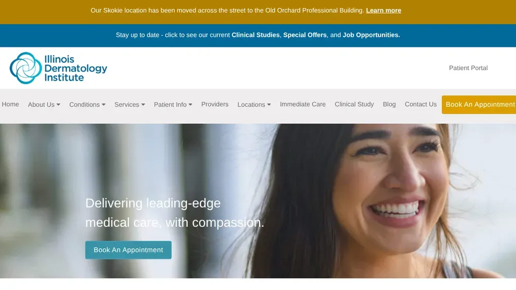
Two announcement bars handle the news (a moved location, clinical studies) so the hero stays clean, with Book an Appointment twice.
Healthcare
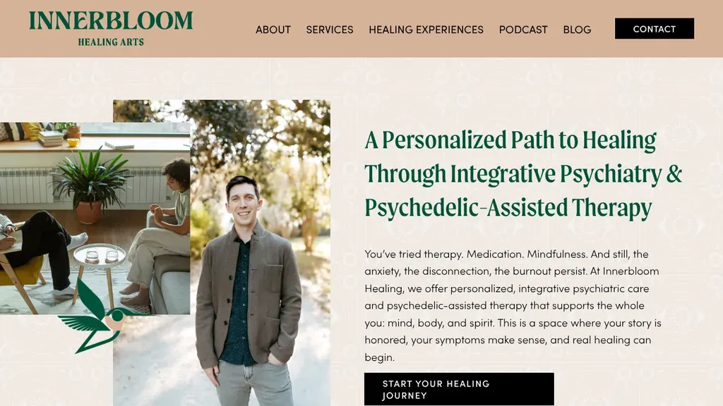
Collaged photos and a portrait of the provider sit beside a headline on integrative psychiatry and psychedelic-assisted therapy, followed by a pain-point paragraph and a black call-to-action button.
Healthcare · Charleston

The doctor leads the page, with three proof points underneath: specialties, years of experience and procedures done.
Healthcare
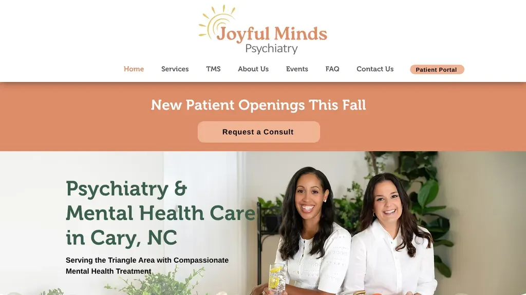
A bright new-patient-openings banner with a Request a Consult button sits above a photo of the two providers and a headline naming Cary, NC.
Healthcare · Raleigh
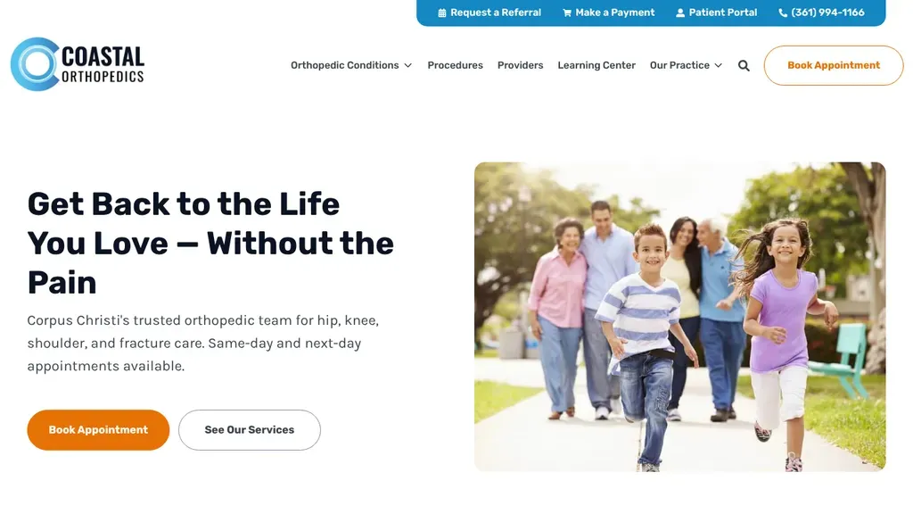
A plain promise, "Get Back to the Life You Love", sits beside a family photo and an orange Book Appointment button, with referrals, payments and the portal up top.
Healthcare · Corpus Christi

The headline speaks to the buyer's goal, a better return from marketing, and four proof tiles sit under the hero.
Healthcare
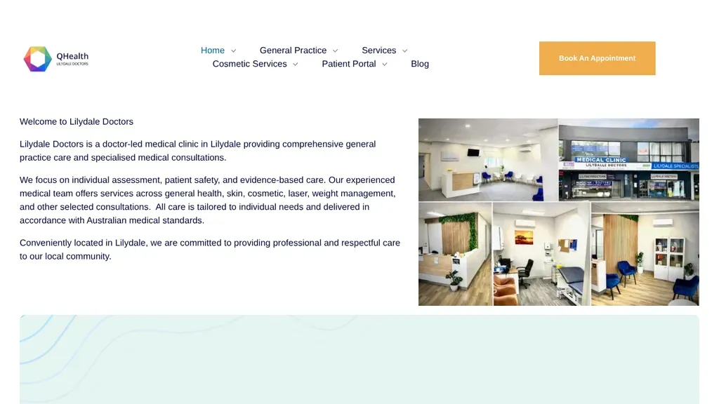
A plain welcome paragraph says who they are and where, next to real photos of the clinic, with Book an Appointment in the header.
Healthcare
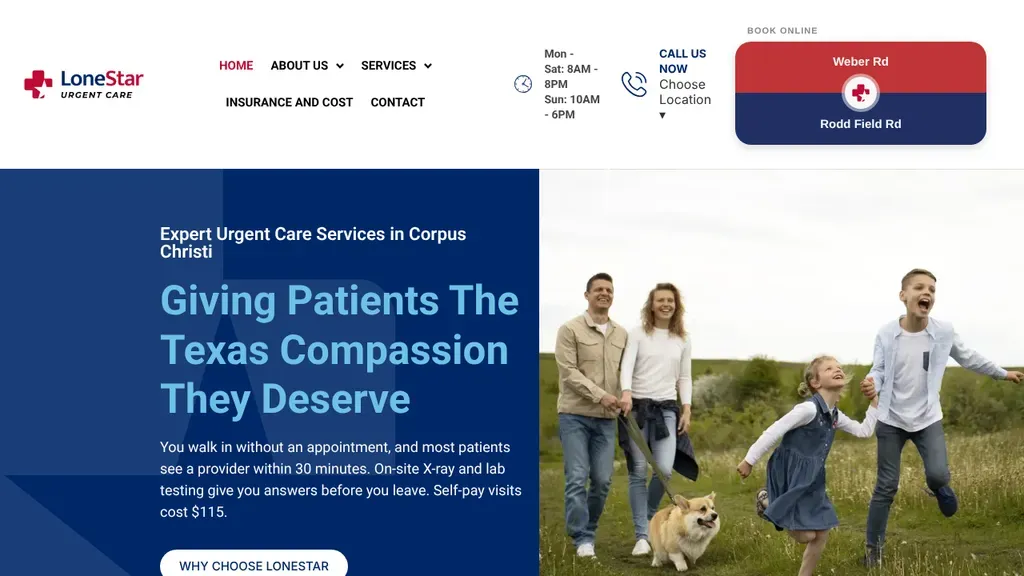
The header's booking button splits between its two Corpus Christi clinics, and the hero promises walk-in visits with most patients seen within 30 minutes, plus the self-pay price.
Healthcare · Corpus Christi
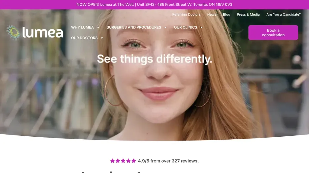
A close-up portrait with the line "See things differently" sets a calm tone, with a magenta Book a consultation button up top and the 4.9 rating just below.
Healthcare · Toronto
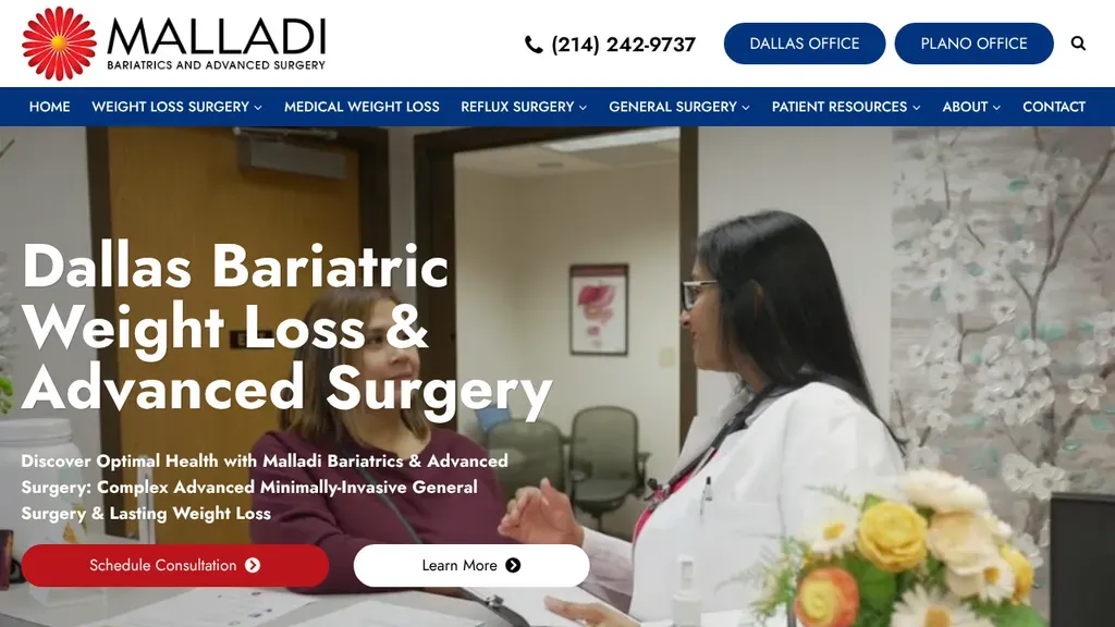
A physician consulting with a patient fills the frame beside a bold Dallas bariatric surgery headline, with separate Dallas and Plano office buttons in the header.
Healthcare · Dallas
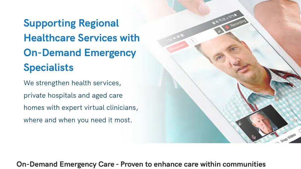
The headline names the buyer, regional health services, and a tablet mockup shows the virtual consult itself.
Healthcare
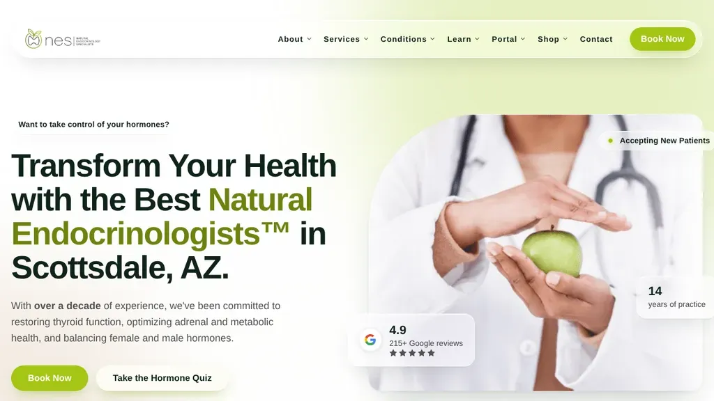
Names its niche and city in the headline, pairs Book Now with a Take the Hormone Quiz button, and floats a Google rating card over the photo.
Healthcare · Scottsdale

Patient photos sit inside a brain-like pattern of blue shapes, and the copy names Scottsdale before Schedule Now and Explore Services buttons, with the phone pinned in orange.
Healthcare · Scottsdale
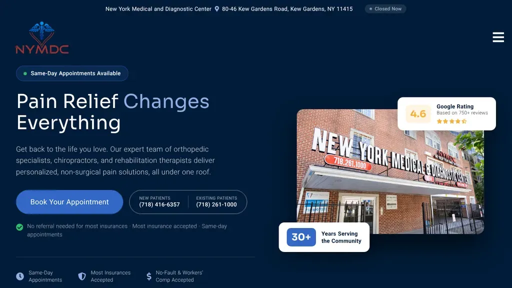
A photo of the Kew Gardens building with a Google rating badge sits beside a clear headline, a booking button and separate numbers for new and existing patients.
Healthcare · New York City
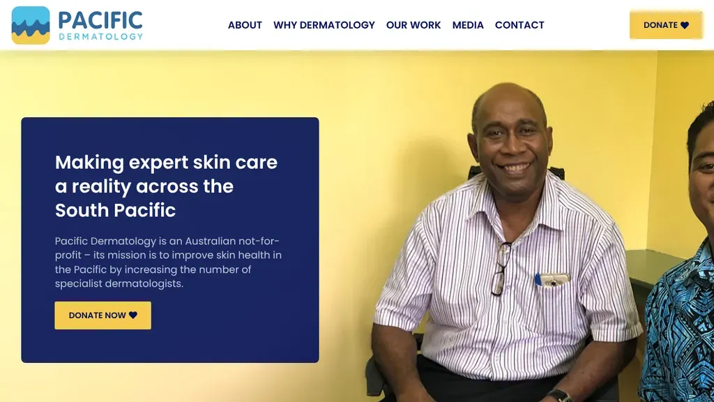
A yellow Donate button appears in the header and again in the hero, beside a real portrait instead of stock art.
Healthcare
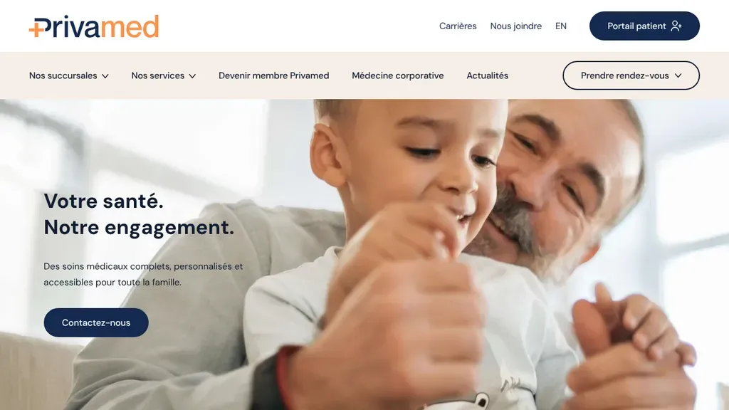
Written in French for Montreal-area families, it pairs a grandfather and grandchild photo with a short promise and a Prendre rendez-vous menu in the header.
Healthcare · Montreal

A photo of a stone building entrance frames the headline and a booking button, and a slim strip below lists new patients, accepted insurers and the age range.
Healthcare · Scottsdale
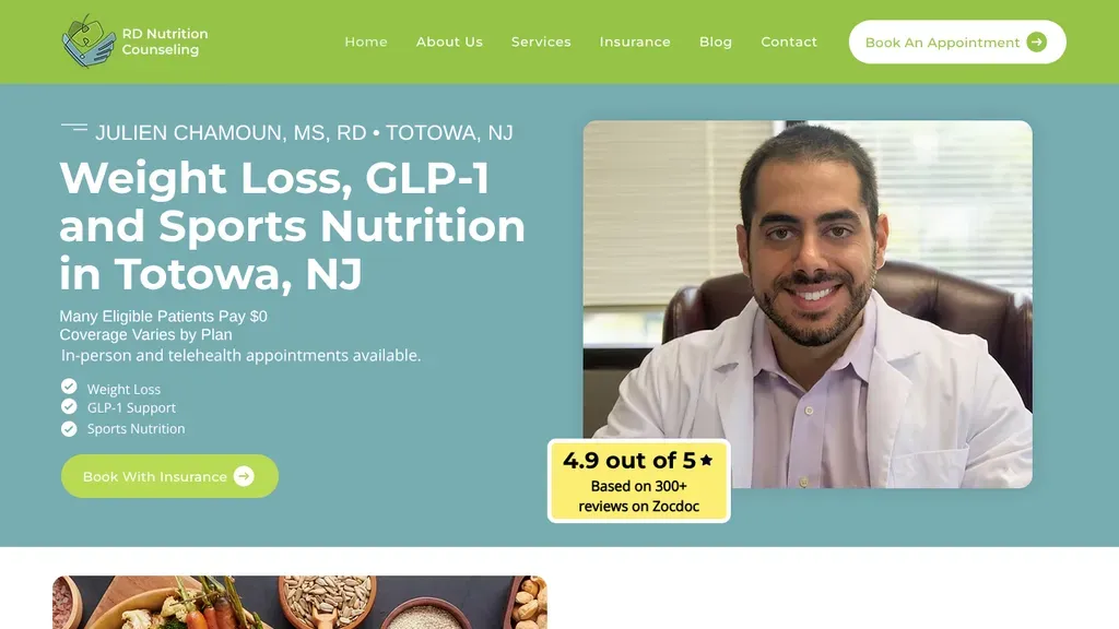
The dietitian's own portrait anchors the hero, with services checked off under the headline, a Book With Insurance button and a yellow badge showing his 4.9 rating.
Healthcare · New York City
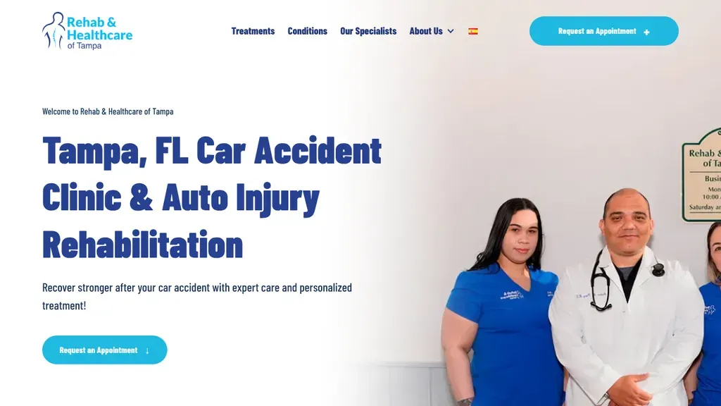
Speaks straight to car accident patients in Tampa with a big navy headline, clinical staff posing in the office, and Request an Appointment buttons in both hero and nav.
Healthcare · Tampa
 Built by us
 Each audience gets its own menu item (assessments, physician consults, physician opportunities), plus Order Now in the header.
Healthcare · Toronto
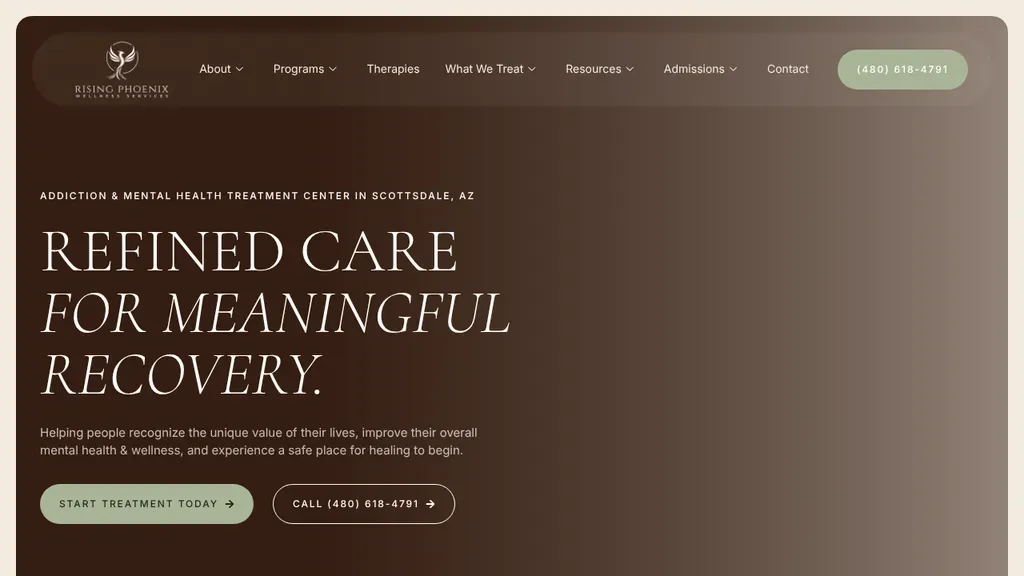
An elegant serif headline and warm brown panel give an addiction treatment center a calm feel, with the Scottsdale location named above and both start and call buttons below.
Healthcare · Scottsdale

A provider in a white coat talks with a patient in a treatment chair behind the thin "Your Skin, Our Expertise" headline, with a yellow Book Online button in the corner.
Healthcare · Washington DC
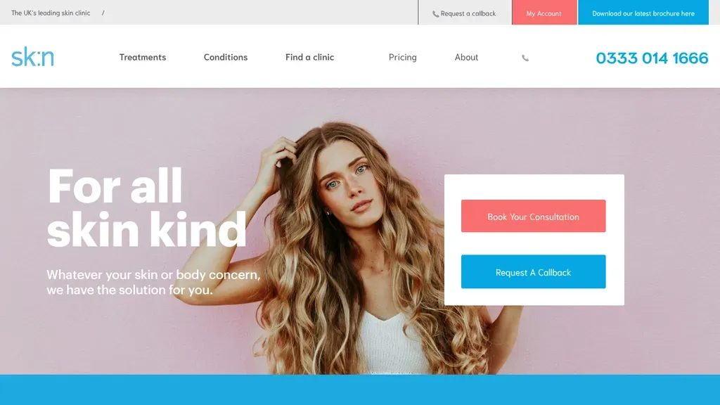
Book Your Consultation and Request a Callback sit in a card on the hero, with the phone number large in the header.
Healthcare
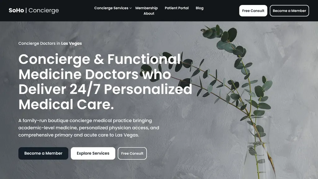
States "Concierge Doctors in Las Vegas" above a headline about 24/7 personalized care, then offers three paths: become a member, explore services or book a free consult.
Healthcare · Las Vegas
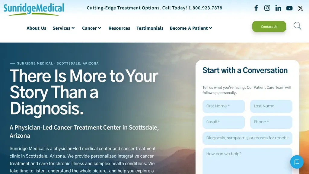
Opens with an empathetic headline, "There Is More to Your Story Than a Diagnosis," and places a Start with a Conversation intake form right beside it.
Healthcare · Scottsdale
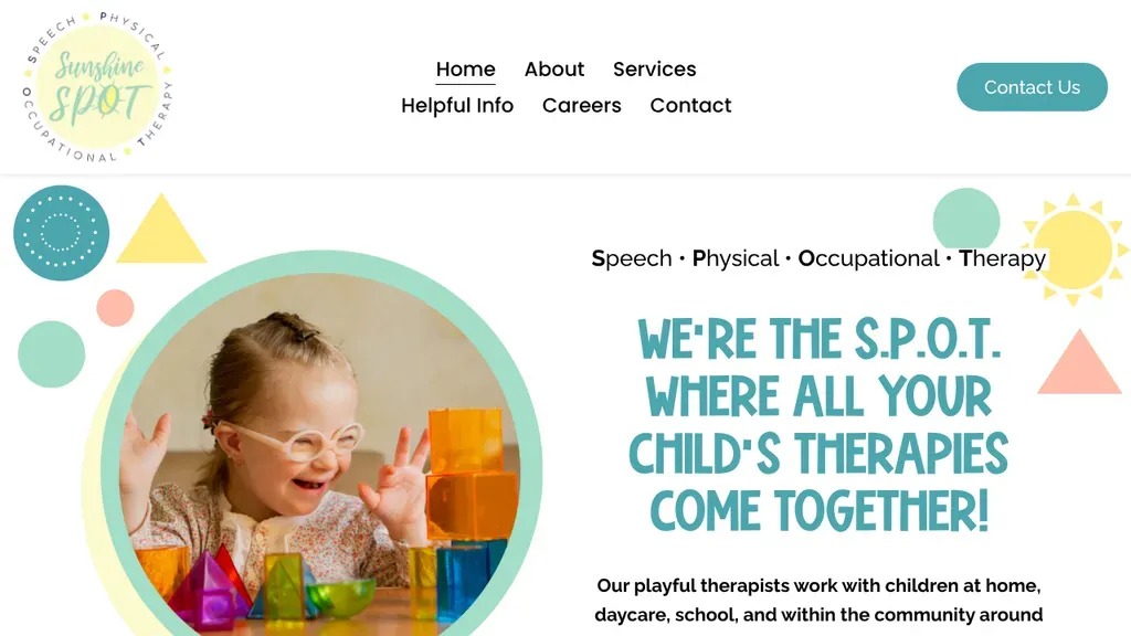
Playful pastel shapes and a sun circle a photo of a delighted child, and the S.P.O.T. acronym headline explains speech, physical and occupational therapy around Tampa at a glance.
Healthcare · Tampa

Three short claims (expert dermatologists, modern clinics, exceptional care) stack into the headline over a clinic photo.
Healthcare
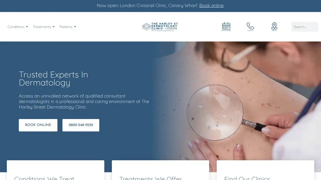
A top bar announces the new Canary Wharf clinic, and Book Online and the phone number sit right in the hero.
Healthcare
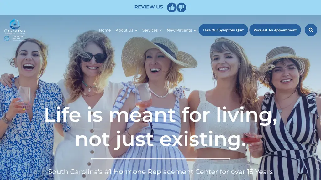
A group of laughing women in sun hats carries the "Life is meant for living" headline, and a symptom quiz button sits beside Request An Appointment in the nav.
Healthcare · Charleston
No websites match, try a different search or industry.
A patient who can't book online will call your competitor instead. Put a scheduling button in the header, repeat it on every service page, and show real availability if you can.
Patients search "knee pain," not "orthopedics." Organize navigation around symptoms and conditions in plain language, then route visitors to the right specialist without making them learn medical jargon first.
Board certifications, real provider photos, and patient reviews belong next to the booking button, not on a buried About page. People choose the doctor they can see and vet.
Insurance accepted, self-pay pricing, and payment plans should be findable in one click. Cost confusion is why patients abandon care, and hiding it reads like you're expensive.
Want a website like these? See our healthcare web design services →