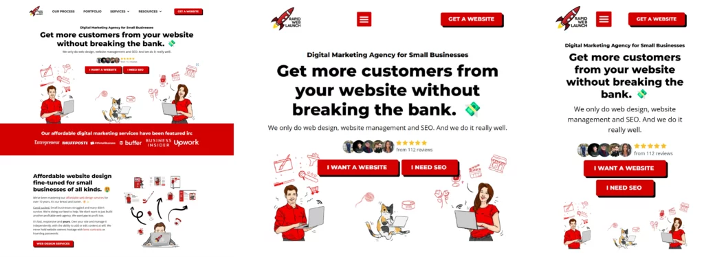
Responsive web design (RWD) is a web development approach that creates websites to automatically adjust and adapt to the size of the viewer’s screen.
The main goal of RWD is to ensure that a website looks good and functions well on any device, whether it’s a desktop, a tablet, or a smartphone. This approach enhances user experience by providing a seamless interaction across various devices.
How It Works
- Fluid Grids: The layout of the website uses a flexible grid system that resizes according to the screen width.
- Flexible Images: Images and other media files are scaled up or down automatically to fit the space available.
- Media Queries: CSS technology that allows designers to create specific conditions for different screen sizes, ensuring that the website adjusts its design according to the device being used.
Benefits
- Improved User Experience: Users enjoy a consistent experience across devices, improving their satisfaction and engagement with the content.
- SEO Boost: Search engines favor responsive websites, which can lead to better rankings in search results.
- Cost-Effective: Maintaining one responsive website is less expensive than having separate versions for desktop and mobile.
By adopting responsive web design, you ensure that your website is accessible and enjoyable for all users, regardless of how they access it.
